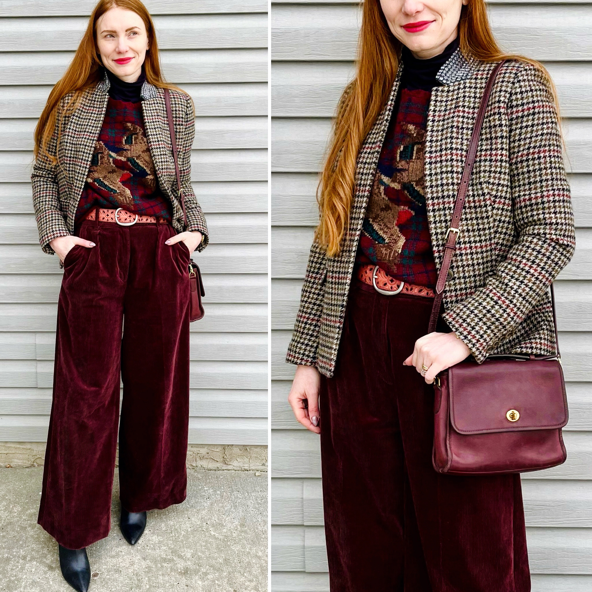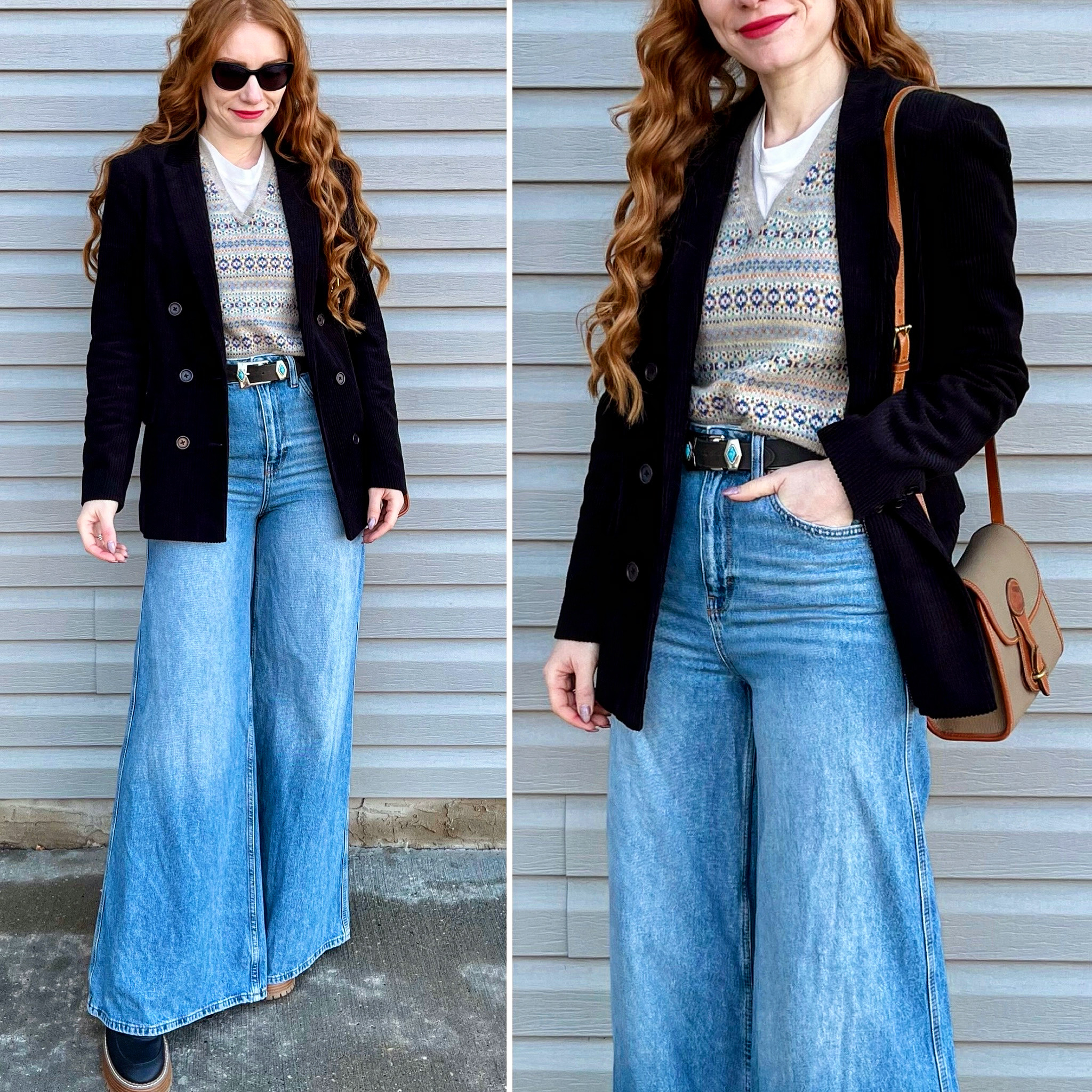
Details: H&M top (retail), Ralph Lauren vest, InWear blazer, BDG jeans, vintage belt, Dooney bag (all secondhand)
Thoughts: Guysssss! This is it! I finally found my palazzo jeans — the style I’ve been hunting for nearly 2 years. They were worth the wait, I love them so much. This one is called the BDG Puddle jean. I think there might be different versions with the same name, though, because the one’s I’ve found on Poshmark under that label look different. Why am I looking for another pair on Poshmark? Because my daughter also loves them and has been trying to steal this pair ever since I found it. Yes, friends, a new era is dawning: my daughter is starting to wear the same clothes as me. Sometimes literally. She’s not quite as tall as me (yet!!) but her inseam is almost as long as mine *cries in long-torso-short-legs* Anyway, the jeans are amazing. As is this wide wale corduroy blazer/jacket. I haven’t had a proper black blazer for a while, but couldn’t resist this one. I’m currently obsessed with corduroy, and I’m also really leaning into a 70s academia vibe — this blazer is perfect on both counts. I’ve been wearing it a lot lately … as you will soon see.
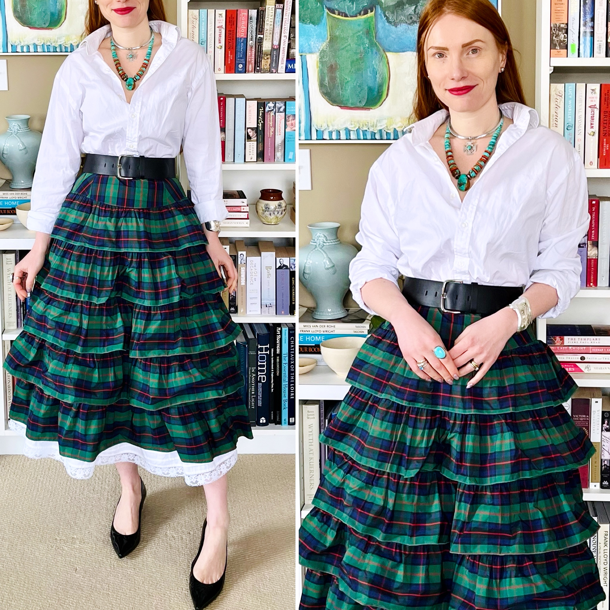
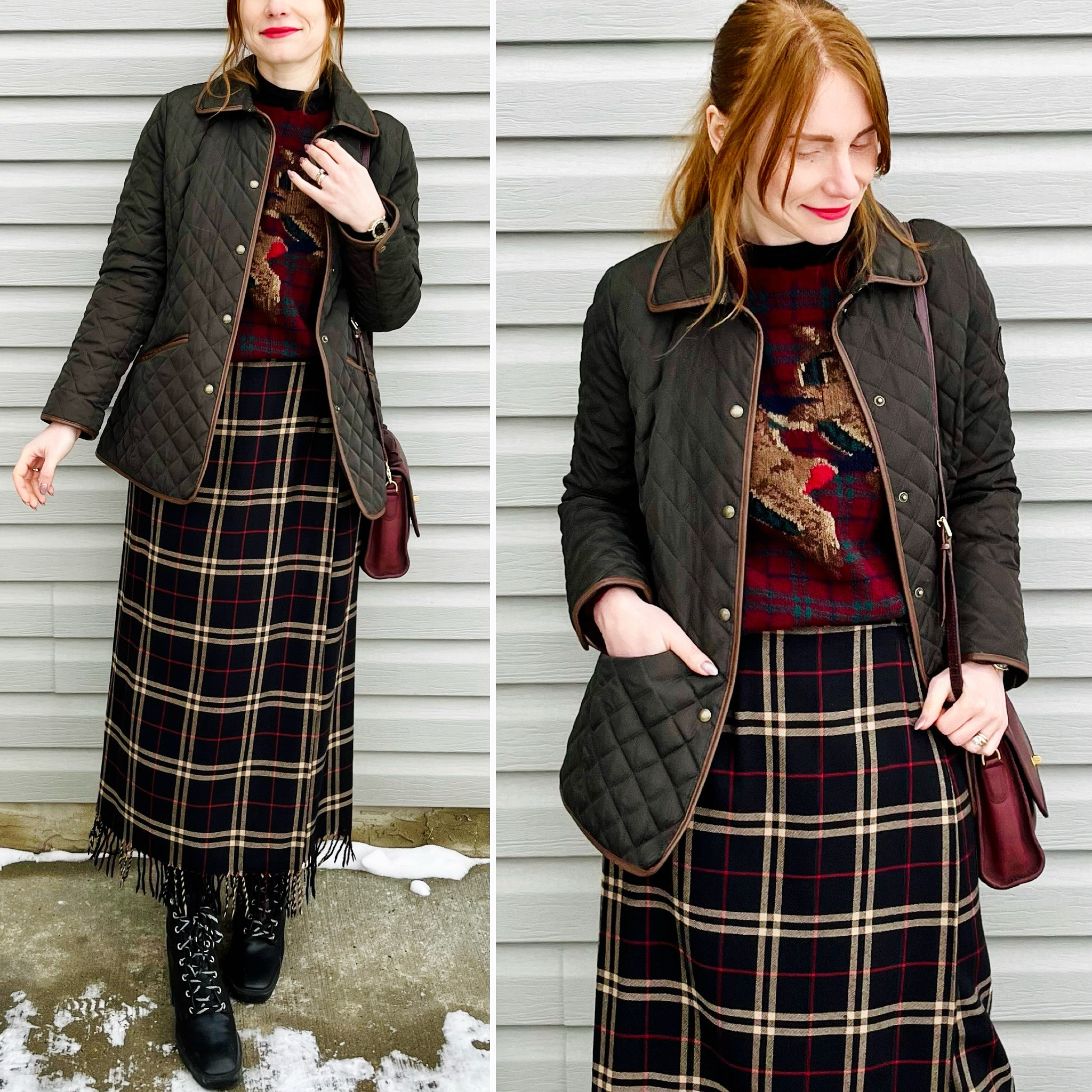
Details: Ralph Lauren skirt, sweater & shirt, Silverado jacket, Nocona belt, Laredo boots (all secondhand)
Thoughts: The weather has been so up-and-down lately, it’s hard to know how to plan outfits from day to day, but I always try to take advantage of warmer temps whenever they grace us. This outfit being a case in point. I am so excited for spring (and summer) and all of the layering possibilities, especially in Trailblazer mode like here.
Details: Club Monaco turtleneck (retail, old), Ralph Lauren sweater & jacket, Cleo skirt, Coach bag, Office London shoes (all secondhand)
Thoughts: I call this my Escape to the Country outfit — IYKYK. I love this earthy colour palette. Words I never thought would come out of my mouth, because I used to be the kind of person who only had 2 modes: black or rainbow. I still love bright colours (summer will prove that) but it’s true that I have been drifting away from black lately — especially heavy doses of black. Brown and brown-adjacent shades seem to fit my current aesthetic much better, and are also probably more flattering to my colouring. I’ll never swear off black completely, but I’m enjoying my Brown Period quite a lot … even if it sounds so, so wrong, lol!
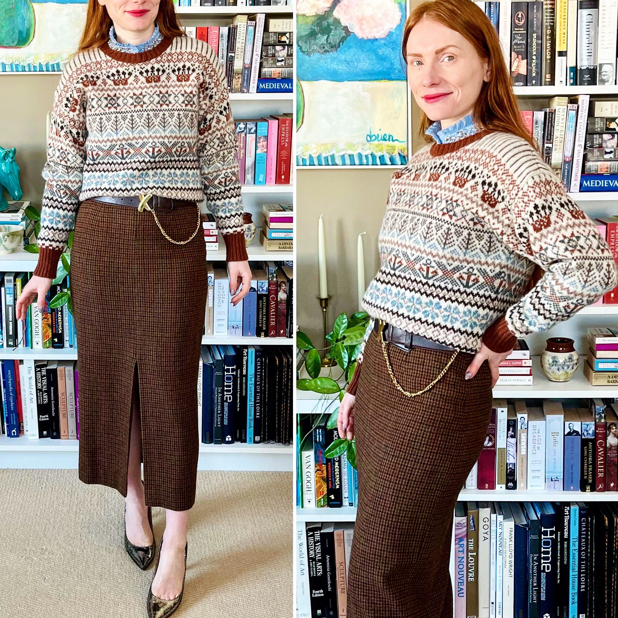
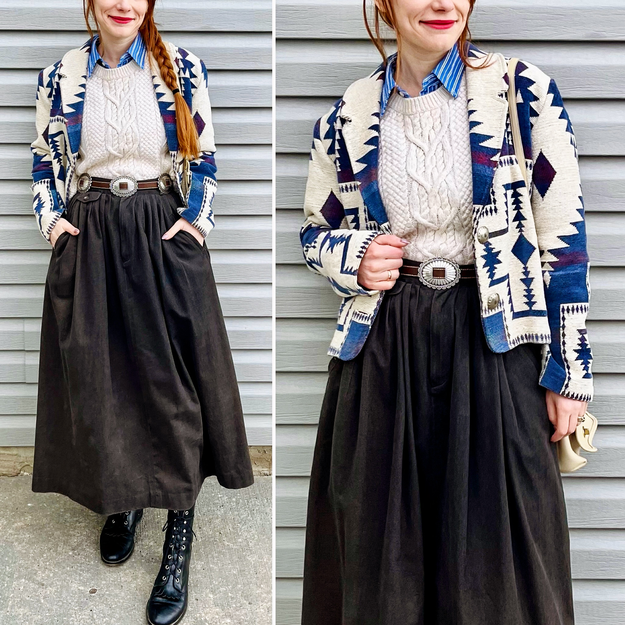
Details: J.Crew shirt, Pitlochry sweater, Ralph Lauren skirt, Paloma Picasso belt (all secondhand)
Thoughts: Speaking of brown, hah! I loved this sweater-skirt combo, with the peek of blue to liven up the browns. The belt was the perfect extra touch. It’s a tricky one to wear because of the chain — though the chain is what makes it special — but it worked here because the skirt has no belt loops to interfere with it.
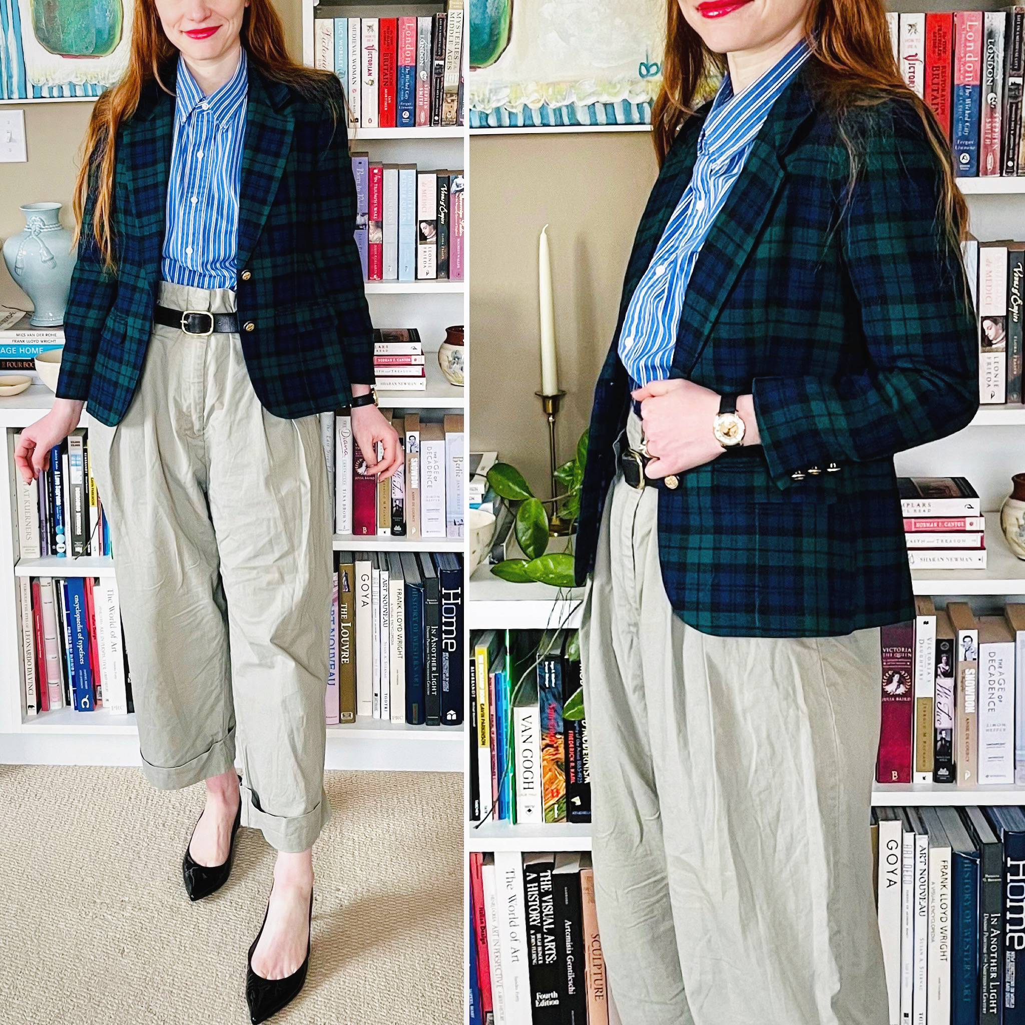
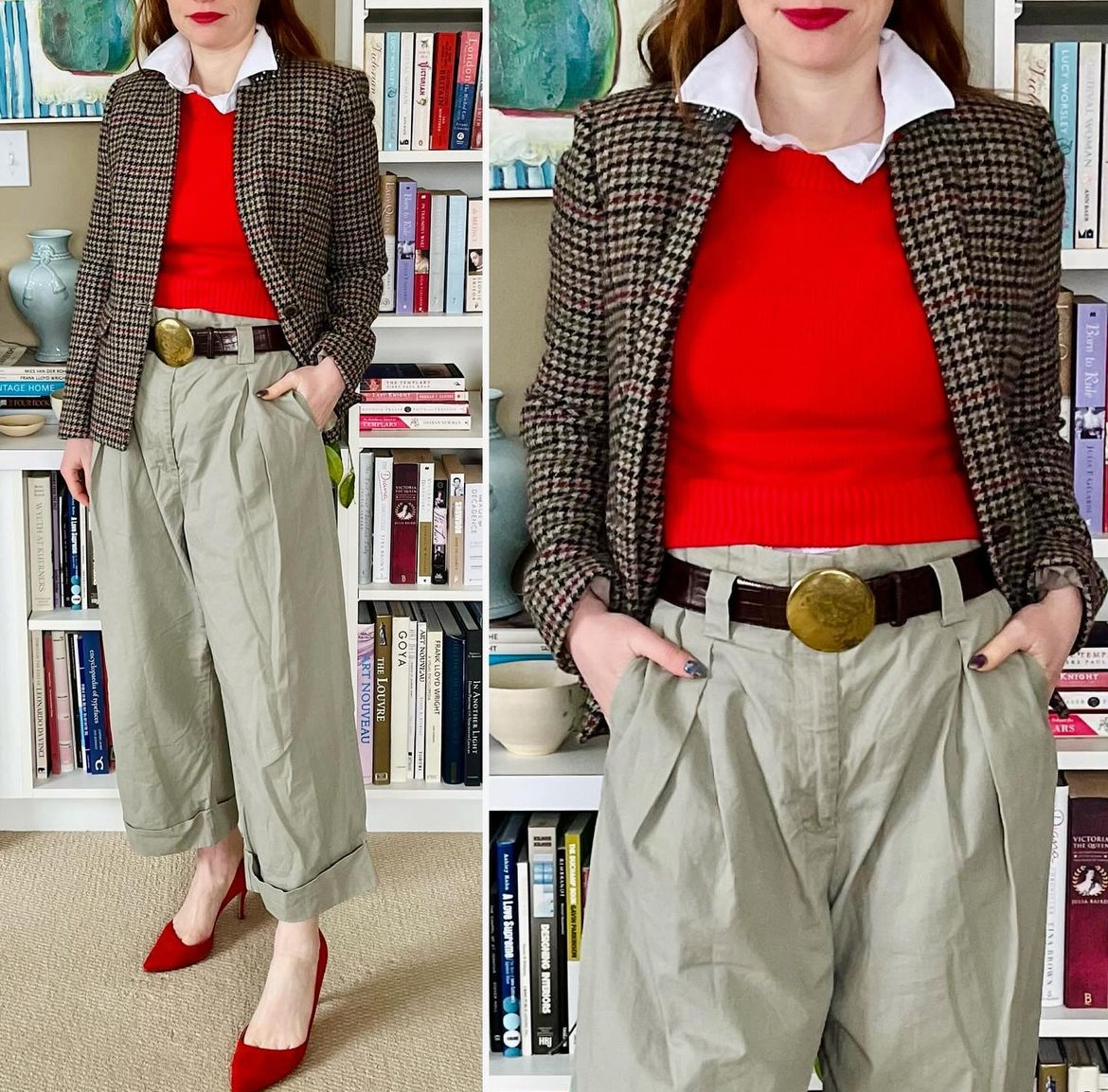
Details: Ralph Lauren shirt, Pendleton blazer, H&M pants, Gap belt (all secondhand)
Thoughts: I enjoyed this simple pattern mix a lot, not least because it features some of my fave colours. I’ve come to appreciate the versatility of khaki/tan pants as part of the Ivy-adjacent aesthetic of the Historian. I guess there’s a reason why they’re a classic. Light-coloured trousers make it feel like a spring/summer ensemble, even with a darker jacket. Taking notes for later in the year.
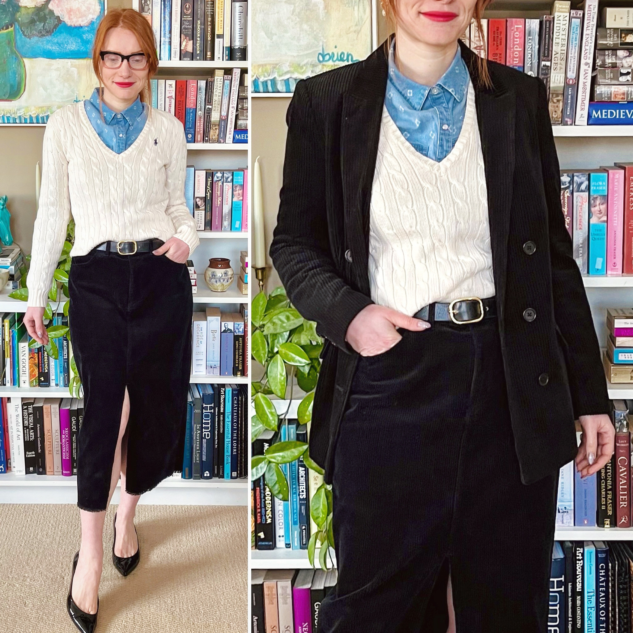
Details: Tahari shirt, Ralph Lauren sweater, Twik skirt, InWear blazer, Gap belt (all secondhand)
Thoughts: I had to go into the office a few weeks ago, and this was the outfit I chose. I wanted something a little preppy but not too buttoned up. The skirt and blazer are both wide wale corduroy and, while not an actual matching set, go together very nicely. The chambray shirt was the right choice to balance out the classic cable knit sweater. I don’t like wearing very bright colours to the office, but I also want to keep my personal aesthetic in the mix, and an outfit like this represents a good balance for me.
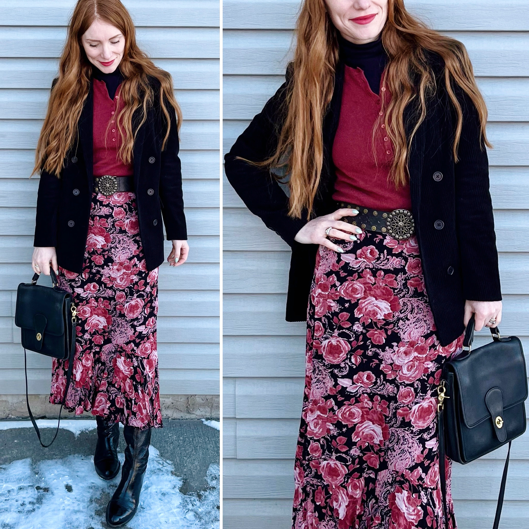
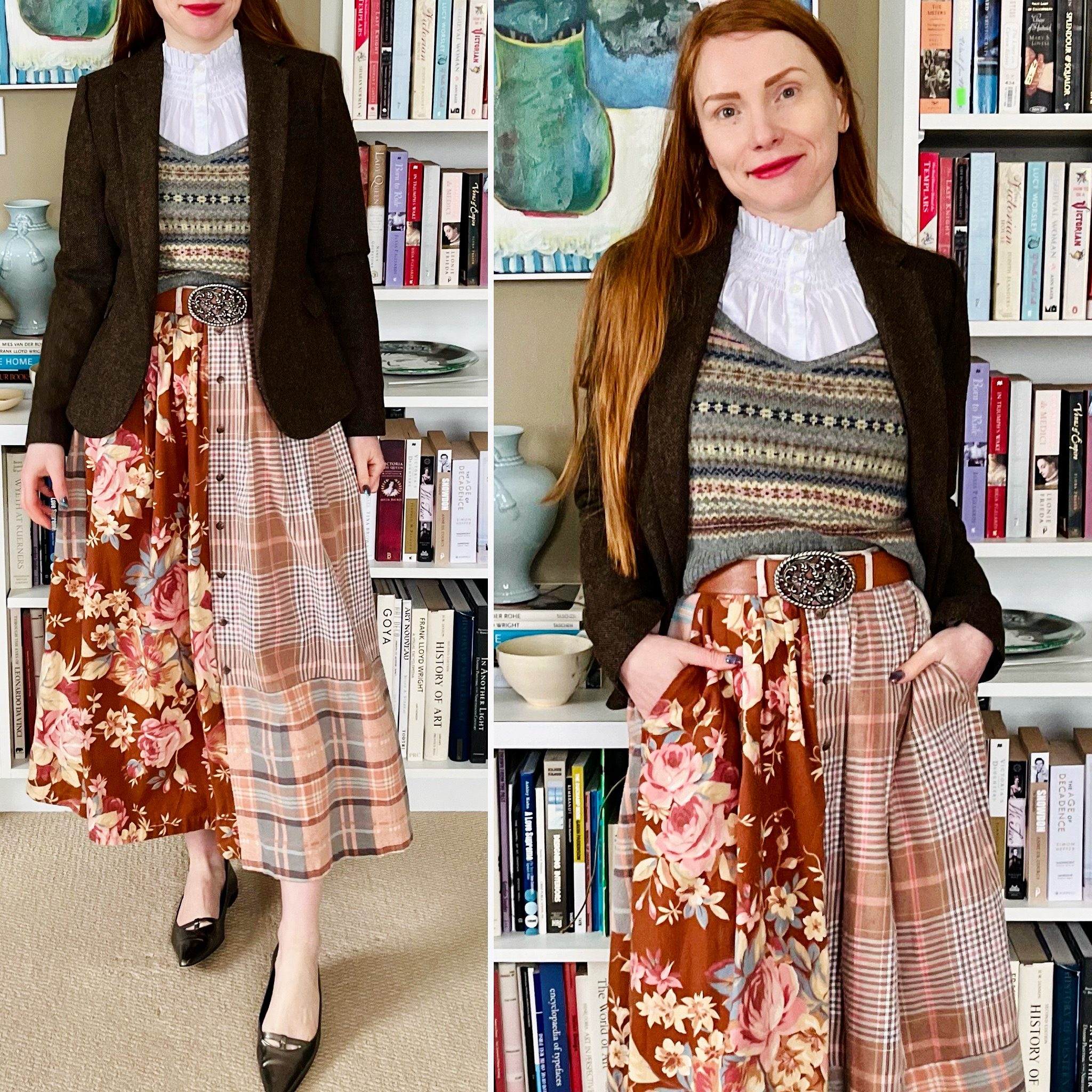
Details: Club Monaco turtleneck (retail, old), Everlane sweater, InWear blazer, no label skirt, Sonoma belt, Coach bag (all secondhand)
Thoughts: Fall 2010 is one of the Ralph Lauren runway collections that lives rent free in my head. It’s a huge inspiration for the Bohemian avatar. It featured lots of muted, earthy colours; frothy floral silk dresses and skirts; and contrasting textures. I have been looking for one of those maxi dresses or skirts for years now. No luck. Recently, I found this vintage (unlabelled) skirt at the thrifts, which has a similar vibe even though it’s less floaty (and not silk, alas). I decided to get it as a placeholder for the time being. It’s also reversible, with a small ditsy floral pattern on the other side. To achieve the RL vibe, I paired it with a cashmere sweater and my trusty corduroy jacket. Gimme all the textures!
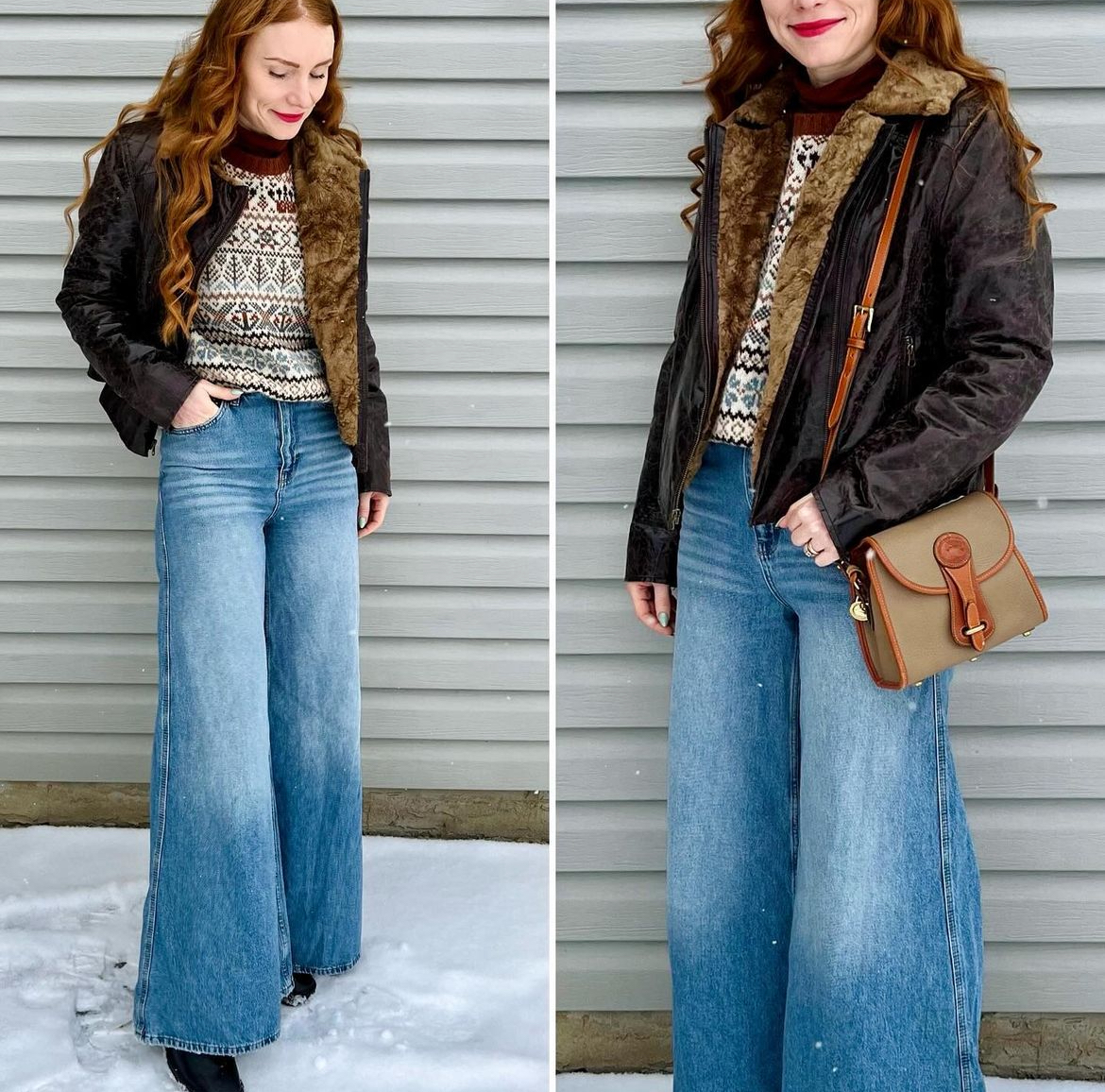
Details: Everlane turtleneck, Pitlochry sweater, BDG jeans, Nine West jacket, Dooney bag (all secondhand)
Thoughts: I think it’s appropriate to bookend this outfit roundup with another palazzo jean fit, featuring a couple of other fave pieces including this Shetland sweater and my beloved leather bomber jacket. I wasn’t kidding when I said I was feeling a 70s kind of vibe. Dig it?