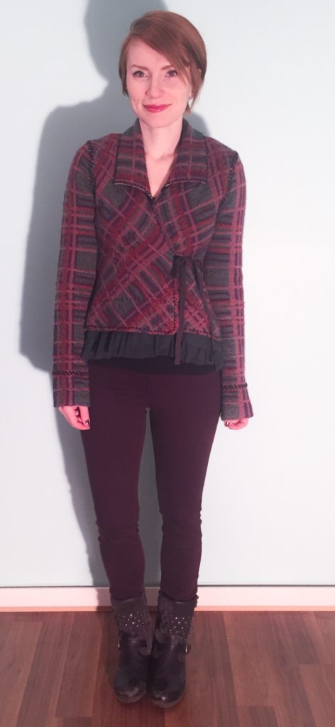
As you may have started to notice, there has been some change happening in the old closet lately. Most of it has been of the organic, go-with-your-gut, find-your-joy variety, but one intentional exercise that I did undertake was updating my wardrobe colour palette. I had done a similar exercise a few years ago, but I decided to start from scratch again. (The results are actually quite similar.) I Googled Pantone swatches and colour names, and ended up putting together some basic collages. I think Pinterest would be a very helpful tool for this sort of thing, but I am too lazy to invest in a whole new social media platform. Below are my amateur efforts, which I’ve also saved on my phone to help me in future shopping trips.
A quick work on process. I didn’t follow any particular rules in doing this exercise – it was more of the same follow-your-instinct approach. Although, as you guys know, I love *all* colours, I realized that there were some that just “call out” to be worn more than others. I debated getting a seasonal colour analysis done, but ultimately decided against it because I wanted my wardrobe palette to reflect the colours I loved, not what I was told I should love. I may revisit this possibility later, just to satisfy my curiosity and see how close my own choices mirror, or not, my recommended colours.
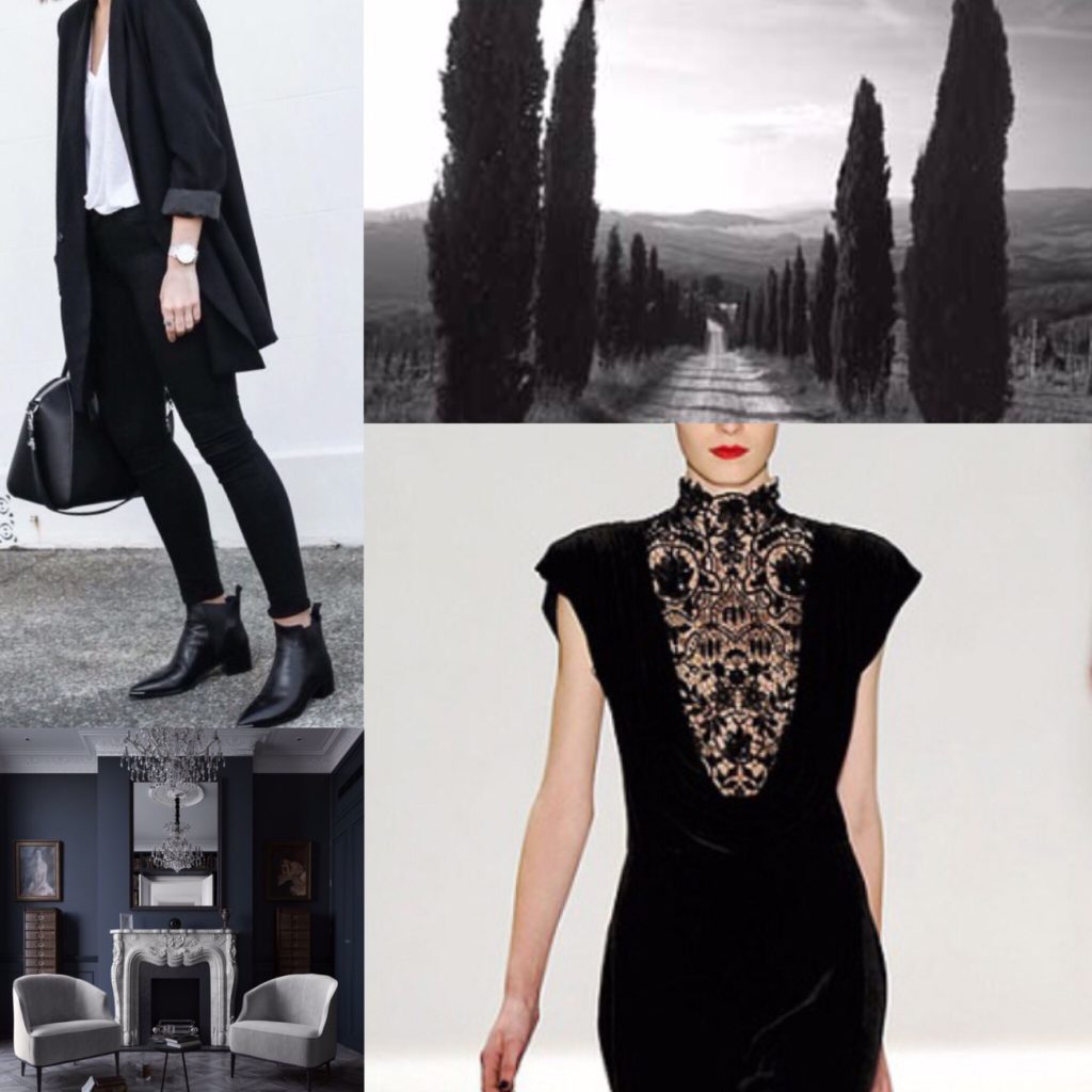
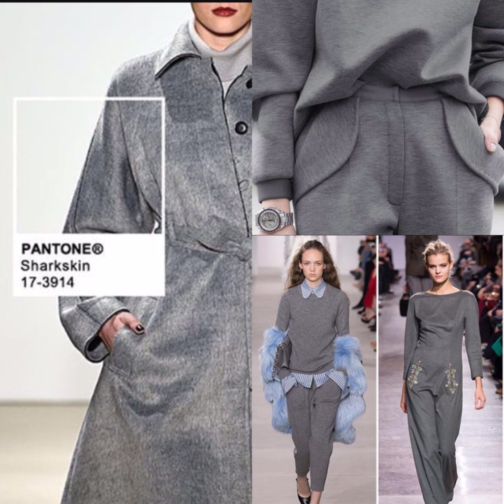
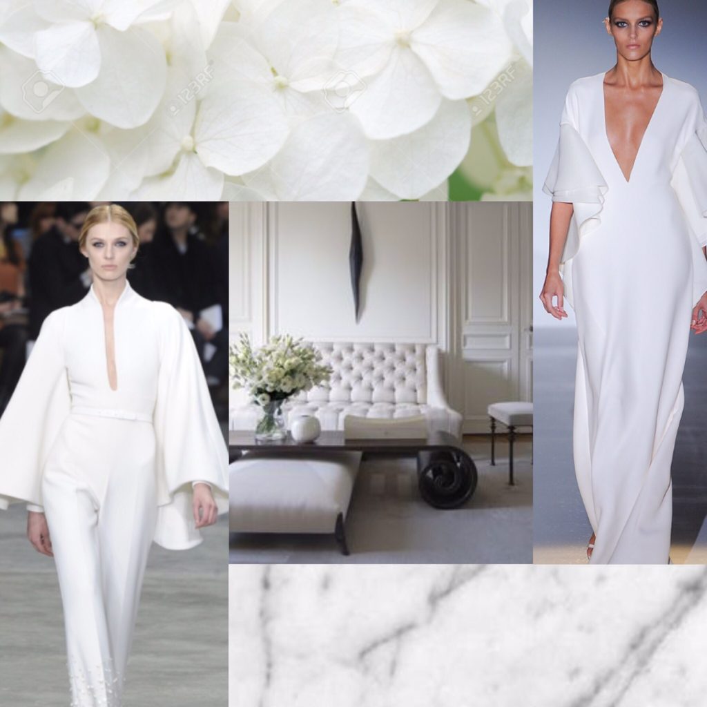
First up, the neutrals.
For anyone familiar with this blog, there shouldn’t be any surprises here.
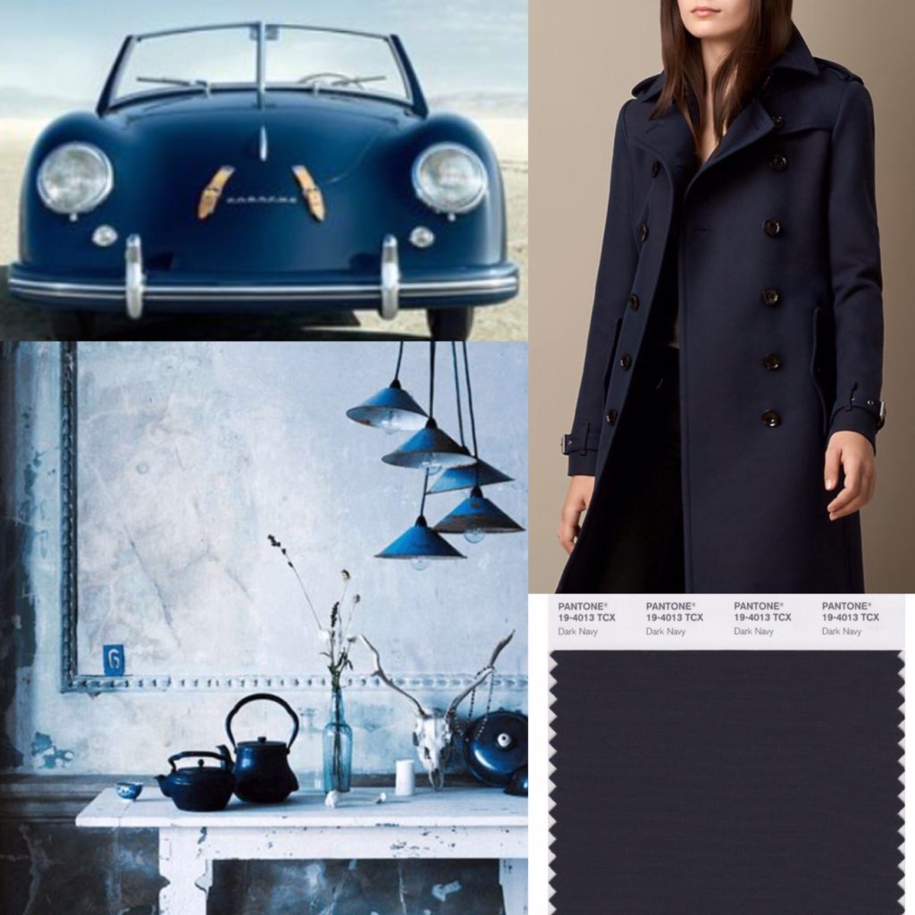
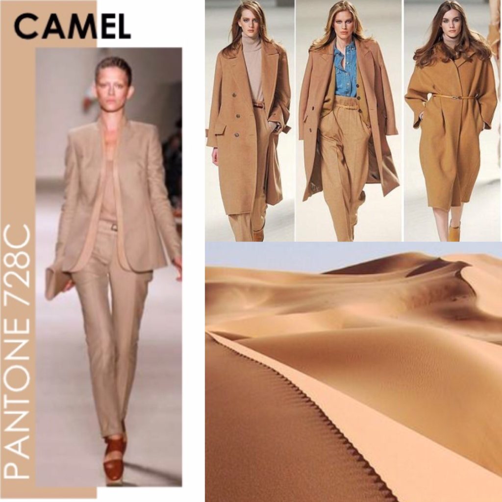
Next, my core colours. The main thing I’ve come to realize is that I like muted, muddled shades as opposed to either jewel tones, brights, or pastels. Basically, take any colour and throw some grey or black into it, and you have something I like. I call them my “complicated colours”. They’re probably not everyone’s cup of tea.
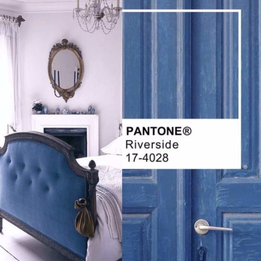
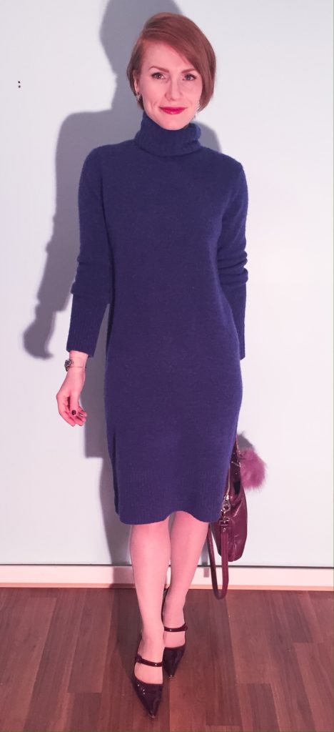
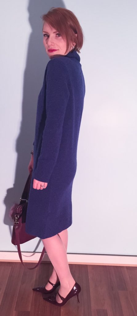
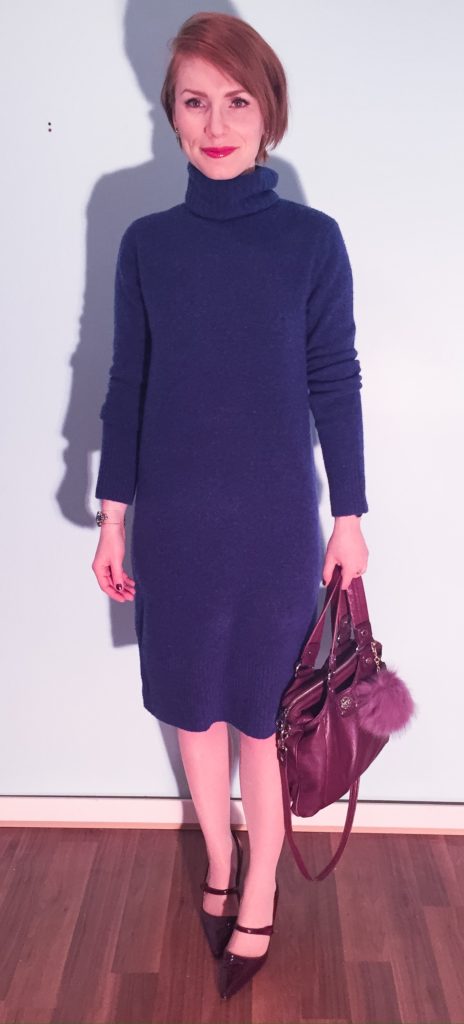
Blue — all shades of it — is my favourite colour, so the idea of narrowing that down to a specific shade was daunting initially. It became a lot easier once I ran across my new Club Monaco sweater dress. That was a blue that just spoke to me at a gut level. I ended up finding echoes of it throughout my existing wardrobe – sometimes lighter, sometimes darker. Pantone has a colour called Riverside that I think is the best approximation of this shade.
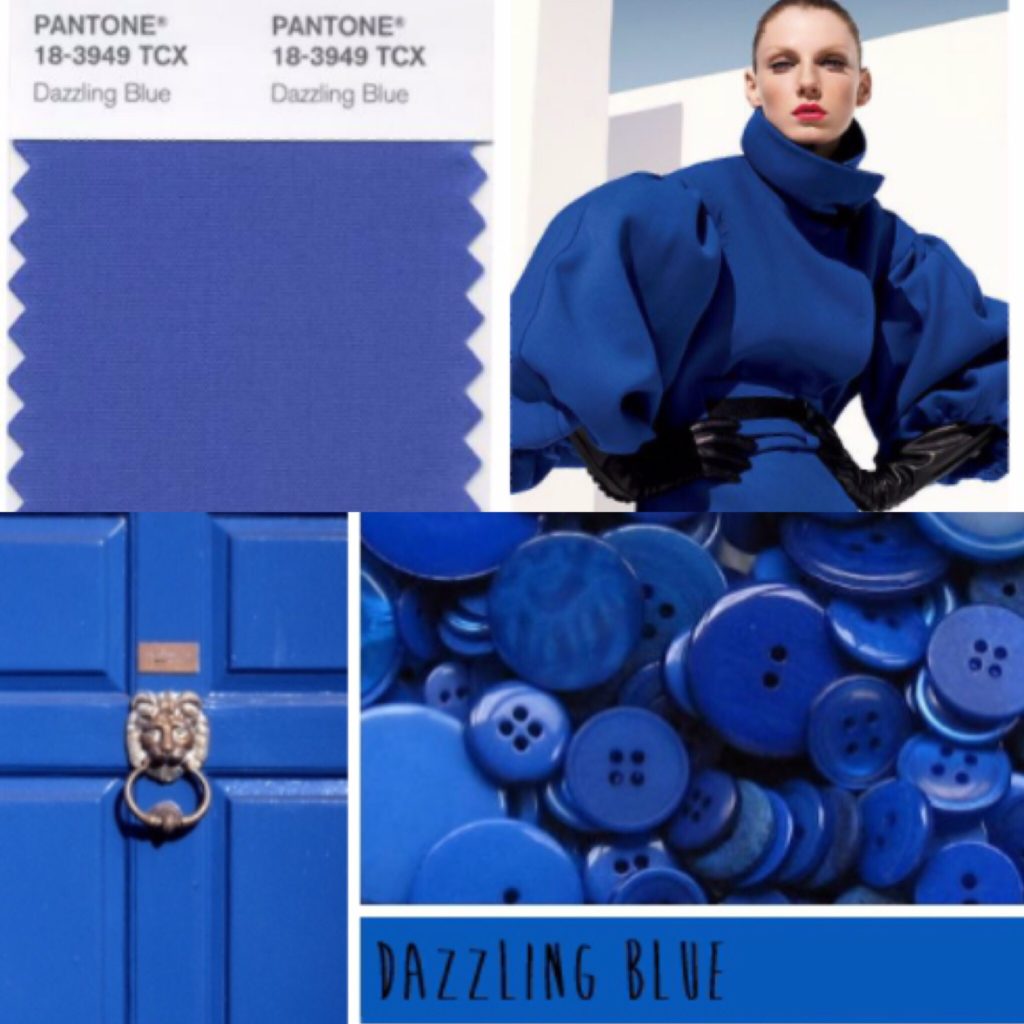
In the process of looking for Riverside, I came across Dazzling Blue. To me eye, it almost looks like a more intense, less muddled version of Riverside. I’m obsessed with it. I’m not sure if I need two colours that are ultimately so similar in my palette, but I’ve included it here because … well, I am obsessed with it.
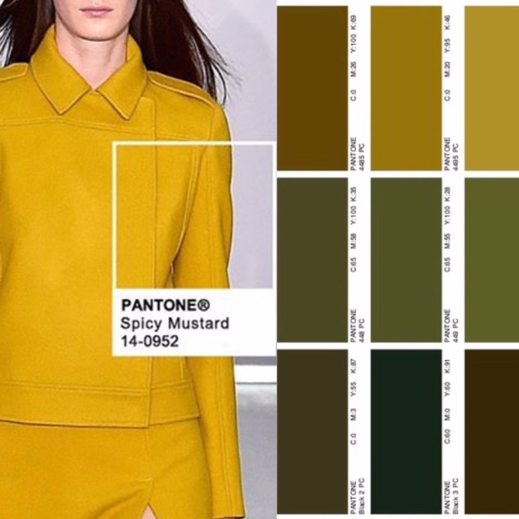
It should come as no surprise that mustard (or Spicy Mustard, as Pantone calls this shade) made the list. There is a lot of it in my wardrobe. Joining it is a small constellation of related hues on the spectrum between golden yellow and dark khaki (see small sidebar above). Basically anything kinda yellow, kinda green, kinda brown. Olive is definitely included, but that in itself has too many varieties to narrow down to only one shade. With the exception of mustard, none of them draw my eye in the same way that my blues do, but I find them very pleasing in combination with the other colours in my palette. To some extent, these warmer shades operate almost like a neutral for me.
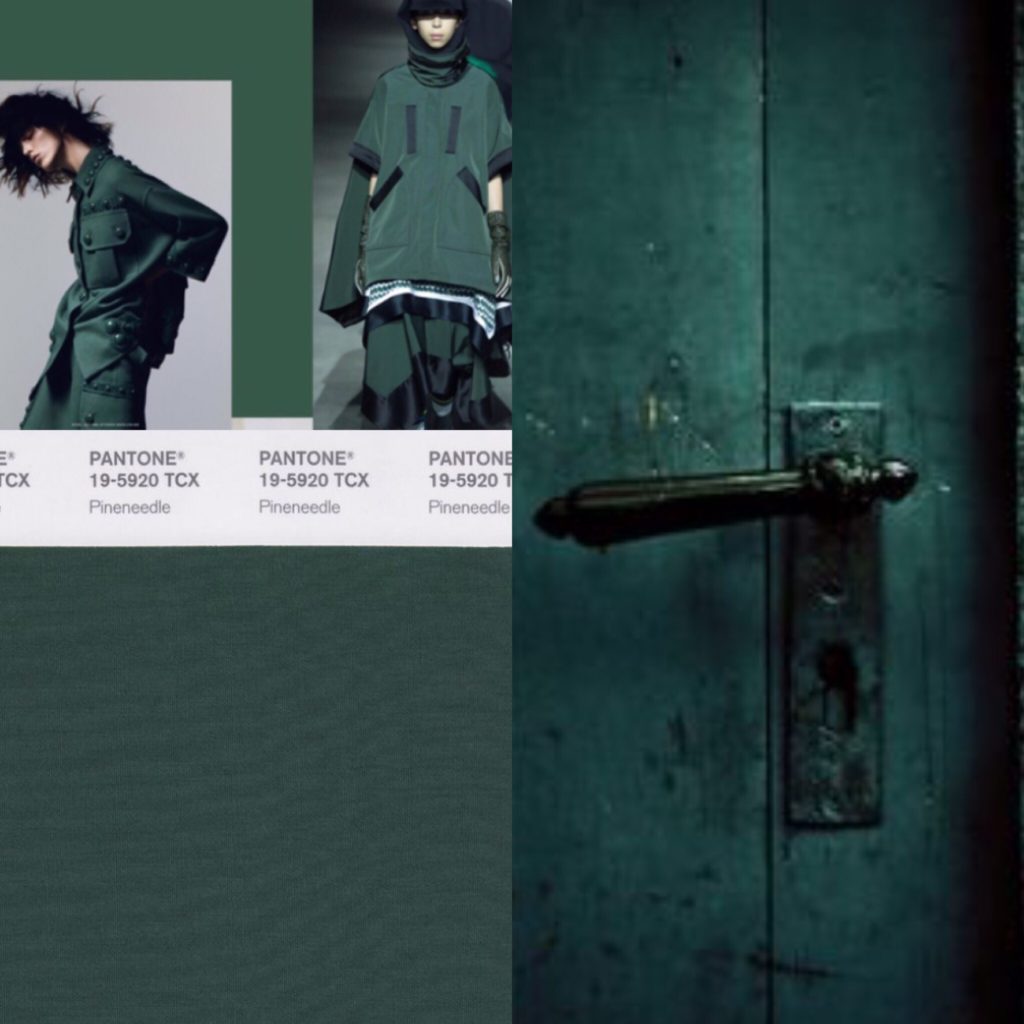
I adore green, but don’t enjoy wearing it. I know, it’s a crazy thing for a redhead to say. The only exception is this dark, mysterious green. It’s kinda like forest green, and kinda like dark teal, but with less blue and more bottle green, and a heart of black. Clear as mud? It was actually quite hard to find photos that matched my imagined ideal, probably because I struggled so much with the search terms. The photos above come pretty close.
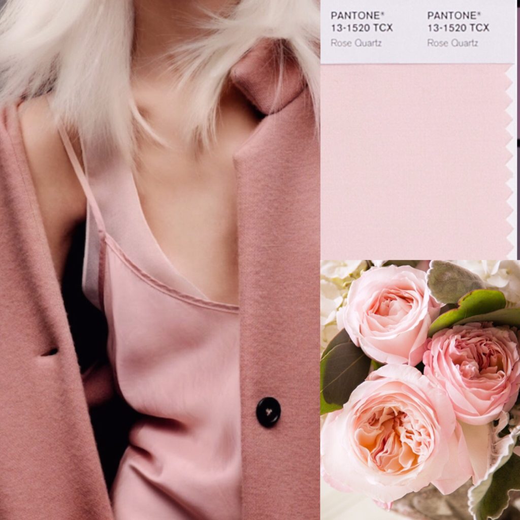
Blush pink (or Rose Quartz, per Pantone) is basically like ivory for me — i.e. close to my skin tone. I’m probably too pale to pull it off smashingly, but I think it works well with my hair colour, and I find it very soothing.
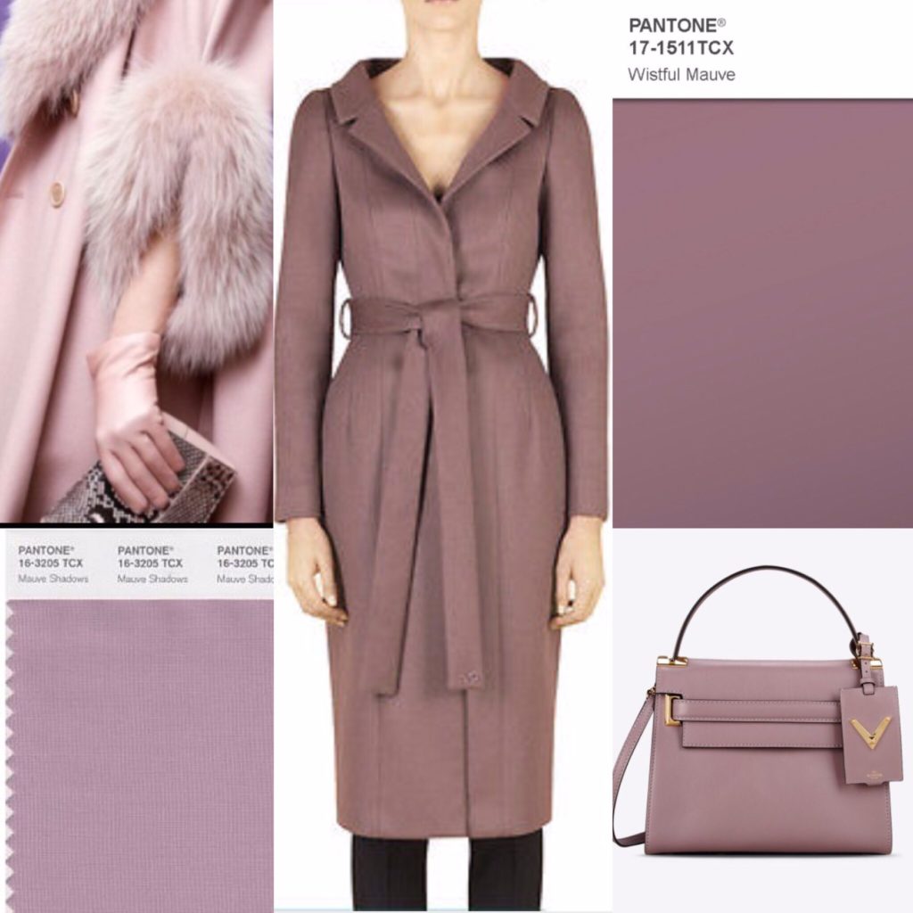
This was another colour for which it was very difficult to find a precise match, but what I have in mind is a very greyed out, desaturated purple.
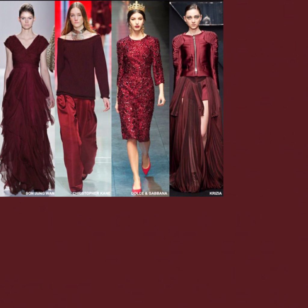
Burgundy, no surprise. I consider it an almost-neutral. Can you tell I got real lazy with this collage?
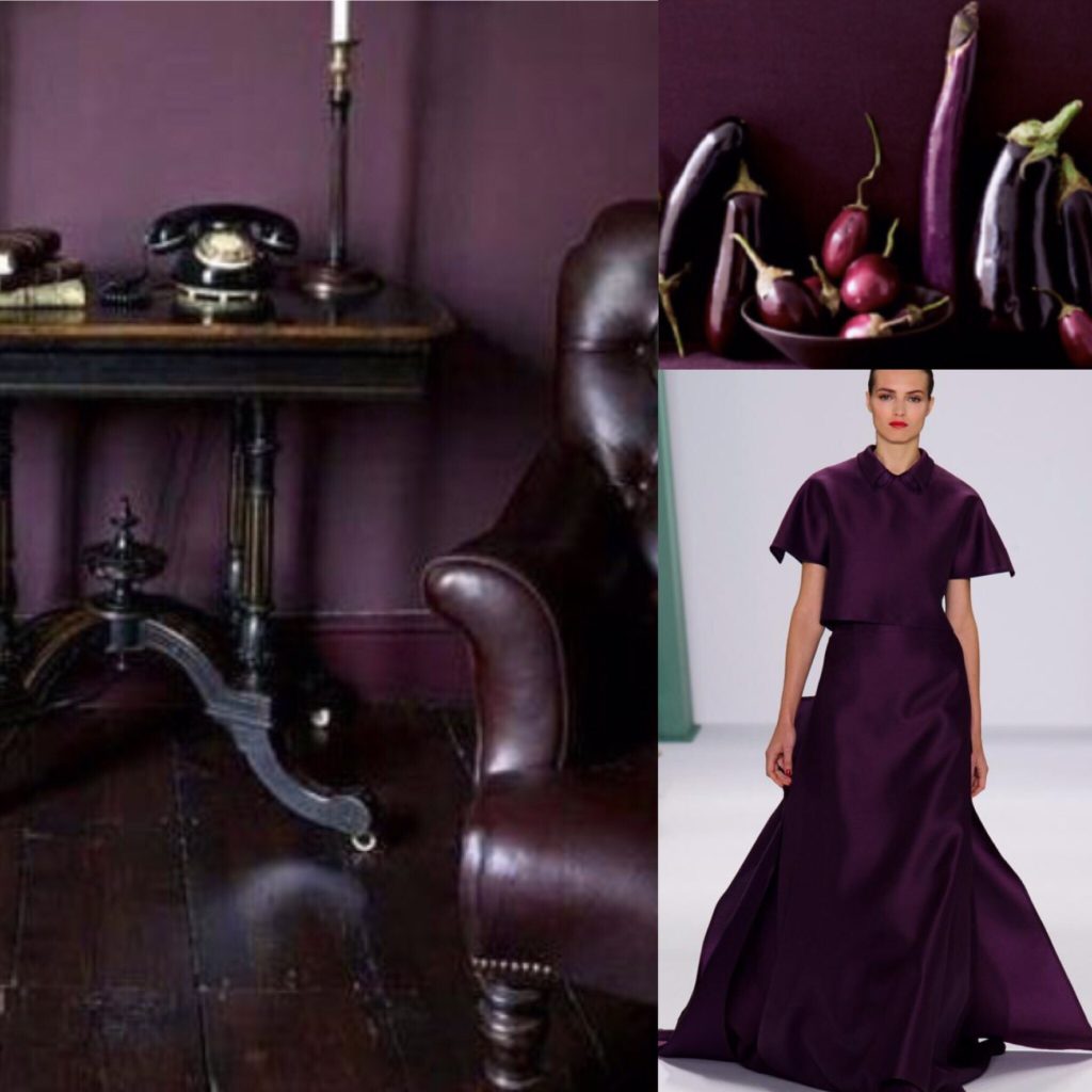
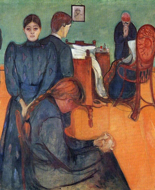
Last but not least, eggplant purple. Again, this is not a jewel tone. It’s darker, moodier (like my soul — zing!). I basically want to wear that magnificent gown (see collage above) everywhere; it’s made for dramatic entrances which, let’s be honest, is #stylegoals right there.
And that is my wardrobe colour palette in a nutshell series of pictures. The only shades missing are red and red-orange, which are my (sparingly used) accent colours.
For those of you who have created a wardrobe palette, I want to know: how did you go about it? Did you find the exercise useful? Did you limit yourself to a set number of colours? And if you’ve had colour analysis done, did you find it worth the price of a consultation?

