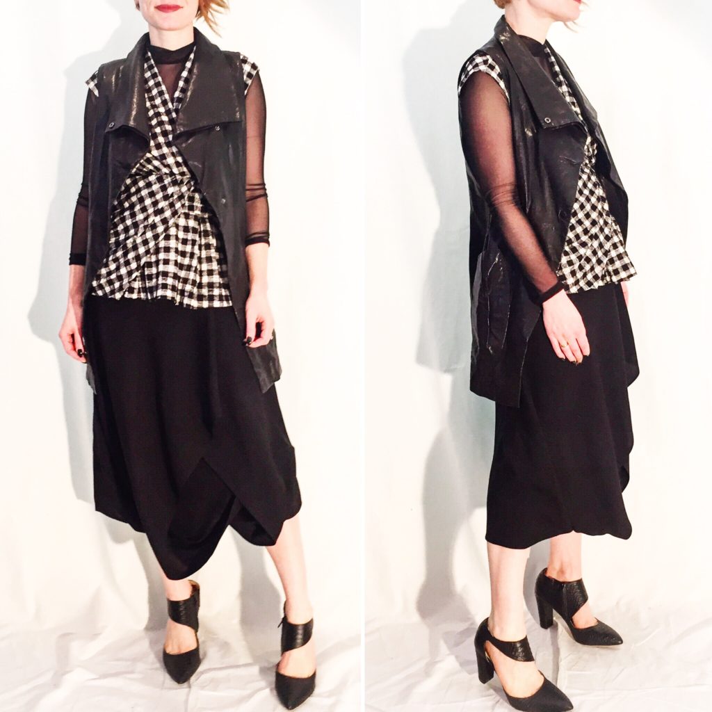
This outfit had a little bit of everything. Geometric print. Leather. Draping details. Interesting angles. I added a mesh turtleneck because it’s what transitional dressing sometimes requires. Strangely enough, it does add some legit warmth. I am quite pleased with this Oska skirt; it has a front faux-wrap/origami-style pleated detail that’s similar to my Crea Concept skirt (except more dramatic), but it’s made from wool not silk. I think it’s what some retailers call “tropical wool” and use in suiting. I had not heard of this brand before, but the quality seems quite good. And I just love a funky skirt.
Notes: Sarah Pacini vest (consignment, $85); Deletta top (consignment, $12); Rebel Sugar turtleneck (gift); Oska skirt (thrifted, $10); Poppy Barley shoes (thrifted, $25).
Butterscotch & Blue
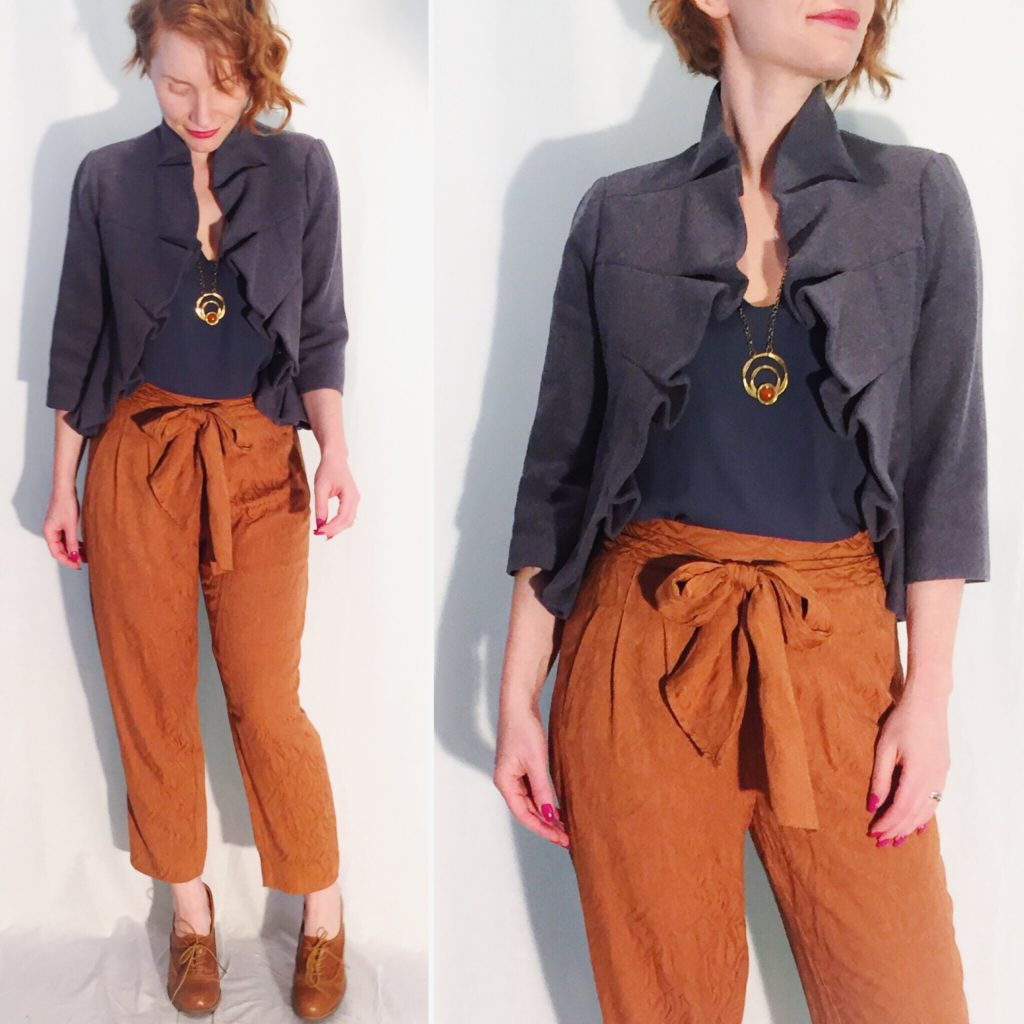
Orange and blue is a very striking and underrated combination. This is a mellow take on it – both shades are somewhat muted – and I am here for it. I’m calling this yellow shade “butterscotch” by the way; it reminds me of the colour of pudding packs sold under that description, and also it’s a more pleasant name than “mustard”. The blue I am calling “slate” because it has strong grey undertones. The top and jacket are quite a close colour match, which pleases my latent matchy-matchy instincts. Plus it makes for a nice colour-blocking outfit.
Notes: Babaton top (thrifted, $12); Tabitha jacket (retail, $60ish? It was, like, 7 years ago, I don’t remember); Anthropologie pants (gift); Rafael necklace (gift); Chelsea Crew shoes (thrifted, $7.50).
Still Mad For Plaid
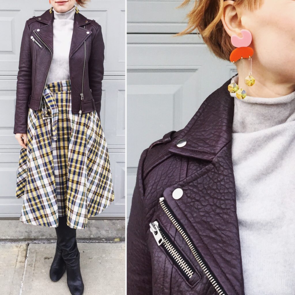
How many plaid skirts is too many? I think the only possible answer is “n +1”, “n” being the current number in my closet. That being the case, you see why I had to pick up this Uniqlo skirt. It’s so fun! There are so many styling possibilities! The funny thing is, I was at West Edmonton Mall recently – for the first time in about 6 months – and was astounded to see that we now have a local Uniqlo store. How did I not know about this? Well, my excitement quickly gave way to disappointment. I’ve heard people sing the praises of Uniqlo, but I found the selection in the store underwhelming. A lot of clothes felt cheaper than Old Navy, and the stuff that seemed nicer was quite expensive. Plus, nothing jumped out at me as Something I Had to Have. The funny part of the story is that I have been impressed with the few Uniqlo pieces I’ve found at the thrift store recently – this skirt and a Lemaire x Uniqlo collab dress. Maybe Uniqlo is like Aritzia: I can never find anything I like in the store, but the stuff I thrift is excellent.
Notes: Artizia sweater (thrifted, $8.50); JW Anderson x Uniqlo skirt (thrifted, $8); Mackage jacket (thrifted, $50); Stuart Weitzman boots (thrifted, $20).
Wear Your Brights
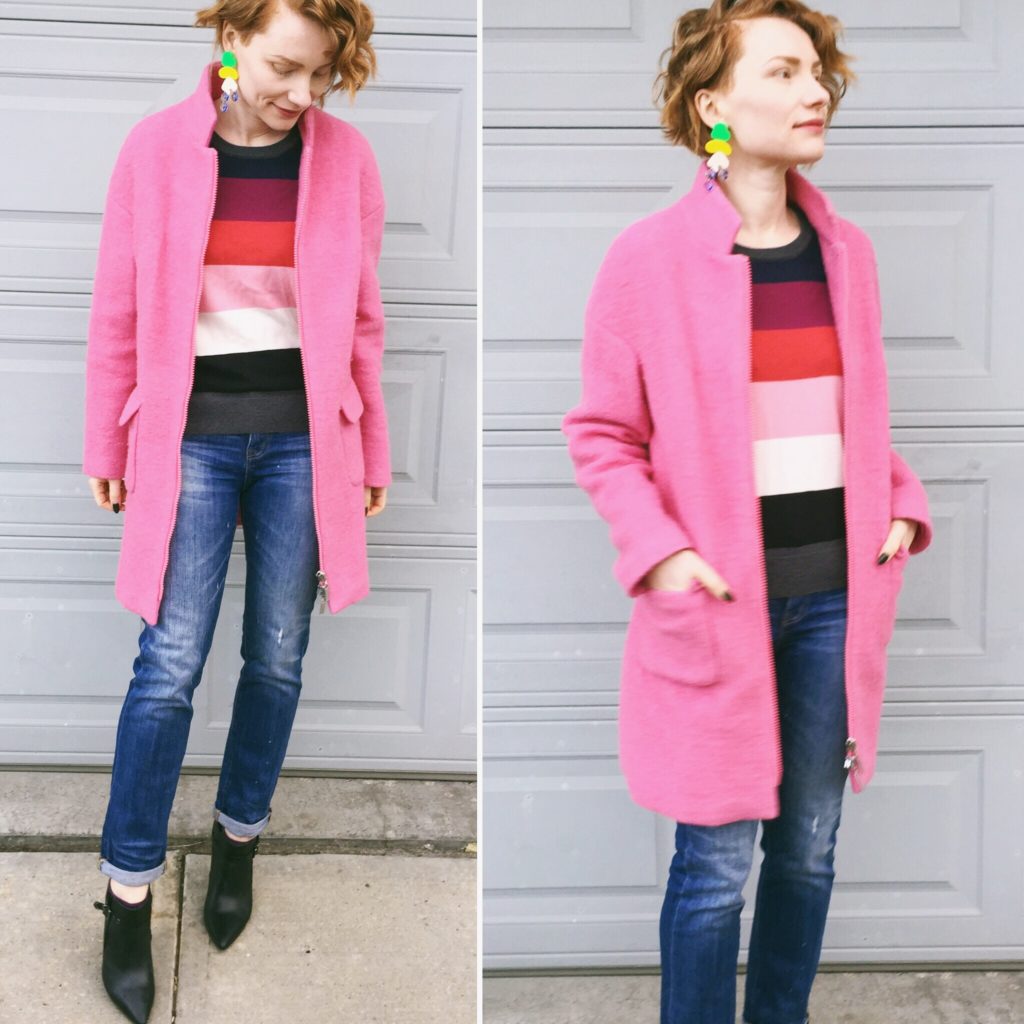
This time of year, I feel like “wear our brights” is an imperative much like “eat your greens”. It’s one line of defence against the cold weather doldrums. And boy, is this outfit bright. This coat remains one of my favourite Winners finds from back in the day (when I used to shop there a LOT); I get tons of compliments on it every time I wear it, and it’s holding up really well both in terms of style and quality. Also a compliment-magnet? This Gap sweater. I have been fully converted to the power of a rainbow coloured sweater. Highly recommend.
Notes: Gap sweater (thrifted, $5); Madewell jeans (consignment, $26); Amaryllis coat (retail, $36); Arnold Churgin boots (thrifted, $20).
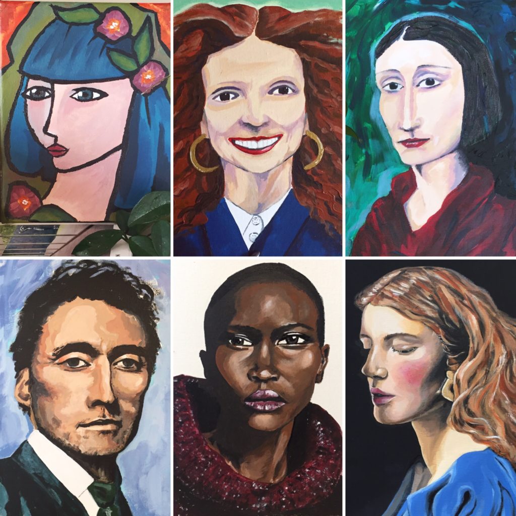
The last time we talked about my painting, I showed you some of my recent pieces which tend to fall into 3 buckets: landscape, still life, portrait. I usually alternate between them, and generally have 2 or more works-in-progress, because I find the variety keeps my eyes fresh; if I work on the same painting for too long, I start to lose perspective. Anyway, today, I want to focus specifically on portraits because I think they illustrate my experience with process as a self-taught artist.
I’m going to start with a confession: I’m a very stubborn person. [Understatement of the year, my husband would say.] One of the ways in which that stubbornness manifests itself is in how I approach new skills; I tend to choose hobbies that I can feasibly learn without instruction. I like to learn as I go, and mostly by doing. Even something as simple as watching a how-to YouTube video (which I’ve had to do for knitting a couple of times) is the antithesis of fun to me. [Perhaps not coincidentally, knitting is the least favourite of my recent hobbies.] It’s quite possible that I would be a better crafter/painter/knitter if I took some lessons, but that’s not how I’m used to doing things, and well … I am stubborn.
It all started when I was about 14 and my family gifted me a box of Caran D’Ache watercolour pastels. I was not familiar with pastels or how to use them, but I played around with them until eventually I hit upon a technique that seemed to work. I used my fingers to rub in and blend the colours to a smooth finish (and developed some serious calluses in the process) that, in some cases, looked almost photo-realistic. I only have a few pieces left from those years, but they’re a good representation of my adolescent work:
As you can see, I was quite interested in faces even though, objectively speaking, faces are challenging subjects. I’m not particularly good at drawing, and I can’t draw from memory/imagination so I have to rely heavily on photos for inspiration. When I started working with acrylics this past summer, it was a portrait that first drew me in.
I quickly moved on to easier subjects because I had no idea how to use the medium to complete something that didn’t look like a Grade 3 art project. But, inevitably, I was drawn back to portraits. First, there was Grace:
I did this without a pencil sketch to guide me, and while the shading is still quite rudimentary, you can already see the improvement over my first picture. I’m learning to trust myself with colours. One of the big lessons I explored with this portrait was the ability to layer. Acrylic is an accessible medium for beginners because it’s quite forgiving; up to a point, you can just pile on more layers of colours over any oopsies, and no one need be the wiser.
By the way, I use “lesson” in this context in a very ex post facto manner. I am not conscious of learning anything in particular while I am working on a piece; it’s usually afterwards, in retrospect, that I can say “ah, yes, I learned to do x while painting y”.
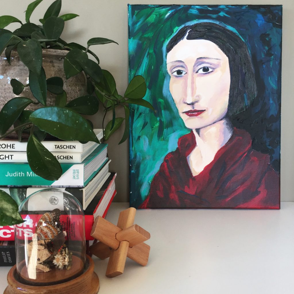
After Grace, my next 2 portraits were much in the same vein. First, there was Edith:
Edith exhibits a slightly more sophisticated technique than Grace, but not significantly so. It remains one of my favourite pictures because I love the colour scheme and the overall “naif” effect.
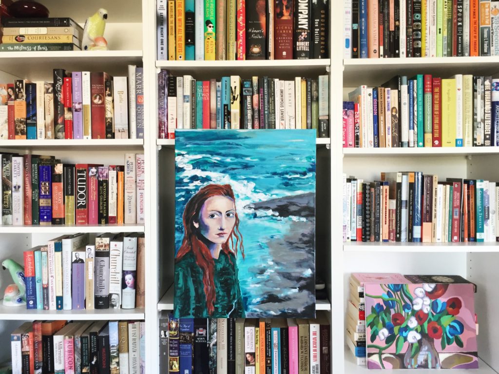
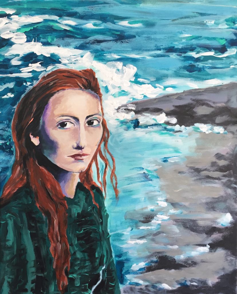
Then, there was the portrait I like to call “Tilda by the sea” (because it was inspired by 2 separate photos of a young Tilda Swinton, though there isn’t much likeness in the final product):
Tilda represents the final stage of this phase. The shading is much more subtle (and abundant) and the effect is more life-like and less caricature. I like the overall picture, but I didn’t feel like I captured the atmosphere/feeling that I wanted from the face itself.
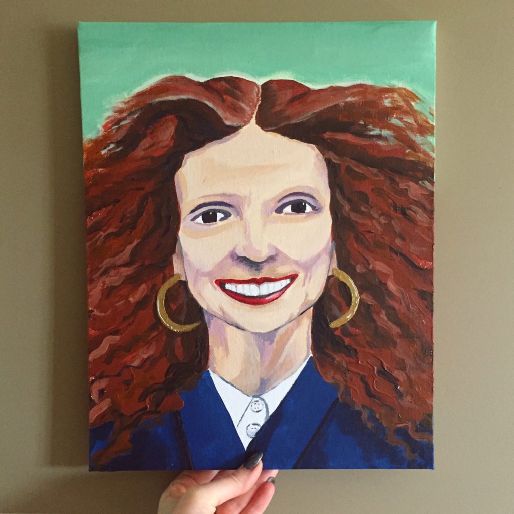
After Tilda, I took a break from portraits for a bit and focused on other stuff. One thing I realized during that time is that some of best work happened when I was “doing my own thing” rather than trying to copy the style of paintings I found online. There is a temptation, when I see a picture I like online, to try to make my own version of it using the same approach; but the results are never satisfactory. I am much happier when I approach a subject matter using my own technique (such as it is). So, for example, my preferred approach to still life is semi-abstract, with clean lines and high contrast.
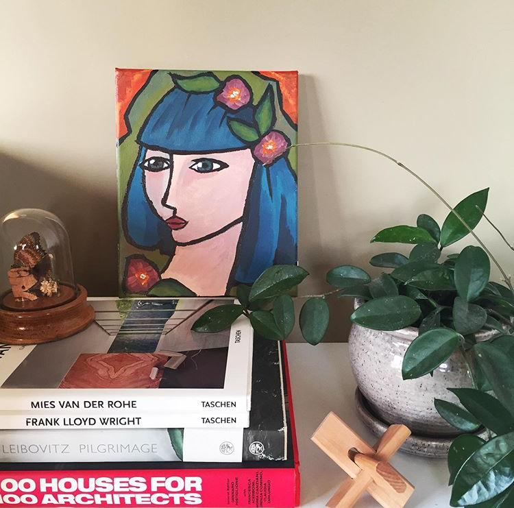
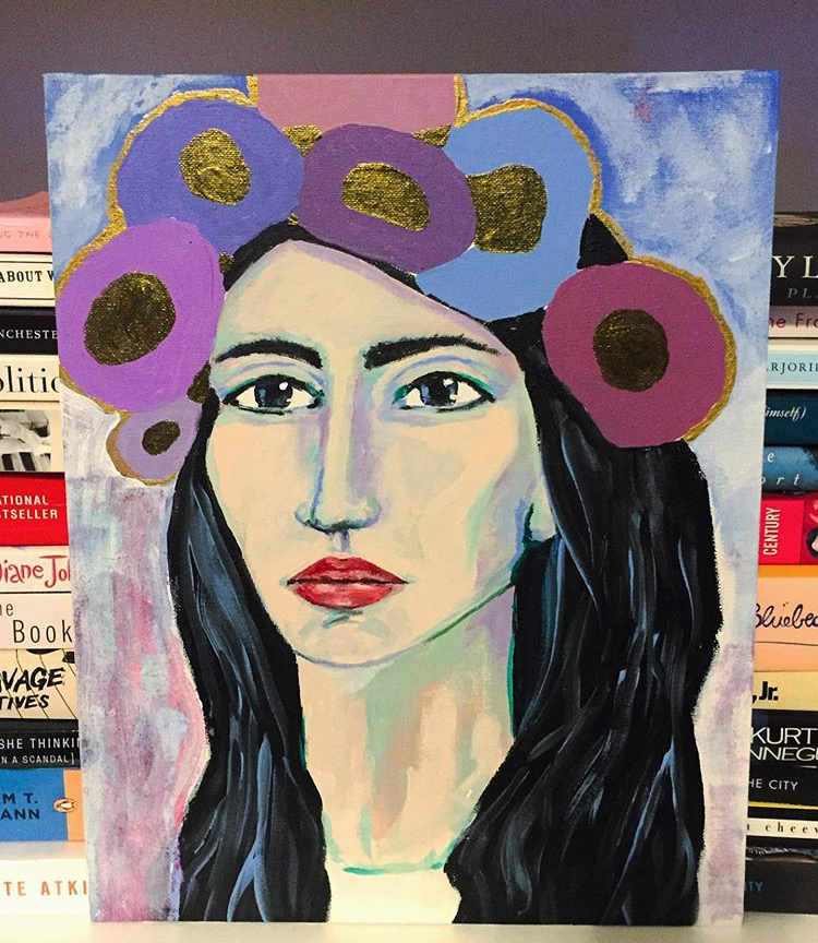
With this in mind, I tried a similar tack with portraits: a completely original piece.
It’s fine. I mean, I don’t hate it but I don’t love it. It’s very generic, which is a failure of my imagination. What I love about portraits is how unique faces are; I am especially drawn to dramatic, unusual ones but I have a hard time visualizing them from scratch. Counterintuitively, despite my slight disappointment with the Girl With Flower Crown, I decided to level up my portraiture. I decided to do a portrait of a man.
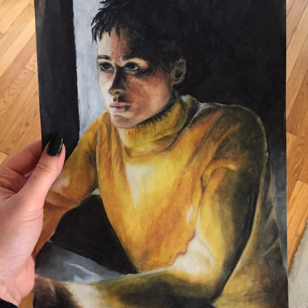
Now, even during my pastel heydays when I became quite adept at drawing faces, I was never very good at doing men’s faces. Not sure what possessed me, but I now decided to tackle this one:
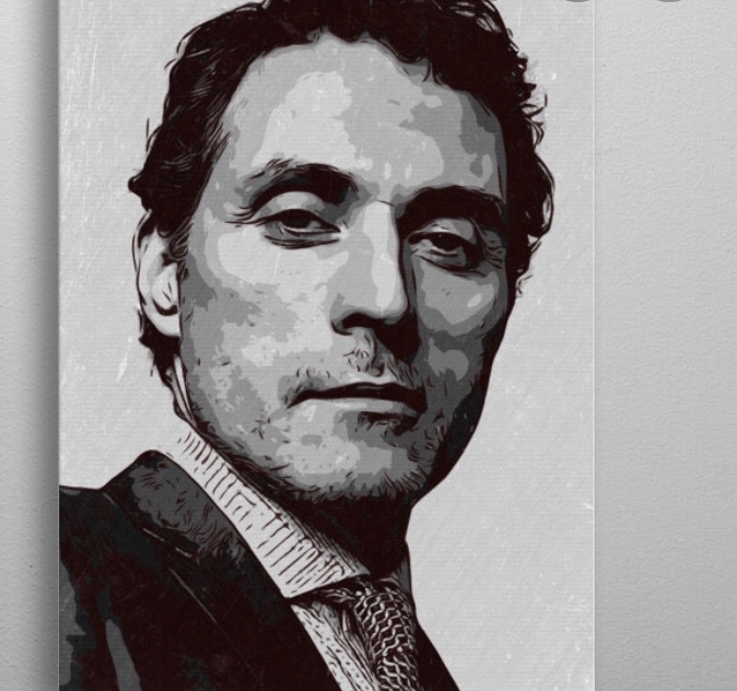
I’ve had a crush on Rufus Sewell for 20 years, but his is not a conventionally pretty face; it has sharp, almost precipitous angles, heavy lidded eyes, thin lips – all challenging to capture. When I was Googling photos for inspiration, I was lucky enough to stumble on this one:
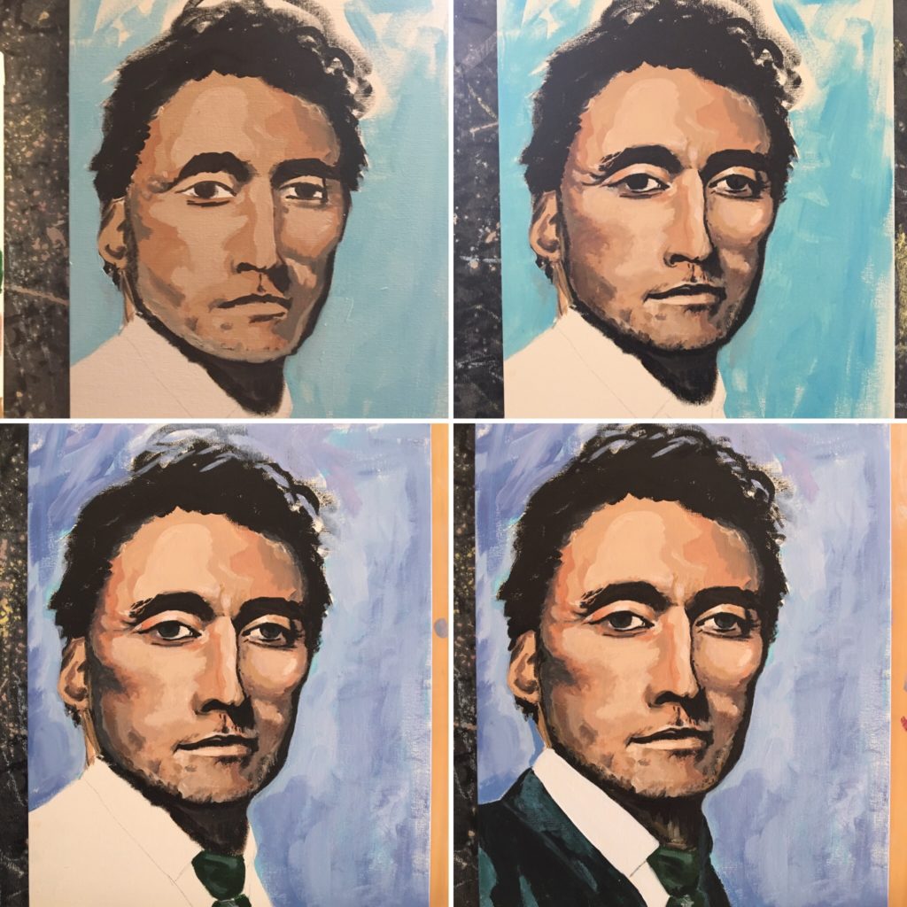
Not, perhaps, his most photogenic shot but I was struck by something else. The pixelated effect was like a “cheat sheet” for shading. I also approached this portrait in a different way. As with my other portraits, my first “pass” was a general one – the purpose of which is to get the general shape of the face and base skin colour down on paper. Next, instead of continuing to work on the face as a whole, I began to focus on sections separately. I would enlarge the corresponding section of the inspiration photo and look very closely at the shadows, lines, etc. I did several passes this way, section by section; with each one, the verisimilitude improved. You can see my progress here:
And here is the finished portrait:
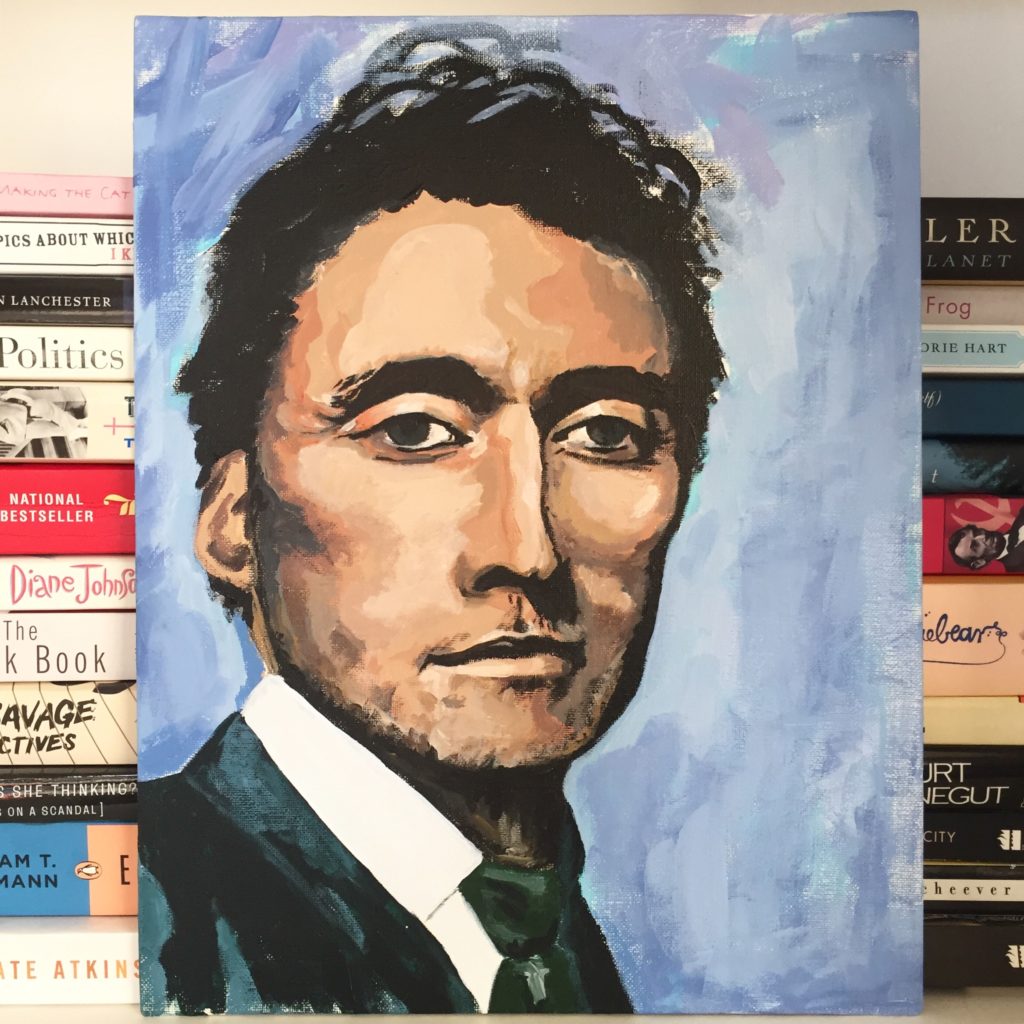
You can see how it’s a “quantum leap” from Tilda. What I learned during this process was to break down the components of a face and teach my eye how to see the shape of features and shadows versus just their overall appearance. It’s hard to explain. It’s the difference between seeing a nose, or the various shapes that make up a nose (and which, individually, don’t resemble a nose at all).
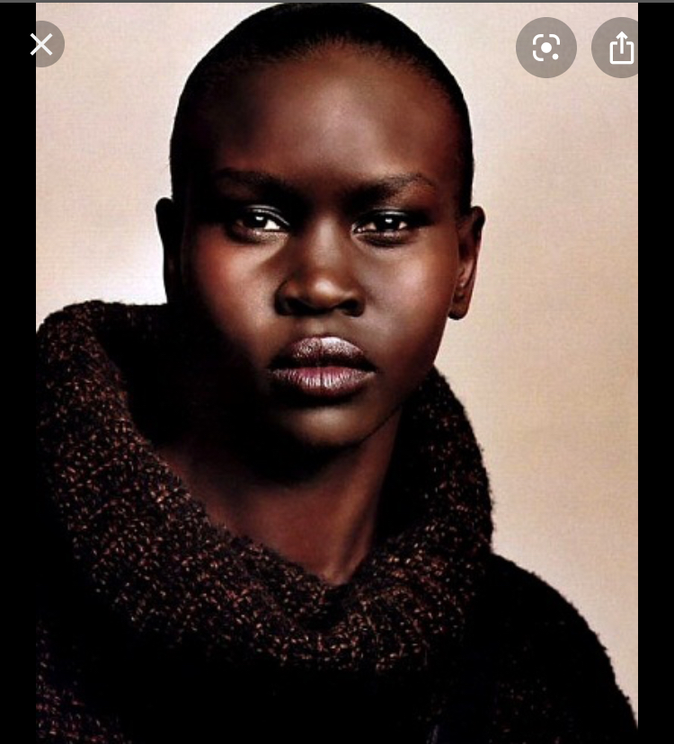
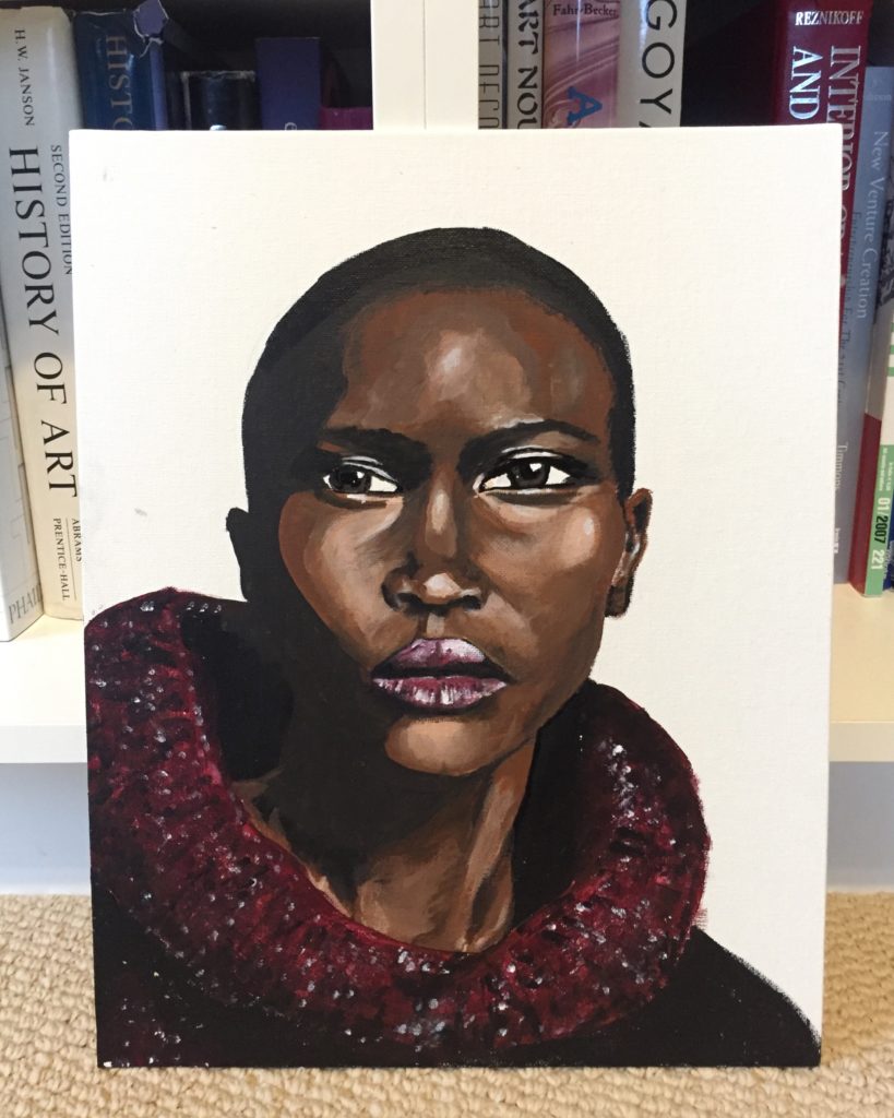
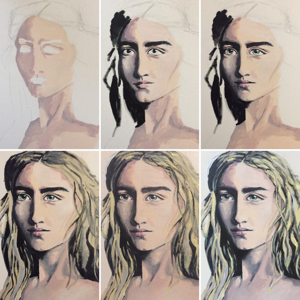
What I learned with Rufus, I put to good use with my next subject, Alek. This was the inspo photo I selected:
I chose it because the dramatic lighting highlights the amazing angles of her face. And, I am not going to lie, I am very proud of my portrait, which is currently my favourite thing I’ve ever made:
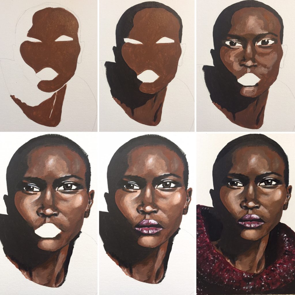
The process I used for Alek was very similar to Rufus. I took a bunch of progress photos to illustrate it:
The top 3 photos show what I did in my first session. It takes me about an hour to get down the initial “sketch”. In this case (as with Rufus), I did use a very rough pencil sketch as a guide – mostly to ensure I had the shape of the head done properly. Then, over the course of about a week or so, I worked to refine each component of the face.
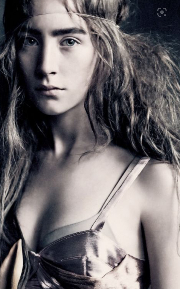
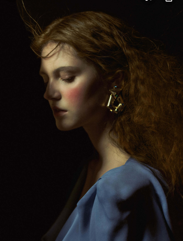
Finding inspiration that speaks to me is one of the hardest parts. I gravitate towards editorial photos because they tend to feature more “arty” shots with dramatic lighting. Finding the right photo online can be time-consuming. In effect, I am looking for something that approximates an image or idea I have in my head; a lot of magazine spreads look, well, too commercial to serve as a basis for a portrait. After Alek, I struggled a bit to find something that spoke to me but eventually I chose this photo of Saoirse Ronan.
To me, it’s the kind of picture that begs to be painted. I could see it, in my mind’s eye, painted. Turned out, the reality was a little more challenging. Because her colouring is much lighter than either Rufus or Alek, I had to be more subtle with my shading to retain the ethereal effect of the photo.
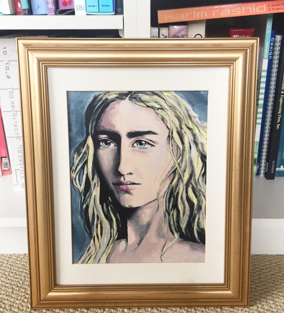
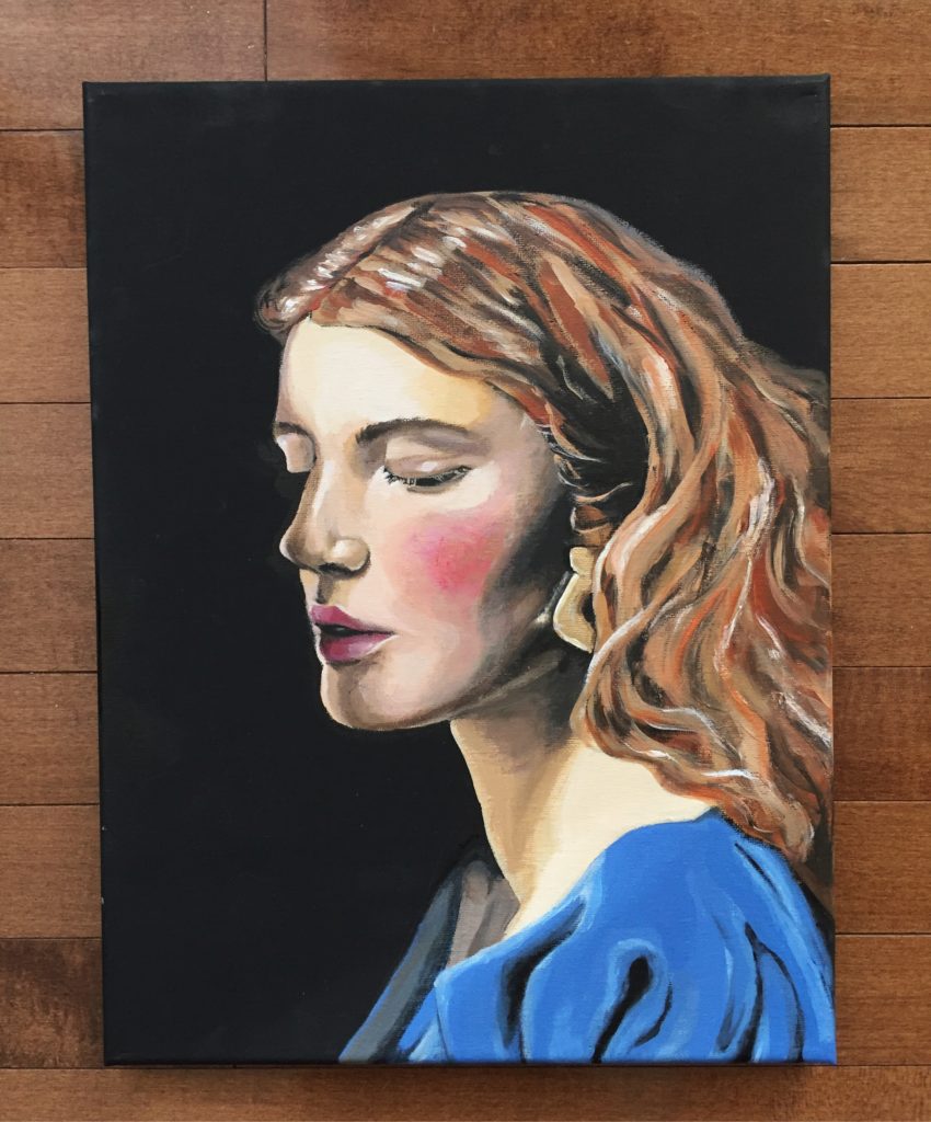
I think I did okay, but I struggled with the skin tone and shadows a lot. Here are the progress shots:
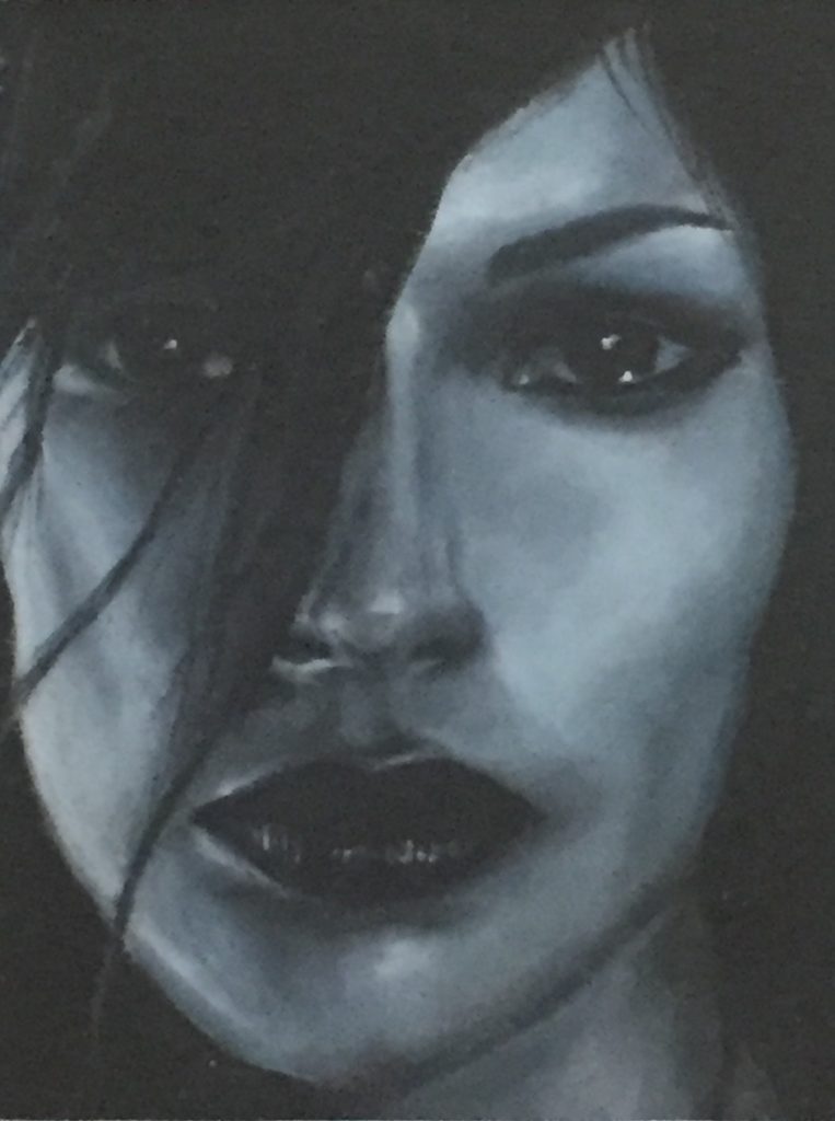
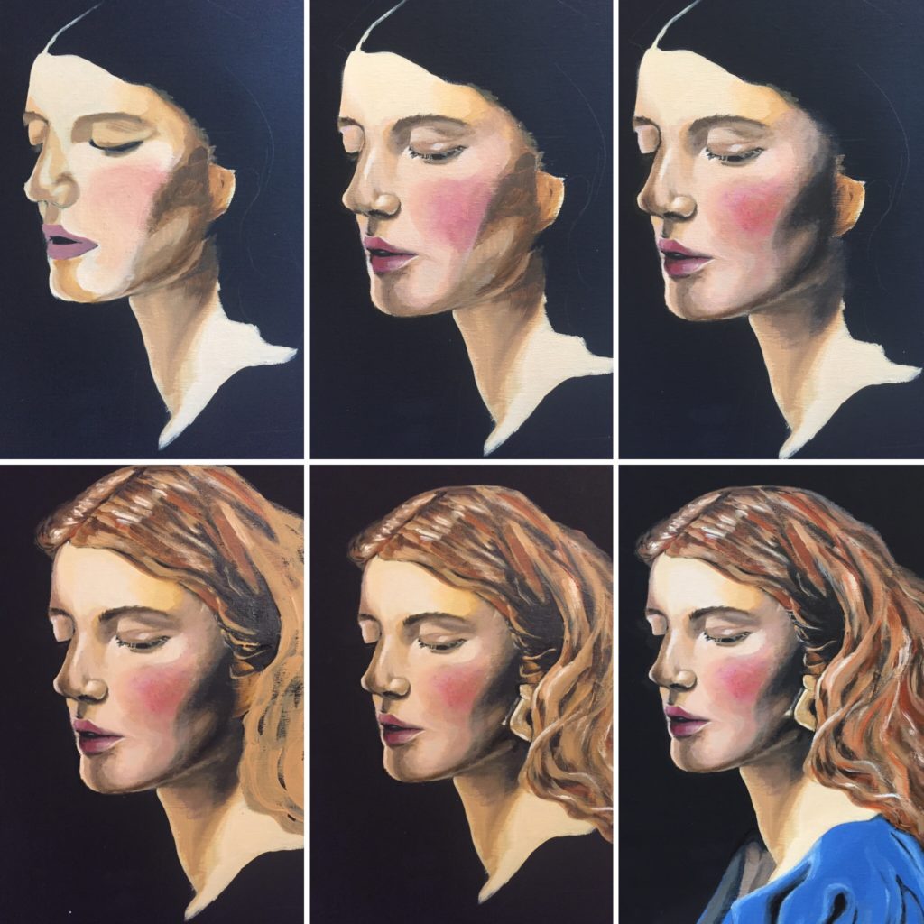
But another quantum leap was around the corner. I fell in love with this photo, and decided to double down on the whole “ethereal, Pre-Raphaelite” vibe.
It also happened that I had just purchased a couple of black canvases. I had used one for a still life, and quickly learned that painting on black is a whole other kettle of fish. Nonetheless, I decided I would do just that for this portrait. Brave or foolhardy, you decide. Luckily, I managed a bit of a Hail Mary pass, and summoned up some new techniques (using my fingers for blending! just like the old days!) that helped me pull it together.
Next to Alek, this is my current favourite painting. I love it so much, even though I made a bit of a muck of the dress fabric and the earring. Progress shots:
Again, I’m not sure if this post is a good testimonial for the learn-as-you-go approach to picking up a new hobby, but I hope it shows that, no matter where you start, practice does tend to lead to improvement no matter how stubborn you are.