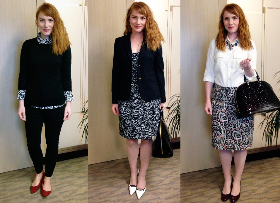
I mentioned recently that I was working on putting together a colour palette for my wardrobe, and while nobody expressed wild interest in hearing more about it, I figured I’d write a post about it anyway. Hey, it’s Sunday: the three of you reading this clearly have already run through all of the interesting stuff that got posted on the internet this week, and scraped the bottom of your social media feeds, and this is surely better than scrubbing your toilet, yes? So. Let’s talk about how I bumbled my way towards wardrobe colour harmony.
There is no particular reason why I needed to figure out a colour palette for my wardrobe. I’m neither looking to replace my current one, nor re-configure it to any significant extent. I feel like I’ve spent so much time – and, let’s be honest, money – doing that in the last few years, that I have little desire to keep pursuing the unattainable – the perfect wardrobe. What I am doing is trying to refine my overall presentation (more sophisticated, more grown-up), and pare down some of the emotional baggage that’s hiding in my closet (sentimental items from decades past, impulse buys gone horribly wrong, you get the idea). Trying to find a unifying colour scheme to the eclectic bazaar that is my current closet is something of a fool’s errand too, so I took a different approach. My colour palette is not something that represents my wardrobe as it currently is, or as it will be next month, next year, or ever. I think of it more as something I’m evolving towards … even as it is evolving too.
Clear as mud?
Let’s leave the mumbo jumbo aside for now, and get into the details a bit. I mentioned that I was looking at some of Into Mind’s sample palettes, and while I found her posts interesting and thought-provoking (as always), none of the actual palettes really spoke to me. So, I decided to try putting together one of my own. Anuschka suggests choosing 3 main colours, so that’s where I started.
And got almost immediately stumped. Because I have only 2 main colours in my life, really. Black and blue. And by “blue”, I mean all of the blues under the sun, which basically defeats the whole point of a colour palette. After abandoning the whole project for a week or so, I decided to give it another, more pragmatic try. For my mains, I ended up picking black, cobalt blue, and navy – mostly because navy seemed like a better choice than light blue (think dark wash denim over light denim) for my work wardrobe, which makes up 70% of my closet.

I know, this is ground-breaking stuff. Honestly, I’ll always be cheating a little when it comes to the main colours because, while I do have a fair bit of cobalt blue (or close enough) in my closet, it will never be my only blue.
Moving on (don’t worry, there’s more rule-breaking ahead).
Next, Anuschka suggests picking two neutral colours. Here, I had another problem. I couldn’t pick only two. So, I decided to go with three. Camel and white were no-brainers. Or, well, almost. I hesitated a bit over picking tan or cognac, and ended up splitting the baby (so to speak) with camel, a sort of in-between colour. (To be honest, I’ll probably be lumping in all three colours under the category “camel”.) For the third neutral, I wavered a lot. I thought about brown. I thought about navy (before bumping it to a “main colour”). I ended up going with grey, which seemed the most versatile and suited to my complexion. The problem is, I struggle with grey, you guys. I have a hard time picking the right shade(s), as exemplified by this effort:

(camel, grey, white)
I was going for a warm, medium grey and ended up with … that. In retrospect, maybe a warm, light grey would be better? To be determined …
Last but not least, there are the accent colours. Anuschka of Into Mind suggests choosing 4 so, of course, I went with 6. Three guesses as to who’s the minimalist here? Anyway, this was actually the easiest part of the whole process, even though, as we’ve established, I love All The Colours and hate to give any of them up, even theoretically. As with the rest of this exercise, I sucked at picking decent representations of my actual picks, which is why the final product looks like this:

I know, underwhelming. Since you probably can’t really tell, the accent colours I chose were burgundy, aqua, teal, red, plum, and yellow. In hindsight, the aqua might have been overkill. I don’t have a lot of it in my closet right now, although I love the pieces I do have. It’s not an essential accent colour for me, though. The others I feel really good about; are “power colours” still a thing? As suggested by Into Mind, I tried to stick to colours that would all (or mostly) work with each other. One of my current fave combos is black + white + accent colour, and any of the ones above would work great. I think they also pair nicely with each of my other two main colours, so there’s that.
And, so, now I have a wardrobe colour palette, which will come in handy next time someone asks me if I have a wardrobe colour palette. And hopefully the next time I go shopping and find myself distracted by All The Colours and All The Prints. Focus, Adina, focus.
Your turn: do you have a colour palette for your wardrobe, and if so, what the hell do you do with it?

