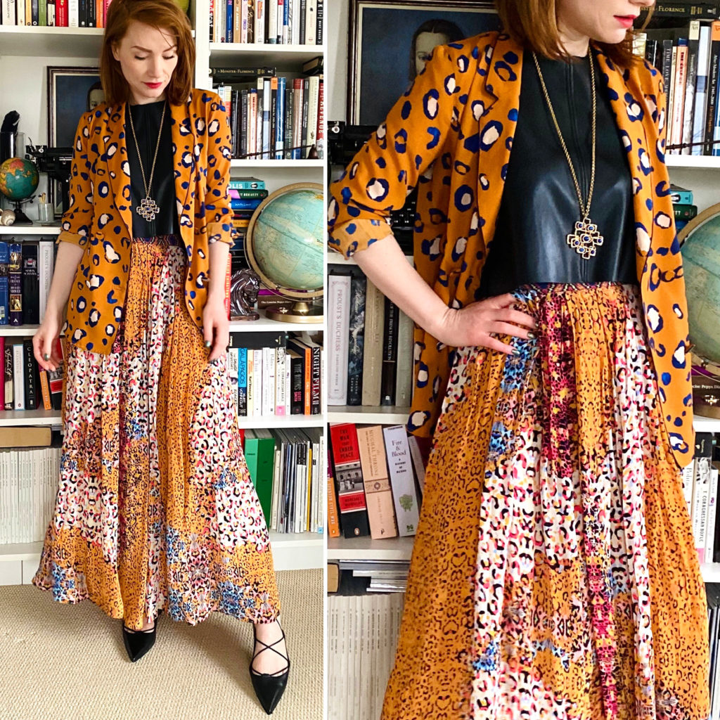
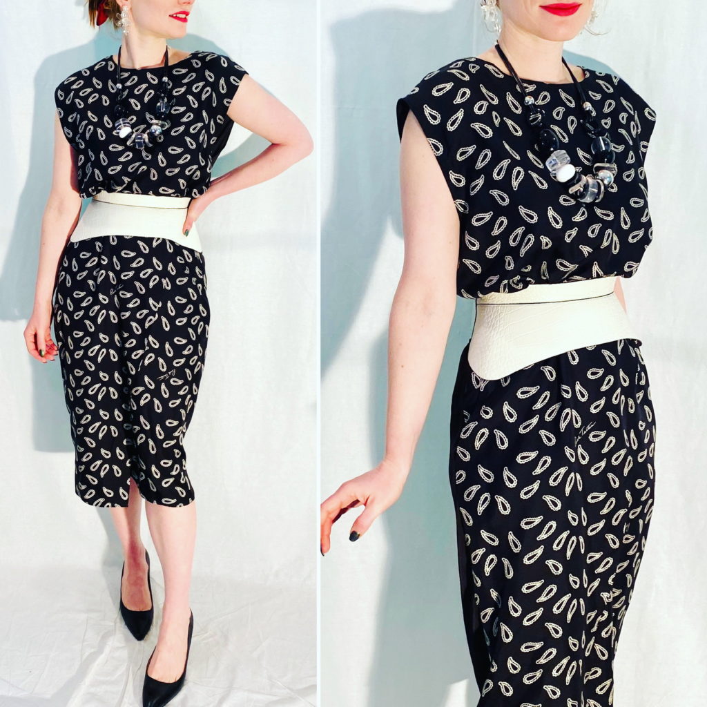
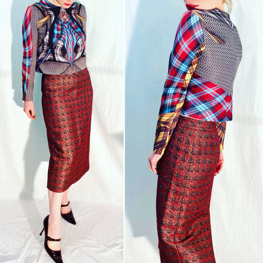
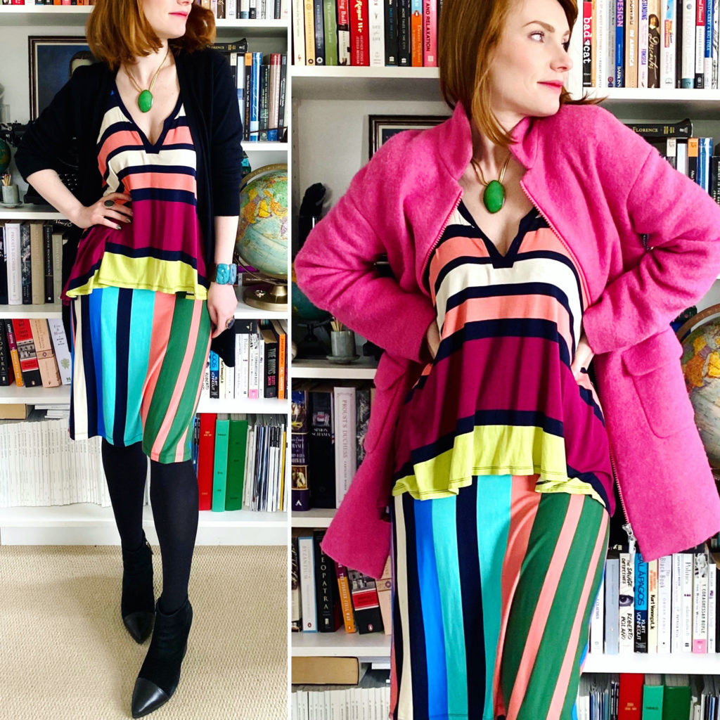
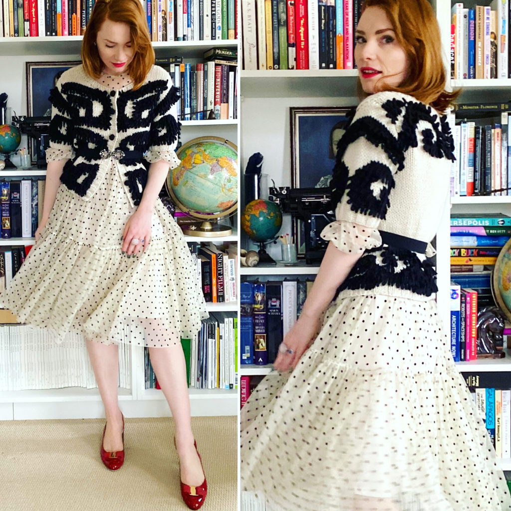
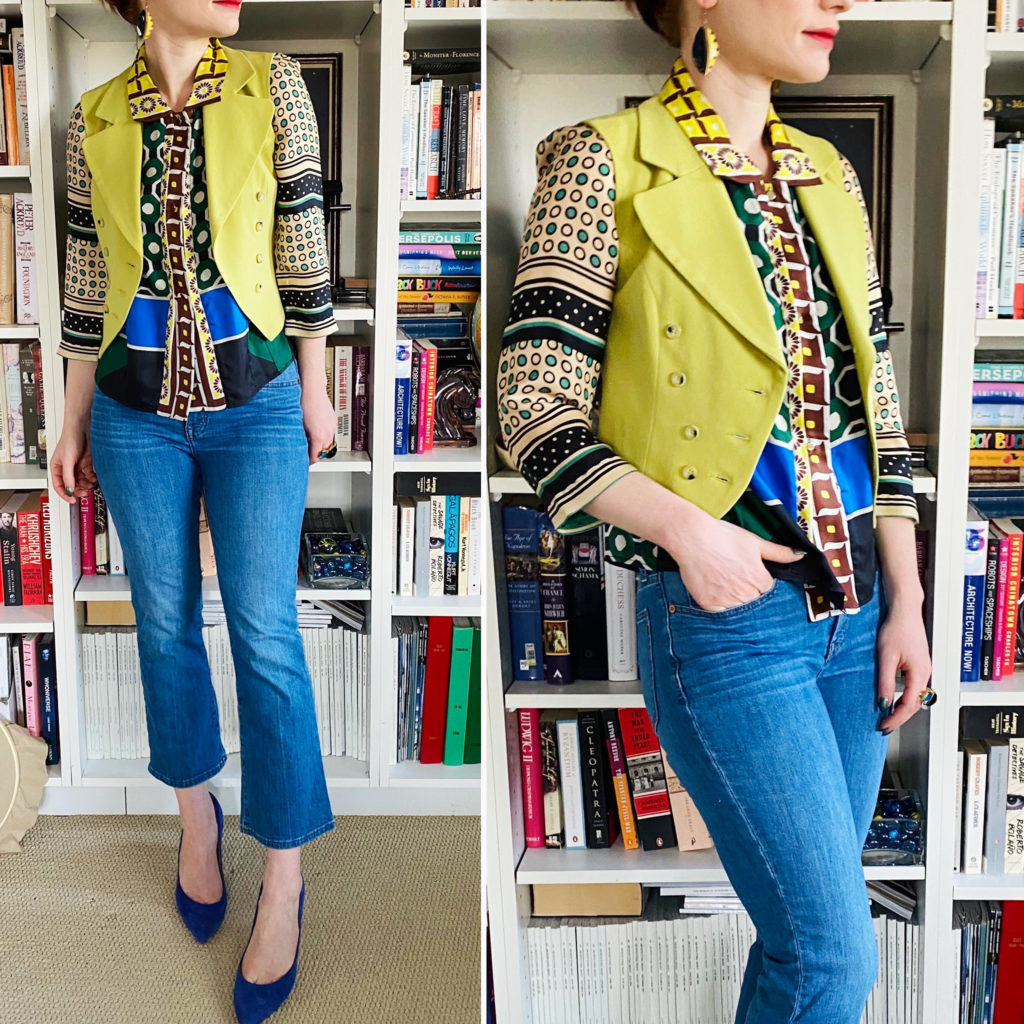
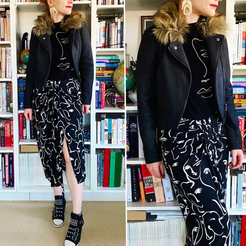
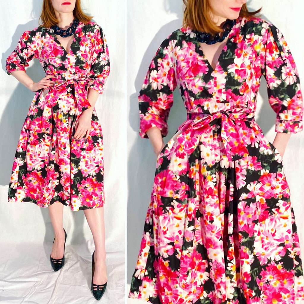
One of the questions I get asked a lot is “how big is your closet?” The unexciting answer is “not that big and not especially Instagram-worthy” but, I hasten to add, it does maximize the available space quite effectively. A common follow-up question is “how do you keep your closet in check?” and it is a good one, because if you’re working with a relatively small space (as I do), keeping it under control is key. There are, of course, many ways of doing that, and I’m sharing mine without any claim of originality or perfection.
When To Edit
Some people do it once a year, or once every six months; others do it with each seasonal change. I do small closet edits (I prefer this terminology over “purge”) whenever I start to run low on my supply of empty hangers, and larger ones at least twice a year. During the small edits, I mostly focus on “low hanging fruit” — items that are readily identifiable as candidates for removal; more on that later. During more extensive edits, I try to go through all of my items, category by category, and assess everything individually.
How To Edit: Stage One
Try it on. Whether it’s one item, a half dozen, or your entire closet. (If the latter, you may need to set aside a few hours for this process, but I recommend not skipping it.) Set aside everything that fits as intended* in one pile, and everything that doesn’t in another pile.
Here is my philosophy on clothing that doesn’t fit. Except in exceptional circumstances, I don’t keep stuff that’s smaller than my current size and if I do, it’s usually not anything that’s significantly smaller. For me, that means that I may keep something that’s 1-2 inches too snug, (subject to the additional considerations I mention below). I almost never keep something that’s more than 1 whole size smaller unless it has extraordinary sentimental value. I have experienced some weight fluctuations in the last 5-7 years, but they haven’t been significant enough to justify keeping around much smaller sizes; with age, it’s more likely that future fluctuations will be in the other direction. For that reason, and because I prefer to wear my clothing looser, I am far more likely to hang on to clothing that is a larger size.
On that note, let’s talk about the asterisk above. For me, “intended fit” is something different than regular size. My clothing covers a gamut of sizes, from XS to XL; this isn’t solely because manufacturers’ sizing is all over the place, it’s also because I am particular about how I want things to fit me, and I will often size up (and, less frequently, down) to achieve the fit that I want. For example, I like long skirts and for that reason, will often prefer to have the waistband sit closer to my hipbones than my waist, which in turn drops the length; to do that (and also because I have larger hips and don’t like to feel squeezed) I routinely “size up” in skirts.
I would encourage everyone to ignore size labels, and buy clothes based on how they want the clothes to fit. If you know your measurements, this is easy enough to do, even online.
Stage Two
Take the “fits as intended” pile and sort the items into four sub-piles: (1) “makes my heart sing” items; (2) necessary items; (3) “wouldn’t care if I never saw this again” items; and (4) “don’t love, don’t hate, now what” items. Piles #1 and 2 go back in the closet, pile #3 gets set aside for donation/selling/swapping, and pile #4 gets put aside for further editing – see next step.
Before moving on, a word on Pile #1. If, after you go through this process a few times, you’re finding yourself putting items into this category that you never seem to wear … ask yourself why. What is stopping you from wearing them? If the answer is either that you’re “saving” them for a special occasion (and it’s not a cocktail dress we’re talking about), or that you’re not sure how to wear them, then may I gently suggest that you take the leap and just … wear them. Experiment. Take a risk. Life is short; wear the clothes that bring a smile to your face, or that make your heart sing.
Also, a word on Pile #2. I cannot tell you what’s a necessary item for you; everyone’s wardrobe needs are different. But these would be the foundational items, or the glue that holds everything else together. You may not get enthused over them, but they serve a purpose. Here’s an example from my closet: a black tank top. I have no strong feelings about it, and I don’t spend any time thinking about it, but I always need a black tank in my closet. I use it as a base layer in the cooler months under my knits (I don’t like to wear sweaters right next to skin, but I also don’t want to feel bulky or over-heated) as well as in the summer.
Stage Three
So now you’re down to 2 piles: the “doesn’t fit” pile and the “don’t love, don’t hate, now what” pile. [well, technically, you also have the donate/sell/swap pile but that doesn’t require further discussion for now.] What’s next?
For each item, here is the next question: how hard would it be to replace this item if I had to? This is a multi-faceted analysis, though it’s not actually that complicated. Consider:
Is the item unique in some way? For example, a zebra print pair of pants will be harder to replace than a black pair of pants because, well, there are not as many zebra print pants out there, whereas every brand has a black pair of pants to offer, every season. However, maybe this is not a run-of-the-mill pair of black pants. Maybe the design is unusual. Maybe the quality is unusually good. On the flip side, though: just because your item is unusual, doesn’t mean that it would be hard to replace – perhaps instead of the zebra print pants, you’d be equally happy with some plain black ones (if you needed to replace them). So let me re-phrase the question: is the item unique in a way that’s valuable to you and would make it hard to replace (either because of scarcity or cost)?
Next question: is the sale value of the item greater than its replacement cost? To explain: can you get more for this item if you were to sell it (assuming you actually plan to do that) than whatever it would cost to replace it or its acceptable equivalent. Here’s a concrete example: say you thrifted a plain black DVF dress for $10. For you, this is not a unique piece from a design perspective, and you know you can find other black dresses of comparable quality at the thrift stores for about the same price. On the other hand, you could get $30 for it if you were to consign it; maybe more if you sold it on Poshmark, etc. So the sale value of this dress is greater (to you) than its replacement cost.
NOTE: If you plan to donate all your unwanted items, then you can obviously skip this step.
Last question: does the item have sentimental value and is that something that’s important to you?
Ok, we are almost there.
Stage Four
Here is what I do next with my remaining piles:
1) Clothes that don’t fit but either (a) are within an acceptable swing of my current size/weight (see above) and are hard to replace or make my heart sing; or (b) are significantly smaller or larger but have great sentimental value, go into my “archive” closet. That means secondary storage wherever I can find it in my house. At least once a year, I do a sweep of my storage areas to check that items are still meeting the criteria for archiving. If they don’t, they get sold/swapped/donated.
2) Clothes that are “meh” but (a) fit, and (b) are hard to replace, go into “purgatory”. That also means secondary storage, although I try to keep it separate from the archive. I revisit the “purgatory” at least every six months or so. If I haven’t missed the item in the meantime, and am I not especially excited to take it back into my closet after 6 months, then it gets sold/swapped/donated.
3) Clothes that fit but are “meh” and not hard to replace get put into the sell/swap/donate pile. Anything that has good resale value, I will try to sell first. If it doesn’t sell after a few months, I either keep aside for swapping (if I though one of my friends might like it) or donate it – more so the latter now, for obvious reasons.
And there you have it — that’s my system for closet editing. At one point, I had developed an entire workflow chart (because that’s the kind of process-oriented nerd that I am) but I didn’t save it and tossed my only copy during a recent closet re-org. Oh, the irony. Anyway, I hope you found this relatively easy to follow, even without the visuals, and somewhat helpful … and feel free to share your tips with others in the comments.

