I have been using my art projects as a distraction since the lockdown back in March, and I feel like I am now hitting a wall. I’ve gotten used to working with my hands constantly in my spare time, but now I find that I am distracted and having to push to finish projects. It’s probably a sign that I need to take a break and maybe allow myself to, well, just “waste” time. The downside is, of course, that life in the midst of the pandemic still requires distractions so I need to find some new healthy ones that don’t involve screen time. But that is a post for another day; today, I’ll show you a some of the things I did manage to finish recently.
Portrait painting has been on the back burner since the beginning of the year; I began to feel burnt out on that back in January so I took a break. Right in the middle of a portrait. The unfinished work has been sitting next to my easel since then, a gentle reproof. Last month, I decided it was time to ease back into portrait painting; I had an inclination to work on a new piece, but I felt like I would first have to finish the old one. So I did. This is what I started from:
I won’t lie – it was a challenge. It’s as if I had lost my muscle memory for it. I struggled for what felt like a very long time and while I don’t feel like it’s one of my best works, I am happy with how it turned out in the end.
This one ended up feeling extra special for unexpected reasons. As I was working on it, I kept thinking that the girl looked like what my daughter might look when she’s older. It’s not why I chose the subject to begin with; the inspiration photo doesn’t look much like my daughter, but the painted version took on a life of its own as my portraits tend to do, hah. After I finished it, my daughter decided (unexpectedly and wholly unrelated) to cut her long hair — almost 18 inches of it — into a shoulder-length bob. So now the likeness feels even stronger in a way.
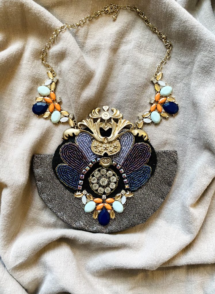
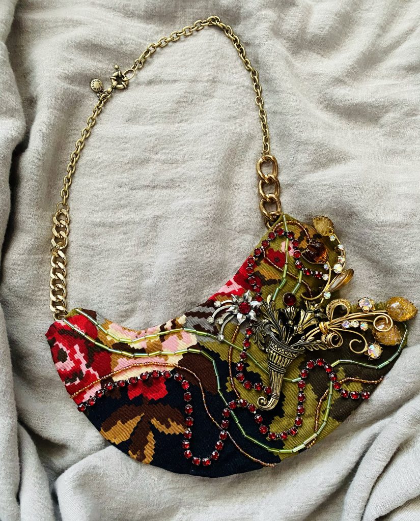
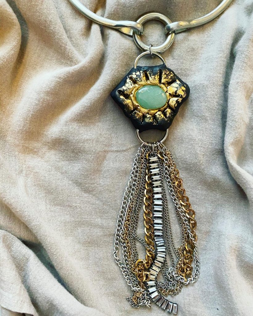
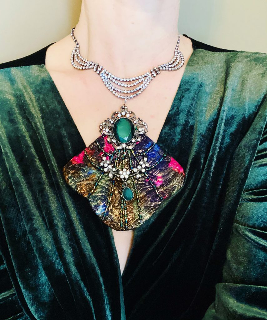
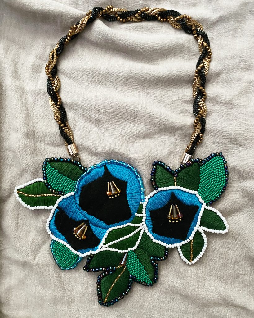
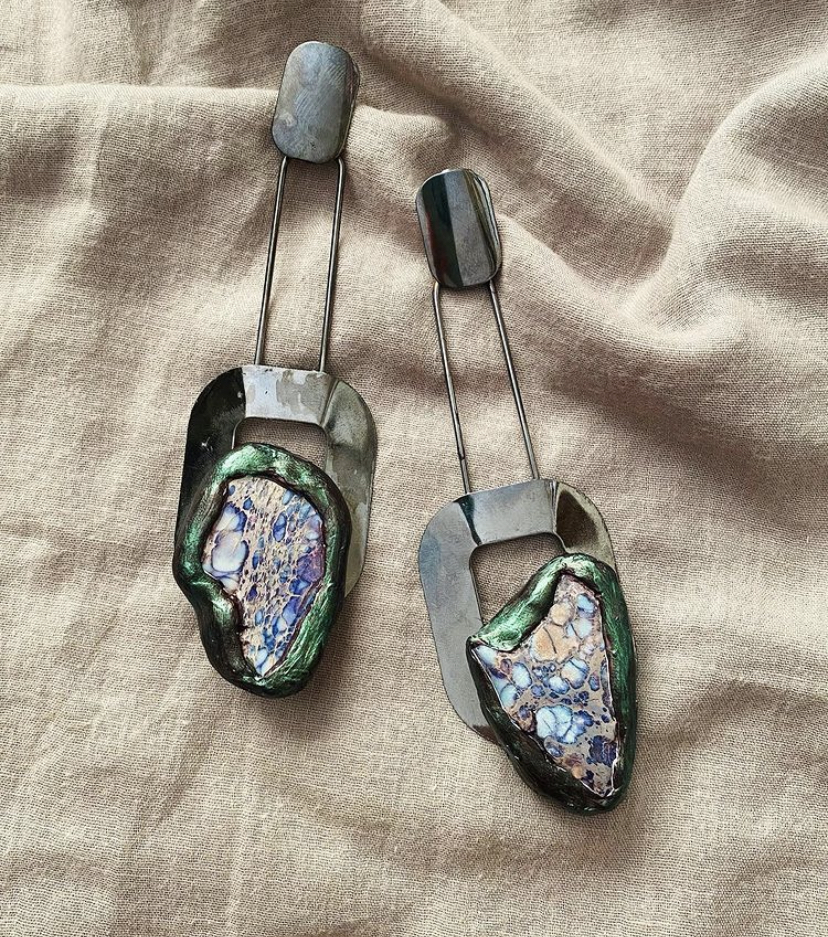
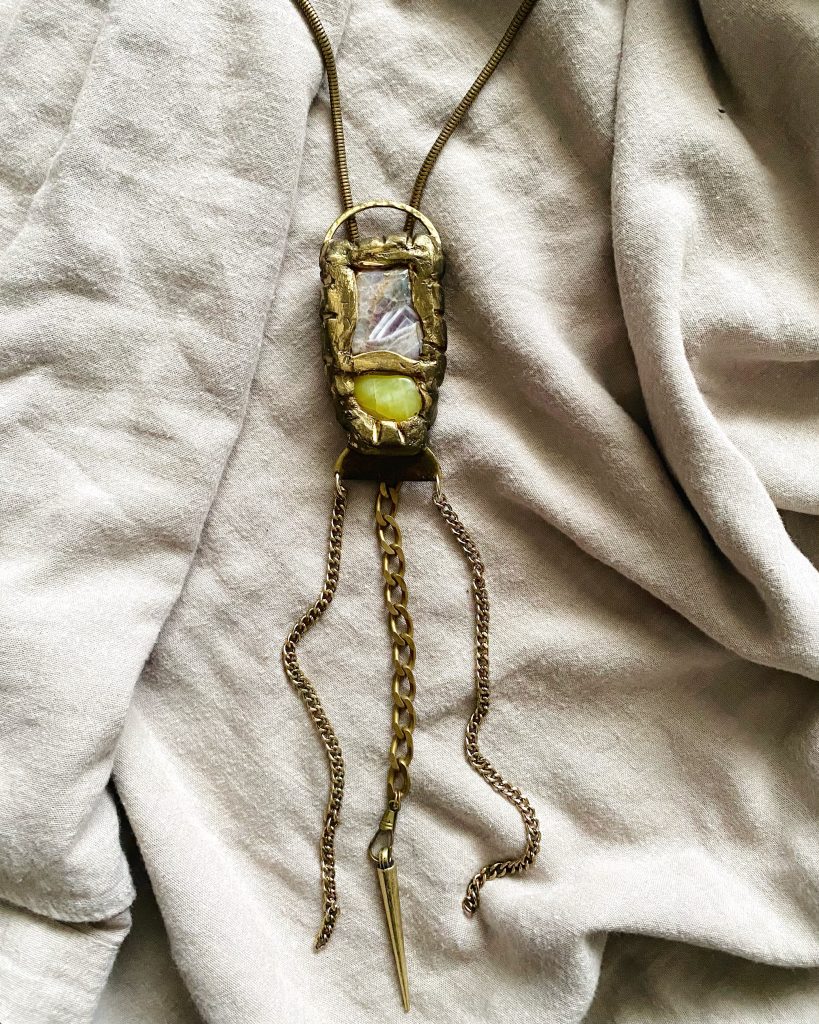
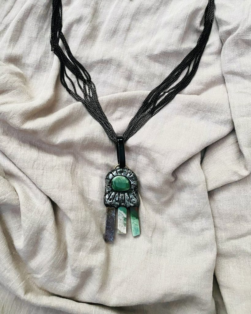
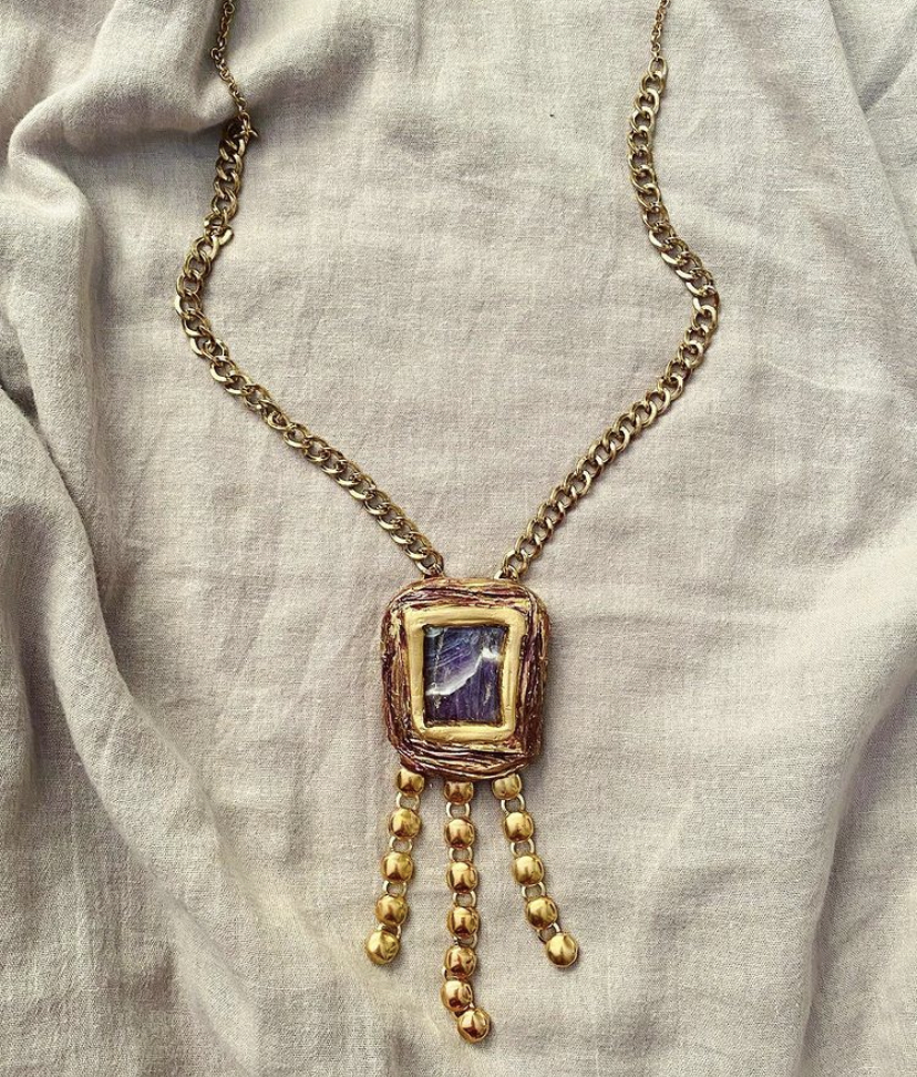
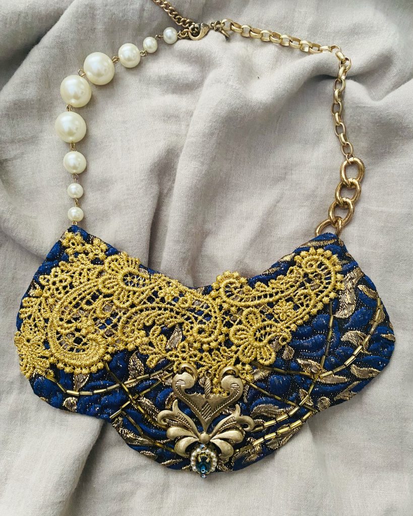
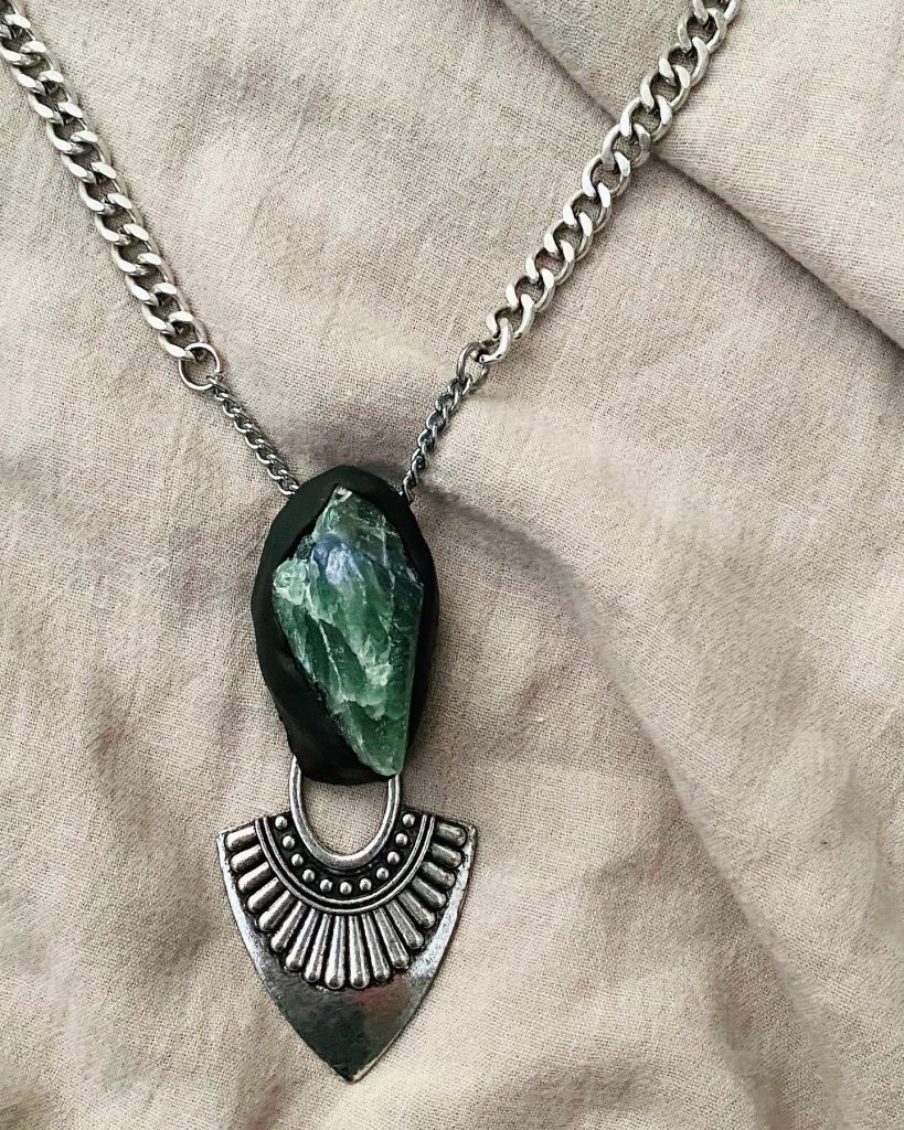
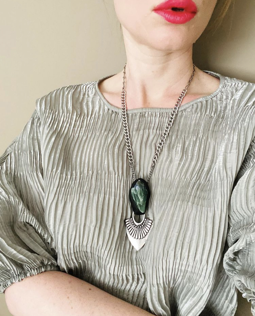
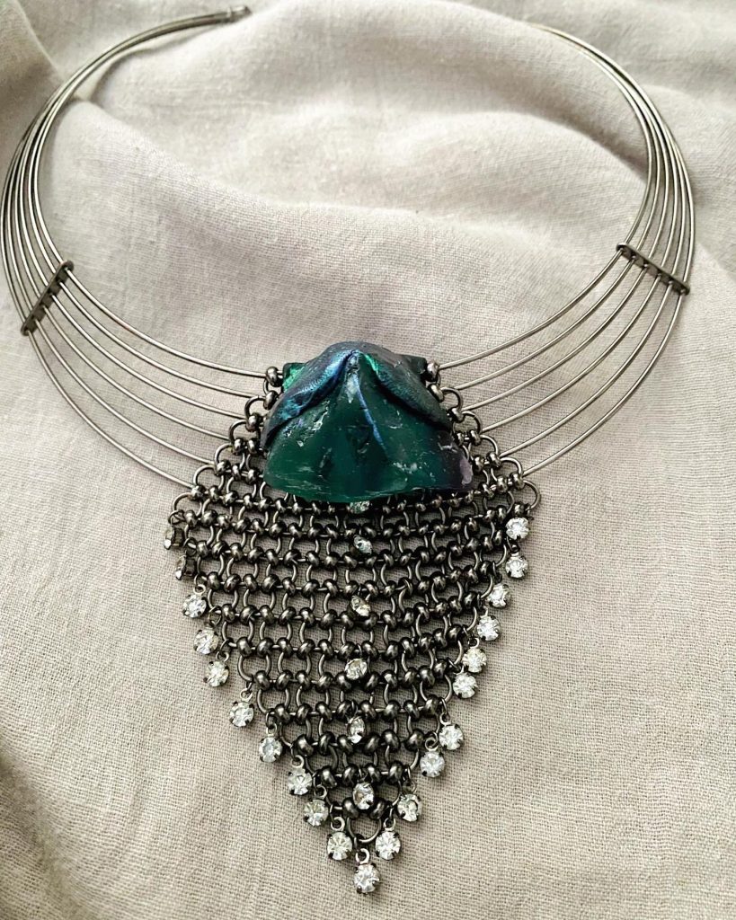
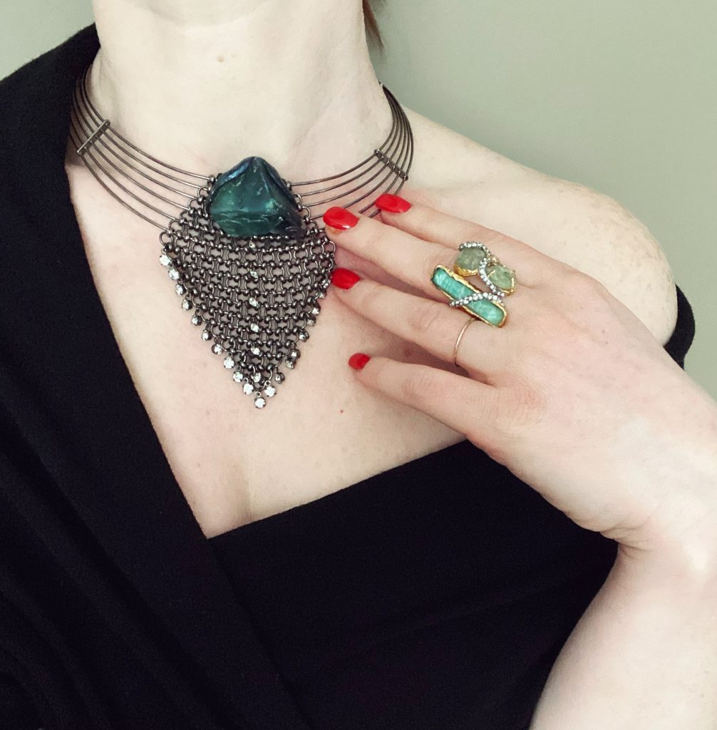
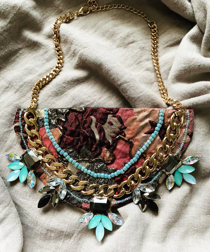
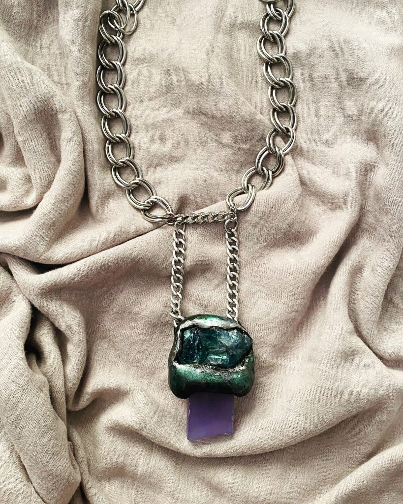
Moving on, most of my time lately has been devoted to making jewelry. I have been lucky enough to sell a few pieces – enough to cover some of my material costs. Gotta love a hobby that can pay for itself. Here are some of them:
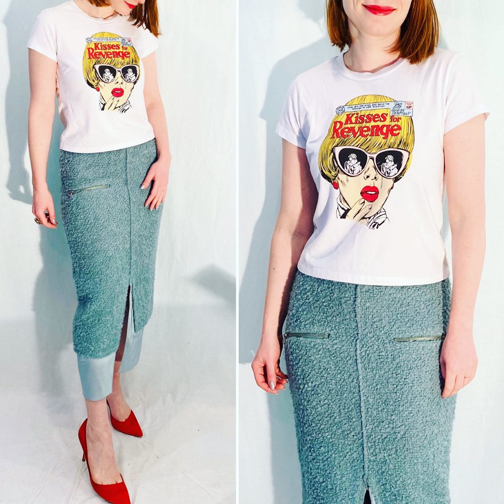
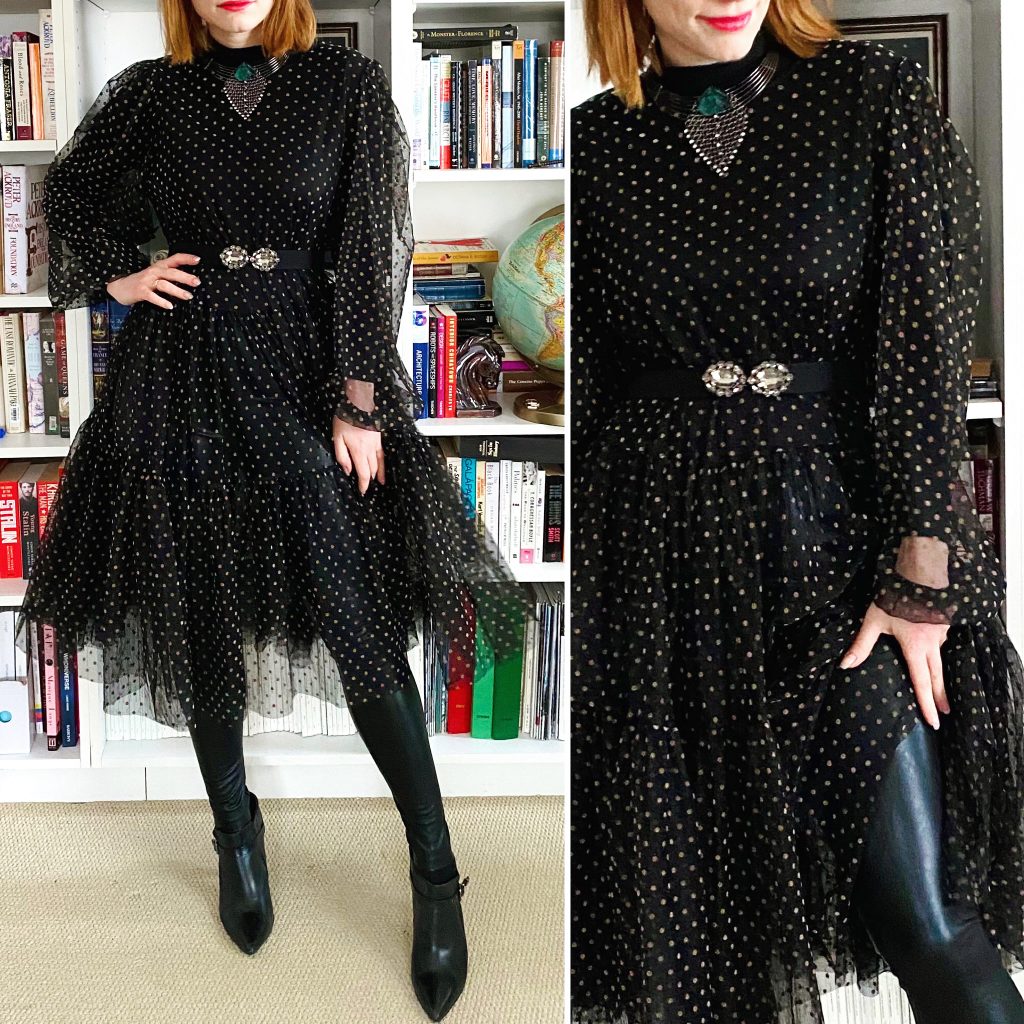
“Styling” my pieces has been a whole separate hobby – it allows me to play with my clothes again, and indulge in a little sartorial fantasy outside the bounds of my (pretty mundane) everyday life. As we move into fall and winter, I’m going to need all the escapism I can get. Speaking of which, I would love to hear about any projects you’ve been working on, or new hobbies you’ve picked up.
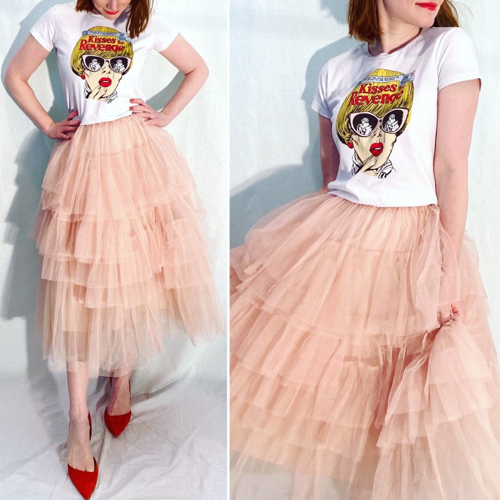
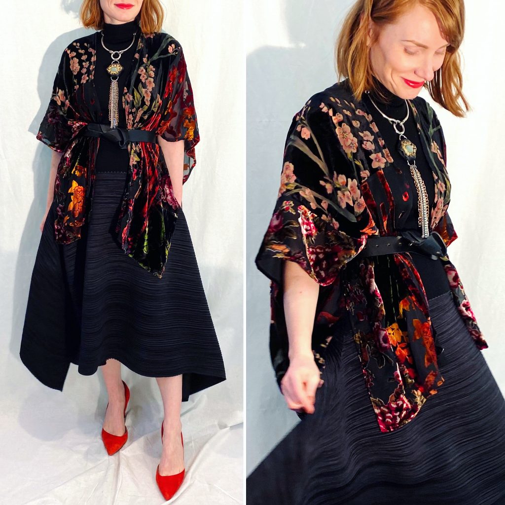
I have been loving this sort of “dark fairytale” vibe a lot lately. Think soft, filmy layers, black tulle, leather and velvet. I don’t really know where it fits within my style avatars — maybe a cross between the Artist and the Bohemian, with a gothic flair. Anyway, this outfit is very much up that style alley. I finally found a piece that layers perfectly with my Rick Owens tunic; it’s a Zara flowy maxi skirt and it has the nicest “swish” to it. It’s nothing fancy but it works so well here. I guess this is the 2020 version of “hi low” styling.
Discovery of Pants
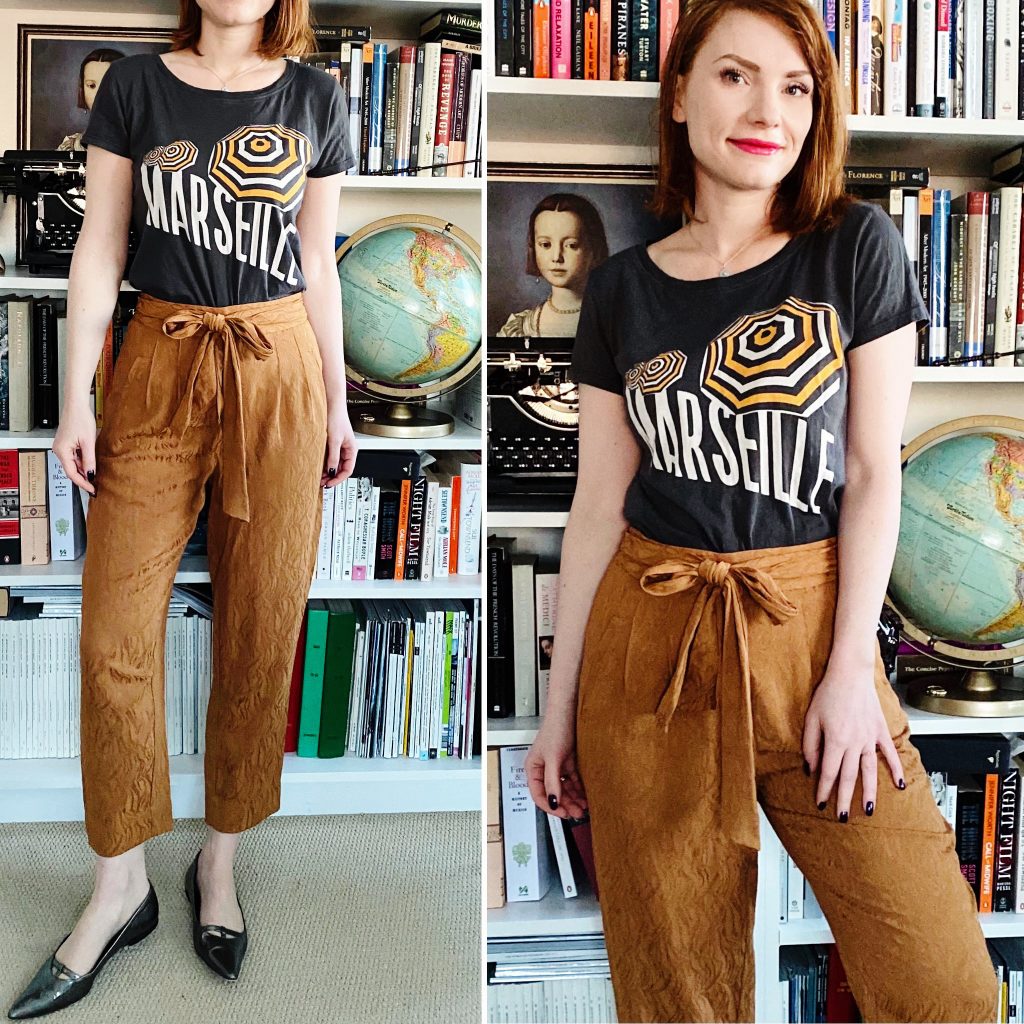
These COS paper bag waist pants got relegated to my archive closet sometime last year. Their crime? Being a bit too baggy. Well, joke’s on me because if 2020 had a style motto it would be “baggy everything”. So yeah, comfy pants are back in rotation. As is this MaxMara linen topper, which used to be part of my “beach vacation” capsule. That’s not a thing anymore (or any time soon) but no linen shall go to waste this summer. This is a great option for days when a jacket is too much but I want a little bit of coverage.
That’s a Wrap
Speaking of linen, you’ve seen this vintage Ungaro dress a few times before but lookit: still very nice. I wish you could feel the weight of this linen, it’s fantastic. And it’s provides a lovely backdrop for one of my handmade necklaces. More on those next week. Meanwhile, pieces like this dress have got me hunting for vintage pieces at the thrift store like never before. I think it helps that the 90s are sort of trendy again. But the quality of old designer pieces just can’t be beat.
Colorblocking
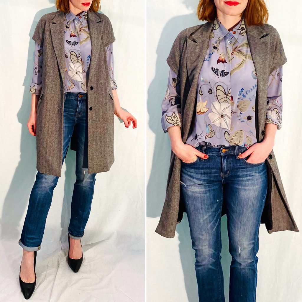
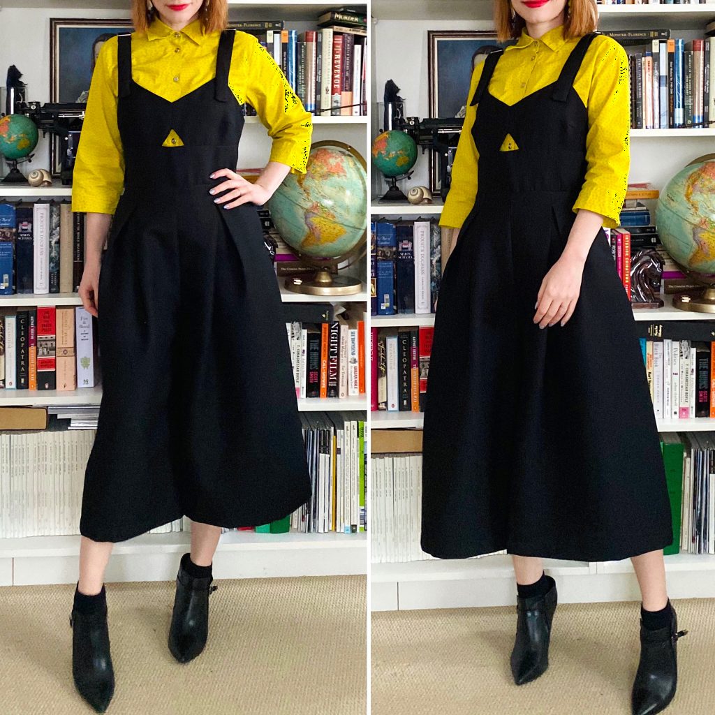
I’m not sure how I feel about this colorblocked Anthro dress; I love it in principle, but not sure about it on me. That being said, I like how it looks paired here with a vintage Ports dress worn as a duster. See, vintage really is awesome. And it usually comes with pockets.
Our daughter is turning 7 next month and starting Grade 2, so we figured it was time for her to upgrade from a plastic playroom table to a proper desk. A desk and vanity combo, actually; it was the only way to get her to agree to let go of an old vanity toy set – another piece of plastic I was hoping to eliminate from her room. After a lot of online searching, I finally found something suitable: a small desk with a fold down mirror. As we were ordering it, my husband asked the fateful question.
“What about the rest of her room?”
At the time, my husband was in the throes of 3 other house projects, all in various stages of completion, so you know he was looking for a new distraction. That’s his MO. One thing naturally led to another, and suddenly we were in the thick of a full-on bedroom remodel. Oops.
Because this all happened so fast, I don’t have a good “before” to show you, but here is a peek at what the bedroom has looked like in the past.
The bedroom was originally my son’s nursery. Because it’s the smallest bedroom in our house, it remained the nursery for our second child. When we found out we were going to have a girl, we did add some pink accessories and cute decals on the walls, but the rest of the decor was hand-me-downs from our son.
The bedroom went through a few more iterations – briefly, both kids used it as a joint bedroom (it was fun for a bit, but mostly they just kept each other up at night) – and eventually ended up like this:
The black IKEA storage unit was a cheap solution at the time we installed it; it had belonged to my husband for almost 20 years – he lugged it from Edmonton to Vancouver and back, through 4 different residences during that time – and it did a decent job of holding a lot of our daughter’s toys and clothes. But it was big and bulky and the dark colour made the room look even smaller than it was. The opposite wall was mostly taken up my a large Barbie house, and assorted Barbie paraphernalia. All in all, there was precious little floor space.
Rather than go our usual route with kids’ bedrooms – by recycling furniture from elsewhere in the house – we decided to start with a fresh slate and create a bedroom that could grow with our daughter well into her teenage years. Between you and me, I also have a plan for this room once she vacates it; it’s going to be my walk-in closet and office. The redesign my husband created will make that future transition quite easy.
For me, the key to living in a small-ish house is maximizing the available space and getting creative about storage. My husband jokes that I have an obsession with built-in cabinetry, but it really does come in so handy (and, really, even if he likes to tease me, he agrees with me). For our daughter’s room, he IKEA-hacked pieces from the Pax system, which is part of their wardrobe collection. He was initially going to use the Billy system (bookcases) but the Pax shelves are a little deeper (can hold cloth bins which was key for me because it’s my secret for hiding toy messes) and more versatile. As our daughter grows, she can change the configuration, add drawers, shoe racks, etc. And later still, I can add more units for my dream closet.
Here is a look at the finished room:
The tall unit with a door is where most of her clothes are stored; the actual closet is for dresses, jackets and winter clothing. It’s organized so that the stuff she uses day to day is on the lower shelves she can reach on her own, while the higher shelves are for off-season clothing and other storage. The lower unit was designed specifically to hold her Barbie house and LOL Surprise camper van. When she is older, we can use the top shelf as a bench/reading nook by adding a cushion, and the bottom cubby as a shoe rack. On the wall above, we can add a mirror – which, if she’s a fashionista like her mom (and it seems likely that she is), she will definitely need.
Side note: we didn’t remove the decals from her room because there was a good chance they would rip paint off and we didn’t want to bother with it. At some point, we/she will want to re-paint the walls, and we will deal with that problem then. Probably whilst in the middle of some other major reno, hah.
As with all my bedroom designs for the kids over the years, I wanted this one to be practical. The shelves on the big unit are organized so they’re easy for our daughter to use, with bins on the bottom row where small toys and other messy items can be quickly swept up. There is even hidden storage in her desk stool – a vintage item I picked up (for myself) years ago at a local antique mall, which we spray-painted white to match the rest of her furniture.
We even added a little gallery wall (because of course we did):
And did I mention the star lights (which double as night lights)?
All in all, this is a room that I would have LOVED as a little girl – heck, I would have loved it as a 20-year old – and it will serve our little big girl well for many years. She’s over the moon about it, and it’s been a joy to see how much she enjoys it. Well worth the time we invested in the redesign … though, it’s easy for me to say that, since my husband did 95% of the work, hah.
One more house project done, only a (few) dozen left …