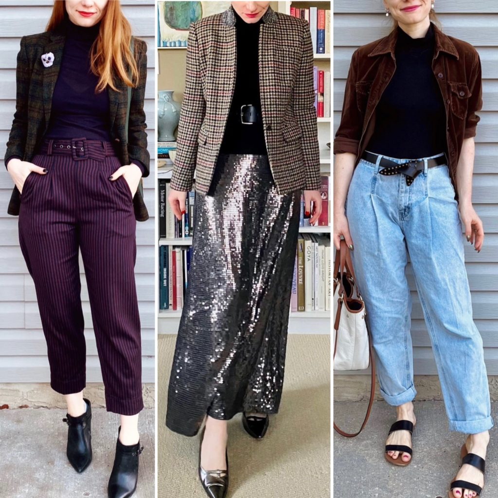
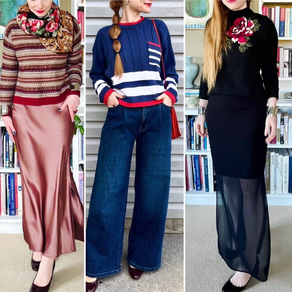
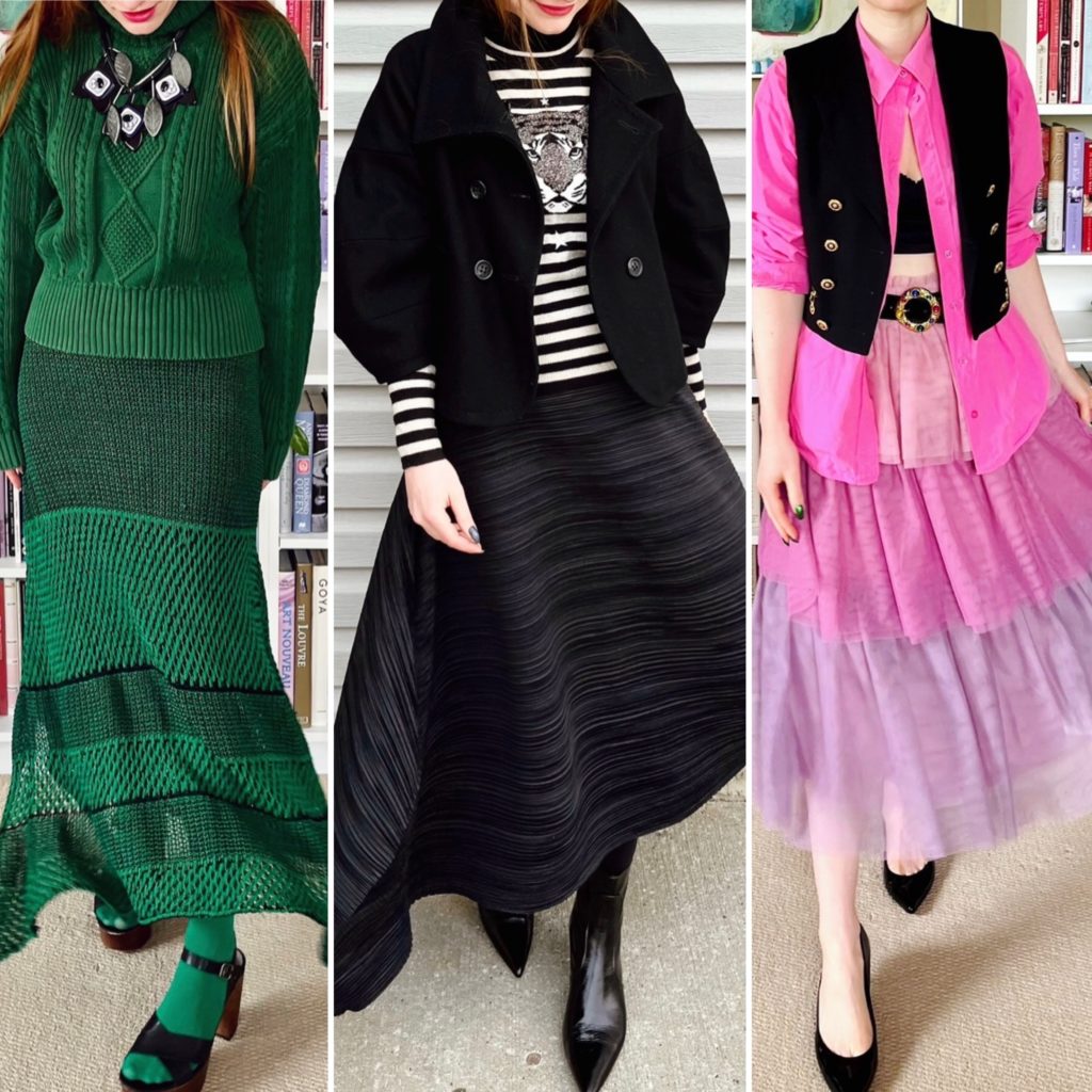
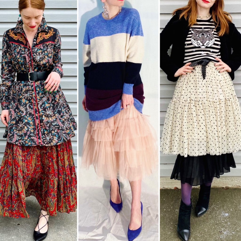
Category: Uncategorized

What I Wore: June 2023, part two

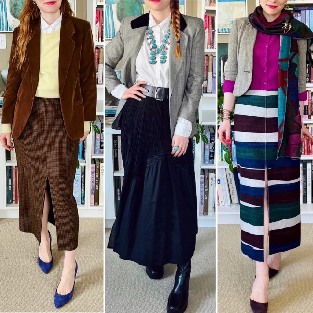
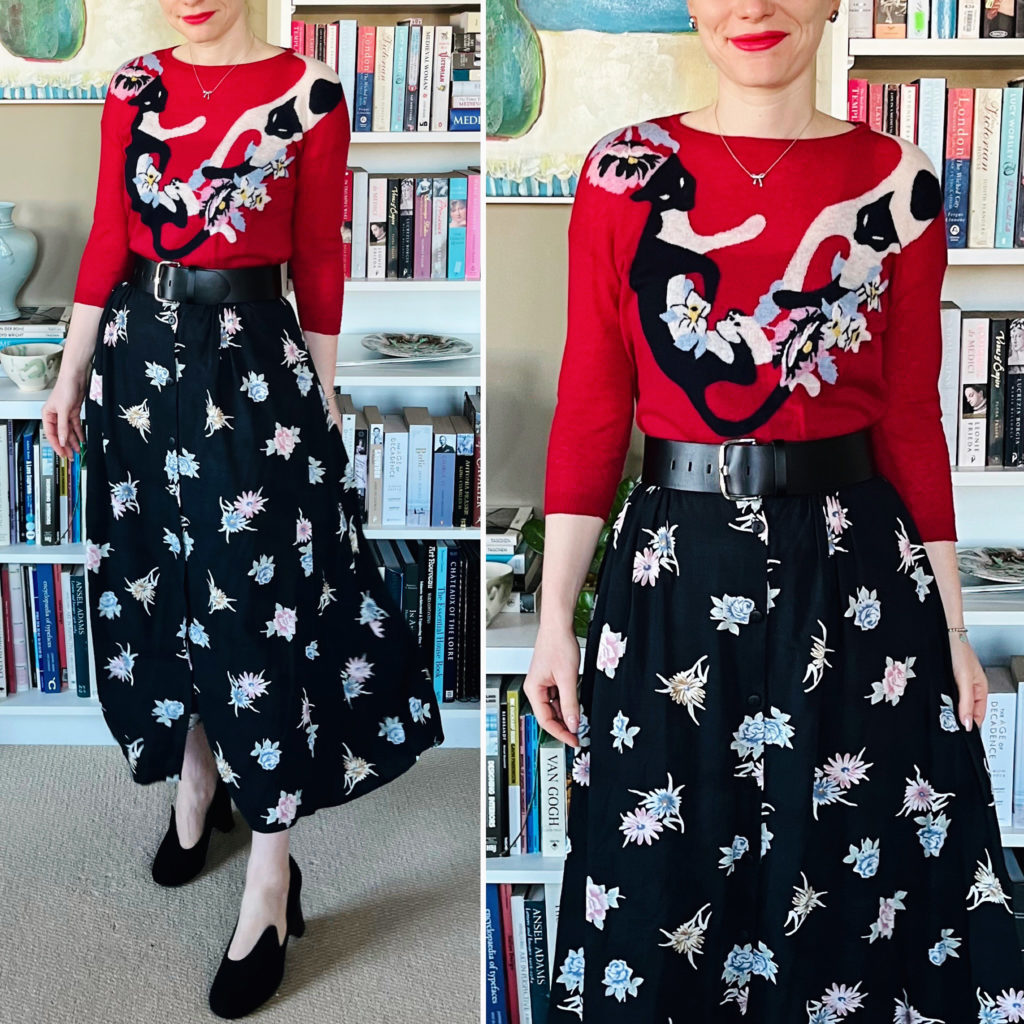
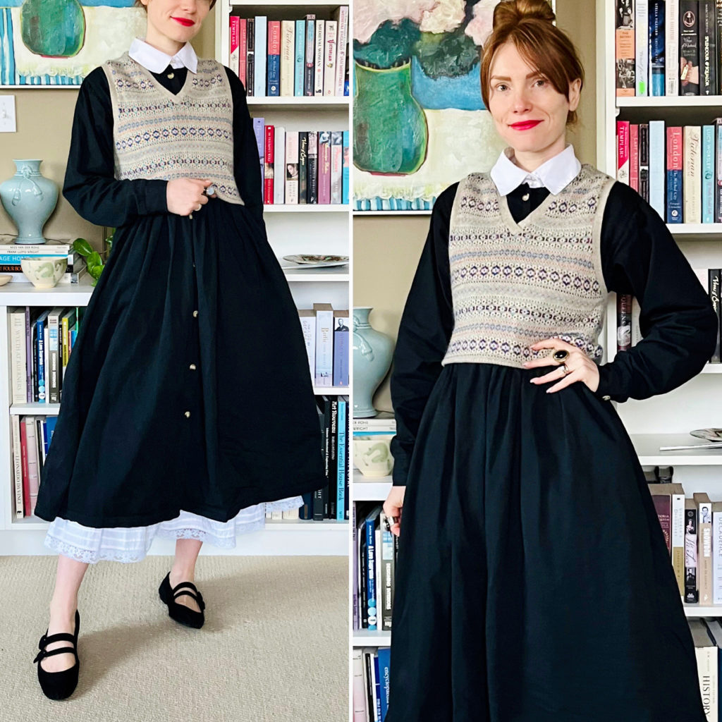
Details: Suttles & Seawinds dress (Poshmark), Second Female cardigan, BR belt, Marquis shoes (all thrifted)

Thoughts: How well matched are this dress and this cardigan? It’s always pleasing to find a perfect colour match. This dress is almost perfect too; the fit of the bodice is impeccable. My only (small) quibble is that I wish it was longer. Of course I do! The longer, the better. So I added a vintage petticoat that has a lovely lace detail at the bottom; it adds a few extra inches and some visual interest to boot.

Details: American Eagle vest, Ralph Lauren blazer, Topshop pants, Ferragamo shoes (all thrifted)

Thoughts: A very dandy sort of outfit, don’t you think? I’m loving vests worn as tops at the moment — a little bit risque but not really. It’s not different than a tank top, when you think about it. In this case, the vest is cut a bit low so to minimize the boobage, I added a vintage scarf (which belonged to my grandma!) as a sort of shawl/neck tie alternative. I love the look of it.

Details: H&M top (Poshmark), Ralph Lauren skirt, BR belt (both thrifted), J. Crew shoes (retail)

Thoughts: Inspired by my recent seasonal analysis discoveries, I put together this outfit to showcase a high-contrast colour combo of dark teal and red. I love it!! Any shades in the teal/turquoise/aqua family look smashing paired with red.

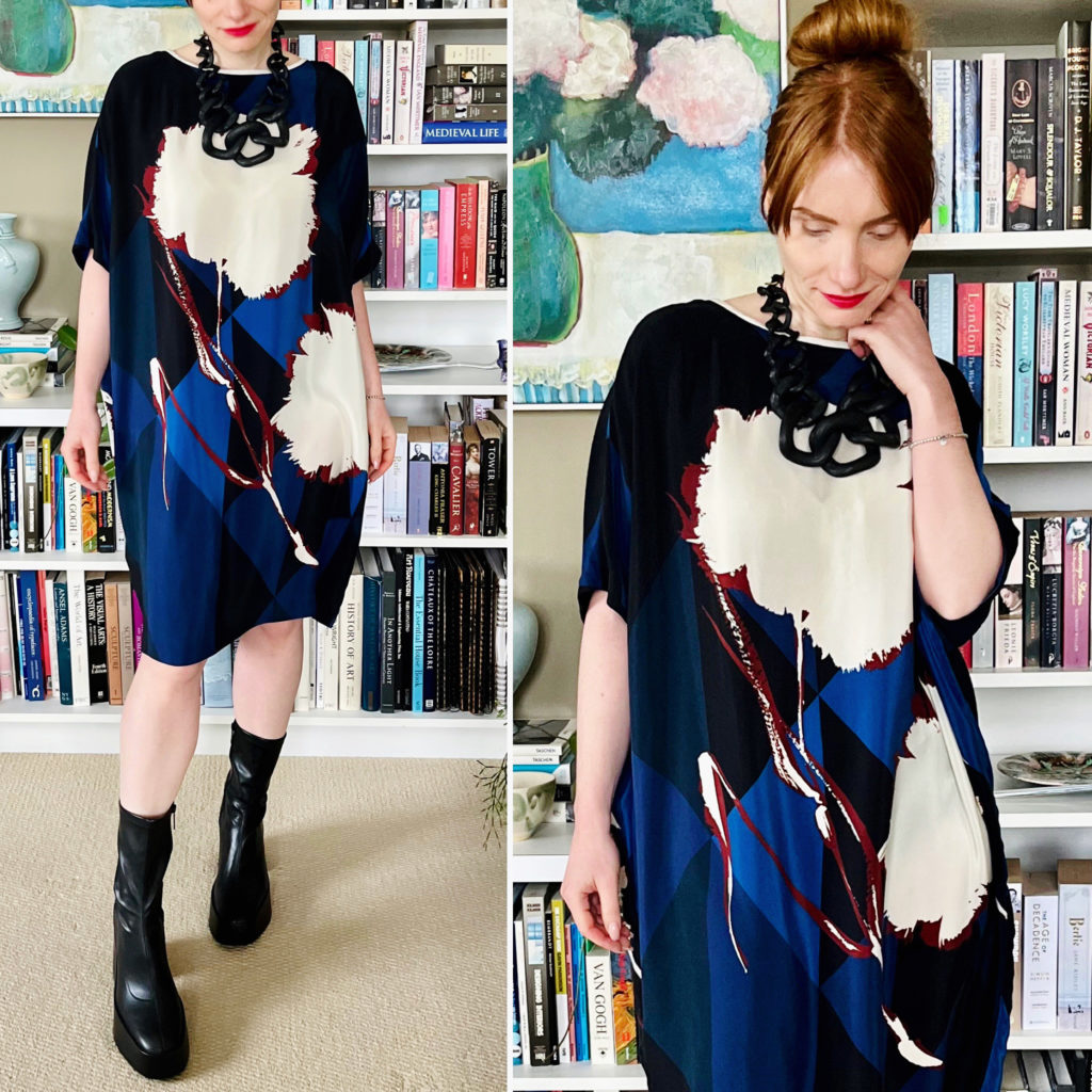
Details: Marni top (Poshmark), Ralph Lauren skirt (thrifted), Rafael Alfandary necklace (eBay)

Thoughts: I can’t believe that I’ve never paired this top and skirt before! The colours are nicely complementary, and the busy-ness of the blouse print actually makes it easy to accommodate another pattern. I wanted to create a “crop top” effect so I tied the blouse at the waist, which completely changed its silhouette.

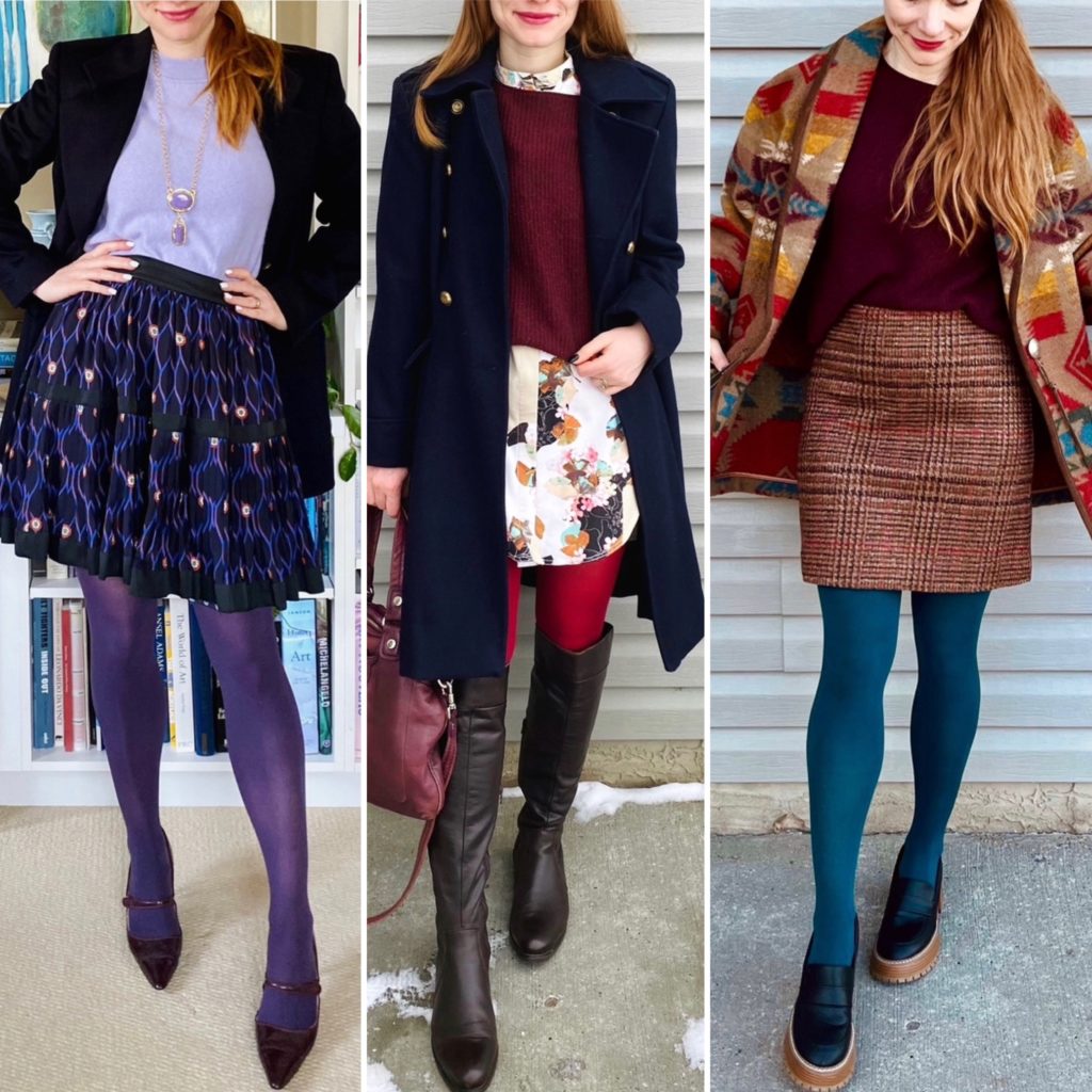
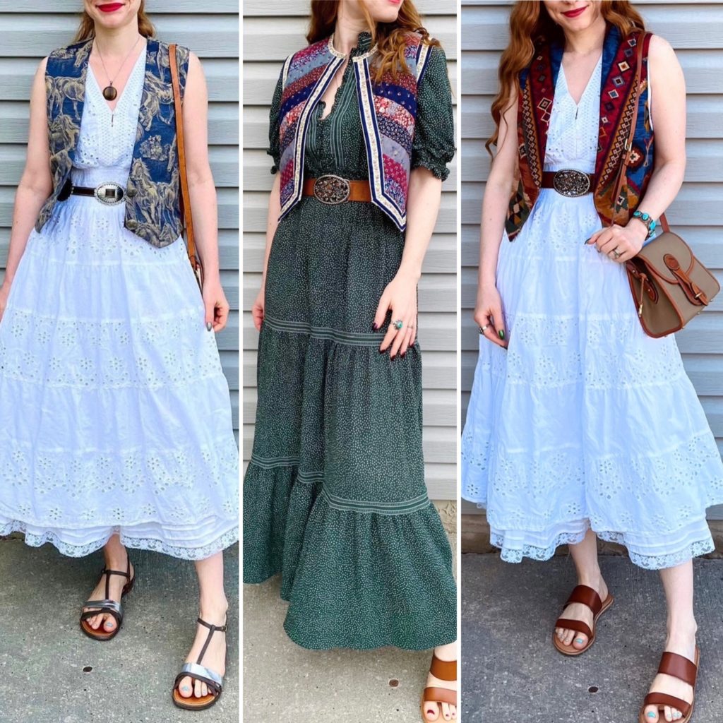
Details: C&C dress, Roughrider vest, Esprit belt (all thrifted), Old Navy shoes, Dooney bag (both Poshmark)

Thoughts: This is *not* my dream white dress, but it’s the closest I’ve been able to thrift so far. Its main downside is that it’s not as voluminous and twirly as I would like. But it is fairly long, and opaque, and has nice eyelet detailing. So I’m pretty happy with it. This outfit is one of my fave summer formulas — dress + vest + sandals. So easy, breezy, and fun.

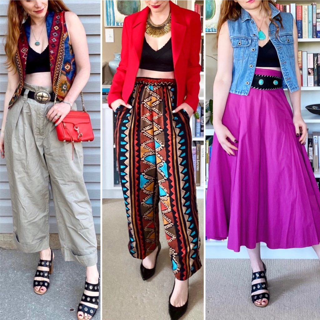
Details: Lee x H&M top, Suttles & Seawinds vest, Esprit belt, H&M pants (all thrifted), Old Navy shoes (Poshmark), Prairie Trail Goods tote

Thoughts: Speaking of favourite outfit formulas, here is another one: crop top + vest + high waisted pats. These pants, specifically, are my go-to piece. I love the paperbag waist detail, and they are loose and comfortable to wear. The colour is a nice neutral that allows for endless remix possibilities. And the wide belt loops means that I can sub a good number of different belts, depending on the vibe and colour palette I’m using. Yay for versatile clothing!

Revisiting Colour Analysis

I don’t normally look at my Explore page on Instagram, but I accidentally clicked on the wrong icon recently and I was pleasantly surprised. I guess that, after all this time, the algorithm is finally starting to understand me a little better. I’m not sure if I should be happy or terrified. At least now my Explore page is filled mostly with things I am actually interested in: fun, colourful clothes, colourful art, and (mostly) colourful interior design. It’s not something I plan to, ahem, explore too much because at the end of the day, that feed still only has one purpose which is to make me what to buy things and I am not interested in that. But it’s nice to know that if someone were to somehow get a peek at it, they wouldn’t get the entirely wrong idea about my interests. It would be horrifying if people thought I was one of those Sad Beige Life folk. [I’m being sarcastic but only a little bit.]

But that’s neither here nor there. One of the things that caught my eye when I looked at my Explore page was a TikTok from some young person about colour analysis. This is a thing that has been around forrrrever but trust that Gen Z will find a way to make it easier to understand. I have struggled, on and off (mostly off), for years to figure out what my “season” is and, 30 seconds into this TikTok, I finally got it. I mean, it’s a bittersweet victory and all, seeing as how I’m now old enough to not care about wearing “flattering” colours or whatever, but it is a victory nonetheless.

Actually, my biggest takeaway is that, in recent years, I have been doing most of the “right” things (per my season) without realizing it. And, full confession mode: it did lead me to do a teeny tiny edit closet which, between you and me, was overdue anyway.

But let’s go back to the beginning.

It turns out that I am a Spring. A Bright (or Clear) Spring to be precise. The colour palette is bright, vibrant, but cooler/less warm than other seasons (except Winter).

Looking at these colours, I am immediately, like, “YES!!” which makes it all the more confusing that I struggled so much in the past to figure out my season. I think it’s because a lot of guides are married to the idea that red hair = warm undertones = Autumn. But not all redheads are the same, duh. As a green-eyed redhead with parchment colour skin that leans rosy not peachy, super warm colours are not my bag. Ironically, one description of Bright Spring I found online mentioned how “[y]ou’ve probably had great difficulty finding your season because no one looks at you and thinks ‘Spring’.” You can say that again!

Here are some of the styling tips given for Bright Spring which resonate with me and actually align with what I’ve discovered (on my own through trial and error) to work for me.

“Since Bright Spring flows from Winter, black in included in the palette. But the best versions of black for Bright Spring are a slightly yellowish charcoal and a slightly greenish black. These are warmer and more suitable dark neutrals than the cool blue-black of Winter.”

I have definitely noticed that some shades of black work better for me than others, and this is something I’m going to pay more attention to going forward.

“[B]lack on its own is not flattering on a Bright Spring since you need vibrant colours to lift your appearance. It’s better to mix it with some of the other warmer, more saturated colours on the palette.”

I love incorporating a touch of black into an outfit with strong, saturated colour. Especially with the colour positioned closer to my face than the black – somehow, those outfits really “pop” for me.

“In general, always aim for at least one bright colour in your outfit. Avoid neutrals-only combinations, monochromatic looks, and low contrast combinations. These will diminish your naturally vibrant colouring.”

I feel SEEN. No beige outfits! I still love monochromatic looks, but I prefer either black with white – super high contrast which works for Bright Spring – or one bold colour (or colour family) head to toe.

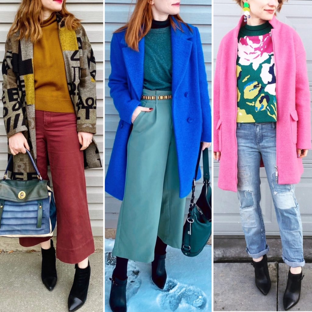
“Don’t be afraid to combine unlike colours – particularly those sitting opposite each other on the colour wheel, such as pink and green. The more unusual the combination, the more striking.”

Don’t. Need. To. Tell. Me. Twice.

Overall, figuring out my season wasn’t a game changer but it did inspire a few tweaks. It confirmed that the colours I’ve been gravitating towards lately – like aqua, turquoise, magenta, bright green – are good choices for me. Ditto for bold colour combinations. It also helped me with a small closet edit; I decided to prune a handful of items in shades which, while lovely, are too muted for me. They were pieces I didn’t reach for a lot (and now I have an inkling of why) and just needed that extra push to let go.

As it happens, over the last few years, my wardrobe has naturally (instinctively?) evolved towards a Bright Spring palette so nothing much will change now that I have a label to hang on to it. I am not planning to take colour swatches with me to the thrift store when I shop, but I will certainly keep the high level ideas – bright colours, high contrast, warm black – in mind.

If you’re wondering about that TikTok that helped me figure out my season … I’m sorry. I didn’t save it and it’s long gone from my Explore page. For what it’s worth, the question that single-handedly helped me the most was the one about the colour of the veins on my arm. I could never quite figure out before if I was warm- or cool-undertoned. (I think my skin tone is actually relatively neutral, which is true for Bright Springs.) The question was something to the effect that if your veins appear green or greenish-blue, you’re warm toned; if they appear blue or purplish, you’re cool toned. The latter is true for me, and figuring this out tipped the balance away from Autumn.

So good luck if you decide to try to figure out your own season. Definitely don’t bother with the Buzzfeed test though. It told me I am a … wait for it … Autumn. Siiiiiiiiigh.

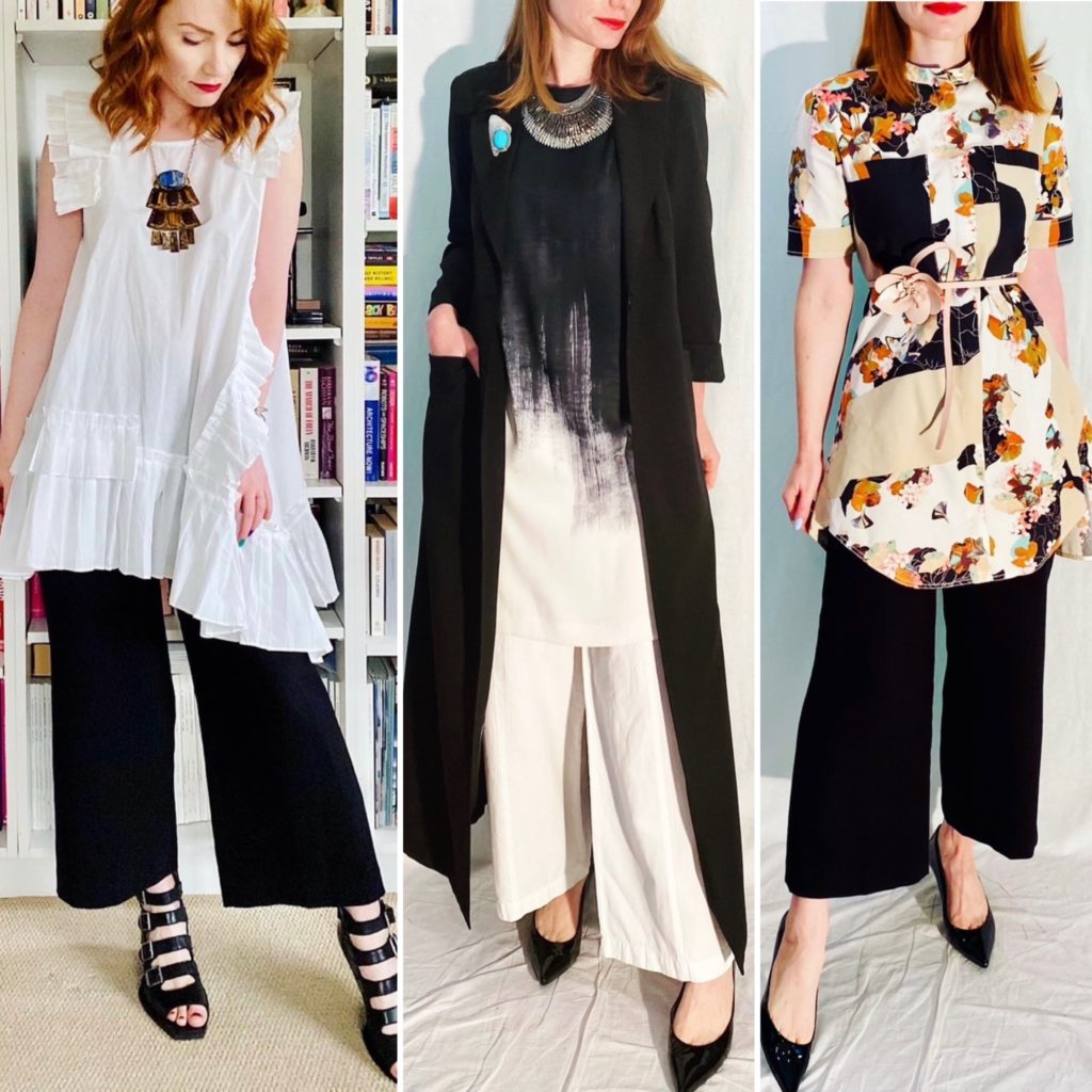
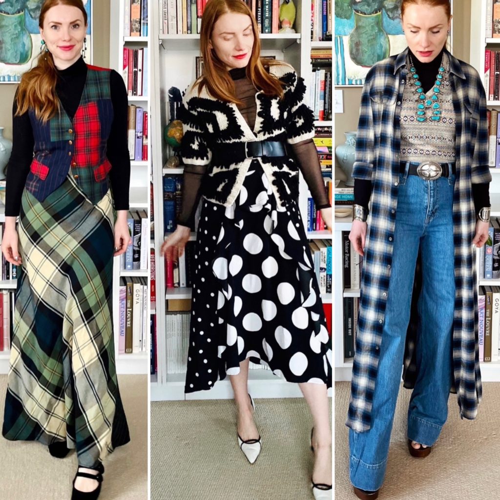
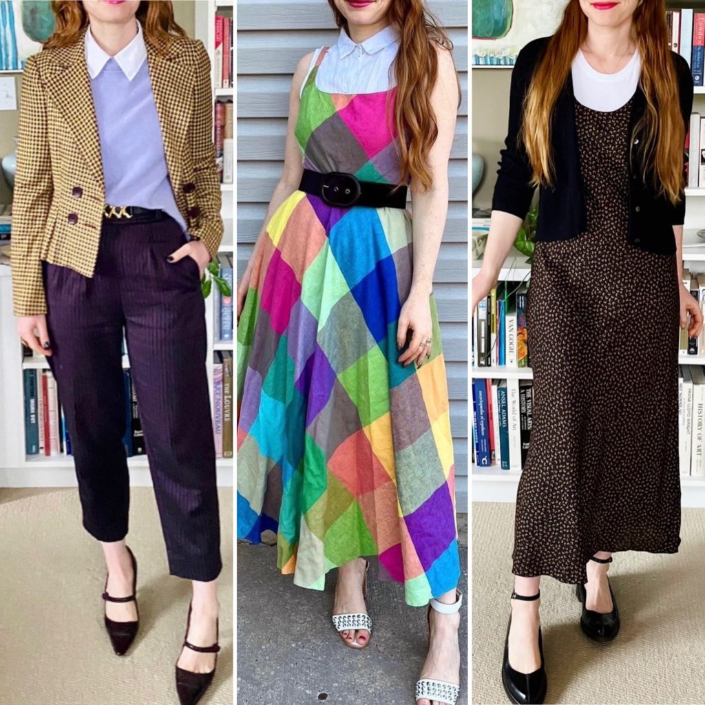
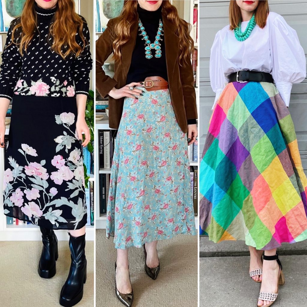
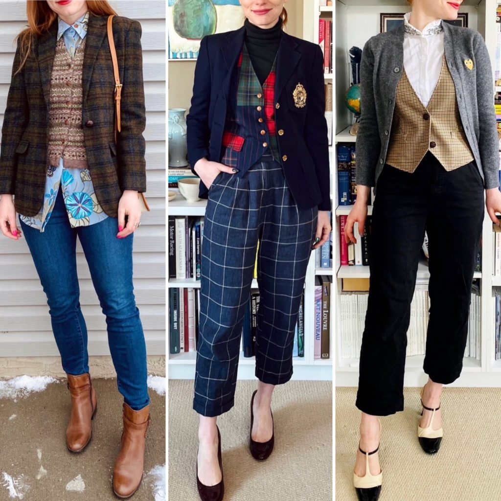
What I Wore: June 2023, part one

Details: Zara shirt (thrifted), vintage vest (thrifted), Atlantic Pacific x Halogen skirt (Poshmark)

Thoughts: This outfit was a happy accident. My original plan was to try wrap tucking this shirt, which is currently my favourite way to wear button up shirts. What is that, you ask? It’s basically wrapping the shirt fronts (unbuttoned) the same way you would a wrap dress, then tucking in the tails into your pants or skirt. This shirt is oversized — which is a must for wrap tucking — but not enough. Time for Plan B. I was playing around with it, and became intrigued with the idea of layering it over a crop top and leaving it open, then adding a vest on top. Anyway, long story short, this outfit was born. I love the way it plays with proportions and volume. It’s not my usual outfit formula/silhoutte, but it’s something I’d like to try again.

Details: AllSaints top (thrifted), Clover Canyon crop top (Poshmark), Greta Constantine x Danier belt (thrifted), Issey Miyake skirt (thrifted)

Thoughts: Speaking of creative layering, I was very pleased with myself for coming up with this shirt + crop top combo; these 2 pieces go together so well. To cover the gap between the bottom of the crop top and the skirt waistband, I added a wide belt; I didn’t want the white shirt to show, visually cutting up the vertical line. This way, the cropped top/high waist bottom silhouette is maintained.

Details: Eddie Bauer sweater, Topshop pants, J. Crew shoes (all secondhand)

Thoughts: I’m kind of obsessed with this sweater, which I’m pretty sure is from the 90s. It’s laidback prep with some nautical vibes. I love that it’s cotton; cotton sweaters are the best. Never itchy, not too sweaty in warm weather, nice and toasty in cold weather.

Details: Topshop dress, Elizabeth & James vest (both thrifted), Anna Paola bag (consignment), Zara shoes (retail)

Thoughts: Every year, I “rediscover” this long vest and remember how versatile it is. Can you believe I’ve had it for 6 years? Time flies. Anyway, it’s a good neutral pairing for this busy pattern dress, and the length works well too, elongating the vertical line. The dress fabric is, unfortunately, crappy polyester so it helps to have an extra layer because if there’s even a hint of a breeze in the air, this dress offers zero protection.

Details: For Cynthia top (retail), J. Crew vest (thrifted), Urban Outfitters pants (thrifted)

Thoughts: I’ve been wanting to experiment with ties, and finally found an outfit that was apropos. Nothing too complicated, but it feels wearable for me as opposed to costume-y, which is how I tend to feel whenever I try to wear ties.

Details: Ralph Lauren top, Mexx skirt, BR belt, Ash sneakers (all thrifted), Ralph Lauren scarf (gift)

Thoughts: Leaned into the Papa Ralph vibe ALL the way with this one. The top is a Polo team shirt from 1996, which is kind of neat. I was going to wear it with my khaki pants, but decided to switch it up and go with a skirt. I could have sworn I’d seen something similar to this in an RL runway collection, but now I can’t find it. I guess I’ll just take the credit for being original. LOL!