Month: February 2019

Then and Now

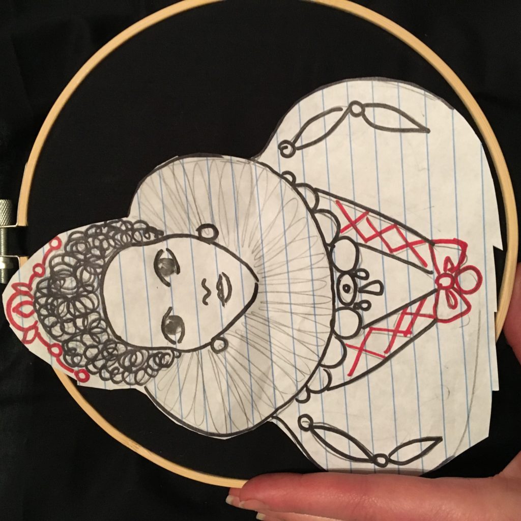
Going through old outfit photos is a fun and occasionally instructive exercise. Sometimes it helps me “re-discover” an older piece and see its possibilities anew; sometimes it inspires me to revisit and reinterpret an old outfit formula. I want to talk about the latter today.

Those of you who have been reading here for a while will know that my style has changed a lot over the years, especially since 2015 or so. At the end of the day, though, like most people with a “regular” job/ life, there is only so much sartorial exploration I can do. Most of my outfits are variations of the same half dozen or so basic/common “themes”. What changes over time are the component elements. I thought it would be a fun exercise to do some side-by-side comparisons to illustrate this point.

DE184362-3F66-44B7-B53C-5616FB81B4B6

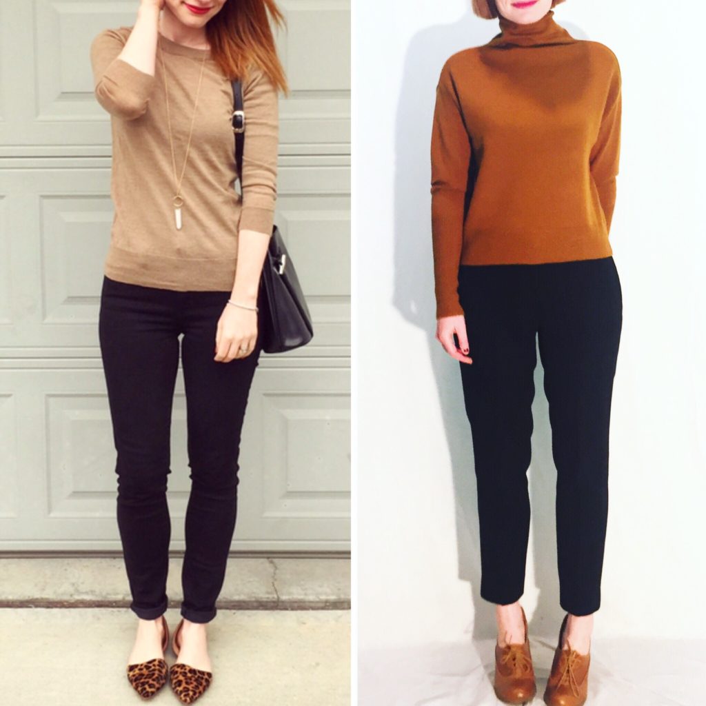
[Photo on the left is 2015; right is late 2018]

Now, in this case, the 2015 photo is a bit a-typical of my style at the time, which leaned more to the maximalist side. I remember this outfit being a conscious effort on my part to go for a more minimalist look. Even so, there are details that are very “2015 Adina”. The pants are skinny jegging type. Compare to 2018; black pants are still my go-to, but the cut is slightly different – still slim, but not skinny, and with a bit of drape to it.

The sweater is similar – still a slim fit, but with more volume to it, and most importantly, a mock turtleneck. I love me a good turtleneck.

And the shoes! 2015 Adina loved a statement shoe. If the shoes were not a bright colour, they were leopard print. I rarely wore black shoes, and on those rare occasions only with an especially brightly coloured/patterned outfit. My current choice is much more likely to be black or some similar neutral (or a subtle metallic). I have sworn off leopard print (anything with calf hair actually, the shedding drives me nuts). And I love oxford-style shoes — not a thing that was on my radar back in 2015.

CA3B97E6-0F5E-43E2-8C90-B7E755B0E6D2

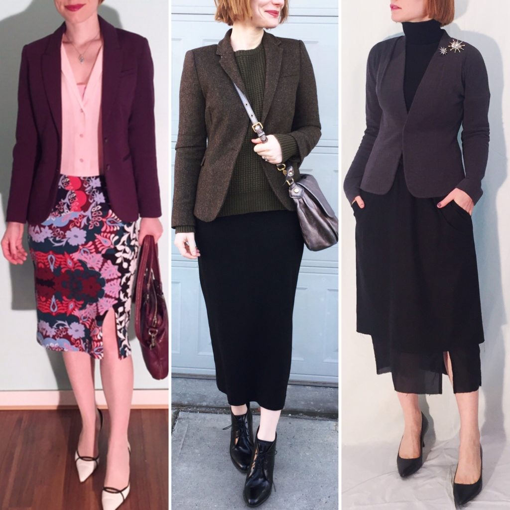
[Pic on the left is 2016; middle and right are 2018]

The 2016 photo here is very representative of my previous style, mixing non-neutral colours and prints, and pairing a pencil skirt and blazer. Man, I used to love my pencil skirts! Nothing wrong with them, of course, but I now prefer the midi/maxi skirt instead. The two current photos are good representations of my current style influences. The middle one has a menswear-inspired vibe (the Adventurer type), which I love to incorporate into my current outfits – a contrast to the definitely more “femme” vibe of the 2016 outfit. The photo on the right fits more with my Prince/Artist personas – the clothes have interesting lines, with a minimalist aesthetic. Above all, a darker, more neutral-heavy palette.

00F2EAFC-3D19-4B56-9E4C-20EBF6E9E0C7

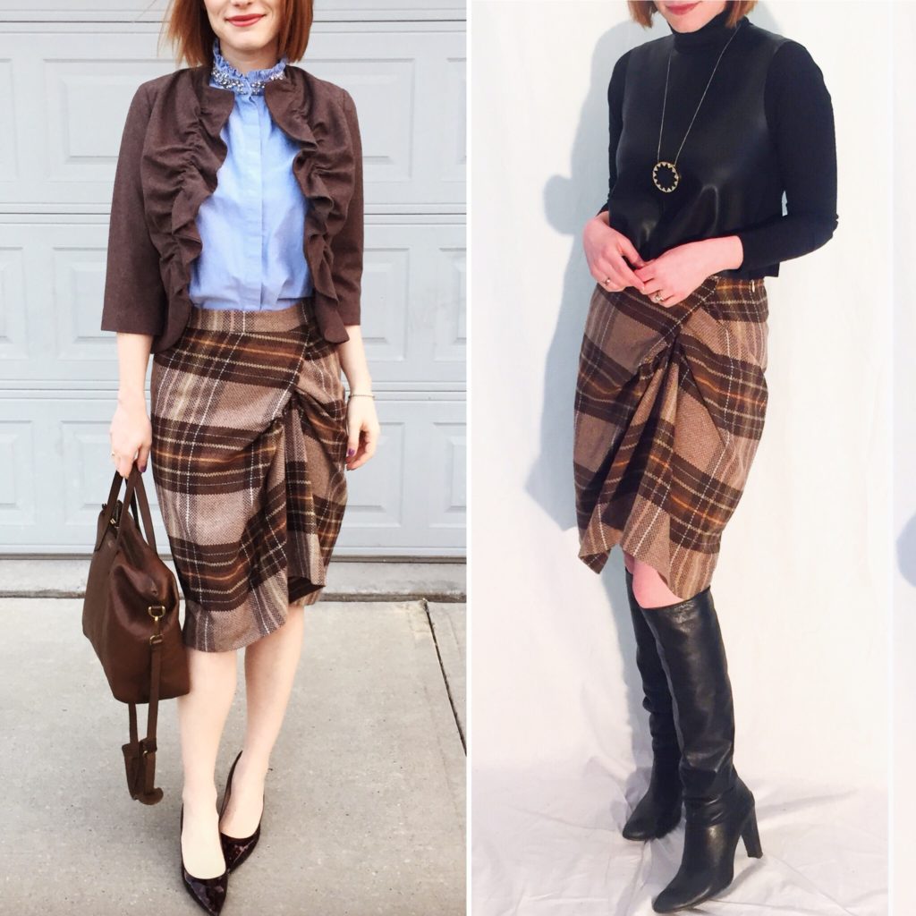
Here are two outfits featuring the same skirt, one from 2017 and one from late 2018. Again, this illustrates my move away from the more “femme” side of the spectrum, to something which, while still more feminine than androgynous, is a lot less “cute” and more goth-inspired.

7CC0F886-9E4E-4238-AF50-9FDACAFB54D3

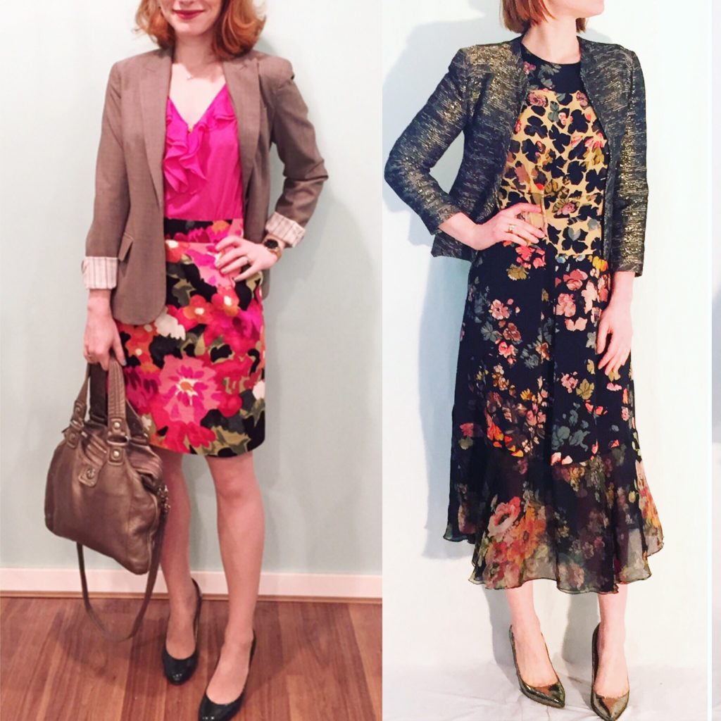
Let’s talk about florals: 2015 versus 2019 edition. Is “sophisticated florals” a thing? Because I feel like that’s one way to describe my current focus. I still appreciate the pattern on the left (the dress was sold a while ago), but it’s not something I feel drawn to actually wear. My challenge these days is to make the right call when it comes to florals; I love them all, but some I prefer to simply look at, rather than wear.

2D9DD8FF-DB2A-41C9-B56B-C5A9A689C1D7

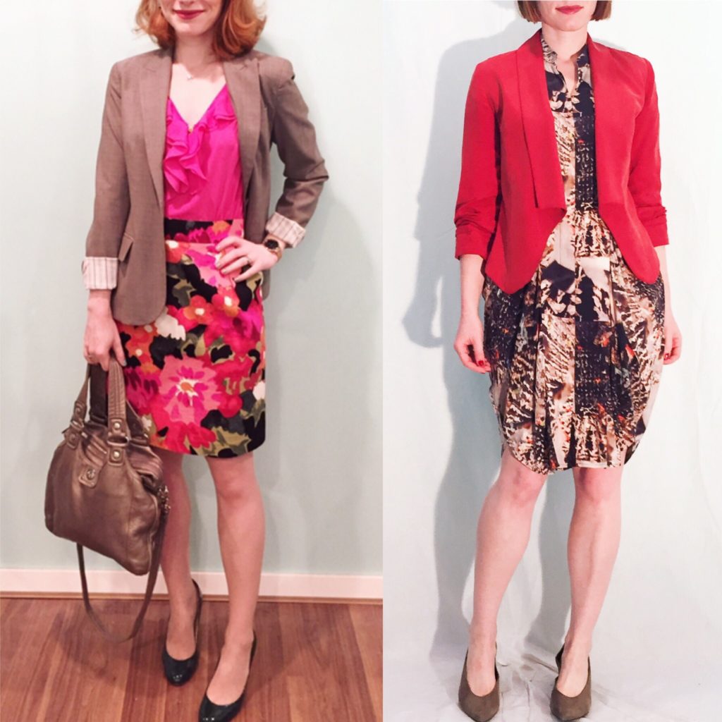
I’m using the same 2015 outfit as above as an example of another common combination: dress + blazer. I used to wear it all the time, and still do – but, again, the pieces are different. I am more likely to choose a less traditional style of blazer, for one thing. I like blazers with interesting details (like contrast linings, embellishments or interesting textures) precisely because my wardrobe is much more neutral-heavy than before. Often, now, my blazers are the statement item, whereas before they were more likely to be supporting players.

Secondly, look at the silhouette of the 2 dresses. One is a sheath-style dress, which was very much my go-to style for years (along with pencil skirts). The Maria Cornejo dress on the right has a much more unusual shape to it, with a cool draping effect along the sides/hips, and an interesting abstract pattern. It totally speaks to my Artist persona.

Lastly, it’s hard to tell, but the shoes on the left are a hunter green; contrast that with the shoes on the right, a neutral taupe.

That’s it for this session of “then this, now that”. Let me know if you would be interested in seeing more!

I Did A Thing, Vol. 16

I loved worked on my mixed-media Frida portrait so much that I decided to do a small series of similar hoop projects. Choosing my next subject was something of an art in itself. Most importantly, it had to be someone sufficiently iconic to be recognizable even in a (much simplified) cartoon form. Ideally, the subject would also allow me to incorporate beading into the project. One of the first ideas that came to mind was Elizabeth I, but it immediately posed a new challenge: creating my own pattern from scratch.

I usually start my projects by looking for inspiration online; I look for pictures of existing hoop art, and either recreate the same pattern (or as close an approximation as I can manage by freehand drawing), or put together a new pattern by amalgamating details from several existing ones. I always try to put my own spin on the projects I do, but I don’t consider them to be fully original because I rely a lot on other people’s patterns to get me started. In this case, I couldn’t find anything that had the specific look I was hoping for – something similar to my Frida portrait (anime-inspired but not leaning too kawaii).

So, I went back to the drawing board (literally and figuratively) with Elizabeth’s formal (painted) portraits. Luckily, these were pretty stylized to be begin with, so rendering a cartoon version of her face was not as difficult as I had anticipated. In her latter years, Elizabeth was famous for her mask-like visage (courtesy of heavy-duty lead-based cosmetics), and habitually wore a wig. The clothing and accessories … that was another matter. I don’t have the inclination to research, or the skill to reproduce a historically accurate costume, so the challenge was to create something fairly basic that could still convey the right vibe, so to speak. This was my sketch:

87ABEEB8-5A96-4ED7-A160-3A814C697EB4

Now, as you can see from the photo above, I made an early, fateful choice: I decided to use black muslin (rather than my usual cream) for the “backdrop” of this portrait. I think my rationale had something to do with the fact that most portraits of Elizabeth have a fairly dark background (the better to allow her to stand out, presumably); I also thought it would help the ruff collar to stand out better. Which was all fine and good … except that (i) I had never worked on black cloth before, and (ii) it turns out that working on black cloth is a pain in the you-know-what.

First things first, I had no way of getting a decent copy of my template onto the cloth. At the time, I had no lightbox (I’ve since acquired a cheapie version on Amazon, stay tuned for more) to help me with copying; to be honest, given that the cloth was opaque, I’m not sure how much this would have helped in any case. Also, I had no white fabric pencil/marker. I borrowed a regular white pencil from my kids’ arts box, but the best that I could do with it was make a very rough outline of the silhouette. So, I basically had to wing the whole design.

I started by tracing the face onto a piece of ivory felt, and creating the cut-out. Before attaching it to the black canvas, I embroidered the eyes, nose and mouth. Then, I centered the head cut-out roughly where I thought it would fit (based on my silhouette outline) and sewed it on. From that point, I built up the rest of the design, piece by piece. Next was the hair (French dots, always fun!) and tiara. The latter consisted of some loose crystal beads, a piece of an old thrifted brooch, and metallic gold-tone thread. I think I’ve said this before, but metallic thread is the WORST. I passionately hate it, but it looks so damn good at the end, sigh.

After the head was complete, I tackled the ruff next. This was also a lot of fun to do, even though it took a lot of white floss to complete. My husband, ever the art critic, suggested that I put in some light grey “ruffles” for added depth. He may have had a point but I was, like, “nah” – partially because I’m lazy, and partially because I liked how the basic ruff had come out and didn’t want to take the risk of accidentally messing it up by trying to be extra fancy. Especially since things were about to get fancy AF with the bodice.

Here, I went all out with my beading. This included loose beads I already had, pieces from an old vintage necklace that I broke apart, and faux pearls from a necklace I thrifted specifically to re-use for this project (and others). [Side note: I’ve recently realized that it’s much cheaper to recycle beads and other bits from jewelry I find at thrift stores than to buy loose beads at retail. Not sure why it took me so long to figure this out.] I also used gold thread for that extra luxe touch.

It was all starting to come together nicely, but there was one last detail left to figure out: the sleeves. One of the elements I really like in costumes from the 16th century are the slashed sleeves; I knew I wanted to recreate that somehow in my portrait, but I was originally stumped on the mechanics of it. My first thought was to leave the sleeves black and simply embroider on the “slash” and the peekaboo contrast fabric (white); but it seemed too simple and blah. My next idea was inspired by the faux pearl necklace I mentioned earlier. I did not have the foresight to take a photo of it before taking it apart, but it looked something like this:

Pic

It had 3 white flowers, with petals made from some kind of chiffon. It struck me that the material had potential as a faux chemise – it was the right colour, and had enough volume/stiffness to it that it would stand out nicely through the “sleeve” cutout. For the sleeve itself, I decided to go with felt over fabric; I wanted something easy to cut, with a good weight/thickness to it, and which didn’t require hemming. The only felt I had which was a remotely suitable colour was dark green (everything else was far too bright and, well, “modern-looking” for lack of a better word); I would have preferred burgundy to match the bow I had already embroidered on the bodice, but such is life. I sketched out the rough position of the sleeves on the muslin canvas, then cut the felt to match. Once I knew (roughly) where the cutouts would go, I attached the bits of chiffon scavenged from the pearl necklace. This is what it looked like:

DB9AFD94-C48A-41EB-AB2E-03C34B0B32D3

The next thing was trimming out the sleeves before attaching them. I know I said that I didn’t want to bother with hemming, but I couldn’t help myself. More gold thread was involved here, and frankly, the results don’t bear too close of an inspection; but from a distance, they’re passable. After sewing on the sleeves, I added some more pearls and some finishing touches to the shoulders.

And voila:

539E6443-4CAF-4434-8B69-44619E6EC51B

And some closeup:

B75C6D29-1B14-4E98-BED0-8C2D897A6929