Month: April 2020

I Did A Thing: Volume 31

As there was some mild interest expressed in regards to how I create my mixed media pieces, today I am going to write a little about the process. I hasten to add that I am by no means an expert – really when it comes to anything, including but also especially art – and my goal here is not to instruct as much as it is to hopefully inspire you to experiment with different ways of expressing your creativity. The idea of mixing decoupage and acrylic painting came to me out of the blue; I have no idea if it’s a thing that people do (probably? Maybe? If they don’t, should I be worried?) but it’s a thing that I’m really enjoying at the moment. And enjoyment, at the moment, is a precious commodity. It’s easy to fall into the trap of denigrating the things we enjoy as being frivolous or silly in challenging times, but we shouldn’t. If Animal Crossing brings you joy, Animal Crossing is a Good Thing. Ditto for sticking paper cut-outs onto canvas and slapping on some paint.

Speaking of which …

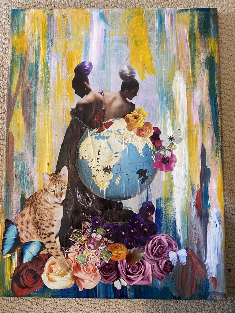
Let’s walk through the process of making The World.

To do any sort of decoupage, you will need as much “raw material” – preferably in the form of fashion or other glossy magazines – as possible. “Mining” for useful images is somewhat time-intensive but not unpleasant; I flip through my source material looking for mainly 2 categories of images: (1) ones that catch my eye or are visually arresting in some way; and (2) ones that provide useful “filler” material. Filler material is stuff that can be used to complete a “tableau” – personally, I like flowers, animals, butterflies, and similar items. Filler is useful not only to add variety and colour to a composition, but also because images are often incomplete in magazines; they can be inconveniently cut off, have weird edges, etc. A filler piece can be useful to disguise such imperfections.

Some magazines are better than others for providing useful materials. For the type of work that I like to do, I prefer Vogue and Harper’s Bazaar (especially the UK editions) although I’ve also found material in Elle, Marie Claire, InStyle, and even my old Cosmo magazines from the early 2000s. Don’t judge me. I used to be an inveterate hoarder of old magazines – they’re expensive to buy, why would I just throw them out? – which is a handy thing to be if you’re getting into decoupage. I actually regret doing a serious purge of some of my lesser collections a while back because I bet they would have been useful too. In my experience, you need a lot of magazines to get even a modest amount of useful images. This can be a somewhat expensive hobby. It’s one of the reasons why I can’t wait for thrift stores to re-open, so I can load up on $1 magazines to my heart’s content.

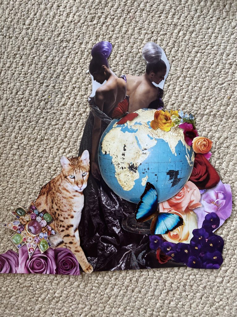
When I source images, I don’t have a particular piece in mind. Once I have collected a good amount of images, then I go back and look through them to see what “connections” I can make. I might have a “theme” in the back of my mind, but I also just look for images that go well together and that create a theme of their own. For The World, I knew I wanted to use a large image of a vintage globe; “on the nose”, yes, but I love globes. I was also drawn to an image of 2 women with fun, ball-like hairdos.

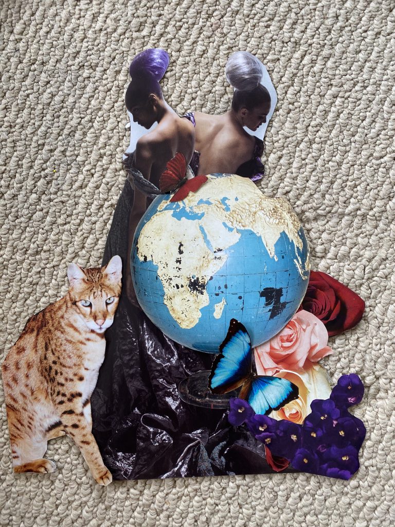
You can see here the importance of “filler”. The globe image had imperfect edges (you can see one of the gouges on the right hand side, I had not covered it yet). There was also a stark straight edge where the dress of the woman on the left ended. It took some time to figure out the composition:

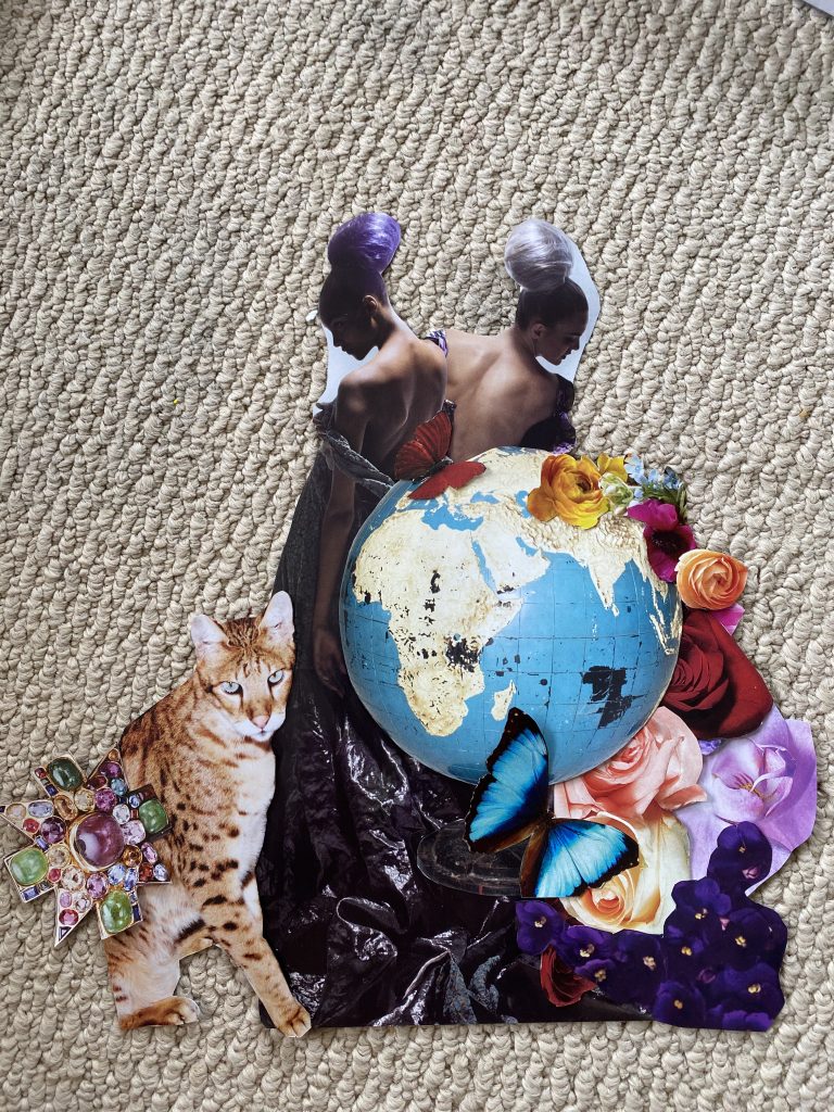
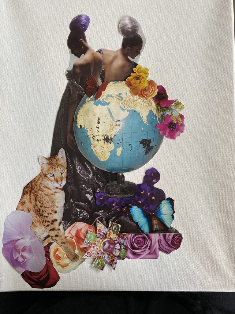
Then I did a rough mock-up of the placement on the canvas.

Once more or less satisfied with the composition, it’s time to get painting.

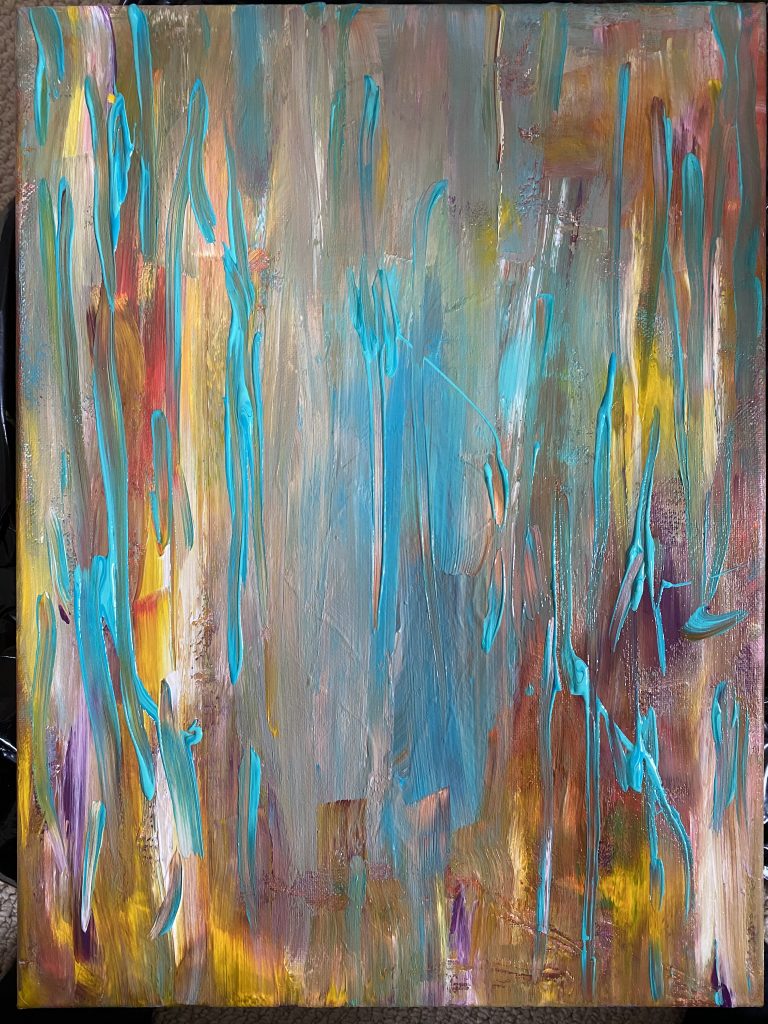
I have always struggled with abstract painting, so working on this series has been an interesting learning process for me. I can’t visualize my abstract paintings. I don’t know if other people can – i.e. if they paint what they see in their mind’s eye – but I can’t. It used to stress me out. Painting without a plan, I call it. I’ve had to learn to just go with it. I pick the colours I think I want to use (and, spoiler alert, these often change as the painting progresses) and start throwing stuff at the canvas. And keep adding until things start to look “right”. The nice thing about acrylic is that you can layer quite a lot of it; there have been times when I completely painted over the “first pass” because I hated it. I used to consider that a failure, but I’ve come to love the depth that layers add to a piece. Sometimes, all you can see of a particular layer is one tiny peek of colour, but it adds something special to the finished piece. The hard part is being patient and waiting for the paint to dry; sometimes I’m too eager to move on to the next layer to build on the piece, but then all that happens is that colours get muddy.

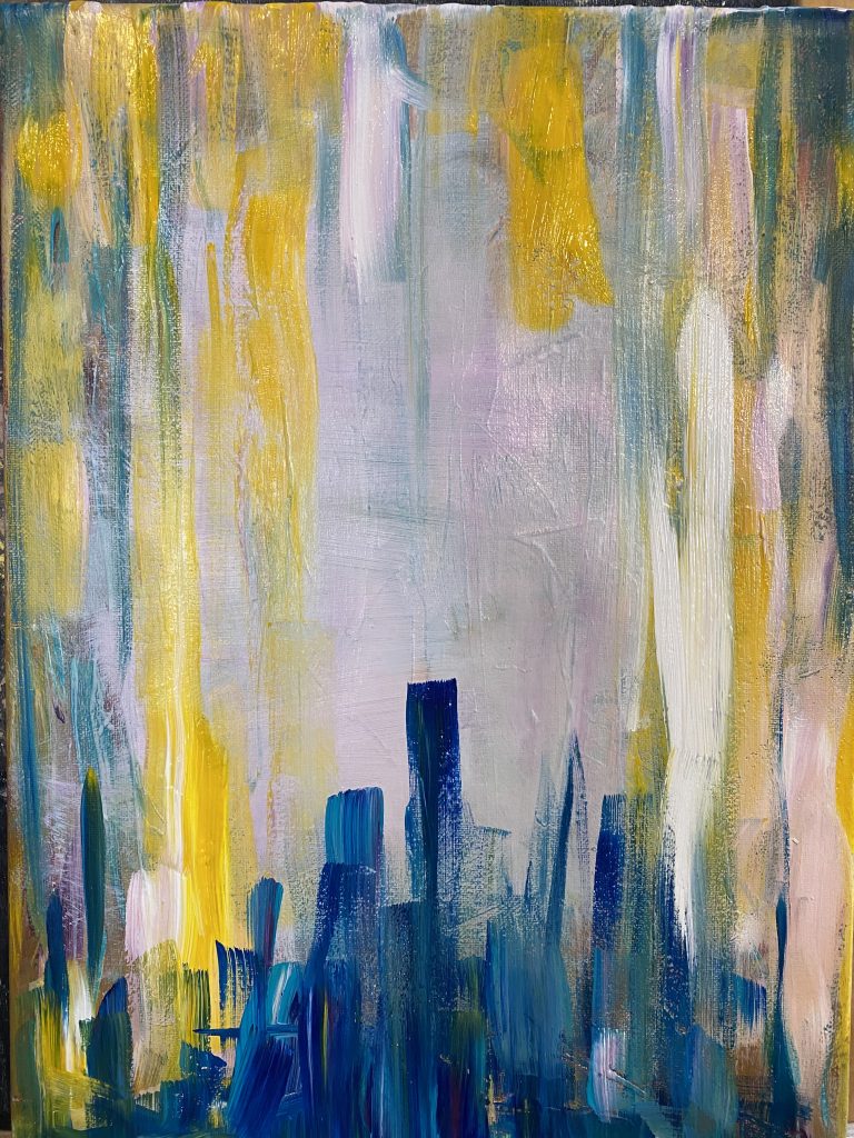
Learning to wait was actually an important part of the process. I leave the piece sitting on my easel for a day or even two, and look at it occasionally. I let it tell me where it needs to go next. Here are a couple of early stages of The World:

Shortly after that second pic is when I added the cut-out images to the painting. The timing of this varies from piece to piece. Sometimes I wait until close to the end, sometimes I add them quite early on because I need to incorporate them more substantially into the painting process. In this case, I also changed the composition slightly at the last minute. Here is how it looked like after being glued:

Then I went back to painting:

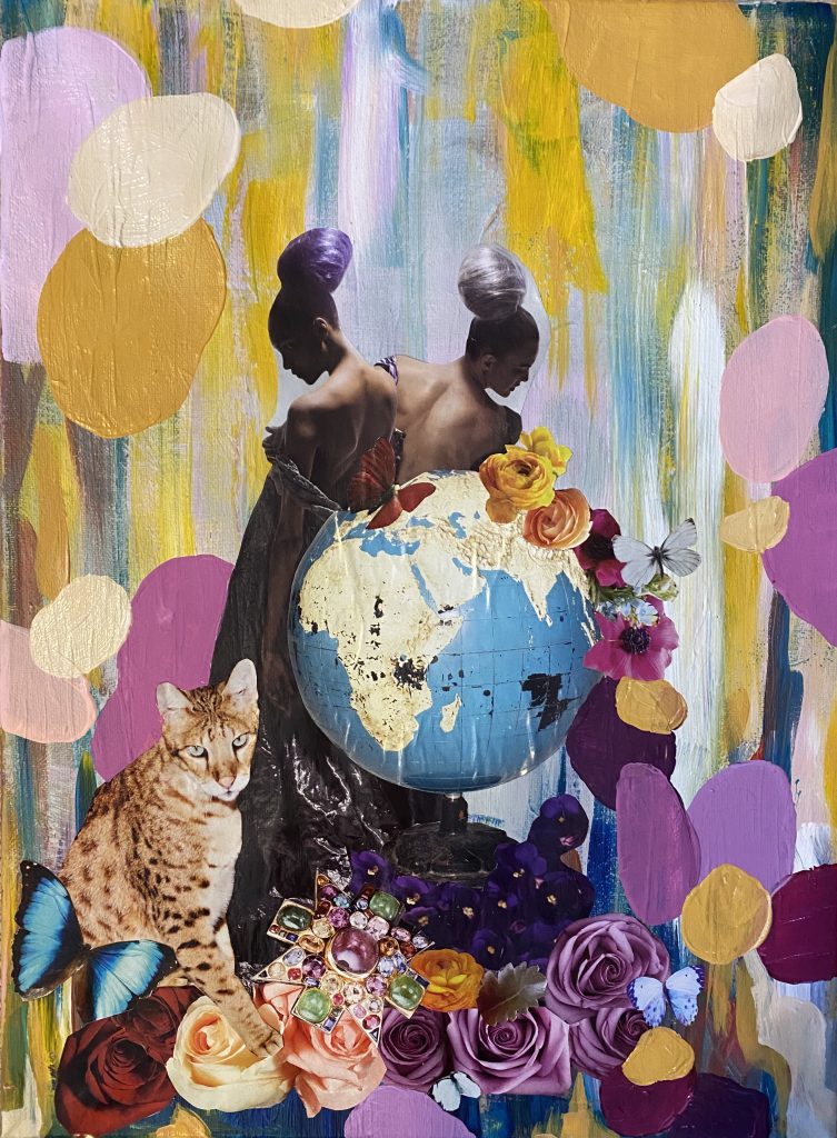
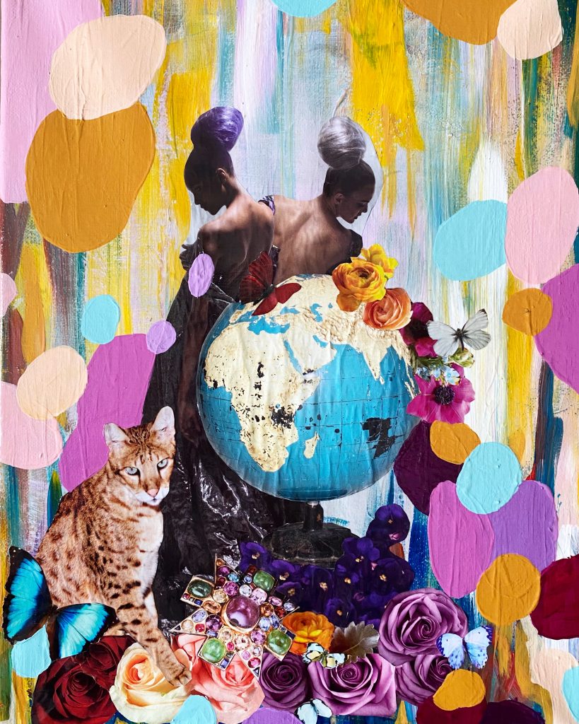
I loved how this was coming together, but it still felt like something was missing. Sometimes, less is more. Sometimes, you gotta go for more. Here is the finished piece again:

I add 2-4 layers of clear gloss varnish to each piece to eliminate some of the contrast between the glossy paper and the painted surface, and also to protect the decoupage. And that’s it.

Happy to chat in the comments!

What I Wore: Sequin Sundays

To keep myself entertained during these trying times, one of the things I started was a feature on my IG account called Sequin Sunday. As the name suggests, every Sunday I put together an outfit featuring a piece of clothing with sequins. It was a nice way to reunite with clothes from my wardrobe that are not getting much wear these days, and exercise some wishful thinking – planning outfits for social occasions that, in the short term at least, don’t exist anymore.

Weekend Brunch


This top is a navy velvet (!) sweatshirt embroidered with iridescent (!) sequins(!) in a floral pattern. It’s a lot and, yet, because of the style it can be dressed down. I mean, you will never blend into the crowd with this top, but worn with casual pants it can read as “casual fancy”. At least in my books … but you guys know that I lean “extra” when it comes to clothes. I loved the way the iridescent colours of the top paired with the marigold yellow of the pants. Dark navy as a grounding neutral is perfect here.

Date Night

Ok, so even at the best of times, my date nights are probably not exciting enough to justify this skirt. Speaking of extra … this is EXTRA AF. I tried to “tone it down” with a very traditional, menswear-cut cashmere sweater. The contrast pleased me greatly. Adding the OTK slouchy boots probably doesn’t help pare back on the extra-ness, but they are undeniably cool. Maybe I just need to gather my courage and just go for it, next time the opportunity comes along.

Dinner Party

I definitely don’t attend dinner parties that are fancy enough for this outfit, but let’s imagine me as a “lady who lunches”. She would wear this outfit SOMEwhere, possibly to a gallery opening or something equally fab. I was originally going to pair this sequin-embroidered wrap jacket with jeans or something super casual (juxtaposition FTW) but I am glad that I leaned all the way into the Ralph-Lauren-80s-safari-look instead. Then again, I probably have been reading too many back issues of Vogue lately.

Black Tie Gala

This is the point where I went ALL IN. This vintage skirt is technically beaded not sequined, but I included it in the line-up anyway. It’s too stunning not to. I wanted to pair with an equally statement piece, so I pulled a Sharon-Stone-at-the-Oscars move (that reference is probably way too old for some of you, sorry) and went with a button-down shirt. But instead of using a men’s shirt, I used a Yohji Yamamoto asymmetrical shirt that I bought from a fellow thrifter on IG (in the Before Times). The construction is out of this world, and you will have to take my word for it, sadly, since I can’t photograph black garments for sh*t. I added my trusty Greta Constantine x Danier belt as a finishing piece, along with some sparkly dangly thrifted earrings. I felt ready for my close-up!

40th Birthday Party

This was not a hypothetical. This was what I had planned to wear this year for my 40th birthday party. I don’t usually throw parties, but I was going to make an exception because, well, milestone. Now, who knows? My birthday is not until August which might as well be 2 years away at the rate life seems to be moving these days. Maybe we will all be partying in the streets come August. But I somehow doubt it. I’m sure I will get to wear this dress at some point – it would be a crying shame otherwise – but probably not as originally planned. So I’m glad that I got the chance to wear it, even for a short while, now.

I Did A Thing, vol. 30: Isolation Creation

I hope this week and new post find you well. I feel like I am stuck in some kind of bizarre Groundhog Day scenario, but the calendar assures me that it’s mid-April. The snow on the ground outside belies that fact but – ahh – springtime in Edmonton is always a confusing time. But let’s talk about something fun instead. One of the main reasons I still have (most of) my wits about me these days is my art. I will never not feel pretentious saying “my art” but I am trying to be better about not trivializing what I make (and its importance to my well-being) simply because it’s not Art-with-a-capital-A; yarn art, in particular, doesn’t get nearly enough respect, in large part I suspect because it’s not something that old white dudes are likely to make. Anywaaaaay. My art.

More so than ever before, I have poured all my spare time into making things. Keeping my hands busy is a huge stress release for me, and being “in the flow” – whether through painting or crafting – is an escape. I am also hoping that some of it will rub off on my kids, i.e. having them see me engaged in creative pursuits (as opposed to glued to my phone for news updates) will make them more likely to do the same. So far, it seems to be working moderately well. Colouring books, paint-by-sticker books, homemade comic books, and playdoh seem to be the front-running favourites. But I digress. Here’s what I’ve been working on.

Faces of the Zodiac series

I’ve talked about this before, but I have only added one more painting to this series: Sagittarius.

I know I say this about all of them, but this might just be my favourite. I am very pleased with how it turned out. I love the shadows on her face, and her eyes in particular. She looks especially nice in chiaroscuro:

That being said, I felt my creative intuition pulling me in a different direction. Enter …

Major Arcana series

I have been wanting to work more with colour again (one of the reasons I went back to embroidery as well, see below) which is probably a psychological response to stress. Colour lifts up my spirits. I started a couple of pieces thinking I would be doing some kind of landscape or abstract picture, and then somehow went off on a wild tangent. I mean, I went from this:

To this:


I haven’t done any decoupage in YEARS. Since the late 2000s, probably, because even then I was a luddite who didn’t understand Pinterest and still made “mood board” notebooks like it was still 1995. Anyway, I liked the “organized chaos” vibe of throwing random fashion magazine cut-outs at an acrylic painting so I went all in. Decided this was perfect for a project I had been wanting to do for a while – a series inspired by the Major Arcana of tarot. The above piece is The Fool.

And this is The High Priestess, one of my favourite cards:


And here is The World:

If anyone is interested in how I make these, let me know and I’ll throw up a quick post.

Embroidery Stuff

As I mentioned above, I have also gone back to embroidery in a major way. Here, too, I wanted to stick with colourful, somewhat abstract designs as well as some of my favourite motifs. Such as my abstract floral doodles:

Inspired by that, I did a series of hoops:

This is the kind of thing that makes me so happy just looking at it.

This had an unexpected “under the sea” vibe – very Ursula the sea witch.

This one ended up reminded me a bit of Klimt’s flowers.

I also went back to another favourite motif: the evil eye.

With rainbows, of course.

Stay safe, friends. Till next time!