Month: February 2017

Tales From The Thrift: Moar Pants

I had good intentions about being VERY discriminating in my thrifting this past month, and I did stick with that. Mostly. But sometimes, life just throws lemons at you and what can you do except make lemonade? Replace “lemons” with “pants” and … well, my analogy breaks down, but my point is that when the thrift store throws premium denim at you, you say thank you very much, and you buy it. Mmmm, lemonade.

Ahem. There was a bunch of other things I saw and didn’t buy. Surprise!

Maeve dress
Maeve dress

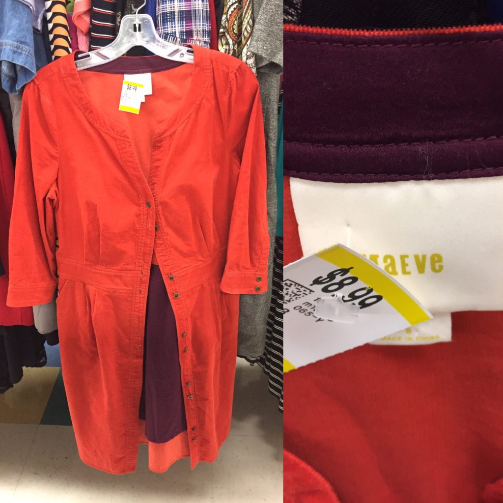
I previously thrifted an olive version of this Maeve dress, but it didn’t work out. Once bitten, twice shy. Also, the orange would definitely not work for me.

Holt Renfrew bucket bag

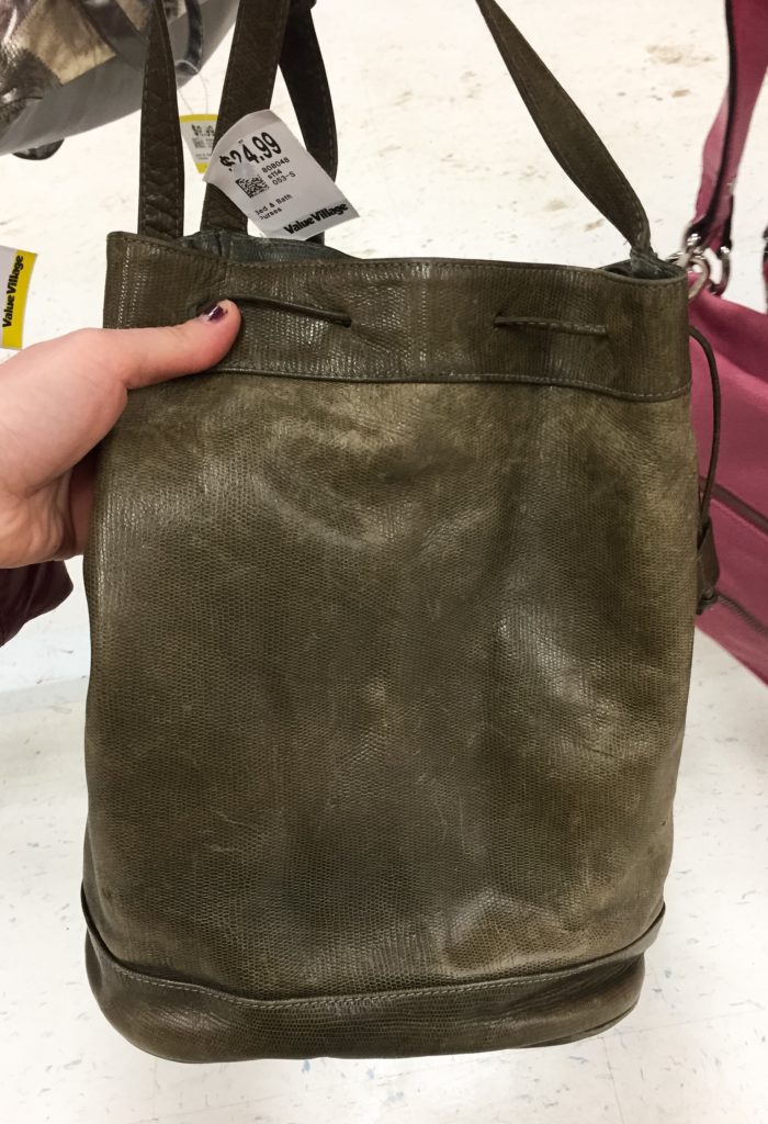
I’ve been low-key looking for a bucket bag for a while now, and I was certainly intrigued by the olive colour of this (vintage?) leather Holt Renfrew number. But the condition was quite poor, and somehow Value Village wanted $25 for it. Pass!

Stuart Weitzman heels

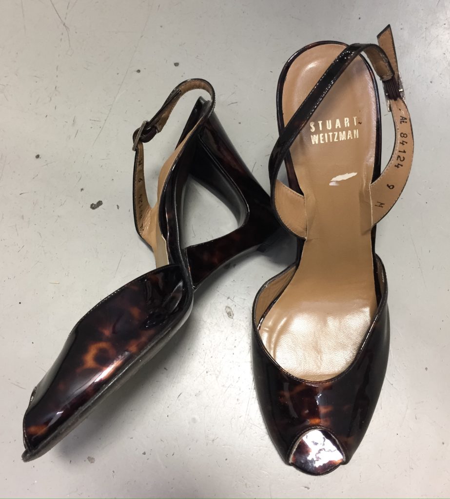
I love Stuart Weitzman’s patent tortoiseshell. Too bad these wedges were a touch too small and had the dreaded peep-toe.

Anthro-brand pants
Anthro-brand pants

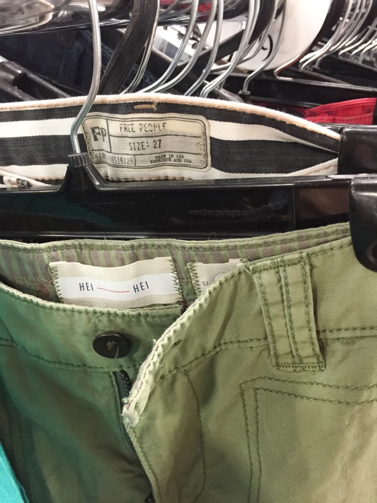
Spotted-not-thrifted a bunch of Anthro-brand pants. The Free People pair would make for an awesome Halloween costume – they were vaguely Beetlejuice-y.

Kate Spade heels
Kate Spade heels

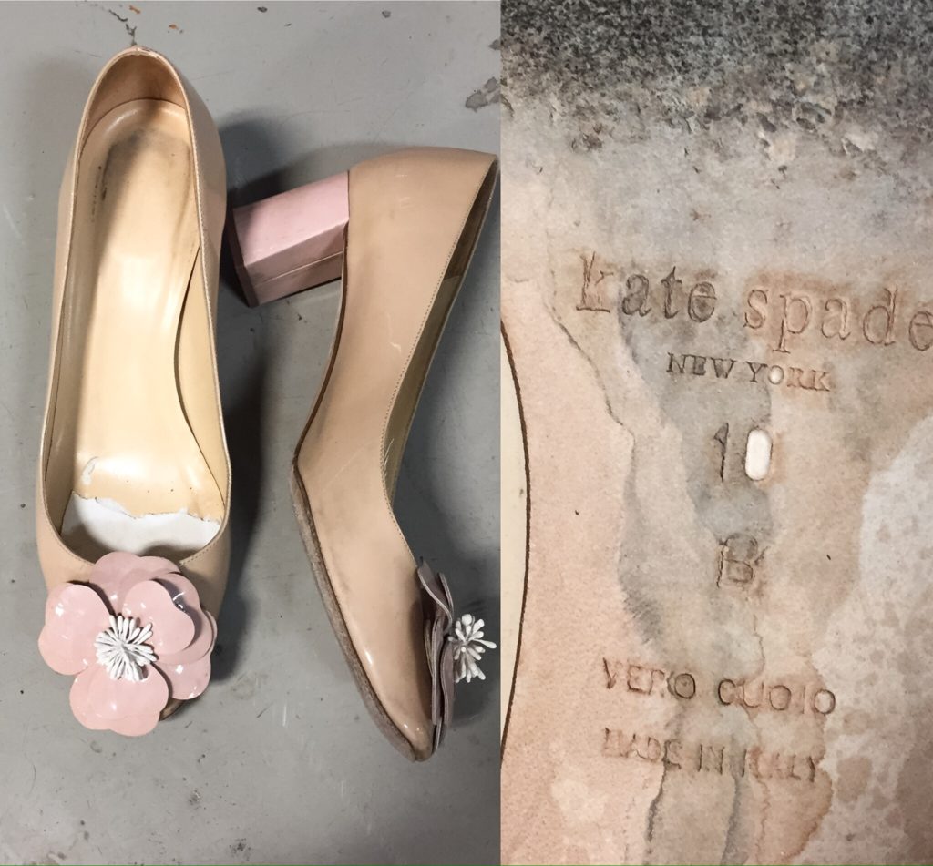
Talk about a blast from the past! These Kate Spade pumps had clearly seen better days, but it goes to show that fashion is ever cyclical; those block heels would fit right in at the moment. The flower perhaps not so much.

Bruno Cuccinelli
fancy Italian jeans

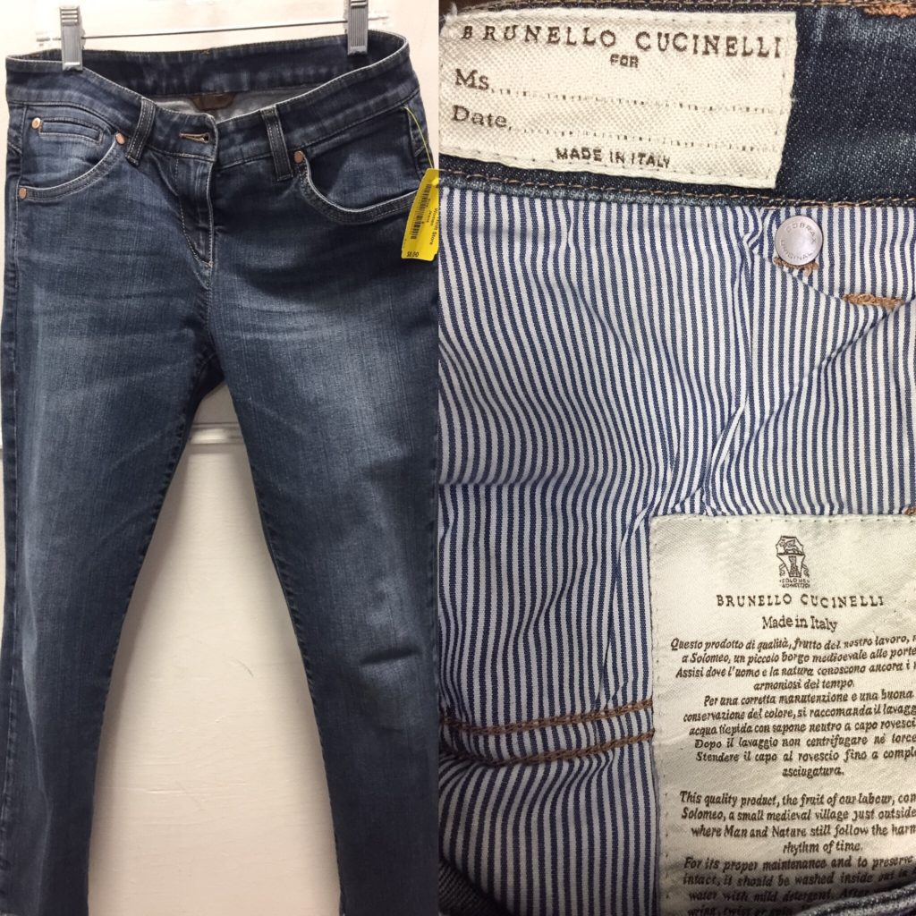
Fancy Italian jeans, with fancy labels. These were marked as a US size 4 … and fit more like a size 0. No vanity sizing for Europeans.

Vince jeans
Vince jeans

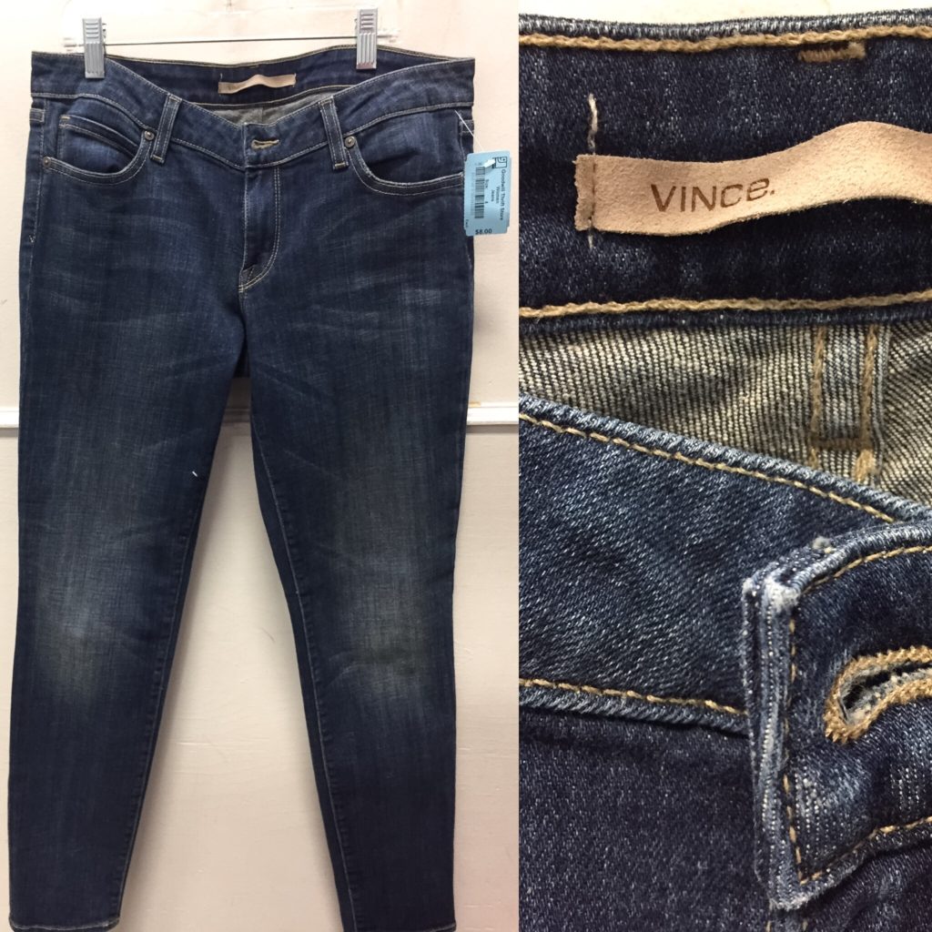
I didn’t know that Vince had branched out into denim. Sadly, this pair was too big otherwise I would have given them a trial run. You can never have too many skinny jeans, right?

J Brand skinnies
J Brand skinnies

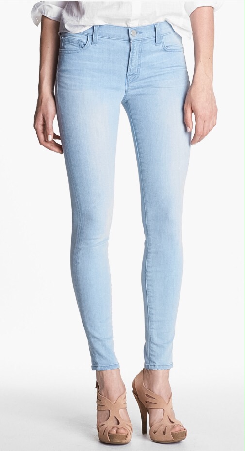
I mean, right? How could I say no to these J Brand’s … especially since they were a gift from my thrifting sistah, Nicole? They filled the “extra light wash skinny jean” hole on my denim spectrum (lighter than my “light wash” AGs, darker than my new “almost white” Rag & Bone pair). Truth is, when you can get premium denim for under $10, exploring the subtleties of different washes kinda makes sense.

J. Crew top
J. Crew top

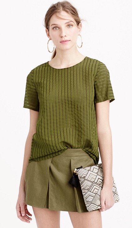
Nicole was also kind enough to bring me back this J. Crew top from her travels in Utah. The colour is bang on for my colour palette, and I love the subtle “shadow stripe” motif.

See You Monday leggings

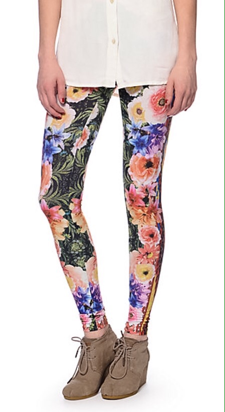
Yes, friends, I did buy these leggings. In my defence (and do I really need one?), these are strictly lounge-wear. My husband is crazy about them for some bizarre reason. Go figure.

Sparrow cardigan
Sparrow cardigan

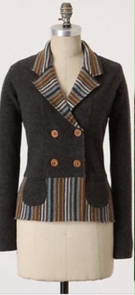
Yep, another Sparrow coatigan. This one is less aristoquirky than the last, and should pair nicely with my many, coloured, casual skinny pants.

Banana Republic faux leather pants (!)

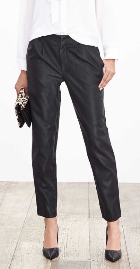
Going back to pants, I somehow ended up with a pair of faux leather cropped, pleated, tapered trousers. They sound like a bad idea, and probably ARE a bad idea, but I was intrigued. Can I make these work? Who knows? The beauty of Goodwill is that I don’t have to bet a lot of money on a potentially losing hand.

J. Crew pants
J. Crew pants

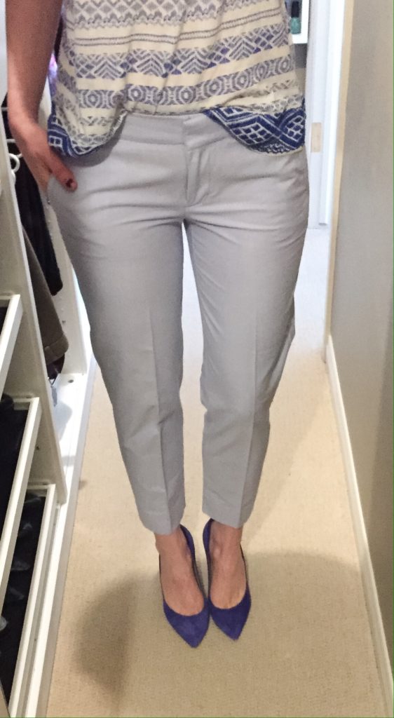
Do I need this pair of pale blue, chambray-esque trousers? No. But they might come in handy this summer. I am allowed to dream of summer, yes? And for $7, the dream is so very reasonable, don’t you think?

Left: AG; Right: Pilcro

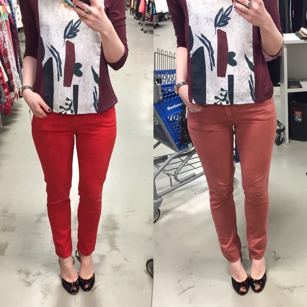
It might seem like I always just buy anything and everything that comes across my path, but that is not true. I did make some hard decisions this month … like choosing only ONE of the above pairs. Both brands are long-time faves of mine, but I ended up going with the AGs this time because they were softer and because I thought the colour would work better with my casual wardrobe.

Rag & Bone x 2
Rag & Bone x 2

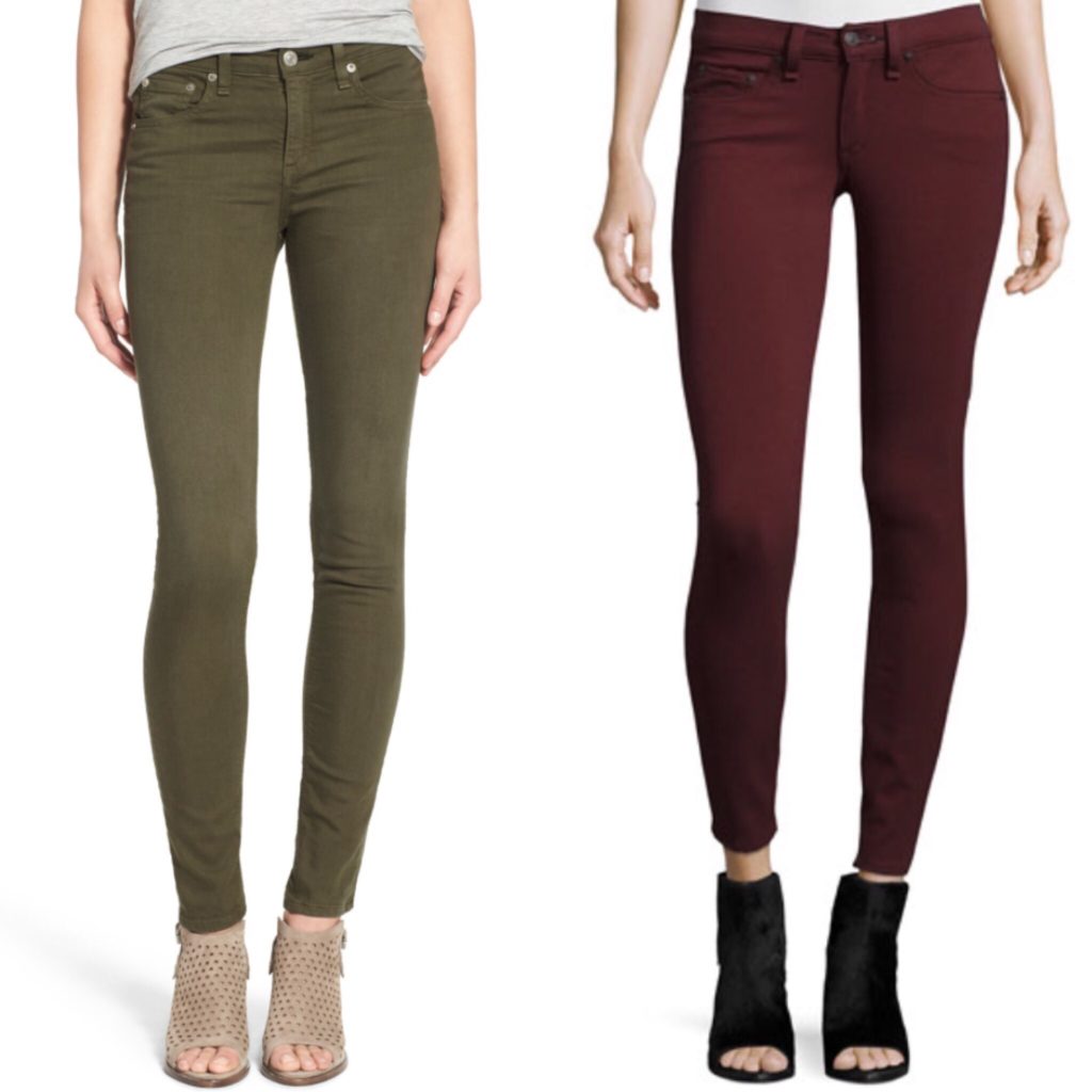
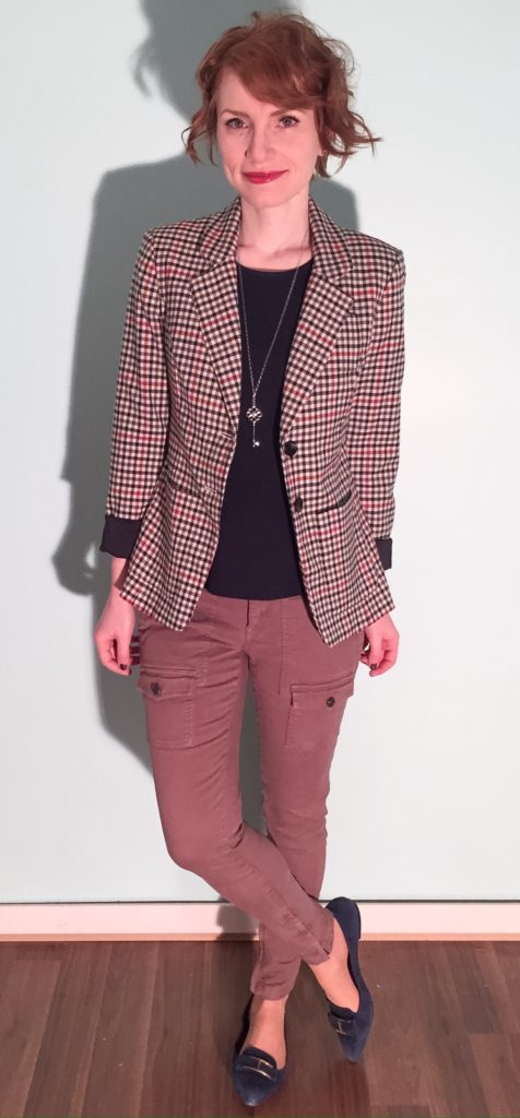
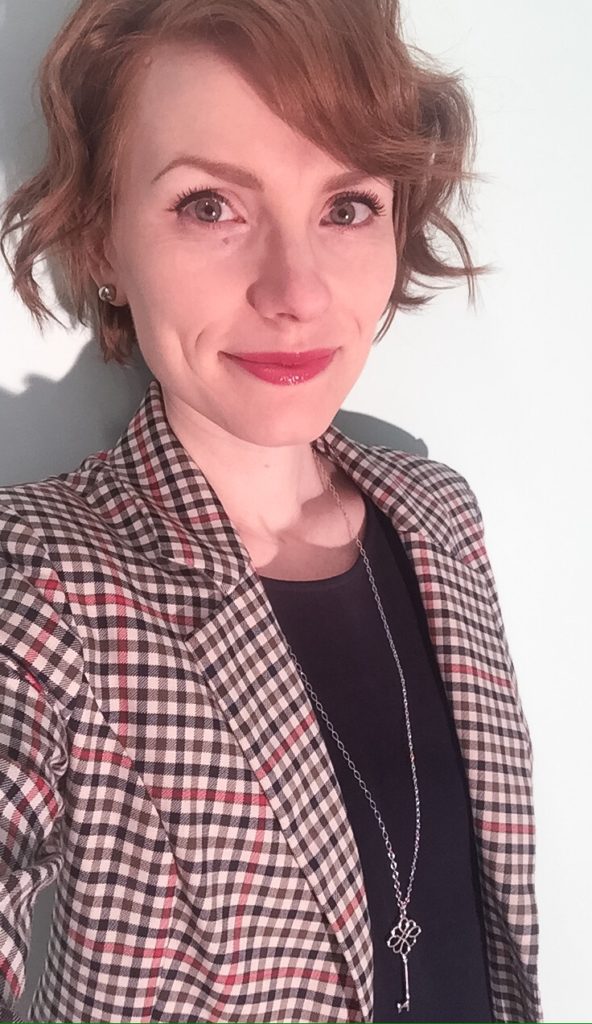
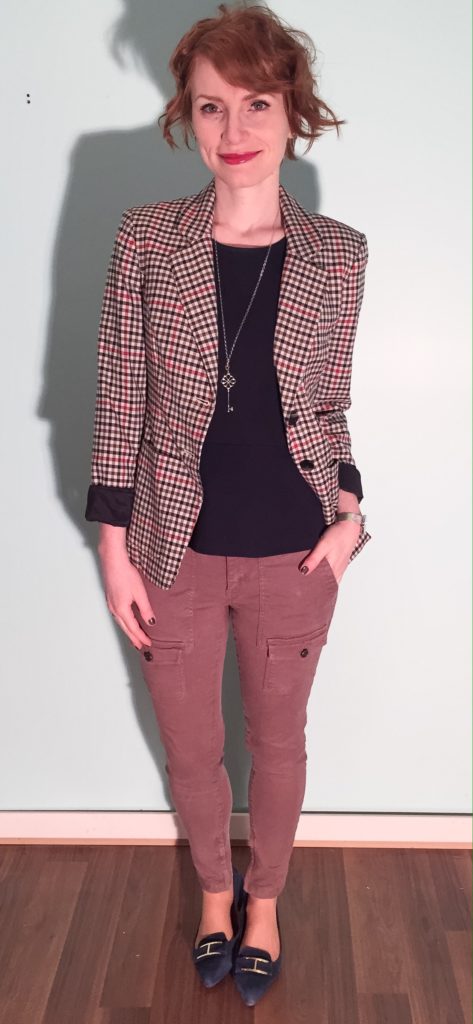
And then I went and bought TWO pairs of Rag & Bone, because at $8 apiece, why not. The colours (olive/khaki and burgundy) are perfect.

Things didn’t always work out so well, however. There was also a pair of Pilcro high-waisted skinny jeans that I BADLY wanted … until I realized that they had a big rip near the crotch. I briefly considered trying to get them repaired, but ultimately passed. But, oh man, they were amazing. So much so that I immediately looked them up on eBay, only to find them listed for over $100 plus shipping. Sigh. And so concludes my pants-buying spree, winter 2017 edition.

The Struggle Bus

blazer, Liz Claiborne (thrifted); top, J. Crew (thrifted); pants, Joie (thrifted); shoes, Tommy Hilfiger (via consignment)

At the risk of sounding overly dramatic, I think I reached my stress limit last week. Between a crazy work week (always happens before a holiday, amirite), dealing with 3 sick family members, and trying to get everyone ready for our overseas vacation, I just about lost my mind. Consequently, most of the week was a blur. Every morning, I grabbed whatever was on the hanger (thankfully, I’d had time the previous weekend to set out my outfits) and ran out the door. It worked out ok until I got to this outfit … which didn’t. Work as planned, that is.

making do
making do

I’d originally picked a different blazer – my Smythe one to be exact. When I put it on, the proportions felt wrong. I switched it for this Liz Clairborne number, which is similar but has a less severe shoulder line. And the proceeded to dither for 5 minutes (which was 4 1/2 minutes longer than I had) over which shoes to wear. I tried to be less predictable. I really did, you guys. But my brain just wasn’t cooperating and I gave up. Navy flats it was. But cargo skinnies are kinda unpredictable, right? Sort of? Maybe. Sigh. Thank goodness it was a Friday. Fridays are a gimme; it is known.

Hope you’re having a fab Monday — just think, it’s probably nothing like my last Friday 😉

better luck next time

Wardrobe Colour Palette, 2017

As you may have started to notice, there has been some change happening in the old closet lately. Most of it has been of the organic, go-with-your-gut, find-your-joy variety, but one intentional exercise that I did undertake was updating my wardrobe colour palette. I had done a similar exercise a few years ago, but I decided to start from scratch again. (The results are actually quite similar.) I Googled Pantone swatches and colour names, and ended up putting together some basic collages. I think Pinterest would be a very helpful tool for this sort of thing, but I am too lazy to invest in a whole new social media platform. Below are my amateur efforts, which I’ve also saved on my phone to help me in future shopping trips.

A quick work on process. I didn’t follow any particular rules in doing this exercise – it was more of the same follow-your-instinct approach. Although, as you guys know, I love *all* colours, I realized that there were some that just “call out” to be worn more than others. I debated getting a seasonal colour analysis done, but ultimately decided against it because I wanted my wardrobe palette to reflect the colours I loved, not what I was told I should love. I may revisit this possibility later, just to satisfy my curiosity and see how close my own choices mirror, or not, my recommended colours.

First up, the neutrals.

For anyone familiar with this blog, there shouldn’t be any surprises here.

B L A C K
B L A C K
G R E Y
G R E Y
W H I T E
W H I T E
N A V Y
N A V Y
C A M E L
C A M E L

Next, my core colours. The main thing I’ve come to realize is that I like muted, muddled shades as opposed to either jewel tones, brights, or pastels. Basically, take any colour and throw some grey or black into it, and you have something I like. I call them my “complicated colours”. They’re probably not everyone’s cup of tea.

R I V E R S I D E (aka blue #1)

Blue — all shades of it — is my favourite colour, so the idea of narrowing that down to a specific shade was daunting initially. It became a lot easier once I ran across my new Club Monaco sweater dress. That was a blue that just spoke to me at a gut level. I ended up finding echoes of it throughout my existing wardrobe – sometimes lighter, sometimes darker. Pantone has a colour called Riverside that I think is the best approximation of this shade.

D A Z Z L I NG B L U E (aka blue #2)

In the process of looking for Riverside, I came across Dazzling Blue. To me eye, it almost looks like a more intense, less muddled version of Riverside. I’m obsessed with it. I’m not sure if I need two colours that are ultimately so similar in my palette, but I’ve included it here because … well, I am obsessed with it.

M U S T A R D (and olive, khaki and other mossy/muddy hues)

It should come as no surprise that mustard (or Spicy Mustard, as Pantone calls this shade) made the list. There is a lot of it in my wardrobe. Joining it is a small constellation of related hues on the spectrum between golden yellow and dark khaki (see small sidebar above). Basically anything kinda yellow, kinda green, kinda brown. Olive is definitely included, but that in itself has too many varieties to narrow down to only one shade. With the exception of mustard, none of them draw my eye in the same way that my blues do, but I find them very pleasing in combination with the other colours in my palette. To some extent, these warmer shades operate almost like a neutral for me.

P I N E (aka darkened emerald)

I adore green, but don’t enjoy wearing it. I know, it’s a crazy thing for a redhead to say. The only exception is this dark, mysterious green. It’s kinda like forest green, and kinda like dark teal, but with less blue and more bottle green, and a heart of black. Clear as mud? It was actually quite hard to find photos that matched my imagined ideal, probably because I struggled so much with the search terms. The photos above come pretty close.

R O S E Q U A R T Z (aka blush pink)

Blush pink (or Rose Quartz, per Pantone) is basically like ivory for me — i.e. close to my skin tone. I’m probably too pale to pull it off smashingly, but I think it works well with my hair colour, and I find it very soothing.

M A U V E
M A U V E

This was another colour for which it was very difficult to find a precise match, but what I have in mind is a very greyed out, desaturated purple.

B U R G U N D Y (aka maroon, wine, etc.)

Burgundy, no surprise. I consider it an almost-neutral. Can you tell I got real lazy with this collage?

E G G P L A N T (aka plum, dark purple, etc.)

Last but not least, eggplant purple. Again, this is not a jewel tone. It’s darker, moodier (like my soul — zing!). I basically want to wear that magnificent gown (see collage above) everywhere; it’s made for dramatic entrances which, let’s be honest, is #stylegoals right there.

And that is my wardrobe colour palette in a nutshell series of pictures. The only shades missing are red and red-orange, which are my (sparingly used) accent colours.

For those of you who have created a wardrobe palette, I want to know: how did you go about it? Did you find the exercise useful? Did you limit yourself to a set number of colours? And if you’ve had colour analysis done, did you find it worth the price of a consultation?