Category: Wardrobe Analytics

State of the Wardrobe: Lifestyle Inflation & Clothes Spending

Let me start by admitting this: I am a bit of a nosy parker. I am fascinated by how other people live – the way they decorate their houses, the clothes they buy, their finances. The latter in particular is something of a taboo subject outside of Personal Finance blogs, so my nosiness on that score is infrequently satisfied. For that reason, I love online discussions like this Reddit sub-thread on income level and clothes spending. The wide range of responses is very interesting, as are the related comments that come up – such as, for example, on the topic of lifestyle inflation. They got me thinking about my own life … and so this blog post was born.

I have absolutely no doubt that lifestyle inflation is a real thing; I’ve got all the proof I need when I compare my life a decade ago to my current situation. Take my recent trip to Mexico as an example. Back in 2007, I went on an all-inclusive vacation to Cancun – and stayed at a 3 star hotel. Last month, the four of us stayed at a 5 star resort on the Mayan Riviera. Same general location, a not insignificant difference in amenities … and cost. I’ve been trying to decide whether lifestyle inflation has crept into my clothes spending as well. If I use the same time period for comparison purposes, I think the answer is unavoidably “yes”. But if I look at the last 3 years or so, the answer is less clear.

For perspective, here are some relevant stats. Since 2013, my personal income has increased by about 50%. During that time, my clothes spending (in absolute dollars) has remained surprisingly steady, varying by no more than 10-15% from year to year. (I did not track or keep a consistent record of my clothes spending before 2013.) The average cost of the clothes I have purchased has steadily declined – from $40/item in 2013, to $16/item in 2016. Meanwhile, the average retail value of the clothes has increased – from $113/item in 2013 to $218/item in 2016. Those numbers represent, in a nutshell, the trend in my clothes spending: buying better (or at least more expensive) brands predominantly secondhand.

But what about lifestyle inflation?

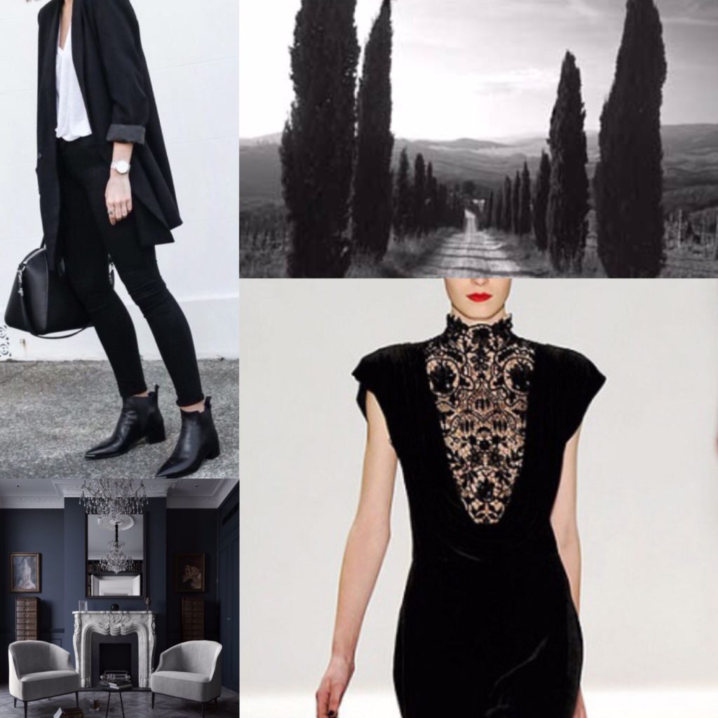
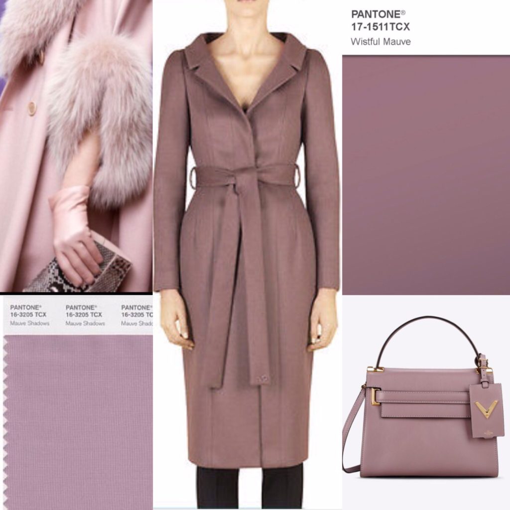
In some ways, it hasn’t affected my clothes spending. After all, on average, I spend less per item now than 2-3 years ago even as my income has increased a fair bit. But that is not the full story. Averages are tricky things … especially when you buy a lot of things, like I do. Masked among my many thrift scores are some “big ticket” purchases that, not that long ago, would have seemed pretty scary. The biggest upward creep in my spending comfort level definitely happened with bags. Spending $500 on a bag doesn’t faze me like it used; I don’t do it regularly, but it’s an easily conceivable notion. My “knuckle biting” threshold for bags is now probably north of $700. Shoes are another category where my thresholds have changed quite significantly. I used to baulk at spending more than $50 on a pair of shoes; now, while I routinely spend less, I am nevertheless mentally prepared to spend up to $200 on a brand I love (like Manolo Blahnik, Frye, etc.). Same thing with outerwear, thanks to my beloved MaxMara camel coat.

At the same time, thrifting has had its own impact on the progression of lifestyle inflation in my clothes spending. The best way I can describe that impact is this: thrifting has made it easier AND harder for me to spend $50 (or more) on a piece of clothing. On one hand, I find it harder now to justify spending more than $20 on anything, because that’s usually the upper limit of thrift prices regardless of the label. On the other hand, if I do find something truly special, spending $100 or even $200 on a single item seems, well, not unreasonable given how little money my thrifting costs me (and considering that it accounts for 90%+ of my shopping). I think that, on balance, the influence of thrifting on my spending mentality is largely a positive thing. I constantly question the value of the things I’m tempted to buy, and am far less likely to be swayed by sale prices and promotions. It has made me more aware of things that are worth the (retail) splurge — boots, outerwear, and good sweaters for example (things that people tend to hold on to, rather than donate before they wear out). Thrifting has also made me more comfortable with the idea that, sometimes, you just have to get the thing that sparks joy, price be damned.

Within reason, of course.

Now, tell me: have you noticed lifestyle inflation in your own life? How do you deal with it?

State of the Wardrobe: Spring 2017

Over the past couple of months, several readers have asked me to write about the most recent phase of my style evolution, and so I have been thinking about how to best approach that hypothetical post – this post – for a while. Though I love to wax analytical about style (it’s my modus operandi in all things, after all), I am all too conscious that such musings can very easily degenerate into a big ole pile of TL;DR. My Fashion Blogger Struggle® is finding the right balance of writing and photographs, and I often end up feeling less than successful. Because of that, my first instinct was to let the evidence speak for itself. I think the direction of my style – which is not entirely new, but not precisely “same old, same old” – is becoming more and more evident with each monthly recap. And, to be honest, it’s not something I have been over-thinking to the degree that is my usual practice. Which is to say, while I have a rough idea of where (I think) I’m going, I don’t have a concrete road map to talk about. Mostly, I’m just following my gut – whether that be when buying new clothes, letting go of old ones, and putting together outfits.

With that said, as I was going through this process, I came across the whole personal colour analysis/style archetype phenomenon, which did help to crystallize some of my more vague gut feelings. I’ve talked about my updated wardrobe colour palette before. I think my palette ended up being very close to what is recommended for Soft Summer. I may or may not be a Soft Summer; I’m still debating investing the money to get an actual consultation with a qualified colour analyst. But, for now, I am using that as a rough guide when considering new purchases.

soft summer palette
soft summer palette

The biggest issue with this is that black is supposed to be a “no go” colour; meanwhile, black is one of my core “anchoring” neutrals. I have no desire to run out and replace all my black clothing with charcoal or navy equivalents, so instead I am being more mindful about how I use black in my outfits. (I still love wearing it head to toe from time to time.)

I am also not running out and buying all the colours from the Soft Summer palette. Instead, I’m focusing on my preferred subset of colours. One of the biggest lessons I’ve learned over the years is the importance of an least somewhat cohesive colour palette. If the colours in your wardrobe are harmonious, it is much easier to weather any style evolution because you can mix old pieces in new ways.

Moving on, I have also self-diagnosed as a Dramatic Classic style (based on my facial features in particular, as recommended by this article), and have started using the tools available online – like Pinterest boards – to guide my style choices. I will say that the DC archetype alone is a bit simplistic, and does not fully capture my personal preferences. I prefer the triad system used by the Truth Is Beauty blog; in particular, I have been leaning towards the Dramatic-Classic-Ingenue and the Ethereal-Dramatic-Classic aesthetics.

Looking at things from this perspective/framework, I realized that my style hasn’t so much changed as evolved in terms of its emphasis on various sub-components. For example, my love of Anthro very much skewed to the Ingenue side of things; as I get older, it is perhaps not unnatural that I should feel more drawn to another existing component (e.g. Classic) or switch to a new one (e.g. Ethereal). Ultimately, this process has become more about fine-tuning than over-hauling, although there has certainly been some turnover in my closet as a result — mostly from things being purged, as opposed to added.

As far as my closet goes, I am largely happy with it — especially as it has become more stabilized over the last few months. I will never not love experimenting with different looks, but I am becoming more and more appreciative of cohesiveness. I do enjoy clothes as a hobby, but the more experimenting I do, the more time-consuming it becomes. Narrowing the scope of that experimenting has freed up time for other hobbies, like reading (and soon, perhaps, writing once more). Don’t get me wrong; it’s not a question of one hobby being better or worse than the other; just different. Right now, I am excited about different things.

With that said, I am embracing a kind of “French wardrobe” approach to my closet. I’m treating 70-80% of it as a “core” — stable, with low turnover anticipated. The balance represents my “statement” pieces, and this is where I expect to focus my experimenting going forward. Even in that respect, I am quite happy with my current pieces; the main exception is the dress category (and, specifically, my work dresses), where I feel like I need to shake things up a bit. To help me with the process, I’ve divided the current work dresses listed in my Stylebook app into two categories: core and statement. Here is a not-great snapshot of the 8 pieces in the latter category:

stylebook app snapshot

None of these are super old, but there are at least 2 or 3 that don’t spark joy as much as they used to (or don’t quite fit my evolving style as before). I plan to continue wearing them for the time being, but I will be keeping an eye out when I thrift for possible upgrades or replacements.

If my ramblings haven’t put you to sleep yet, I would love to hear what’s new in your sartorial lives. With spring and summer just around the corner (mother nature willing), what are your plans for your closet? Share everything in the comments.

Wardrobe Colour Palette, 2017

As you may have started to notice, there has been some change happening in the old closet lately. Most of it has been of the organic, go-with-your-gut, find-your-joy variety, but one intentional exercise that I did undertake was updating my wardrobe colour palette. I had done a similar exercise a few years ago, but I decided to start from scratch again. (The results are actually quite similar.) I Googled Pantone swatches and colour names, and ended up putting together some basic collages. I think Pinterest would be a very helpful tool for this sort of thing, but I am too lazy to invest in a whole new social media platform. Below are my amateur efforts, which I’ve also saved on my phone to help me in future shopping trips.

A quick work on process. I didn’t follow any particular rules in doing this exercise – it was more of the same follow-your-instinct approach. Although, as you guys know, I love *all* colours, I realized that there were some that just “call out” to be worn more than others. I debated getting a seasonal colour analysis done, but ultimately decided against it because I wanted my wardrobe palette to reflect the colours I loved, not what I was told I should love. I may revisit this possibility later, just to satisfy my curiosity and see how close my own choices mirror, or not, my recommended colours.

First up, the neutrals.

For anyone familiar with this blog, there shouldn’t be any surprises here.

B L A C K
B L A C K
G R E Y
G R E Y
W H I T E
W H I T E
N A V Y
N A V Y
C A M E L
C A M E L

Next, my core colours. The main thing I’ve come to realize is that I like muted, muddled shades as opposed to either jewel tones, brights, or pastels. Basically, take any colour and throw some grey or black into it, and you have something I like. I call them my “complicated colours”. They’re probably not everyone’s cup of tea.

R I V E R S I D E (aka blue #1)

Blue — all shades of it — is my favourite colour, so the idea of narrowing that down to a specific shade was daunting initially. It became a lot easier once I ran across my new Club Monaco sweater dress. That was a blue that just spoke to me at a gut level. I ended up finding echoes of it throughout my existing wardrobe – sometimes lighter, sometimes darker. Pantone has a colour called Riverside that I think is the best approximation of this shade.

D A Z Z L I NG B L U E (aka blue #2)

In the process of looking for Riverside, I came across Dazzling Blue. To me eye, it almost looks like a more intense, less muddled version of Riverside. I’m obsessed with it. I’m not sure if I need two colours that are ultimately so similar in my palette, but I’ve included it here because … well, I am obsessed with it.

M U S T A R D (and olive, khaki and other mossy/muddy hues)

It should come as no surprise that mustard (or Spicy Mustard, as Pantone calls this shade) made the list. There is a lot of it in my wardrobe. Joining it is a small constellation of related hues on the spectrum between golden yellow and dark khaki (see small sidebar above). Basically anything kinda yellow, kinda green, kinda brown. Olive is definitely included, but that in itself has too many varieties to narrow down to only one shade. With the exception of mustard, none of them draw my eye in the same way that my blues do, but I find them very pleasing in combination with the other colours in my palette. To some extent, these warmer shades operate almost like a neutral for me.

P I N E (aka darkened emerald)

I adore green, but don’t enjoy wearing it. I know, it’s a crazy thing for a redhead to say. The only exception is this dark, mysterious green. It’s kinda like forest green, and kinda like dark teal, but with less blue and more bottle green, and a heart of black. Clear as mud? It was actually quite hard to find photos that matched my imagined ideal, probably because I struggled so much with the search terms. The photos above come pretty close.

R O S E Q U A R T Z (aka blush pink)

Blush pink (or Rose Quartz, per Pantone) is basically like ivory for me — i.e. close to my skin tone. I’m probably too pale to pull it off smashingly, but I think it works well with my hair colour, and I find it very soothing.

M A U V E
M A U V E

This was another colour for which it was very difficult to find a precise match, but what I have in mind is a very greyed out, desaturated purple.

B U R G U N D Y (aka maroon, wine, etc.)

Burgundy, no surprise. I consider it an almost-neutral. Can you tell I got real lazy with this collage?

E G G P L A N T (aka plum, dark purple, etc.)

Last but not least, eggplant purple. Again, this is not a jewel tone. It’s darker, moodier (like my soul — zing!). I basically want to wear that magnificent gown (see collage above) everywhere; it’s made for dramatic entrances which, let’s be honest, is #stylegoals right there.

And that is my wardrobe colour palette in a nutshell series of pictures. The only shades missing are red and red-orange, which are my (sparingly used) accent colours.

For those of you who have created a wardrobe palette, I want to know: how did you go about it? Did you find the exercise useful? Did you limit yourself to a set number of colours? And if you’ve had colour analysis done, did you find it worth the price of a consultation?