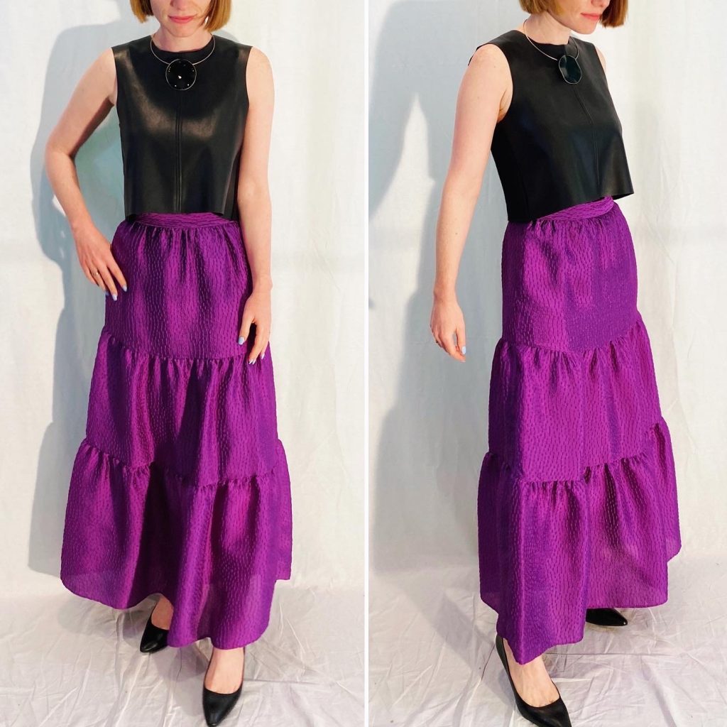
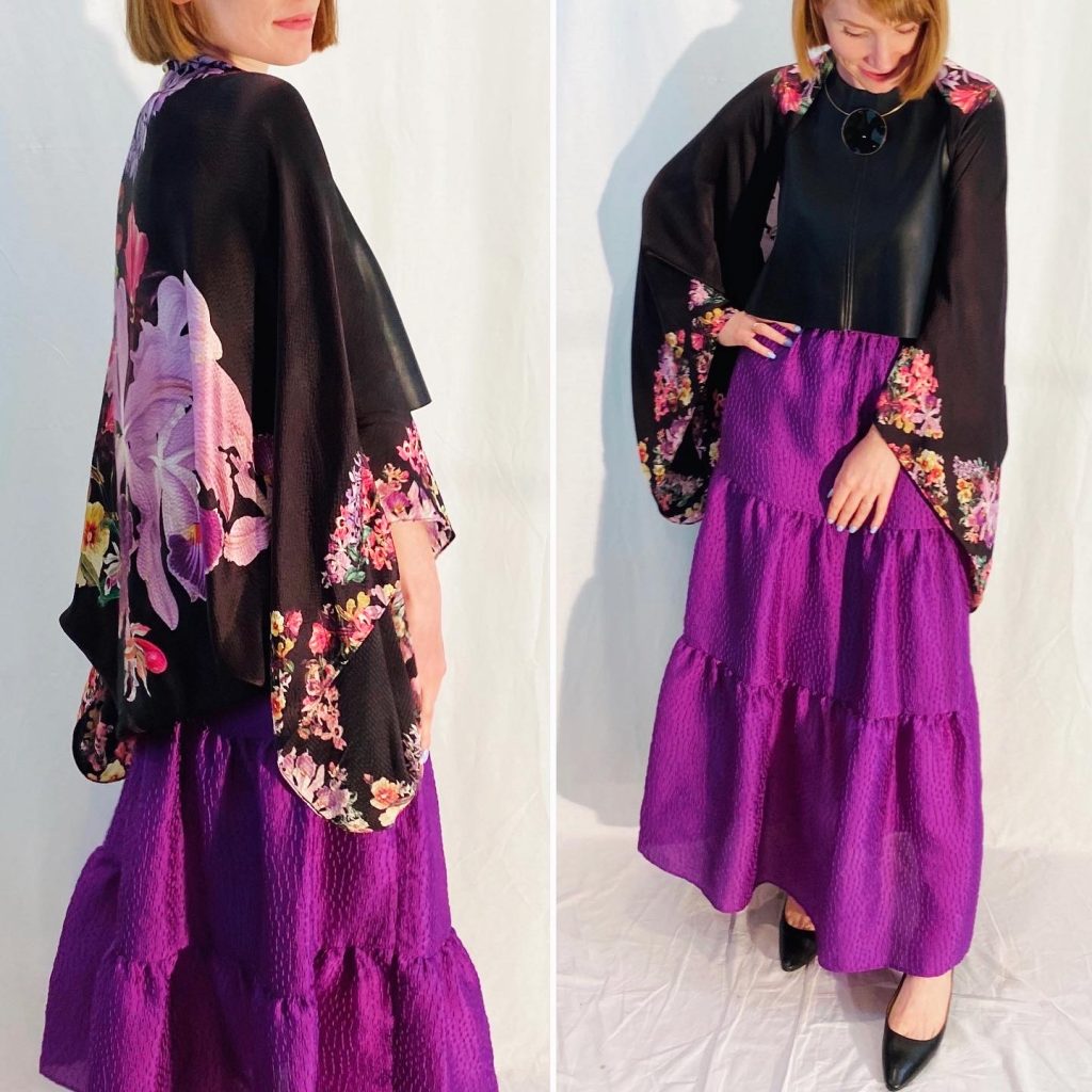
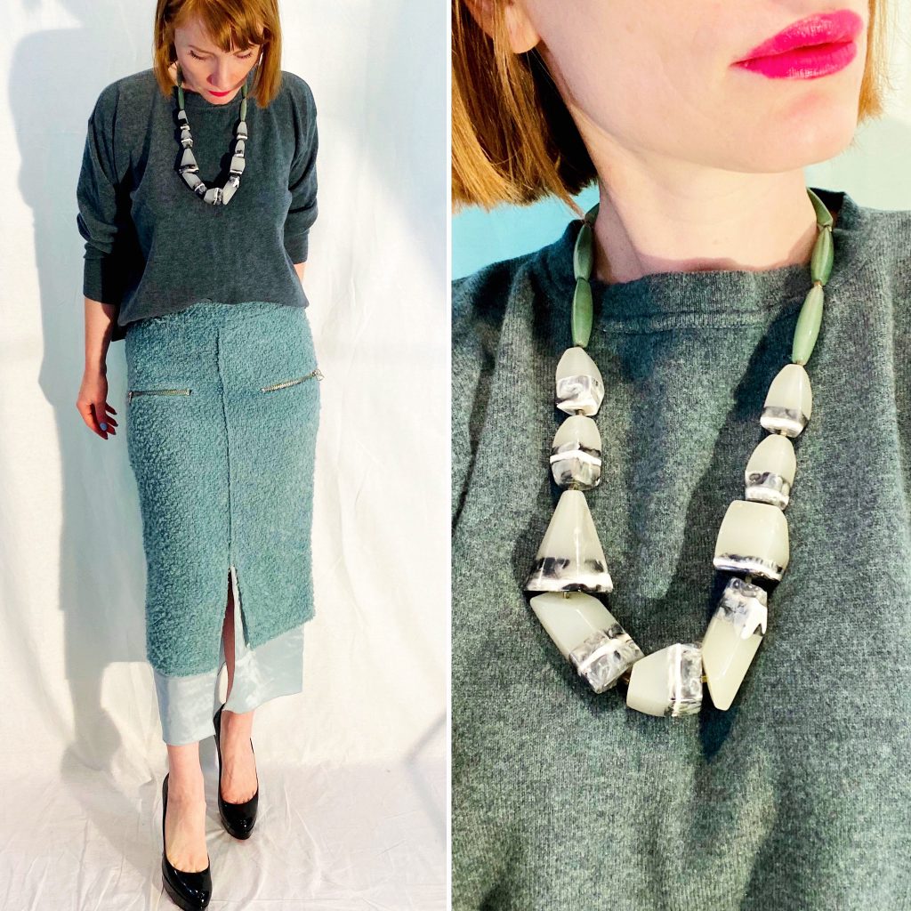
This Zara skirt was a late-night impulse buy on Poshmark (a category that seems to be growing every week) and, boy, I’m glad it’s one I DIDN’T talk myself out of. Not something you can say about every impulse buy, for sure. But I love the lines of this skirt so much, and the colour is so wonderfully punchy. It’s probably an “inspired” design – as most of Zara’s output tends to be – but I have no idea which designer originated it. Regardless, I approve. It can definitely skew boho (with a touch of flamenco flair), but I wanted to see if I could go in a different direction with it too. Something more minimalist and architectural. Paired with my cropped faux leather Zara top, plus a simple geometric necklace, it definitely has an edge. And yet, it can be transformed immediately by adding just one extra piece – like this Ted Baker floral wrap.
Detail Oriented
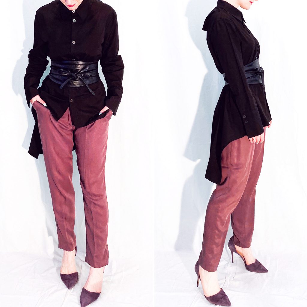
This is a deceptively simple outfit: shirt, pants, belt. But the details … ahhh, the details make all the difference. This shirt is a Yohji Yamamoto piece I scored last year from a fellow thrifter in the US via Instagram (thanks, Morgan!) It’s anything but a basic button-up. There is an asymmetrical peplum/train detail, plus a cool vent on the back below the collar. I decided to add a wrap belt to further emphasize the tailored cut of the shirt. The softly draped pants quietly complement the more severe lines on the top. And, luckily, they still fit * insert crying-laughing-but-mostly-crying face here*
Playing Around
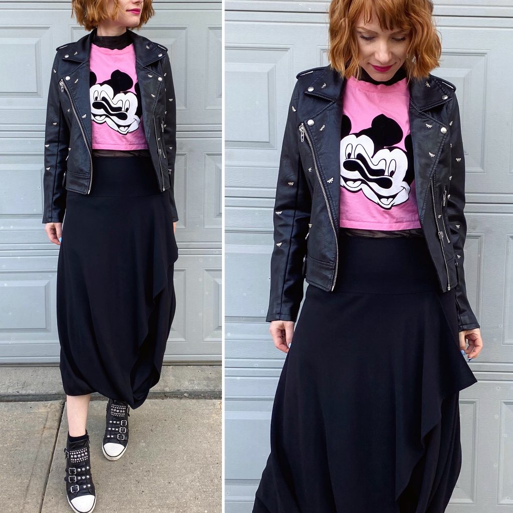
I wanted to “punk up” this Mickey shirt and I’m pretty happy with this resulting outfit, though again, probably not very punk at all. I wish the details of the skirt translated better to photos; it has a neat draping detail in the front that gives the whole outfit some added visual interest. I would have loved to try this look with a black tulle skirt instead – maybe something with tiers, for added shape/angles – but alas, that is an item that Poshmark hasn’t (yet?) delivered.
Saved The Best For Last
Um, that the title says. I scored this Acne skirt on eBay a couple of months ago (it was a steal of a deal!) and it took this long to get it from Australia. But, boy, was she worth the wait! I am in love with the colour, the textures, the shape. Someone on IG called this a “mermaid” skirt, and I am obsessed. I am maybe definitely hunting for more aqua coloured pieces on Poshmark (and the thrift store) and contemplating a whole new category in my style inspo files called “mermaid chic”.
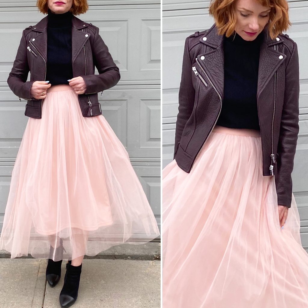
Someone on IG called this “punk princess” and I was, like, “hello, my new best friend.” But seriously. I would like to think I have a bit of punk spirit in me, but the reality is that I am a white, middle class, suburban working mom which doesn’t exactly scream “punk”. The best I can hope for is a slightly edgier take on a basic fall outfit; add a tulle skirt to a leather jacket/sweater combo, boots with a bit of attitude, and call it punk-adjacent. Speaking of the skirt, I am quite confident that this will be the Statement Skirt Fall, because I’ve suddenly acquired half a dozen interesting skirts in the last few weeks, to add to an already full roster, and I need to give them a chance to shine. Not coincidentally, I’m sure, fewer and fewer of my pants fit. As they say: one door closes, one door opens.
I Heart Marni
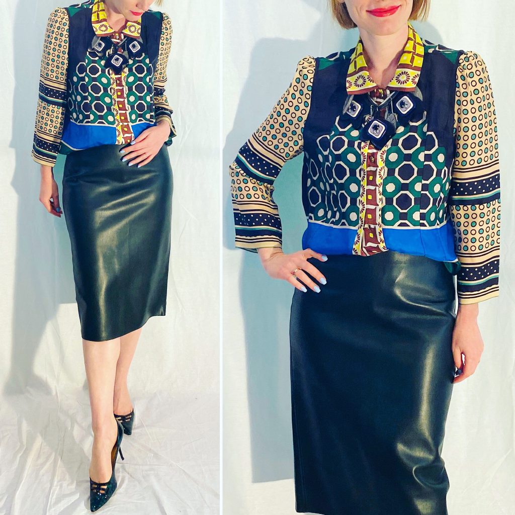
Along with Dries Van Noten, Marni is my number 1 designer brand to stalk obsessively on Poshmark. I love their aesthetic; like Dries, they do really cool things with prints and silhouettes. I pounced on this blouse when it came up on Posh for a great price, because it’s everything I love about Marni. Interesting colour palette, mixed patterns, slightly unusual design (it’s cut almost like a boxy jacket, but wears like a blouse). I kept things simple with the rest of the outfit here, but I am planning to see how I can take that pattern mixing up another notch.
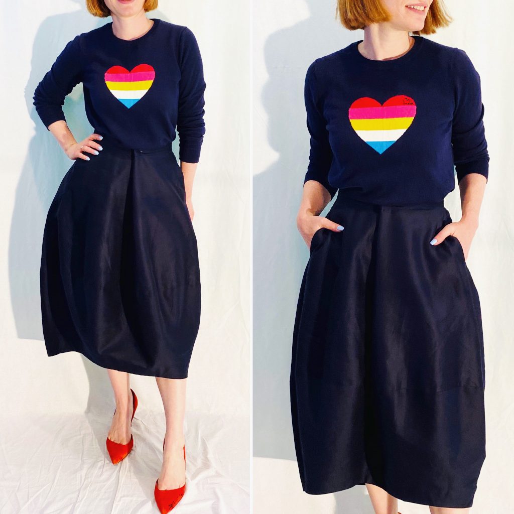
I Also Heart Gap
Sometime in the last year, I fell into the habit of collecting Gap novelty sweaters. In the grand scheme of things, it’s not the strangest collection I own, and you only have to look at this sweater to see why it’s a fun collection to have. Long time readers are well familiar with my Gap rainbow stripe sweater (I actually own 3 different versions now), which is a shockingly versatile piece. I think the same is true for this rainbow heart sweater. It’s a simple but eye-catching graphic design that adds a pop of colour – and a bit of whimsy – to an otherwise fairly plain outfit. The playfulness also works well with the exaggerated balloon shape of this COS skirt (a recent Poshmark purhase). I am really pleased with the overall silhouette, which is a slightly different take on my regular midi skirt formula.
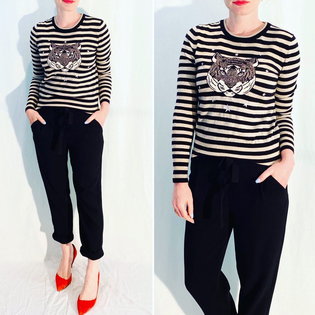
Eye of the Tiger
Um, did I mention how much I love Gap novelty sweaters? I did? Thirty seconds ago? Well, good. Here’s another one. This reminded me of Kenzo’s signature tiger design, without being a total knock-off. I like that this tiger is a lot more cuddly-looking, and I appreciate the juxtaposition against the stripes. The little stars are just chef’s kiss All in all, it’s one very photogenic sweater. That’s actually a distinction; I have plenty of beautiful garments that photograph “meh”. Not this sweater. And it really makes this otherwise basic outfit totally memorable.
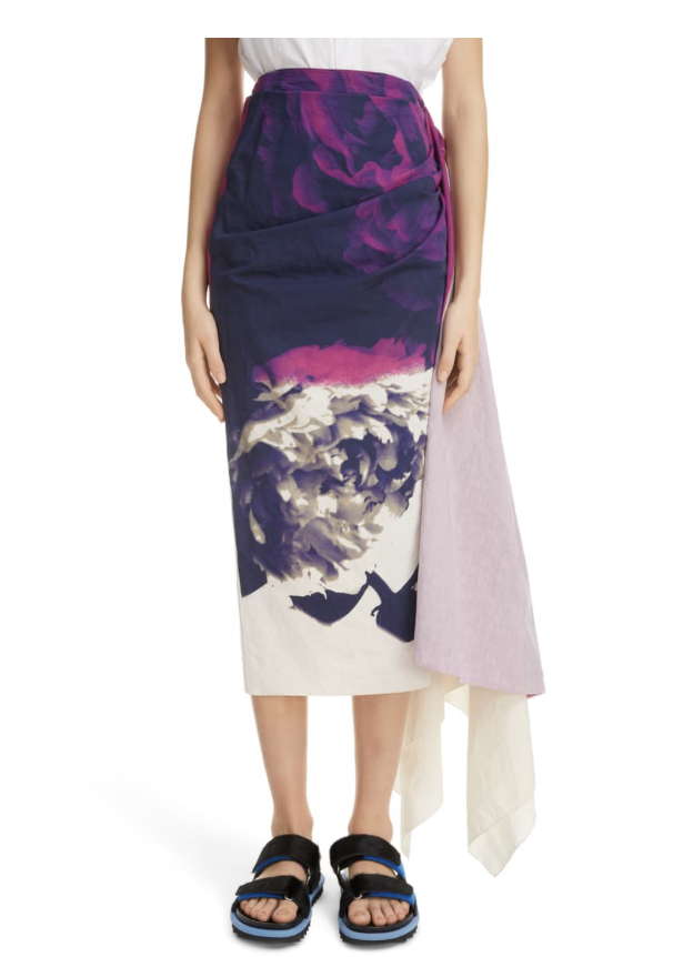
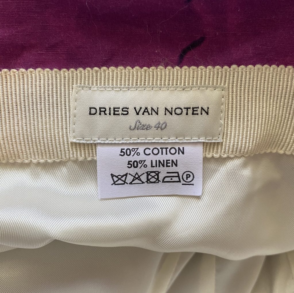
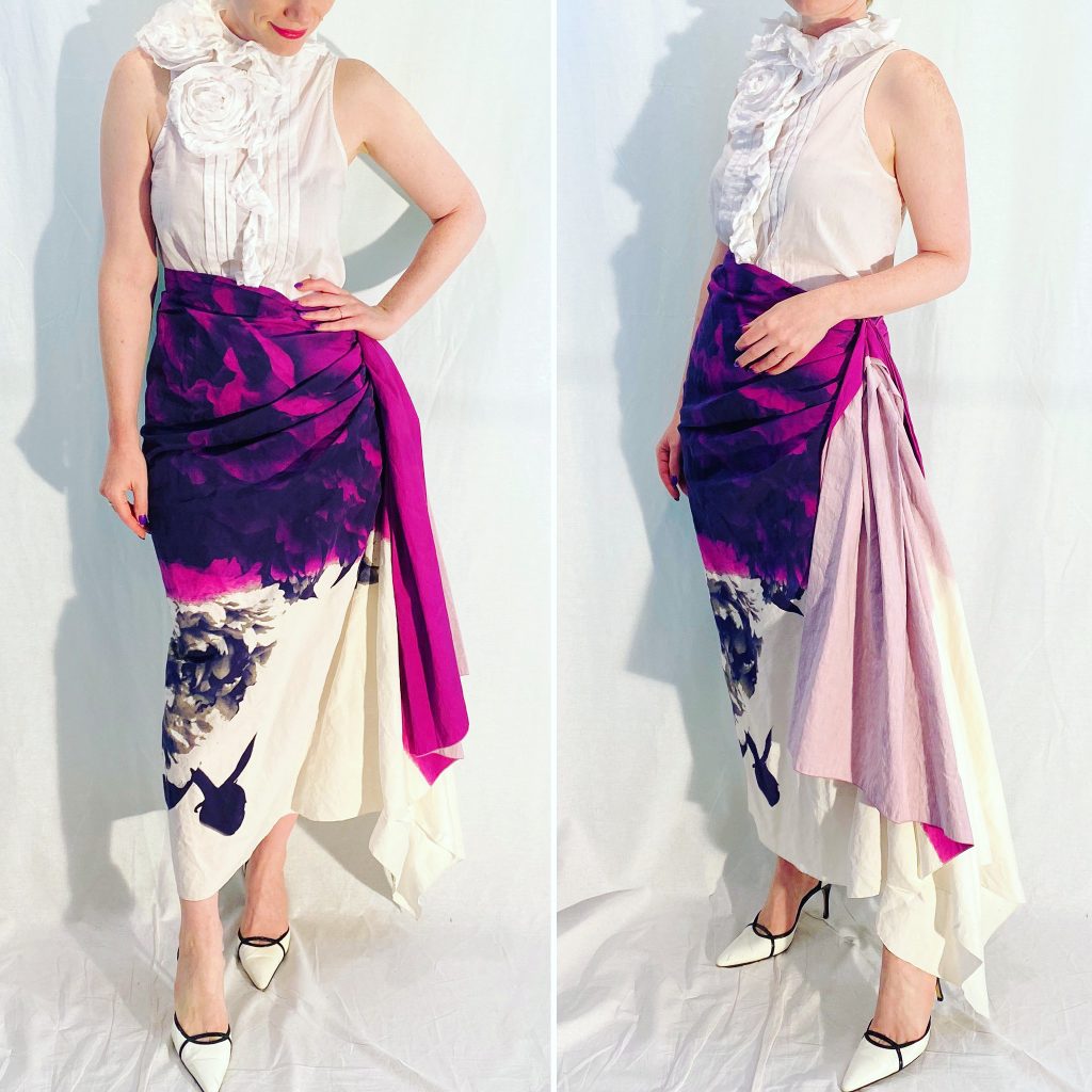
As promised a few weeks ago, I am dedicating this entire post to one of my favourite pieces from my closet: this Dries Van Noten skirt.
But rather than just wax rhapsodic about it, my goal today is to use it as an example of quality workmanship to look for, whether like me you’re a dedicated thrifter or whether you prefer to shop retail. I have said this many times, and it bears repeating: a designer label or a high price tag is no guarantee of quality. Conversely, just because something doesn’t carry a particular label doesn’t mean that it’s not good quality; even fast fashion brands like Zara will occasionally put out pieces that are as well made as their designer counterparts.
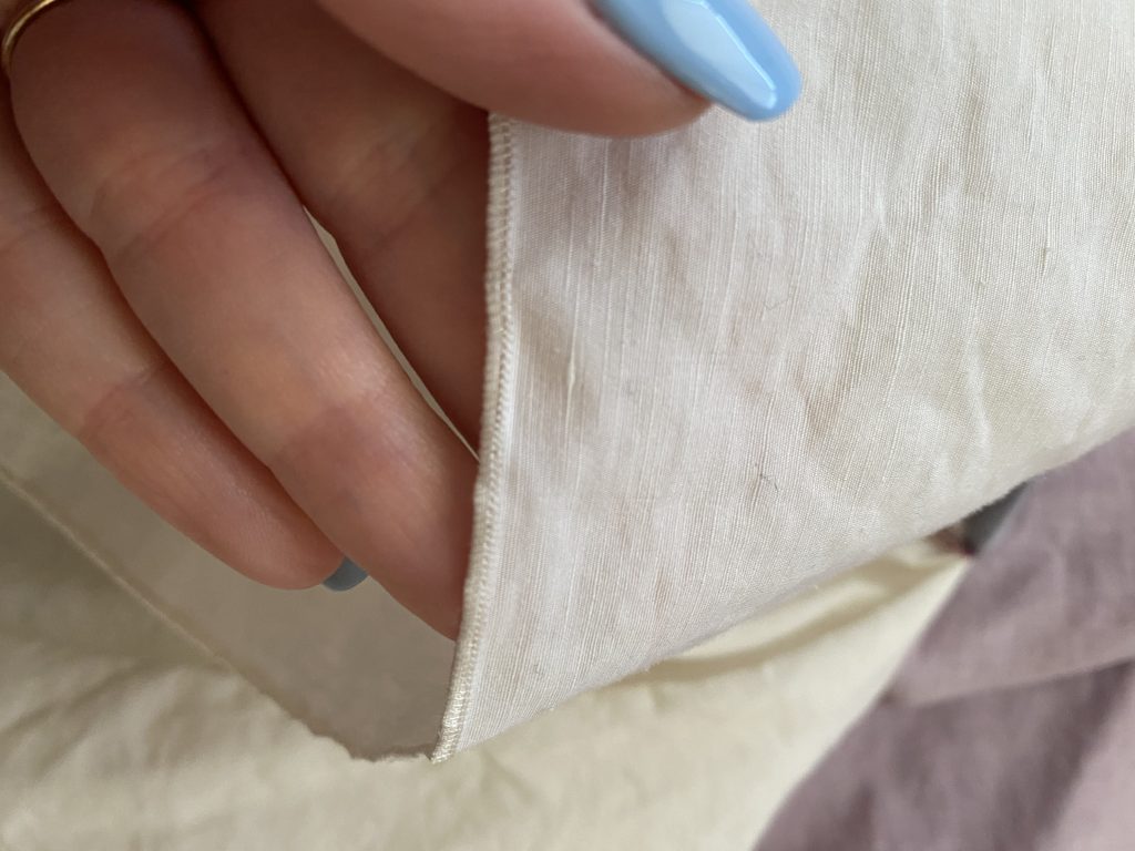
Let’s start with fabric. This is the trickiest part because (a) I am not a textile expert, and (b) it’s hard to describe the concept of “hand feel”. If you’ve spent long enough at a thrift store, you will start to be able to pick quality materials from touch alone. Acrylic feels different from wool or cashmere. Silk feels different from polyester, for the most part anyway; polyester comes in a LOT of different varieties, and some are just as nice as silk but can be easier-wearing. There is thin linen and thick linen; same with cotton. As well, there is the type of garment and its purpose to consider, because that will impact what material works best. Personally, I prefer clothes that have shape to them, as opposed to more body-con pieces that mold to the body, so I tend to look for heavier weight fabrics. Keep in mind, though, that I live in a temperate/cold climate, so that is a factor as well. Generally, though, the thinner or more see-through a fabric, the lower the quality (no matter how high the item is priced cough tissue-thin designer t-shirts cough).
With this skirt for example, the material is a cotton-linen blend. It’s stiffer and heavier than cotton, which gives it shape and drape – important for this type of design. But it isn’t as wrinkle-prone as linen, and has a smoother “finish”; again, important to the presentation and overall appearance of the skirt – you don’t want to look like you wrapped a literal potato sack around your waist. In general, I am also a big fan of silk-linen blend fabrics which are similar. Sarah Pacini is a designer who uses them a lot, and I love the way her clothes look as a result – I call it “wearable luxe”.
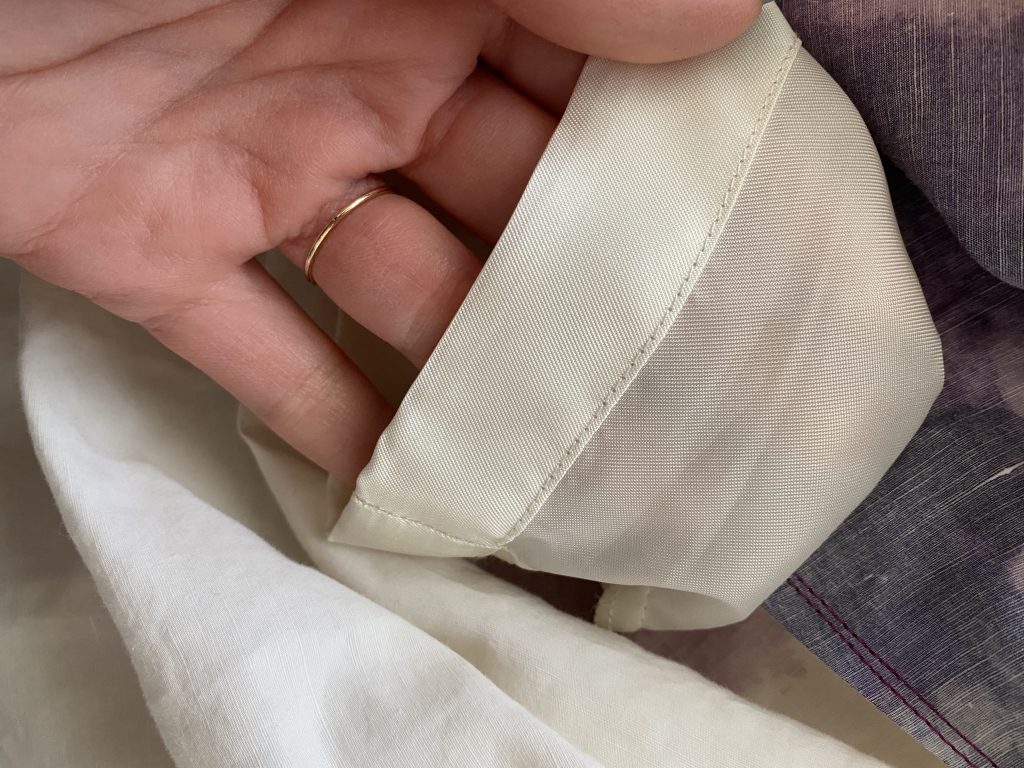
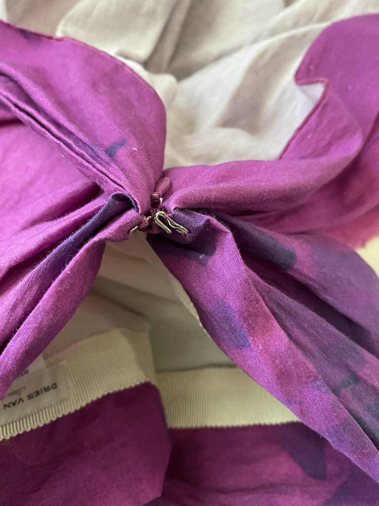
The inside finishing of a garment – seams, trim, hem, etc. – is a huge giveaway for quality. Look at the label above. It’s neatly sewn: no loose threads, even stitching. Look at the way the ribbon detail is attached; it’s flawless.
This is the bottom hem of the top layer.
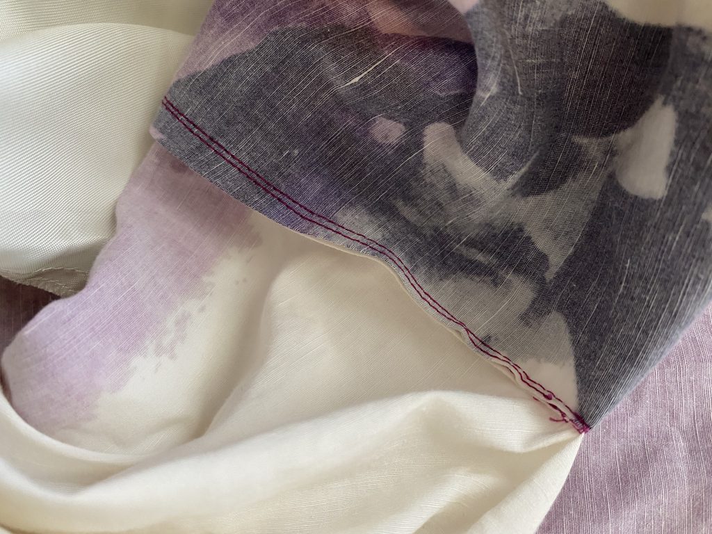
This is the inside seam.
This is the hem of the skirt lining. Again: everything looks neat and even and durable. These details are important because this is where brands will often cut corners. A garment might look really attractive on the front, but it’s the “underbelly”, so to speak, that will tell the true story. Turn it inside out and have a close look.
Design details are another way to spot quality. Some can be really minor things which, nevertheless, can make a big difference in the wearability of the garment. Women often complain about the lack of pockets in dresses and skirts. I am not fanatical about this; pockets are nice, but they’re not a must-have for me. [This skirt doesn’t have any, and I can’t say that it’s worse because it.] On the other hand, I am fanatical about bra keeps – those little hooks that hold your bra straps in place under thin-strapped dresses. It annoys me to no end when companies skimp on this and don’t add them when the dress design calls for it; they are literally made from one small snap and a piece of thread. Yes, they are fairly easy to add after the fact, but if you’re selling a (thin-strapped) dress for $200 and up, this should be a standard feature. Gah!
Another small design detail that can be easily overlooked is a hook-and-eye closure at the top of a zipper. I never gave these much thought until I came across a skirt that didn’t have one … and had to constantly fiddle with the zipper every time I bent over and it opened ever so slightly. These closures also help you to zip up the skirt more easily and without catching the fabric.
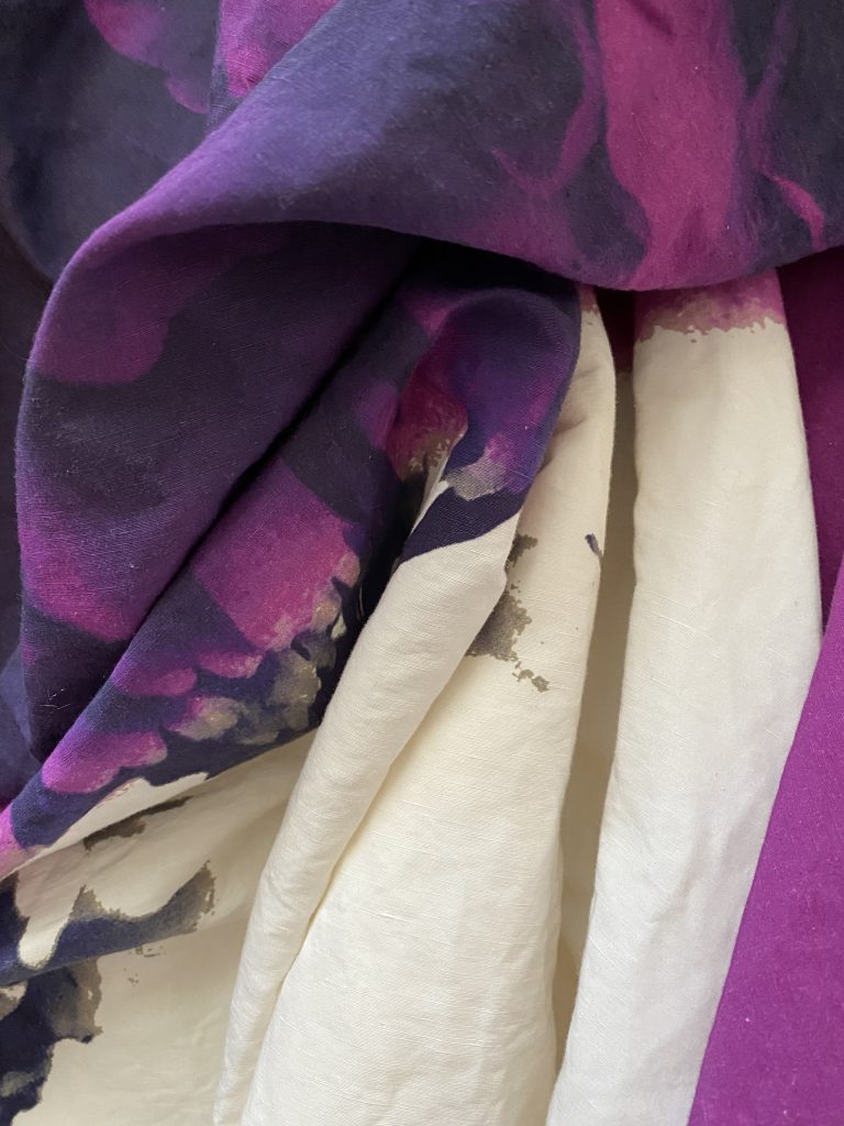
Other design details are more unique. I think the moment I truly fell in love with this skirt was the moment I realized why I could sit in it so comfortably. Let me explain.
You can see the way this skirt falls around the body – it’s intended to look like a sheath, with the skirt getting narrower towards the bottom. It’s a stunning shape, but often hard to walk and sit in because of that narrow opening. But not this skirt.
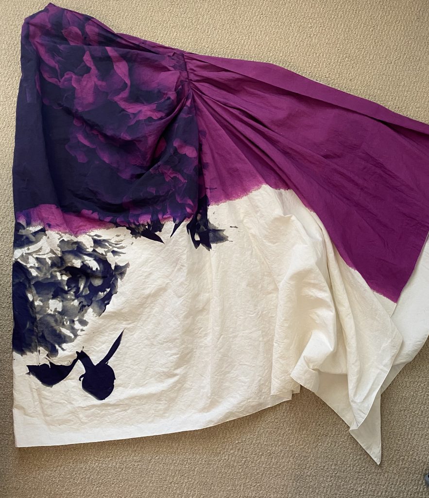
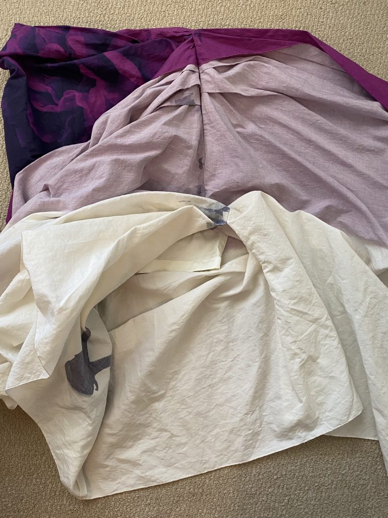
When I “fan” it out flat, you can see that it’s actually not any narrower at the bottom. Moreover …
The bottom half of the skirt is merely draped, not actually sewn together like a tube all the way down. The lining goes to the knees, and the skirt itself is sewn together only to that point as well; from the knees down, it’s opened on one side (with the opening covered by the side drape). This makes it comfortable to walk and sit, while maintaining that very architectural shape. This is a clever design.
While this is a very specific example, I am always looking for design details that are unique AND make my life, as the wearer of the garment, more comfortable. Here’s another example, borrowed from a Yohji Yamamoto shirt I own: small buttons hidden inside the placket in the space between regular buttons to eliminate gaping. From the front, it looks like a normal shirt, buttons-wise; but the placket lies flat with no gaping, almost as if by magic.
The key with clever design is that someone has thought about the person wearing the garment, not just about what the garment looks like. Some of these details you can spot in the garment on a hanger, but some may only become apparent when you put it on. Remember, if you find that you have to fiddle with a garment and constantly adjust it while wearing it, even though it’s supposedly the right size, the problem isn’t you – it’s most likely poor design.
I would love to hear your tips on spotting quality, so please feel free to share in the comments.