Time for another round-up of stuff I recently thrifted for my house (and the future vintage shop of my dreams). I’ve actually taken a little step towards the latter, by starting a new page for vintage sales and testing the waters a bit. At this point, I’m just listing things from my house that I wouldn’t be devastated to “lose”, and my goal is to see what people are interested in (learn your audience), practice my object photography/styling skills, and slowly start to build a local client base (fingers crossed). Baby steps towards a someday dream 🙂
But on to All The Things I found:
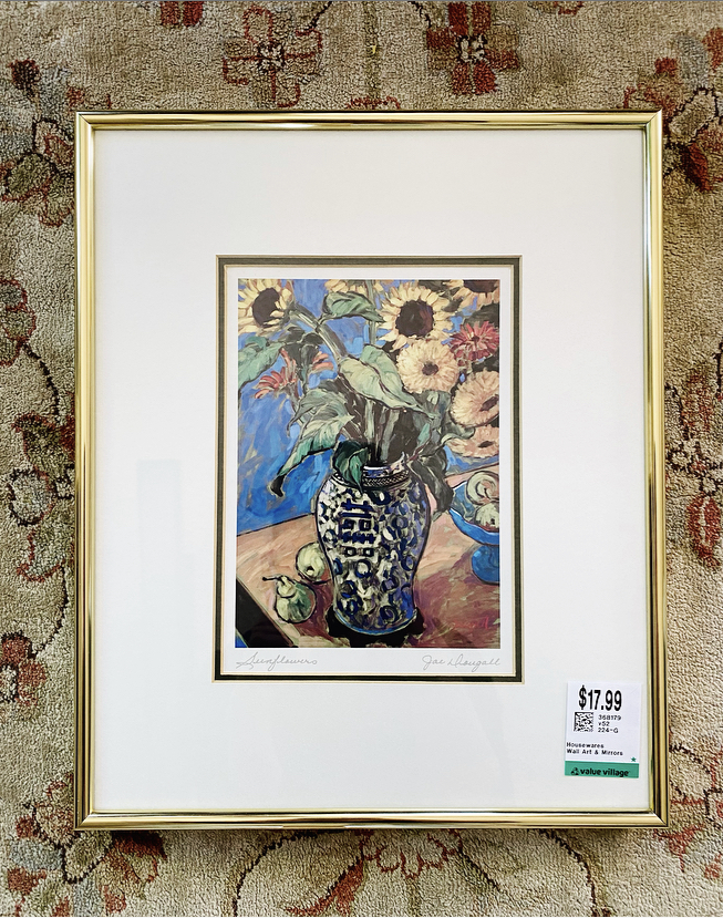
I “paid up” (thriftwise) for this Jae Dougall framed print but I love her work, and this one immediately caught my eye – love the composition and colour palette. It’s my third one, so I guess it’s officially a collection, hah.
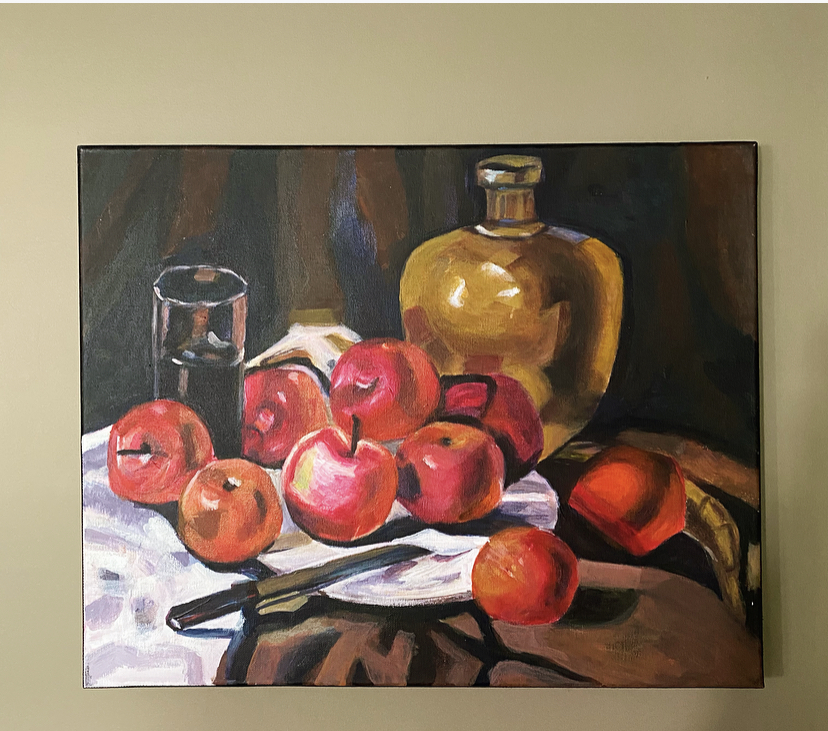
This is an unsigned painting, and I love it so much. I only paid $5 for it, which seems like such a steal. Love the warm palette of red, ochre and brown. It’s perfect for my reading nook with the yellow wingback chair.
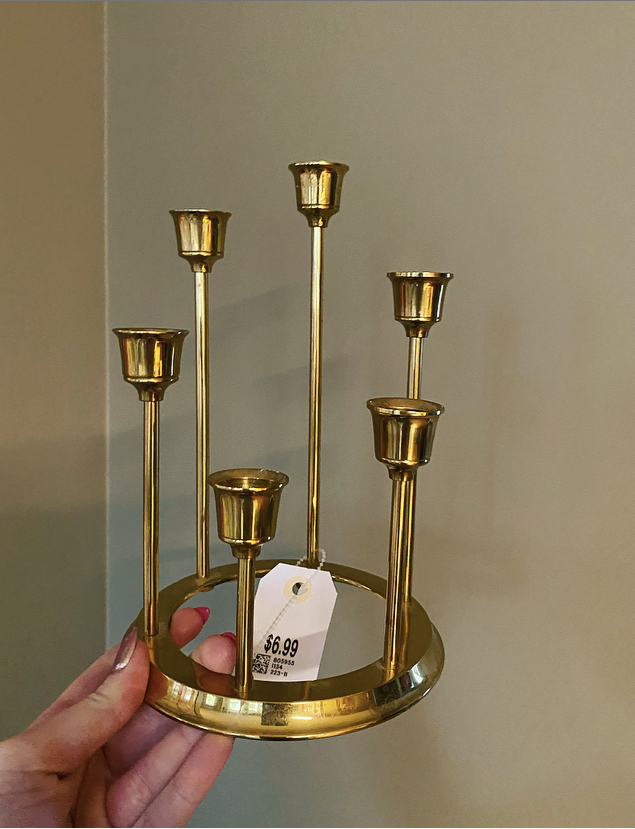
I can never resist an interesting MCM brass candle holder. As if.
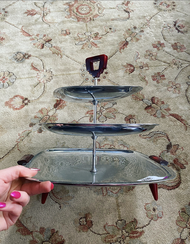
Speaking of MCM, I’m obsessed with this chrome GloHill Gourmates tiered stand. The handles are Bakelite. It’s such a cool, sleek vintage piece. I’m using it as a fruit display at the moment.
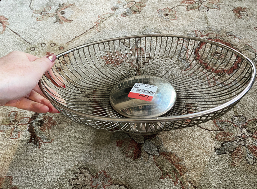
Ditto for this made in Italy brass bowl. I think it’s like an 80s piece, but it still has that MCM feel to me. It makes my apples look quite chic 😉
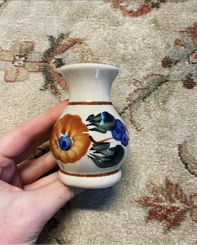
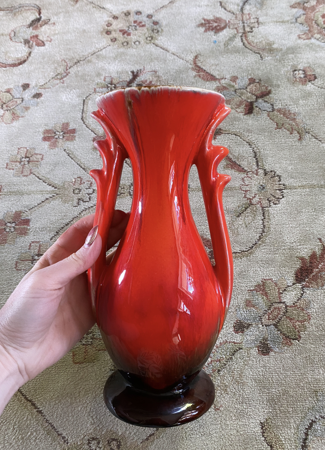
Itty bitty painted bud vase. Sooo cute. It reminds me of traditional pottery back in the Old Country.
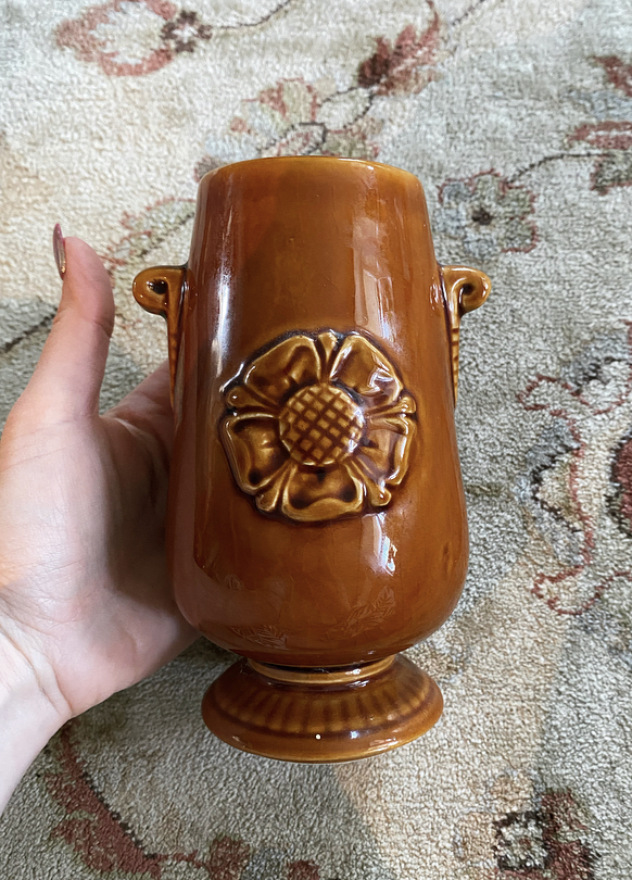
This is a Prinknash vase with a “Tudor rose” motif. I’ve been trying to learn more about the various English potteries, but online information is scarce so I may need to try to find a book. Any recommendations welcome.
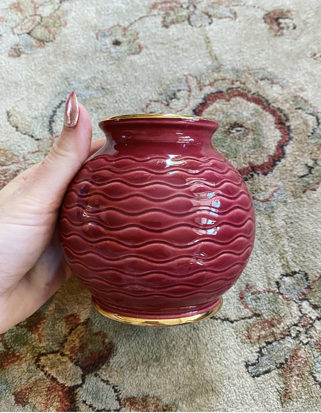
Speaking of English pottery, this is an HJ Wood vase. Interesting design and a lovely vibrant cerise colour.
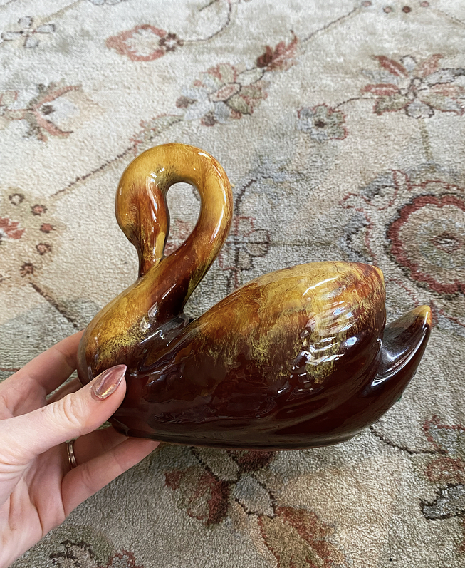
Adding to my swan/water fowl collection with this large Blue Mountain Pottery piece. It’s my first time finding one in this colour; I’m used to the traditional green/black glaze.
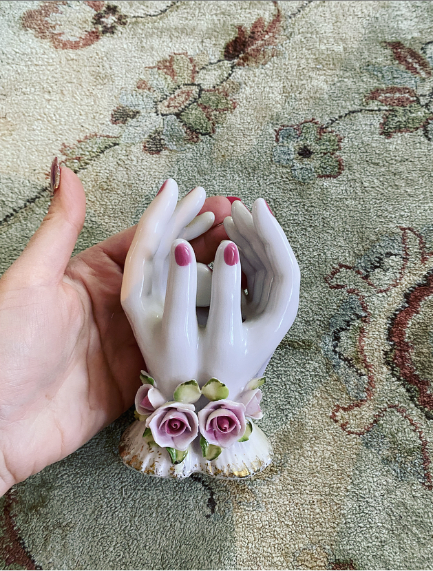
Finally! I’ve been obsessed with finding hand statues for a while, and no luck. This is my first piece that’s not a pair of praying hands. I was hoping for a more MCM design, but I love how dainty and delicate this piece is (made in Japan). It’s perfect for my vanity table.
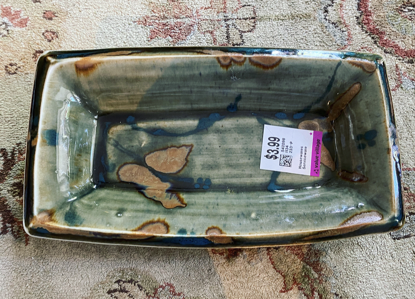
A small platter from what I believe is a local pottery studio (Selfridge). I was intrigued by the colours.
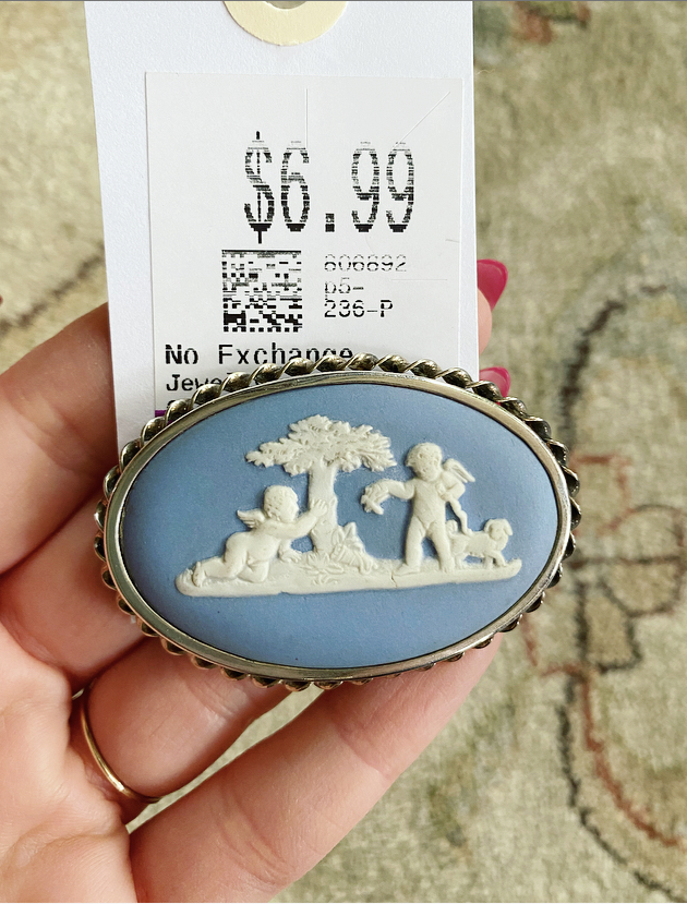
A very cool find — I know it’s not housewares, but bear with me. It’s a Wedgwood brooch! Stamped 1956 on the back, which makes it definitely vintage.
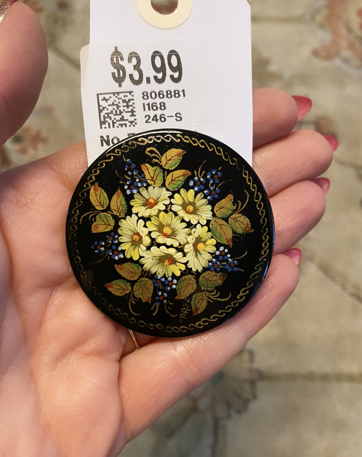
While this brooch is not lacquerware, it’s made in the same style as my grandmother’s Russian lacquer pieces so I had to grab it. There is a date and signature on the front (1992), and the brushstrokes are quite delicate, which makes me think it could be an original piece (but I have heard that there are now repros or knockoffs too, so who knows).
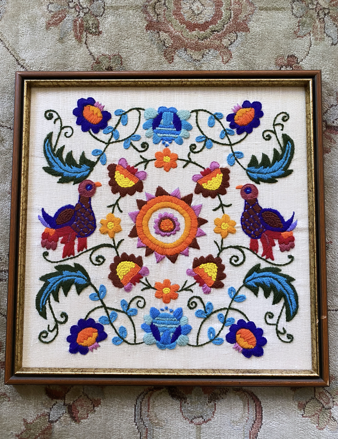
One of my fave recent finds! This is one of the first crewel work pieces I’ve spotted at my local thrifts, and I love it. After some debate, I finally managed to convince my husband to hang it up (in a hallway, but still!). I don’t know how he can not love it — it’s so whimsical and colourful.
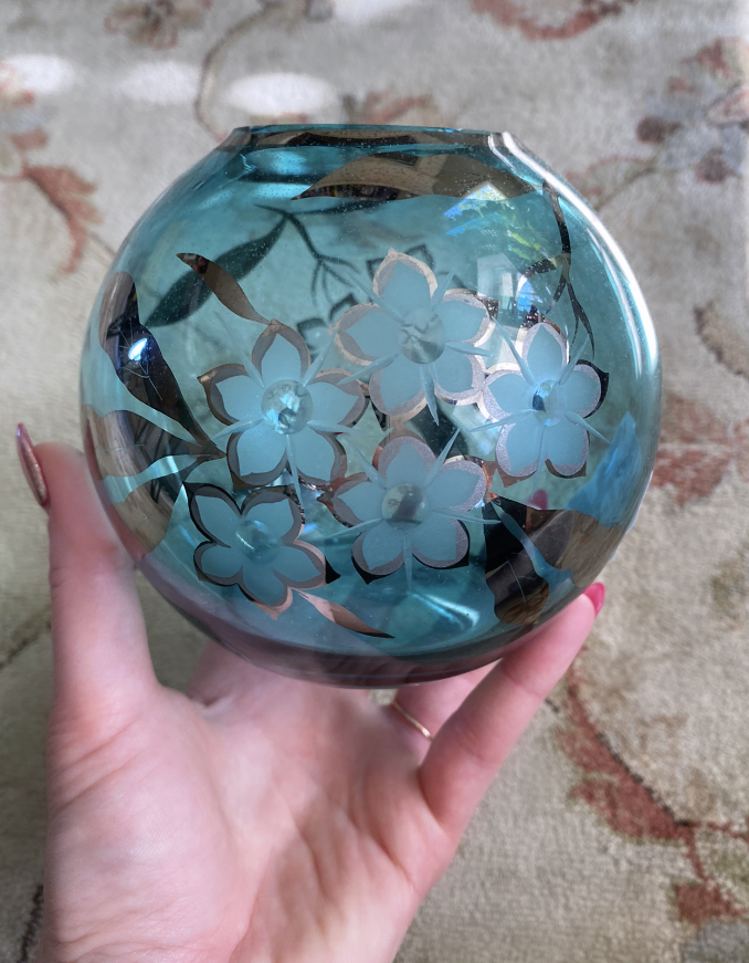
Aqua coloured glass? Cherry blossoms? Sold!
I liked the shape and vibrant colour of this vintage Seewal vase (Canadian pottery company). It really doesn’t take much for me to add more pottery to my collection, sigh.
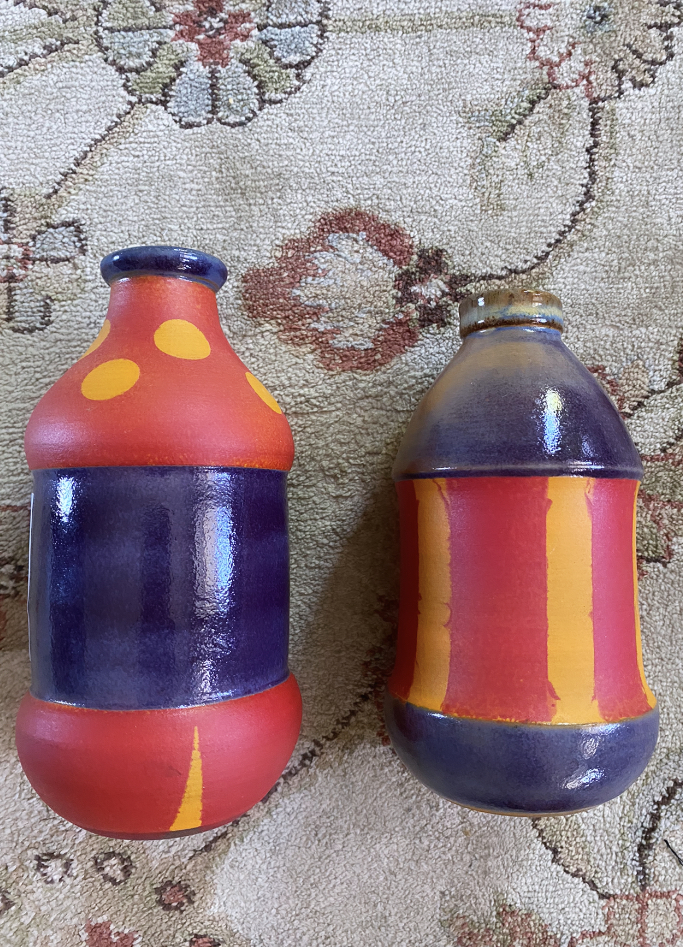
I got these two bud vases because, well, they’re so odd! They remind me of circus tents.
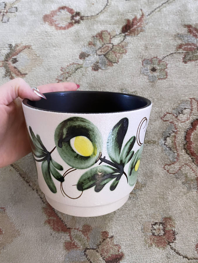
As a plant mom, I can never pass up a cute pot. This one is vintage, made in West Germany, and looked unused. It’s now housing my miniature African violet.
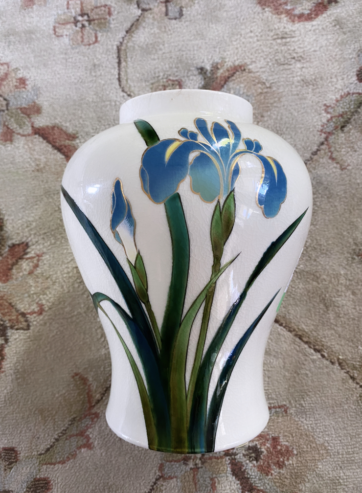
I’ve been obsessed with irises lately, so of course I had to get this vase. The colours are stunning, it looks like it might be hand-painted then glazed. So pretty!
And that’s it for now. Hope you enjoyed my “thrift haul” and stay tuned for more adventures in treasure hunting soon.