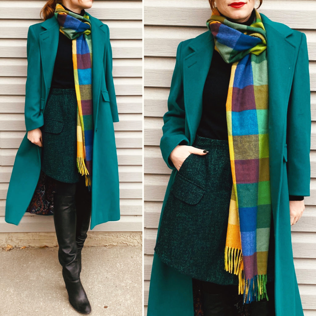
I recently added this wonderful vintage London Fog wool coat to my winter arsenal, and my only regret is that its colour is impossible to photograph. It’s much more saturated in real life, and a perfect deep turquoise-with-green-undertones. I love it so much, and it really brightens up a grey day. I would love to do a fully monochromatic look with it some day, but finding this exact shade of blue/green is incredibly difficult, it seems, even at thrift stores (where variety is the order of the day, every day). Anyway, I used to be the kind of person who only bought black or neutral coats, but don’t be like me and sleep on the possibilities of a brightly coloured version. I am actually still hunting for a replacement for my old MaxMara camel coat, but in the meantime, I’m having fun with something a little bolder.
Sparkle & Shine
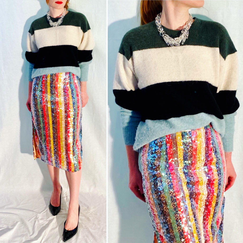
Winter is the season for sequins. It’s not even just the association with the festive holidays; sequins twinkling remind me of sunlight on snow. I hate snow, but I will grudgingly admit that, in the dead of winter (before the melt), it can look very pretty. Probably not rainbow-coloured, but that is where sequins are superior. I did a stripe-on-stripe outfit here, and I was very pleased with it.
Bloomsbury Girl
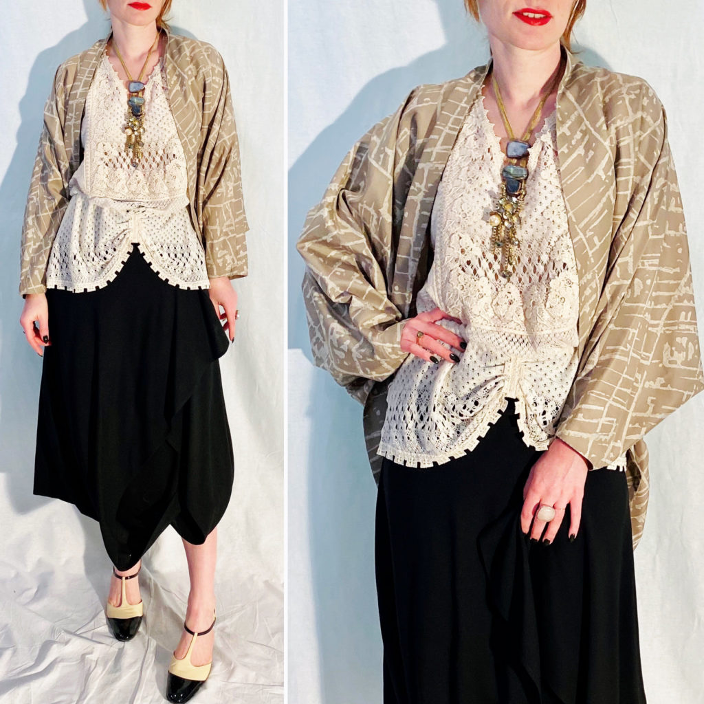
Hopefully you don’t get whiplash from all the back-and-forth, stylewise, that’s happening here. Some days, though, one craves a little bit of neutrals. Beige doesn’t have to be boring. Okay, it usually is (to me), but I love this Anna Suit crochet top and silk-wool Claude Poitras wrap, so I am making them work. The outfit ended up feeling evocative of the Bloomsbury Group (maybe I’m still secretly obsessed with Living in Squares), which I enjoyed very much. Most of my Bohemian outfits are usually every colourful, but this was a lovely change of pace.
Not So Fast, Buster
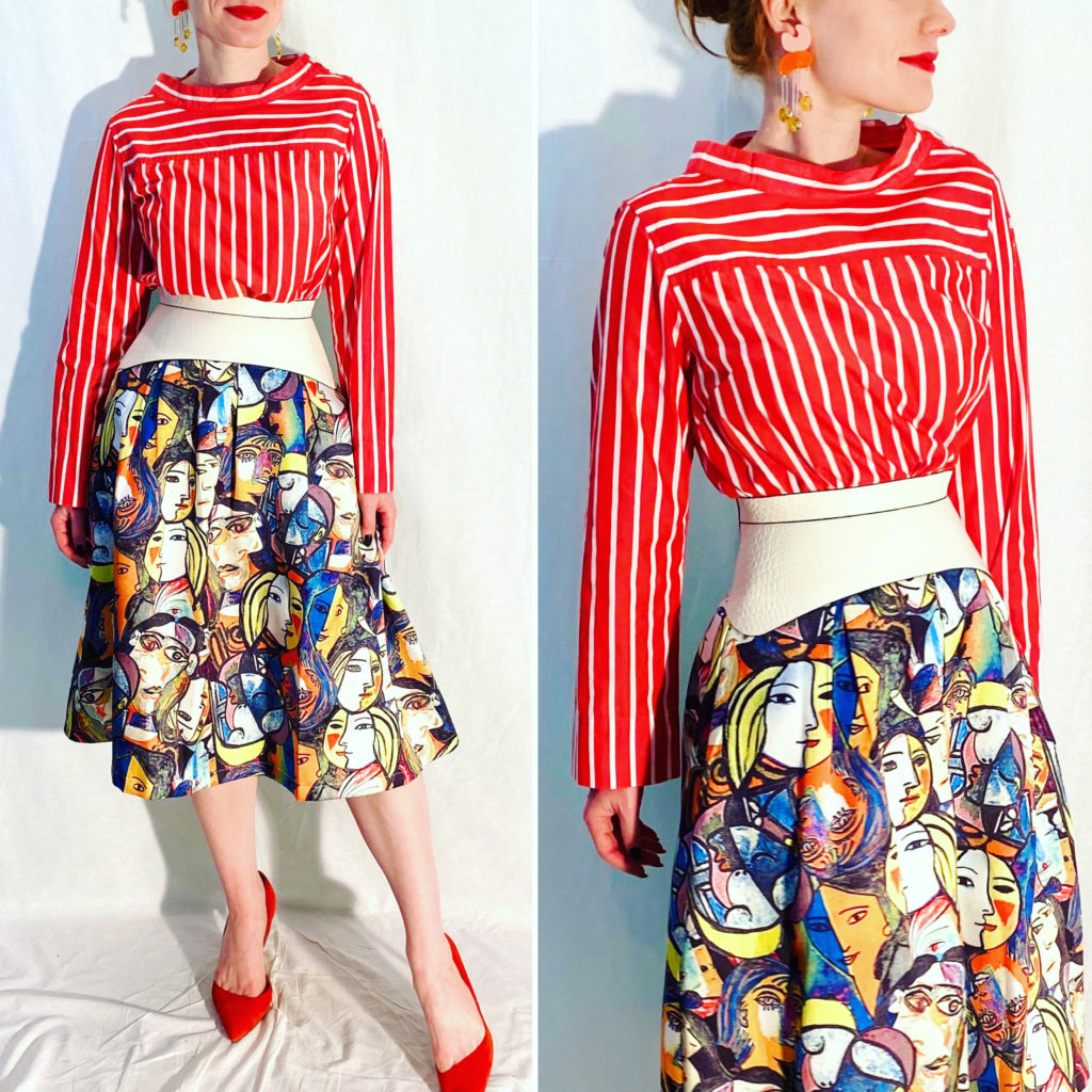
… because, yes, back to colour again we go! Candy stripes and abstract faces? Why not. I like that the unifying colour in this outfit is white. White always feels fresh when used intentionally like that. While I probably wouldn’t have worn this outfit at the office, I love that I could wear it at my home office; it makes me happy.
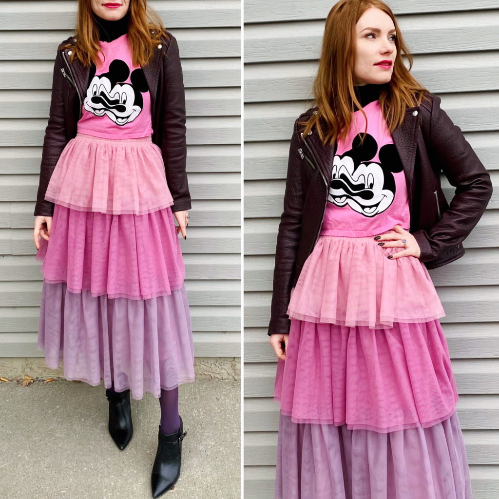
I’ve been meaning to wear my “cupcake skirt” again, and there’s no day like the present, as they say. Plus, once the snow hits, it will be harder. I paired it with my “glitchy Mickey” Zara tee, and some tonal tights (and leather jacket) and I feel like that hit the right balance of whimsical-without-being-twee that’s simultaneously so tricky to hit, but also so fun.
Luxe Historian
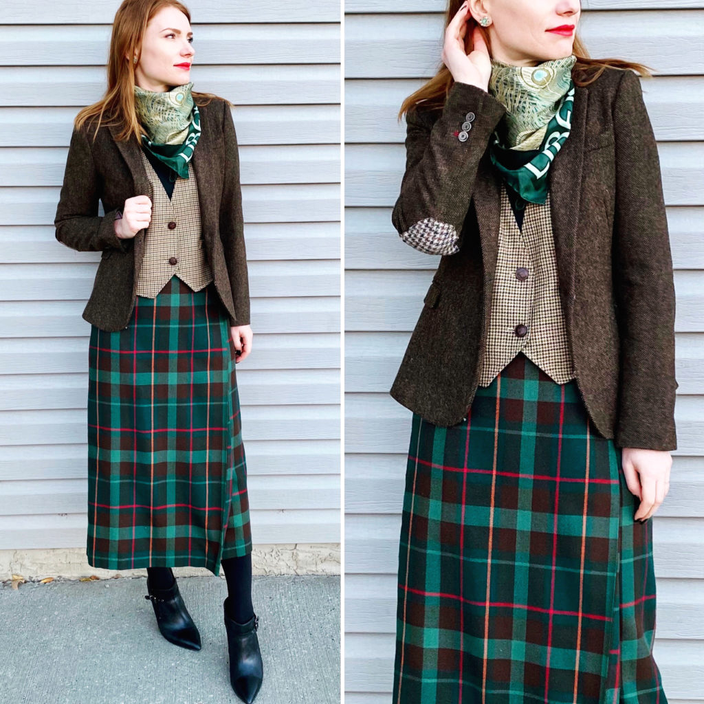
I still don’t have a good name for this avatar, but it’s basically my version of Diana Bishop (from A Discovery of Witches) come to life. I always enjoy doing a 3-piece-suit outfit, and here I mixed up a bunch of check patterns to good result, I think. I’ve been loving brown and blue combos lately, but brown and green works well too. The Liberty scarf was a nice extra touch; I need to remember to wear my (non-blanket size) scarves more often.
Après Ski, Hold the Ski
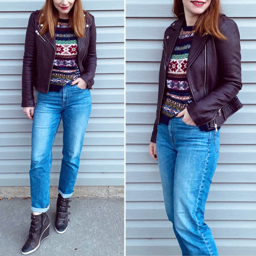
I have been looking for a Fair Isle type sweater for a while, and when I saw this MaxMara one pop up on Poshmark, I knew it was The One. I’ll post a better shot of it next time, I promise; it has a very cool, mixed pattern effect going on, with contrast sleeves and a contrast back panel (of course, are you surprised). This was otherwise a pretty basic outfit, also featuring my new-to-me pair of Ash sneakers, also courtesy of Poshmark. I have 2 other pairs that I have been wearing non-stop, and one is starting to go. In a panic, I went and got this one as a back-up. I love this style of sneaker so, so much. They’re leather, they have cool embellishments, and that wedge heel is very comfortable and also lends me some much needed extra height. I might have taken a break from my heels, but I will never not be looking for a little extra height.
One, Two, Three Punch
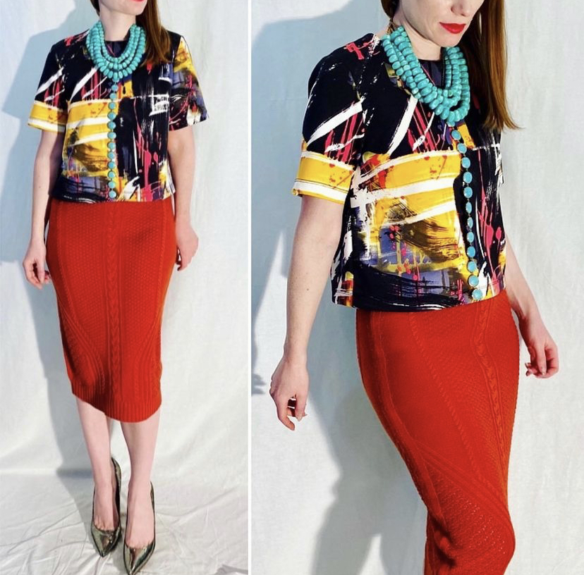
Orange and blue are such a powerful combo, but here it’s the yellow that really punches up the visual impact. I layered 2 necklaces to get this collar effect, and I love how they came together; much more dramatic than either necklace on its own. I realized that, with the shorter darker days ahead, I am increasingly relying on colourful outfits to brighten up my mood. Even when I’m feeling “witchy”, my default seems to be bright+bold+patterns. Then again, who’s to say that witches can’t love colour?
I was asked to write about my approach to pattern mixing, which is not surprising given how much of it I’ve been incorporating into my outfits lately. I’ll caveat this post with my usual disclaimer: I am not a professional, and 99% of my outfit choices are based on gut instinct. I look in the mirror – “does this look good?” If yes, we’re off to the races. If no, then I tweak (or start from scratch again) until it does. So I am perhaps not the best person to talk about this because I am not following any kind of scientific (quasi or otherwise) theory, and the thoughts I’ve assembled here are based on some post-facto analysis of outfits that I would consider successful examples of pattern mixing.
All of which to say … there are probably better guides out there (which is in fact the reason I didn’t call this post a “guide”, hah!) but you’re here reading this so let’s go.
Idea #1: Cheat Your Way to Pattern Mixing
Cheating as the very first suggestion? Wow, that’s ballsy. But, seriously, it’s the best (and perhaps only bona fide) tip I have for you. Pick a pattern. Look at the colours in that pattern. Find another pattern that uses some or all of the same colours. Whatever colour(s) you choose as the “glue” of your outfit, it should feature prominently enough in both prints to be easily visible as such.
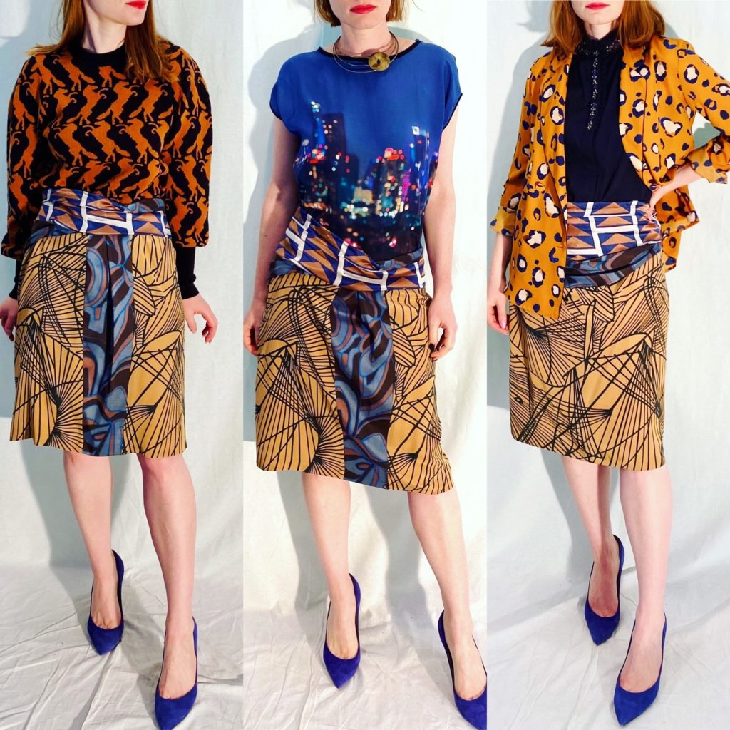
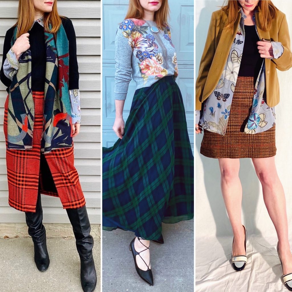
Here are some examples using a Dries Van Noten skirt. I chose this because the skirt itself features pattern-mixing.
As you can see, I am partial to using cobalt blue and/or some shade of rusty orange as my unifying colours, because they pick up on the colours of the skirt. Each of the contrasting patterns is very different, but the overall colour palette is consistent, which looks pleasing to the eye (to me). And oops, I only just realized I wore the skirt backwards in that photo on the right, d’oh!
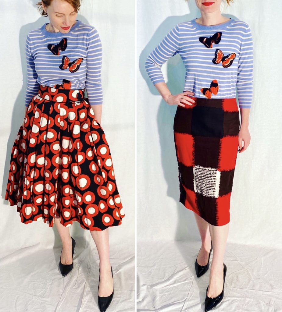
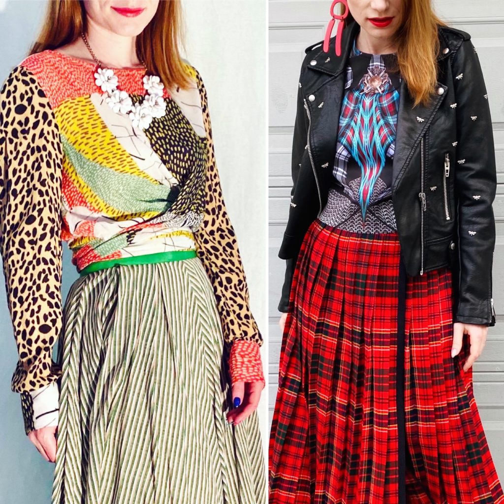
Here are a couple more examples:
Obviously, here, the unifying colour is red. As I will discuss below, stripes are a safe bet for pattern mixes, because they work with floral prints, geometric prints (what I would describe the two skirt examples above), and abstract prints.
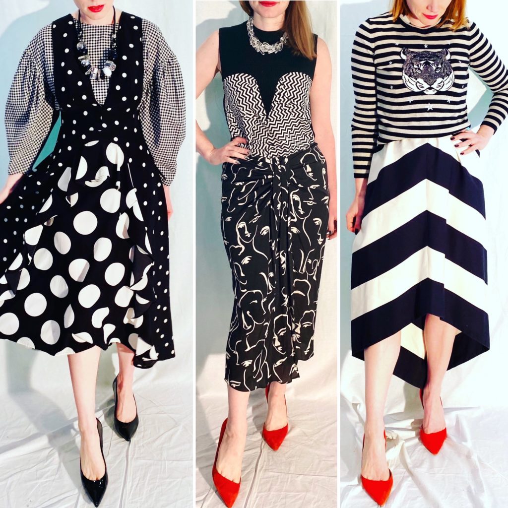
Idea #2: Monochromatic Free-For-All
If you stick with monochromatic (black and white, or single-colour) patterns, you have more leeway in terms of what you can add to the mix. Maybe this is just an extension of the first tip? Gah. Let’s pretend is brand new information, okay?
What I try to do with monochromatic prints is make sure they are quite different (e.g. middle outfit – geometric vs abstract) and/or of different scale. You can see the impact of scale with the left and right outfits. On the left, you have 2 different sizes of polka dots, plus a gingham print that’s smaller than both. The outfit is high-contrast. On the right, you have two stripe patterns, but the stripes are of different widths and orientations. The tiger is just an nice bonus.
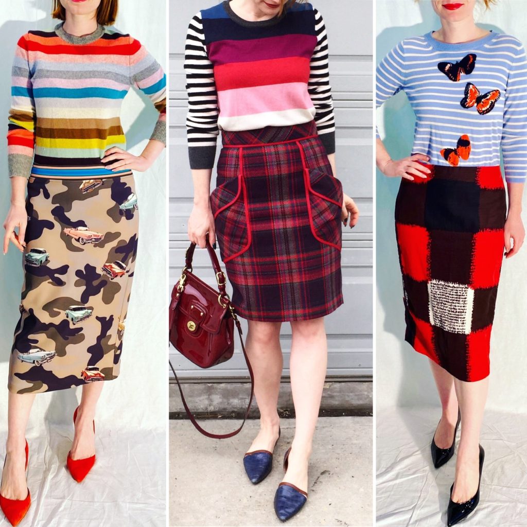
Idea #3: When in Doubt, Stripe It Up
I know not everyone is a fan of stripes (especially horizontal ones) but I have come to love them. I think the key is finding stripes that suit you. I am personally not a fan of thin stripes, and Breton-style tops. I love chunky stripes (bordering on colourblocking) and colourful ones. These look great with other big/bold prints; I’m not sure I would pair them with a small, ditzy floral, for example.
Again, the key when working with 2 very colourful prints (including stripes) is to find a unifying colour. The example on the left is probably the most subtle; it looks like a very wild combination but there are actually a few unifying colours. Can you spot them all? There is red, of course (red stripe, red cars, red shoes); aqua blue (aqua stripe near bottom of sweater, which is a bonus because it means it’s visually closer to the skirt, and the aqua cars); bright blue (blue stripe around the bust, blue waistband on skirt); and black (black stripe, black in camo print). I’m not counting brown, because the shades in the stripes and the camo print are too different.
Idea #4: Florals and Checks
I bet you were wondering when I would get to florals. Well, here we are. Someone asked me if I had said that “florals are a neutral” and, honestly, I can’t remember but it sounds like something I would say. I love florals! Strangely, though, I haven’t used them a lot in pattern mixing … at least not according to my unscientific search of my photo albums. This is a discovery that I’ll be brooding on for a while, let me tell you. What I did find is that, whenever I do use florals in a pattern mix, I tend to pair them with what I’m going to (incorrectly, I’m sure, don’t @ me) categorize as “check” prints. This includes, per the examples below, plaids, tartans, houndstooth, and checks of all other description.
Idea #5: Compound Patterns
This is probably becoming a bit niche, but what if you’re dealing with what I’m calling a “compound pattern” – i.e. a pattern made up of several prints. Here are two examples: (i) bl^nk top on the left; (ii) Clover Canyon top on the right.
I tend to wear compound patterns with solid colours, but it is possible to pair them with prints as well. Part of it is, again, finding a unifying colour. Part of it is finding a print that’s complementary to whatever’s in the compound pattern. On the right, the top has some bits of plaid sprinkled in; the skirt carries through that theme. On the left, the top has a variety of small-scale prints; the skirt has very thin stripes which look like they would fit right in with the others.
This is by no means an exhaustive compendium of ideas for pattern mixing (I reserve the right to change my mind! at any time! I’m capricious like that, but also style is never written in stone) but I hope it’s provided some fodder for your closet experimentation. Share your ideas in the comments 🙂