
I don’t normally look at my Explore page on Instagram, but I accidentally clicked on the wrong icon recently and I was pleasantly surprised. I guess that, after all this time, the algorithm is finally starting to understand me a little better. I’m not sure if I should be happy or terrified. At least now my Explore page is filled mostly with things I am actually interested in: fun, colourful clothes, colourful art, and (mostly) colourful interior design. It’s not something I plan to, ahem, explore too much because at the end of the day, that feed still only has one purpose which is to make me what to buy things and I am not interested in that. But it’s nice to know that if someone were to somehow get a peek at it, they wouldn’t get the entirely wrong idea about my interests. It would be horrifying if people thought I was one of those Sad Beige Life folk. [I’m being sarcastic but only a little bit.]
But that’s neither here nor there. One of the things that caught my eye when I looked at my Explore page was a TikTok from some young person about colour analysis. This is a thing that has been around forrrrever but trust that Gen Z will find a way to make it easier to understand. I have struggled, on and off (mostly off), for years to figure out what my “season” is and, 30 seconds into this TikTok, I finally got it. I mean, it’s a bittersweet victory and all, seeing as how I’m now old enough to not care about wearing “flattering” colours or whatever, but it is a victory nonetheless.
Actually, my biggest takeaway is that, in recent years, I have been doing most of the “right” things (per my season) without realizing it. And, full confession mode: it did lead me to do a teeny tiny edit closet which, between you and me, was overdue anyway.
But let’s go back to the beginning.
It turns out that I am a Spring. A Bright (or Clear) Spring to be precise. The colour palette is bright, vibrant, but cooler/less warm than other seasons (except Winter).
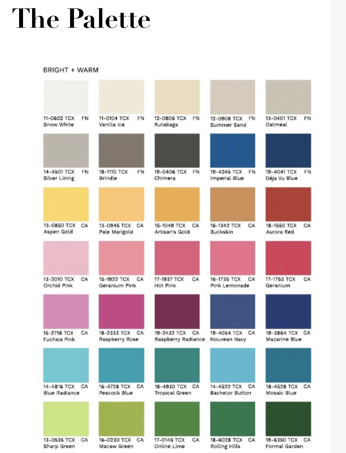
Looking at these colours, I am immediately, like, “YES!!” which makes it all the more confusing that I struggled so much in the past to figure out my season. I think it’s because a lot of guides are married to the idea that red hair = warm undertones = Autumn. But not all redheads are the same, duh. As a green-eyed redhead with parchment colour skin that leans rosy not peachy, super warm colours are not my bag. Ironically, one description of Bright Spring I found online mentioned how “[y]ou’ve probably had great difficulty finding your season because no one looks at you and thinks ‘Spring’.” You can say that again!
Here are some of the styling tips given for Bright Spring which resonate with me and actually align with what I’ve discovered (on my own through trial and error) to work for me.
“Since Bright Spring flows from Winter, black in included in the palette. But the best versions of black for Bright Spring are a slightly yellowish charcoal and a slightly greenish black. These are warmer and more suitable dark neutrals than the cool blue-black of Winter.”
I have definitely noticed that some shades of black work better for me than others, and this is something I’m going to pay more attention to going forward.
“[B]lack on its own is not flattering on a Bright Spring since you need vibrant colours to lift your appearance. It’s better to mix it with some of the other warmer, more saturated colours on the palette.”
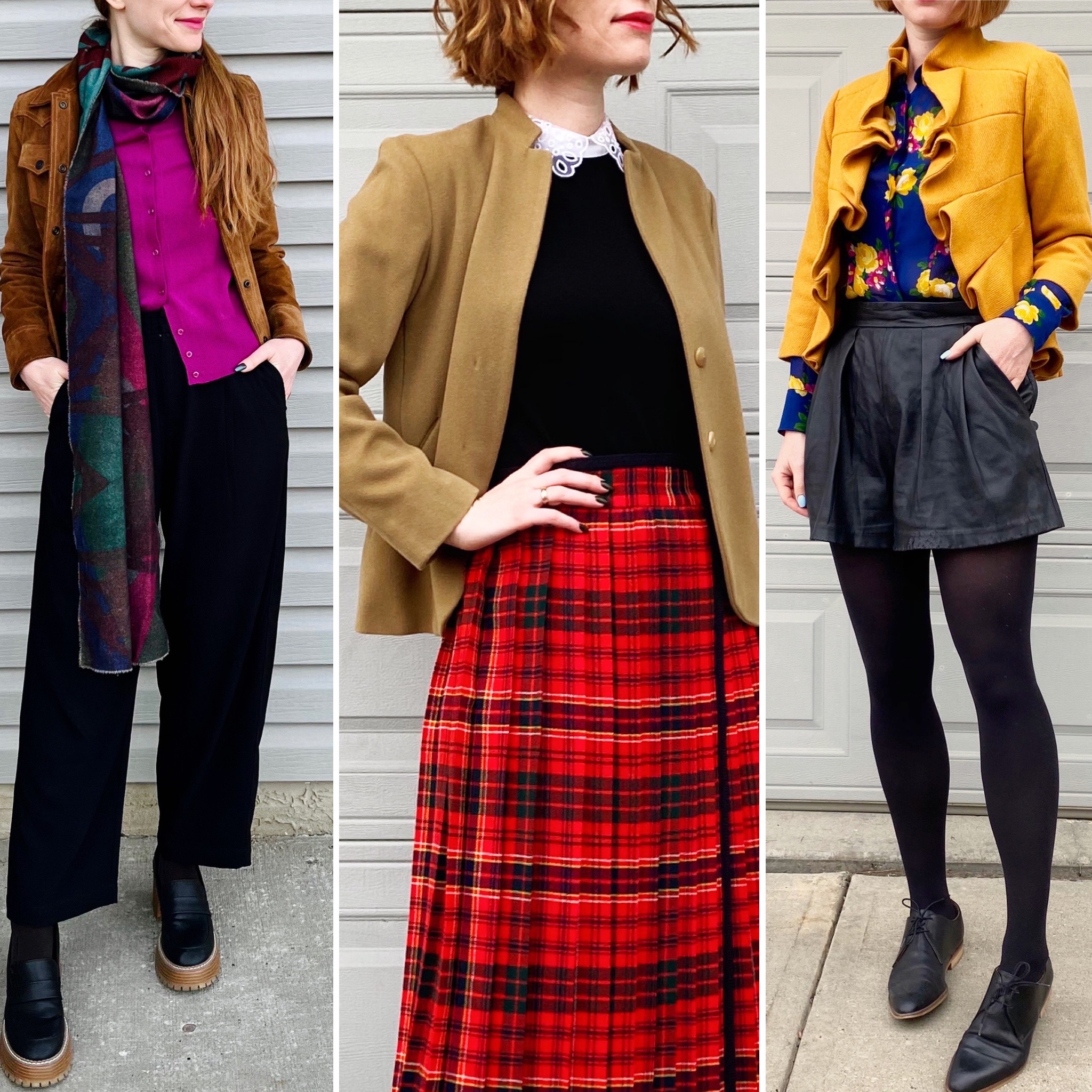
I love incorporating a touch of black into an outfit with strong, saturated colour. Especially with the colour positioned closer to my face than the black – somehow, those outfits really “pop” for me.
“In general, always aim for at least one bright colour in your outfit. Avoid neutrals-only combinations, monochromatic looks, and low contrast combinations. These will diminish your naturally vibrant colouring.”
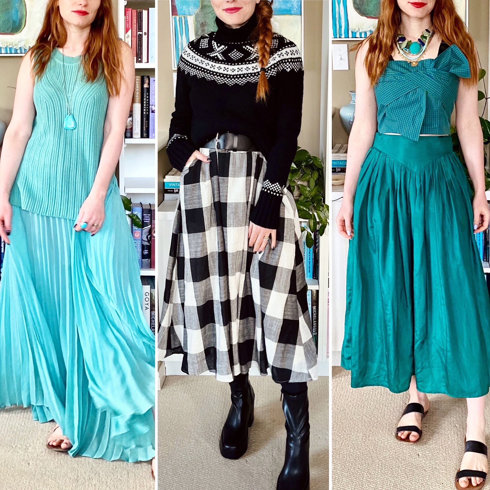
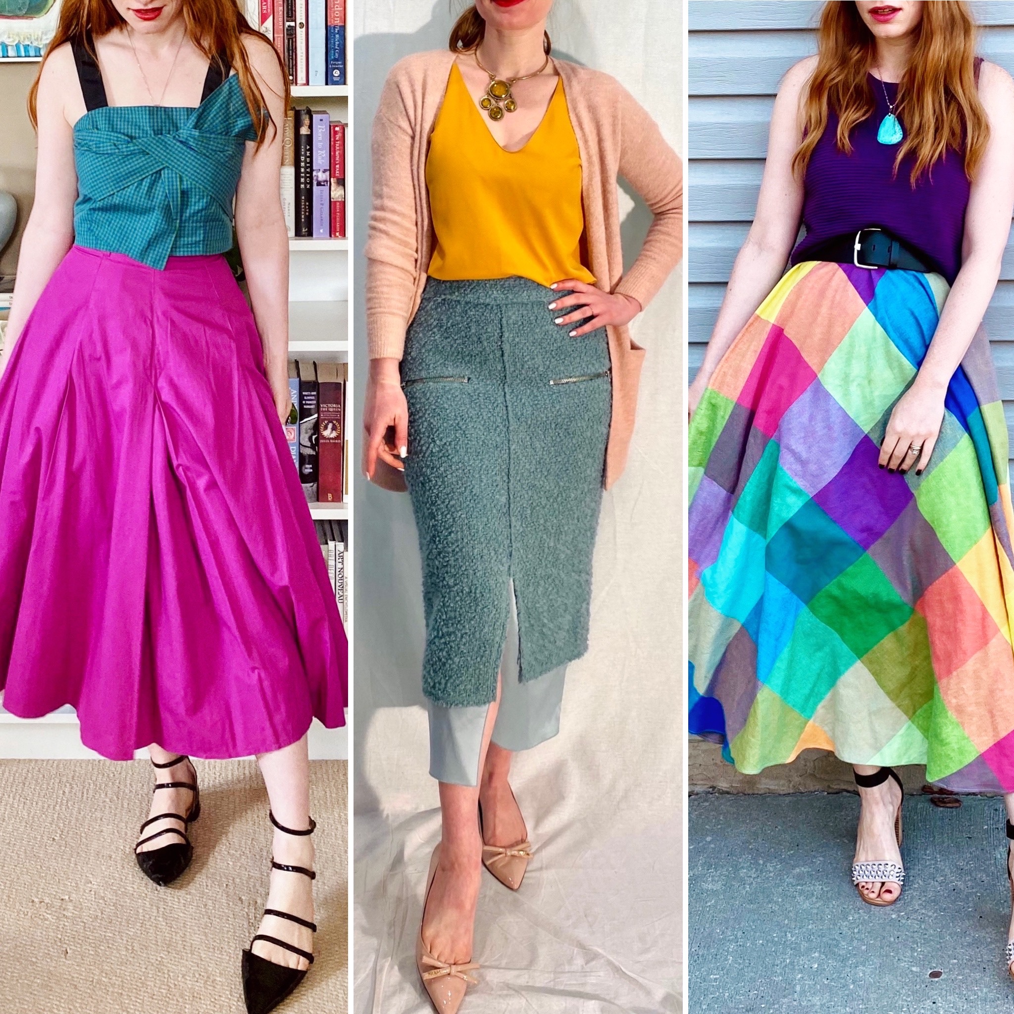
I feel SEEN. No beige outfits! I still love monochromatic looks, but I prefer either black with white – super high contrast which works for Bright Spring – or one bold colour (or colour family) head to toe.
“Don’t be afraid to combine unlike colours – particularly those sitting opposite each other on the colour wheel, such as pink and green. The more unusual the combination, the more striking.”
Don’t. Need. To. Tell. Me. Twice.
Overall, figuring out my season wasn’t a game changer but it did inspire a few tweaks. It confirmed that the colours I’ve been gravitating towards lately – like aqua, turquoise, magenta, bright green – are good choices for me. Ditto for bold colour combinations. It also helped me with a small closet edit; I decided to prune a handful of items in shades which, while lovely, are too muted for me. They were pieces I didn’t reach for a lot (and now I have an inkling of why) and just needed that extra push to let go.
As it happens, over the last few years, my wardrobe has naturally (instinctively?) evolved towards a Bright Spring palette so nothing much will change now that I have a label to hang on to it. I am not planning to take colour swatches with me to the thrift store when I shop, but I will certainly keep the high level ideas – bright colours, high contrast, warm black – in mind.
If you’re wondering about that TikTok that helped me figure out my season … I’m sorry. I didn’t save it and it’s long gone from my Explore page. For what it’s worth, the question that single-handedly helped me the most was the one about the colour of the veins on my arm. I could never quite figure out before if I was warm- or cool-undertoned. (I think my skin tone is actually relatively neutral, which is true for Bright Springs.) The question was something to the effect that if your veins appear green or greenish-blue, you’re warm toned; if they appear blue or purplish, you’re cool toned. The latter is true for me, and figuring this out tipped the balance away from Autumn.
So good luck if you decide to try to figure out your own season. Definitely don’t bother with the Buzzfeed test though. It told me I am a … wait for it … Autumn. Siiiiiiiiigh.
Can you link to the TikTok video? I have such trouble with this!
No, I didn’t save it when I saw it on IG and it’s long gone from my Explore page. I don’t have TikTok so I can’t look for it there. Sorry!
Ah, this makes so much sense! Back in the day everyone told me I was an Autumn, but that never really quite worked for me. Given what you mentioned about the vein color that also means I am more cool toned. And I too love me some opposite side of the color wheel mixing 🙂
Yeah, so many times the quizzes and what not kept pushing me towards Autumn, and it just doesn’t work for me even though I do love many of the colours. Even Summer (which was sometimes suggested) wasn’t a good fit. I def feel like what was missing was the high contrast and bright colours.
Mom and I had our colors done in the late 1980s. She was a Winter, and I am a Light/Soft Summer. With my hair back to my childhood shade of ashy blonde, there is very low contrast between my skin and hair. What I have learned with time is that anything bright is too harsh and overwhelms me–it wears me. I could pull off richer shades when my hair was undyed, and I still feel that I have a right to wear those colors now, esp. in the winter. So, I am that season that can pastels, gray, and anything “heathered” till the cows come home.
I loved Mom’s cool brights and jewel tones growing up, and I will never give up black because I am a Scorpio, damnit, and black is our birthright. But her colors are just too much. She had a lot more contrast between her pale skin and dark brown hair. I also know that if I put on some of your warmer brights–especially lime green–I turn yellow and look sick. Olive is just dull and does nothing for me. I do not wear orange or brown.
So it was learning what looked good on me and wearing what I wanted until I was a little older and realized that some colors just do not work on me.
Should anyone wear beige? Mom and I called it a non-color. I found myself being attracted to “flax” linen earlier this year, and I was like, when did I get so old, and WTH?
Haha, should anyone wear beige? Well, you know my feelings on that. Every time I find myself even remotely tempted, I have to remind myself that I do not look like a Nancy Meyers character come to life in beige. I look like a sorry bowl of oatmeal, lmao!