Pantone’s Colour of the Year for 2025 is Mocha Mousse and people are having some kind of feelings about it. In case you haven’t already seen it, here it is:
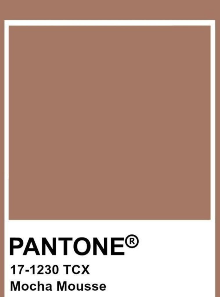
I get why it would be a more divisive pick than usual for Pantone. Brown isn’t a colour most people get excited about. I used to be one of them and while I could proselytize about brown with all the typical enthusiasm of the recently converted, I am going to save my breath and let others figure out their own journey. Mocha Mousse is not brown at its most inspiring, but that’s also just a personal preference; it’s a bit too washed out and cool-toned for me. But I’m thrilled that any shade of brown has hit the Zeitgeist, however briefly, because it means that I get to be accidentally on trend for a bit, which is rare enough in my case to make for a pleasant surprise.
My wardrobe has been slowly filling with brown clothing and I am excited to start a new year – four new seasons! – with so many exciting options at hand. While Mocha Mousse doesn’t feature prominently (or at all, really) in my line-up, here are some of the shades of brown that do:
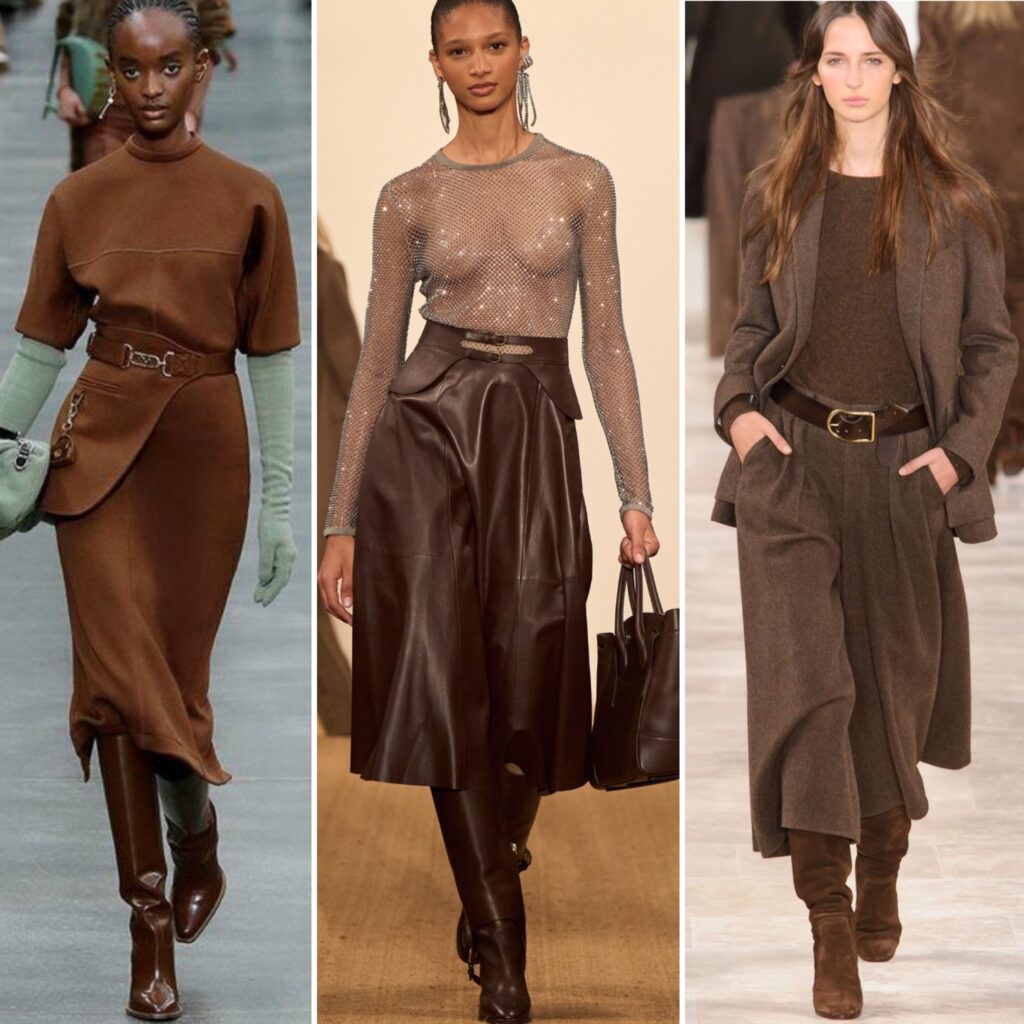
Since brown has replaced black as my core neutral, I have been slowly adjusting the rest of my wardrobe palette around it. Many of the colours I’ve gravitated towards in the past – blue, first and foremost – do work well with brown. But brown has opened the door to some different colours – and colour combinations – as well, and I have been enjoying exploring those in recent months. As in all sartorial matters, my experimentation has been guided by my thrifting. It’s one of the reasons why I don’t get too excited about Pantone’s opinions; thrifting always marches to the beat of its own drum. As a thrifter, you have to embrace the chaos and learnt to spot the possibilities it spins your way. A few colours that have lately crossed my path at the thrifts have made the jump from ‘hey, that’s nice’ to ‘shoot it straight into my veins, NOW’ territory. In short, I am obsessed.
What colours are we talking about?
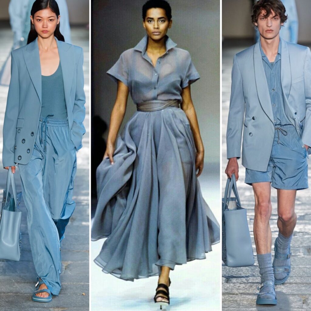
I am crap at describing colours and this particular shade of blue is impossible to pin down. I did my best to find images that line up with the mental image I have, but it was difficult. The middle image* probably captures it best. It’s a slightly greyed-out sky blue. A lot of similar shades I’ve seen online tend to lean either too purple (more like periwinkle) or too green, or they’re too pastel or too icy. The inspiration behind my obsession is a Uniqlo sweater I thrifted back in November; I have been wearing it once a week ever since, and considering how many sweaters I own (answer: dozens!), that’s saying a lot.
*Also, can we take a moment to appreciate that stunning dress? It’s Alaia, of course. Sigh.
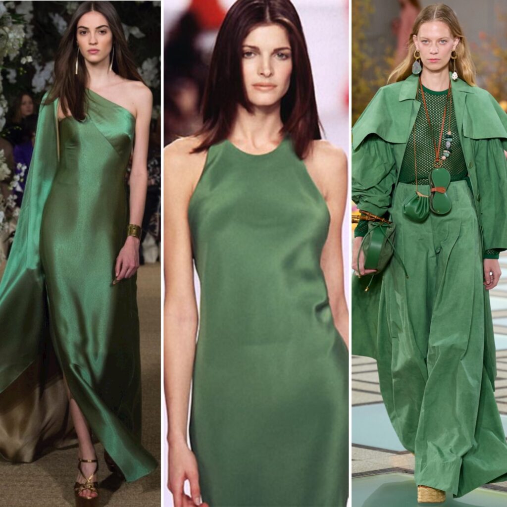
Speaking of colours that are difficult to find, can I introduce you to this gorgeous shade of green that doesn’t seem to have a name? I adore it. The closest thing I’ve found so far is a slightly more blue-leaning version, but I am persistent as hell when it comes to the objects of my hyperfixation, and I expect I will find my luck at the thrifts sooner or later. It’s a shade that reminds me a lot of the 90s, and I love how unexpected it feels.
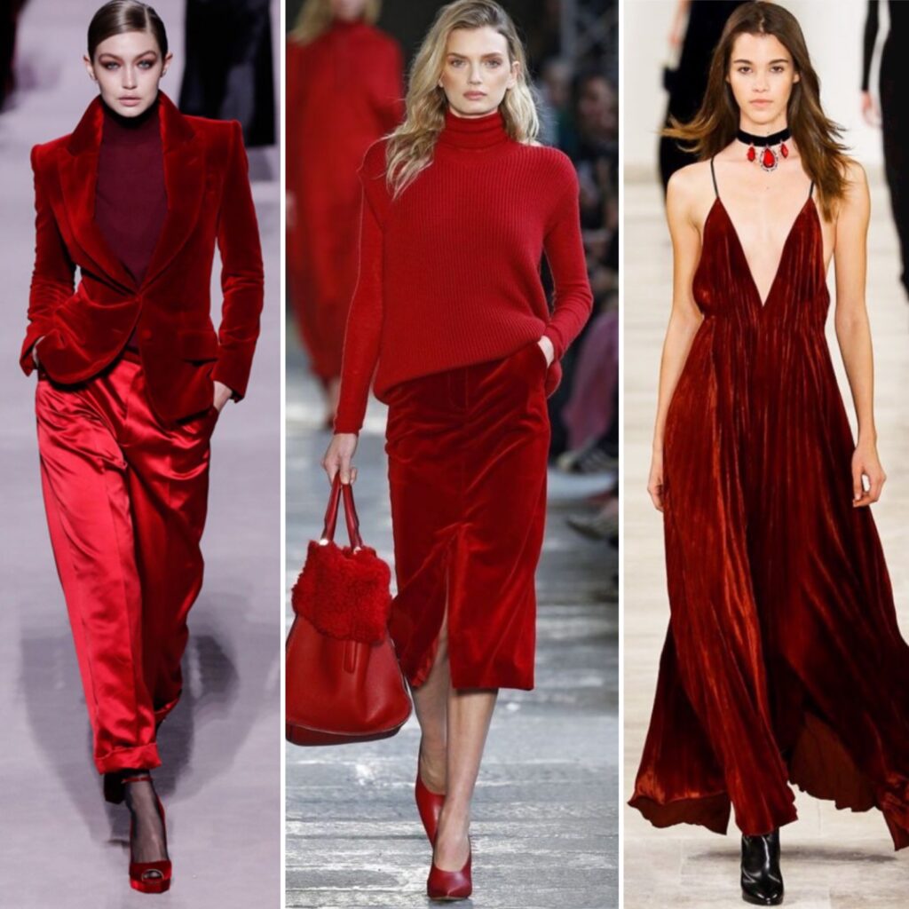
This one should come as no surprise, as I have been obsessed with deep red for a while now. Again, nailing the right shade is tricky. It can’t be too orange, but it also can’t be too blue. It can’t be too bright (lipstick red), and it can’t be too dark (burgundy/maroon). It’s not a colour I would wear head-to-toe, but it’s perfect as an accent.
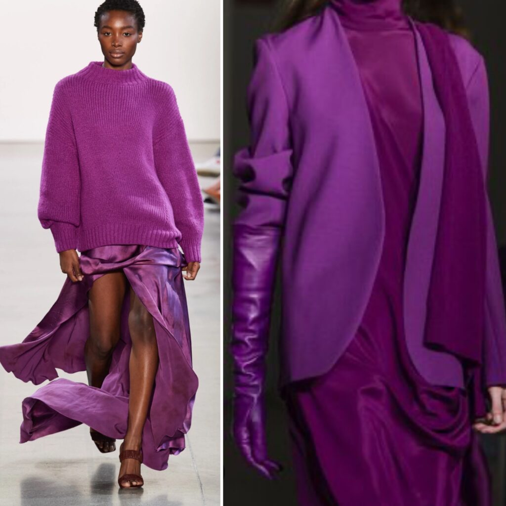
Orchid was a Pantone Colour of the Year a while ago, but seemed to fade out of the collective consciousness pretty quickly (no pun intended). I have a love/hate relationship with vibrant purples: I love looking at them, but struggle to wear them. In the past, I have gravitated more towards the plums and aubergines, which seemed to play along better with the rest of my colours. But I’ve always had a bit of a soft spot for magenta and I feel like, recently, that has pushed me to reconsider orchid.
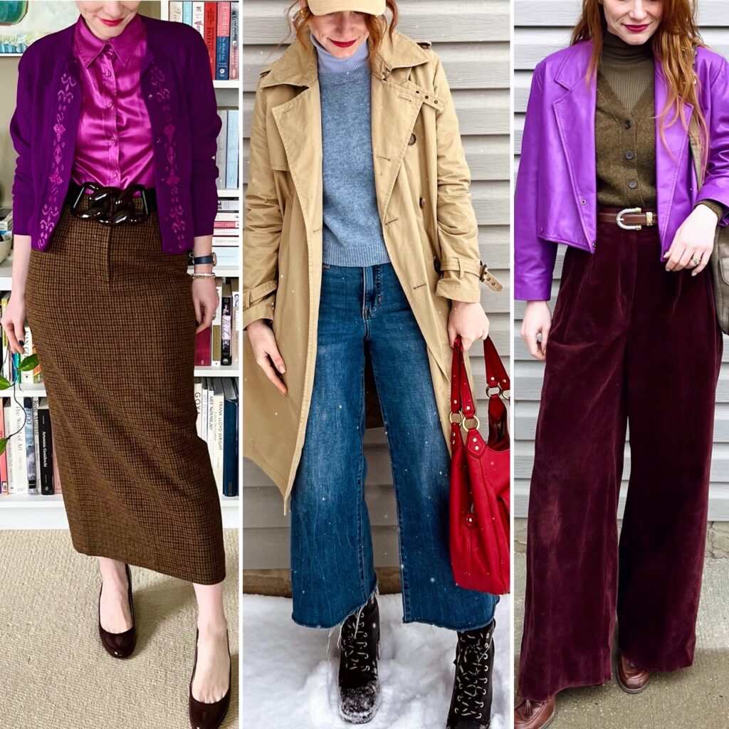
All of these colours pair nicely with one or more shades of brown, so adding them in small doses to my closet will create lots of remixing possibilities. I have already tried a few of them … and I want more!

I‘ve long dreamed of owning a dress in that exact shape of green that I also cannot really name after seeing this picture on Pinterest: https://pin.it/5MyEbP5NG
Also love, love the blue.
Even without brown being the new colour of the year I also found myself gravitating more to it. In my teens chocolate brown was a huge deal but afterwards I could not see myself wearing anything but camel for years. It‘s nice to see how time changes and brings out a slightly different brown that again so many people love.
I am convinced there is a shade of brown out there for everyone. You just gotta find the one that speaks for you.
That blue color is striking in its subtlety. My thought is Maxfield Parrish – I feel this is a blue he used in places that he wanted to convey great distance, such as far-off mountains or buildings, usually in the pieces that convey a sense of repose or dreaminess.
My grandma would have called the green shade “bottle green”, but that mesh top in the right picture makes me think of seaweed. Kelp Green?
I’m not sure what I’m looking at with the red. Is there brown? Is there yellow? It looks burning, but not burnt. If that makes sense. Like embers.
The orchid purple is a color I admire on others, but feel strange in. I gravitate more towards brighter violet-blues and royal purple.
I am not a fan of the mocha mousse color, although if you set a bowl of actual mocha mousse in front of me, I would hoover it up like a hungry Boston Terrier.
I love this entire comment so much, you have no idea. Thank you for making me laugh and also giving me some rabbit holes to chase down.
I’m in my brown era too. I was so excited to see a muted brown as the Pantone color—that’s infinitely more wearable to me than the past several colors. I’m glad we’ve all collectively decided brown needs to have its moment! I’ll be wearing the heck outta it.
Love the blue and green pictures—the material of the greens in particular remind me of 90s fabrics! The sheen is interesting.
Although I adore that deep red color (especially in velvet!), I’m loving brick red right now because it’s complements my skin tone more. Or maybe I’m just not ready to let go of those fall colors.
I’m all for wearing your favourite colours year-round, regardless of season. And YES to brown having its moment!