Sherry (SaverSpender on IG) posted this Guardian article to her stories the other week, and I have to admit, I was triggered by the title alone. I get all the reasons why buying mountains of (new) clothes is bad for the environment, and there are plenty of valid reasons for wanting/needing/having a small wardrobe, sustainability concerns aside. But … women with fewer clothes dress better? Really? I feel attacked, y’all.
Let’s dig in, shall we.
“A fabulous capsule wardrobe is the sustainable way”
I mean … ok? I’m not going to argue that this statement is entirely wrong but there are nuances here that are important to note. First, a capsule wardrobe is ONE way to be sustainable – and it comes with a caveat. I am aware of so called “capsule bloggers” whose purchasing habits are not all that different from the average person’s. If you’re buying a new “capsule” every season, or every year even, that’s not particularly sustainable. It’s just a trendy label on the same old wardrobe.
Second, a lot of discussions of capsule wardrobes tend to be very reductive. Not everyone lives in the same climate, not everyone has the same lifestyle. The idea, perpetuated in this article as well, that everyone can get by with a 4-piece core capsule (as presented here courtesy of Wardrobe NYC, that includes a blazer, shirt, t-shirt and leggings) is seriously flawed.
Side rant: I mean LEGGINGS, people! I’m not bagging on leggings, but even with my generous office dress code, leggings wouldn’t cut it as a core piece of my wardrobe. Did I mention these 4 pieces will set you back a cool $1,500USD? I’m not sure what you’re supposed to do when your fancy leggings are in the wash, but when money is no object, I assume these problems just resolve themselves.
Back to my point: discussions of capsules rarely seem to factor in weather, lifestyle requirements, or laundry into the equation. A big part of why my clothes last for years is that I rotate them regularly, thereby reducing the need to wash them as often. If I had only 2 or 3 blouses to wear, guess what: they’d be getting washed all the time and, no matter how much care I took of them, they would start showing wear in fairly short order.
The comeback to that is always “buy better quality” but here’s the thing: true good quality is hard to find. There is no reliable indicator like brand or price point; you have to know what you’re looking for and spend time finding it. A lot of people don’t have that luxury. And to say, “well, spend the equivalent of a mortgage payment on 4 pieces of clothing” is also not realistic to the vast majority of people.
“Fancy, limelight-hogging showpieces are a distraction best avoided. Jazziness is good, but keep it subtle.”
So, the article pays lip service to the idea that a capsule wardrobe has to be practical and serve the person’s needs … and then it immediately proceeds to tell people what they need. The answer is a blazer, apparently. I like blazers as much as the next person (who likes blazers) but the idea that everyone MUST own one needs to die. Apart from being unhelpful to a lot of people, it’s an idea that connects up with a phenomenon that other, smarter, more eloquent people have described better elsewhere: the flattening of personal aesthetic. It’s why we have Instagram Face and AirSpace – everything and everyone is starting to look the same. There is nothing wrong with Instagram Face, per se; it’s a perfectly fine aesthetic, if that’s your thing. The problem starts, as far as I’m concerned, when Instagram Face becomes so ubiquitous that it stops being an aesthetic and becomes a value standard. To go back to clothing: neutrals are good. I LOVE black. Like, a lot. White, and cream, and grey, and camel – all fine. But elevating them to be the universal standard of “good style”? No. You can dress like a rainbow and have good style.
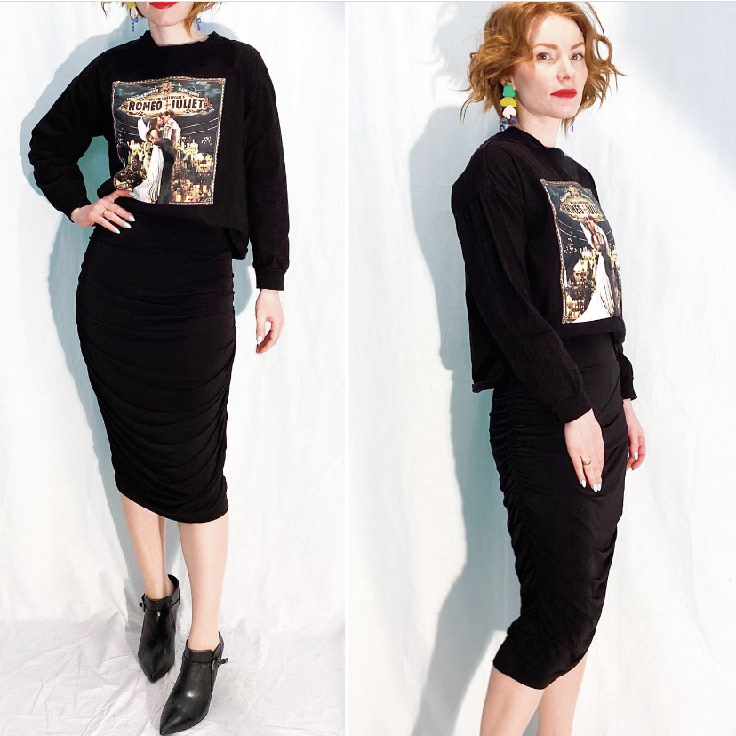
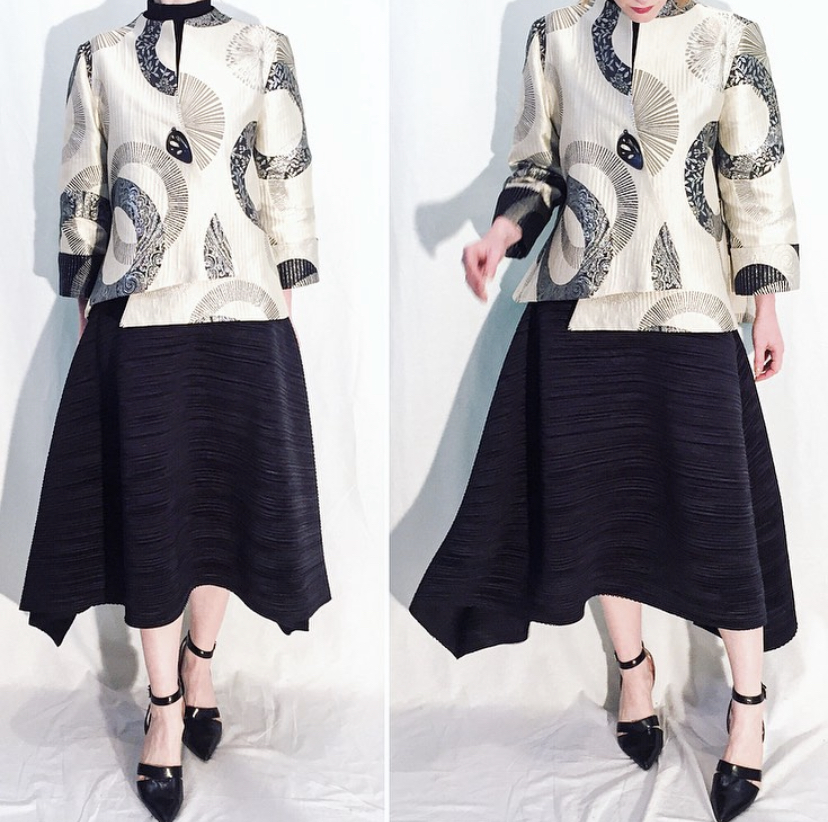
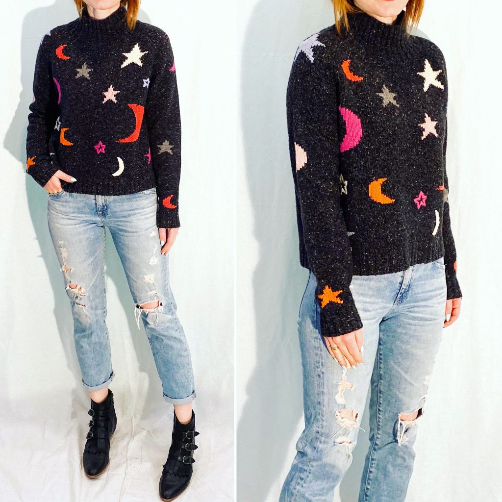
Give me “fancy, limelight-hogging showpieces”. I adore them. They’re not for everyone. But they are for some people, and to suggest that those people are “worse dressers” because of it is not ok. There is something about the phrase “jazziness is good, but keep it subtle” that sets my teeth on edge. I am a white, middle-class, cis woman and far from being especially woke, but there is an undertone to statements like this that makes me uncomfortable. The aesthetic touted in this article and throughout modern history as the epitome of “elegant” and “stylish” is a very particular one: it’s Audrey Hepburn; it’s Carolyn Bessette-Kennedy, it’s Francoise Hardy (all women cited at the very beginning of this article). What do they all have in common?
Look, I am not bagging on the neutrals-heavy minimalist aesthetic; like leggings, it has its attractions and I am not immune to them. But let me repeat: I am not inherently a better dresser when I wear head-to-toe monochrome than when I am wearing bold prints or loud colours. And why can’t a person have a capsule – yes, even a small one – of “fancy” showpieces? Sure, people might be able to more easily tell that the person is re-wearing the same clothes but so what? On one hand, this article is touting the merits of outfit-repeating, while on the other, it suggests that one ought to find ways to disguise that fact (by wearing clothing that is as homogenous as possible). I don’t get it.
Here’s my take on capsule wardrobes. They won’t make you a better dresser. Sorry, but there is no shortcut for that. Personal style is as much an art as any other creative endeavour. There is no formula for sprezzatura. It’s not effortless; don’t believe the lies. The secret to style is not to be unlocked by buying the “right” clothes.
That’s the bad news.
And the good news? First, you don’t need to be a good dresser or particularly stylish in order to be well-dressed. And by well-dressed, I mean dressed appropriately for the occasion, whatever it may be. That is all that social convenience requires. Just as not everyone can or wants to be a concert pianist, not everyone can or wants to be a style icon. (If you want to be, you will dedicate time to it, just like the concert pianist. But it’s okay to not want that, even if you enjoy listening to classical music.)
Second, a capsule wardrobe can definitely simplify the process of getting dressed. That’s obvious. Fewer choices mean fewer decisions to be made. For some people, this is a very worthwhile goal. (For people like me, the decision-making process IS the fun part.) But convenience is an entirely separate issue from style. You can be obsessed with style but wear the same thing every day because you have a very narrow aesthetic. Or you can wear the same thing every day because you don’t care about style. Conflating the two might make for a click-baity headline but it’s not very helpful.
“A streamlined wardrobe frees a little more of your time, your sanity – and the world’s resources”
Where do I begin. One, this article has apparently never heard of a circular economy, or secondhand clothing. Ok, fine. Let’s keep it basic: buying fewer clothes is better for the environment. But sanity? Holy whopper of an assumption, Batman. My sanity is just fine, thanks for the concern. I’ll say it again: I. Enjoy. Choosing. What. To. Wear. Every. Day. I like painting with my full box of colours – literally and figuratively. And, yes, not everyone does. Some people don’t want to paint, period. And while you might think that this type of article empowers them, I think it does the opposite. Go back to the premise: having a capsule wardrobe makes you a better dresser. Why would someone who doesn’t care about style – who feels overwhelmed (their sanity!) by the idea of having to choose something to wear every day – care about being a good dresser? They don’t. What they care about, presumably, is being appropriately dressed and getting on with things they actually enjoy doing. But, implicitly, this article is telling them that they should care. And that there is a solution to this problem they didn’t know they had.
And, yeah, there you have it.
Capsule wardrobes are a f*cking marketing gimmick. What, did the “subtle” (can’t make it too jazzy, after all) advertising for the $1,500 4-piece wardrobes not tip things off?
Sigh.
I know, I know: this whole post could have been condensed into: “Late stage capitalism, man.” But then I would not have had the opportunity to rant for nearly 1,500 words which is, surely, almost as pleasurable as spending $1,500 on a pair of luxury leggings. Thanks for indulging me.

