Today, let’s talk about a small, recent closet reorg project. January is supposedly the season of fresh starts, but you know how I feel about that; I actually did this project in December, after watching a YouTube video from Trinny Woodall about her belt collection. I, too, am a big believer in the transformative power of belts, and seeing how she organized hers made me realize that I needed a better system for myself, to make it easier to access and use my belts.
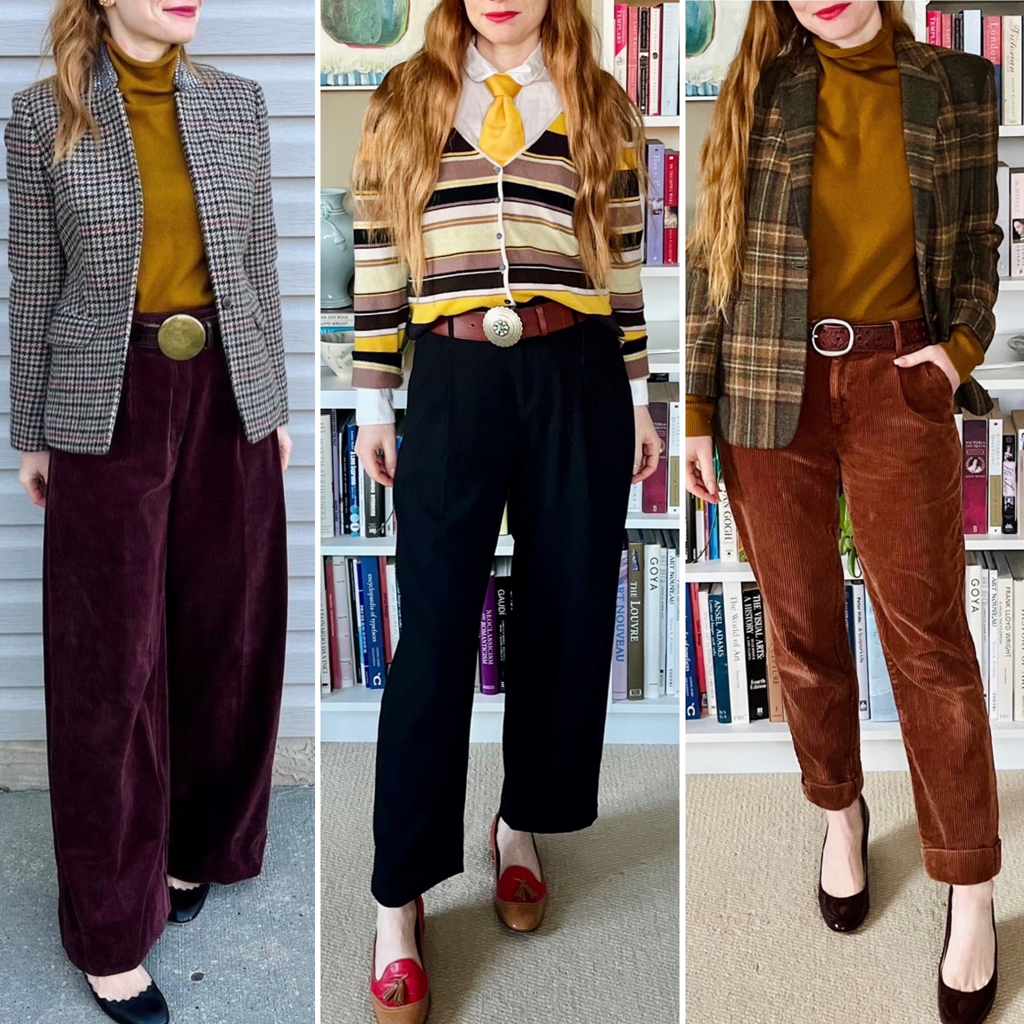
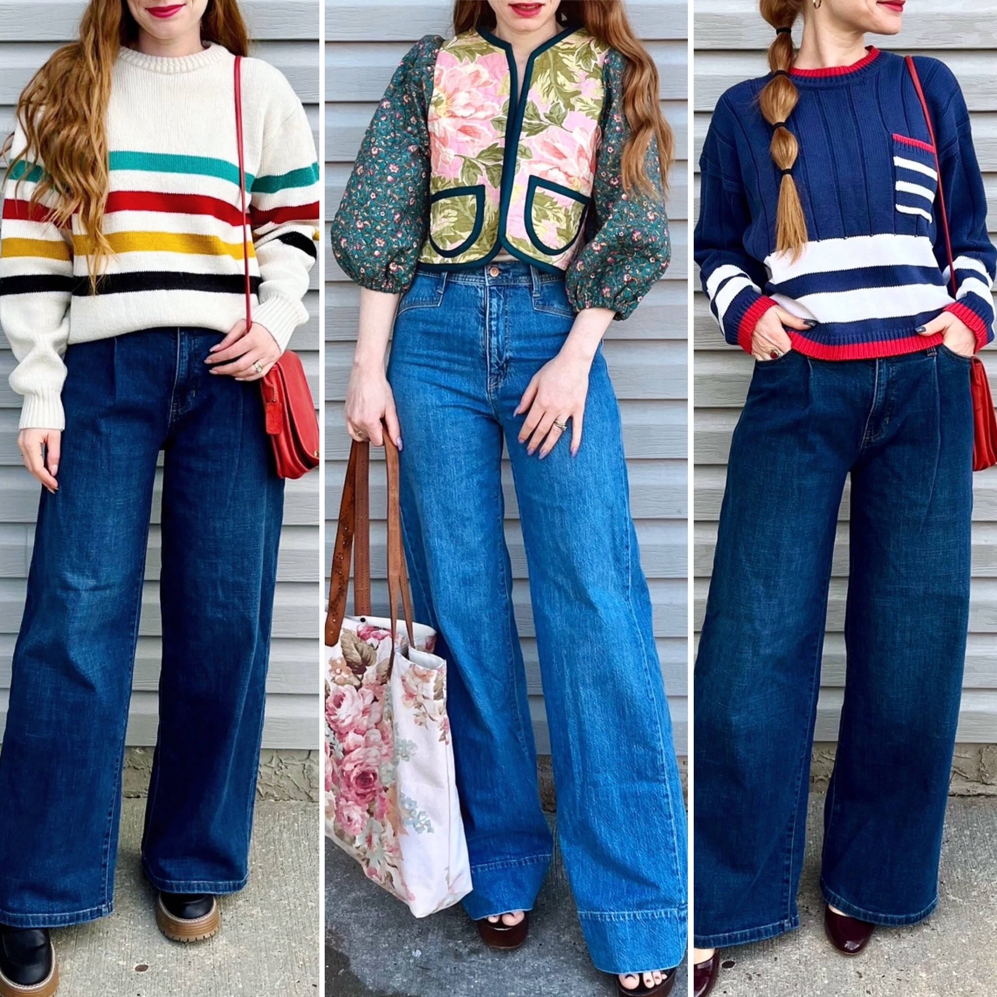
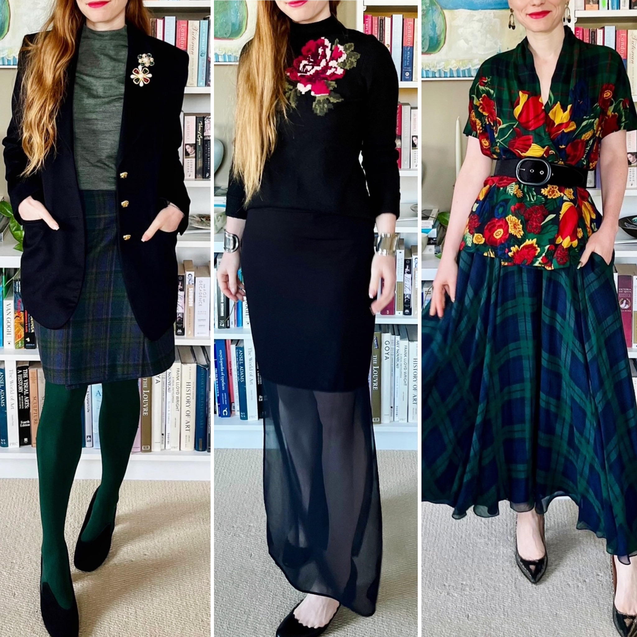
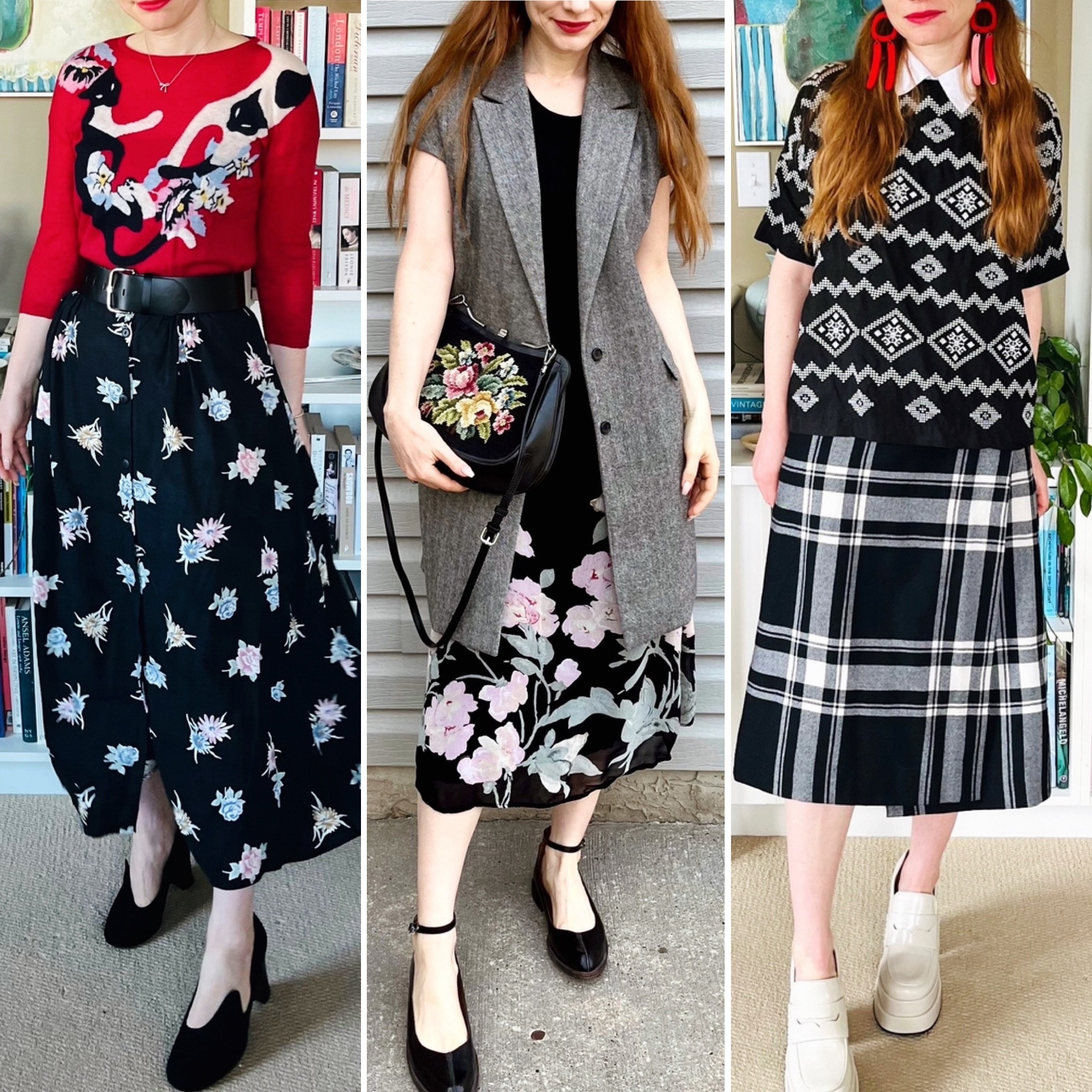
Belts have become one of my favourite categories to thrift in recent years. As I said, I think belts can make a huge impact on how an outfit comes together — at least in the case of my current style. Belts are expensive to buy at retail (I prefer real leather) and unique ones can be hard to find at the mall. At the thrifts, these challenges can be overcome. I’ve accumulated a pretty extensive collection of wonderful belts in the last couple of years, and most of them cost less than $10 a piece. When you consider how much they’ve helped me elevate my outfits, that’s good bang for your buck.
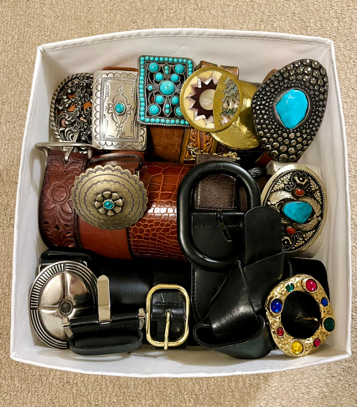
If I had to break down the belts I have into categories or types, they would be:
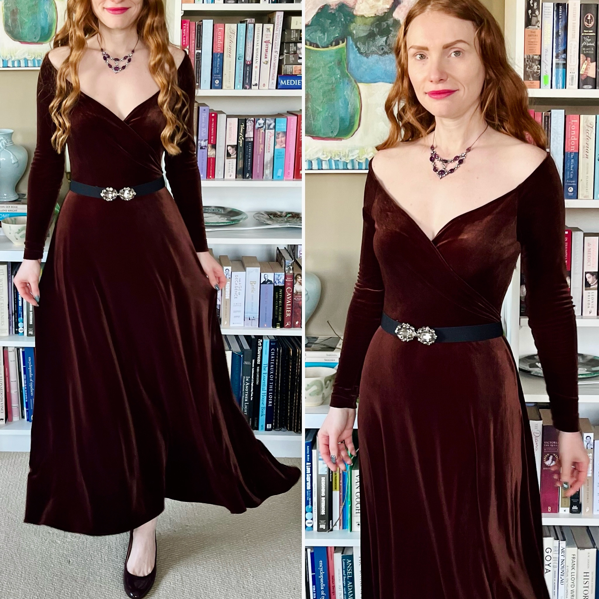
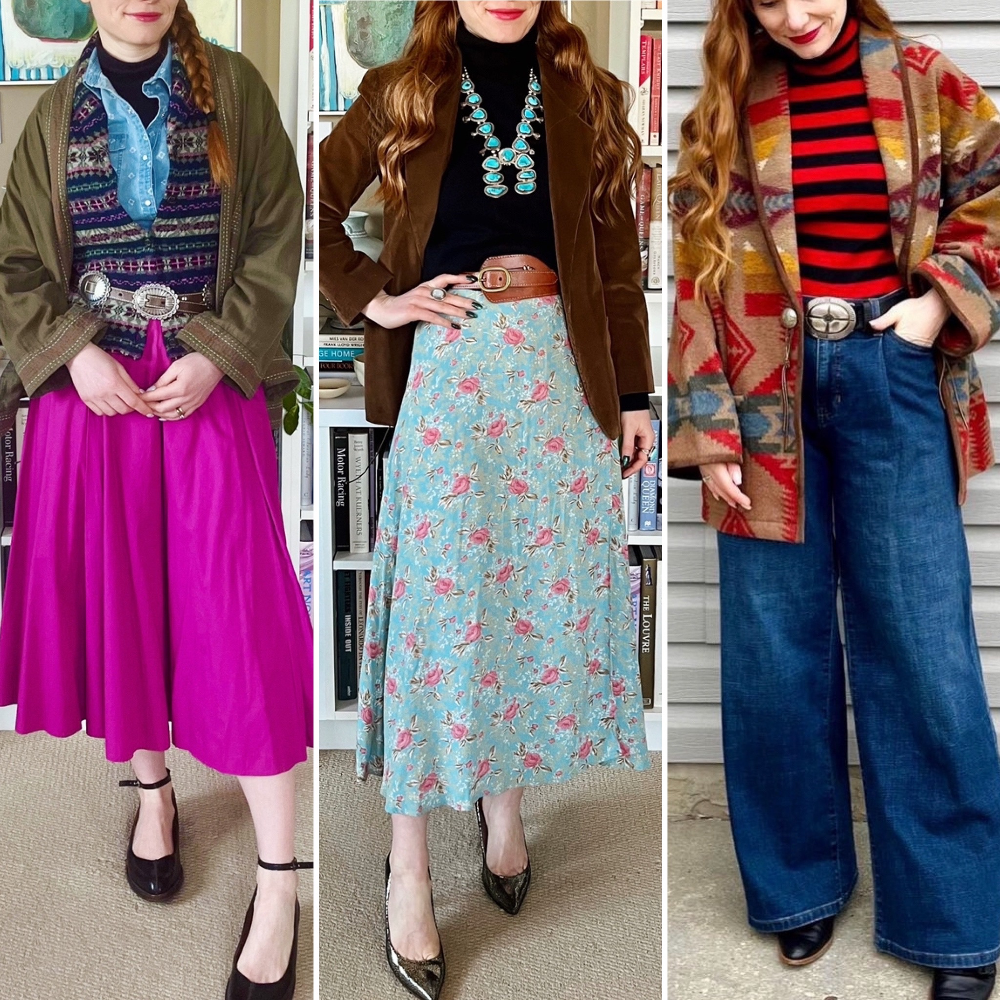
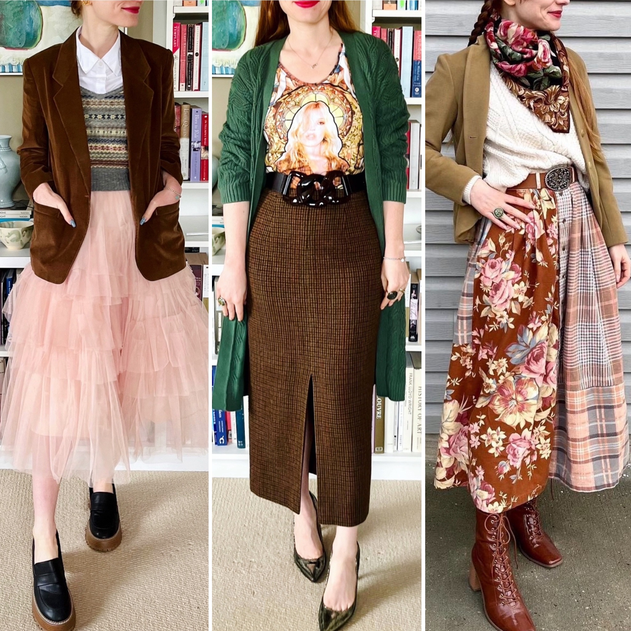
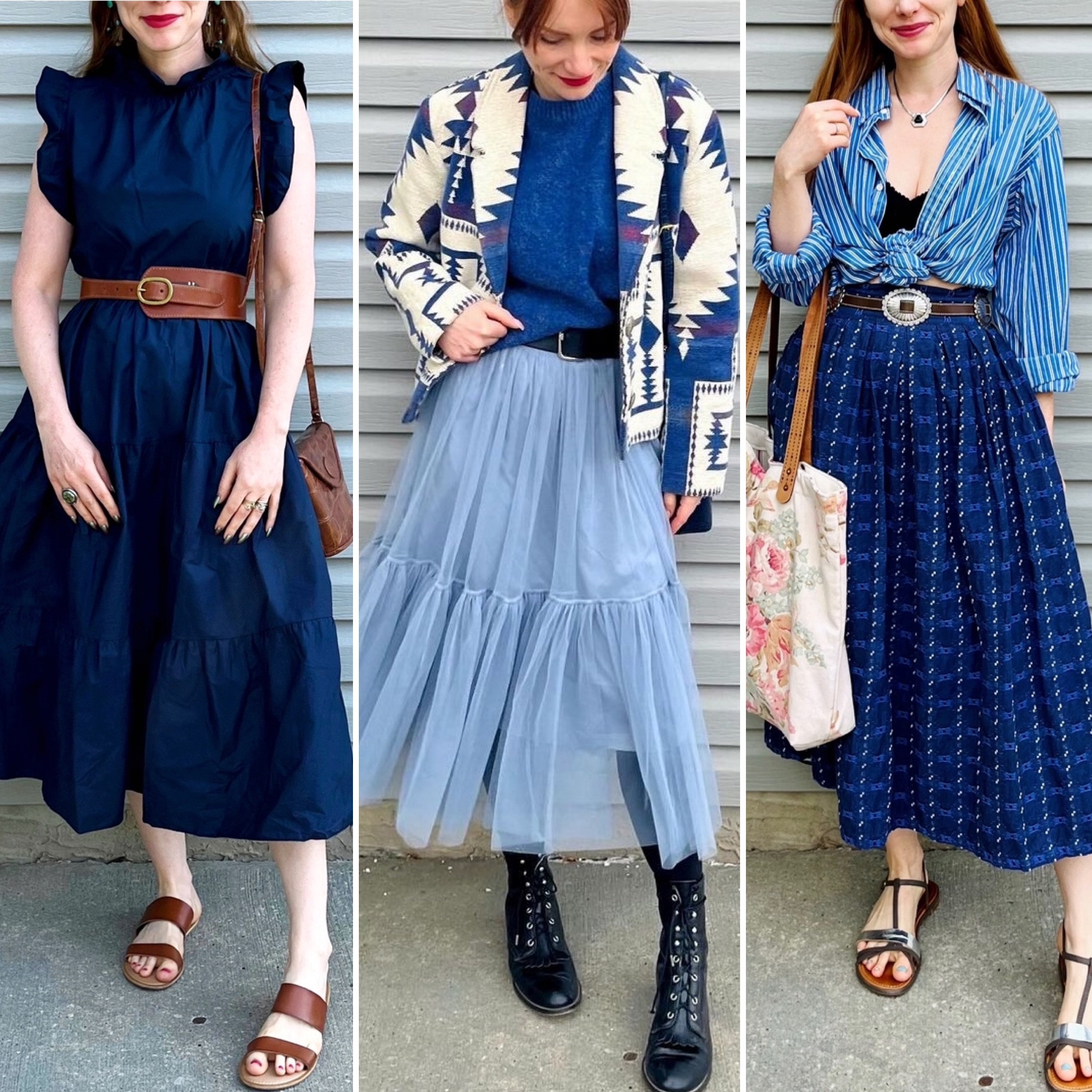
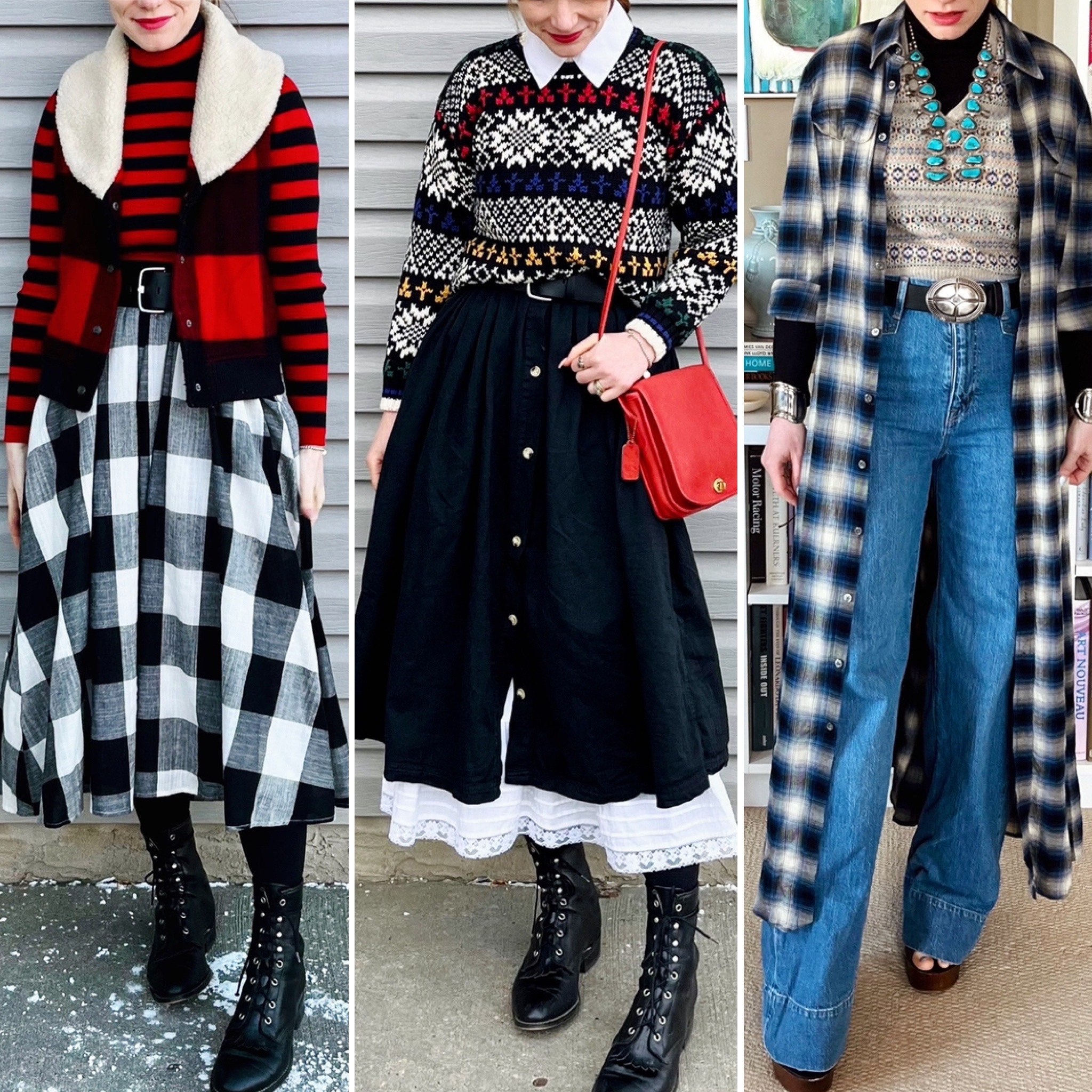
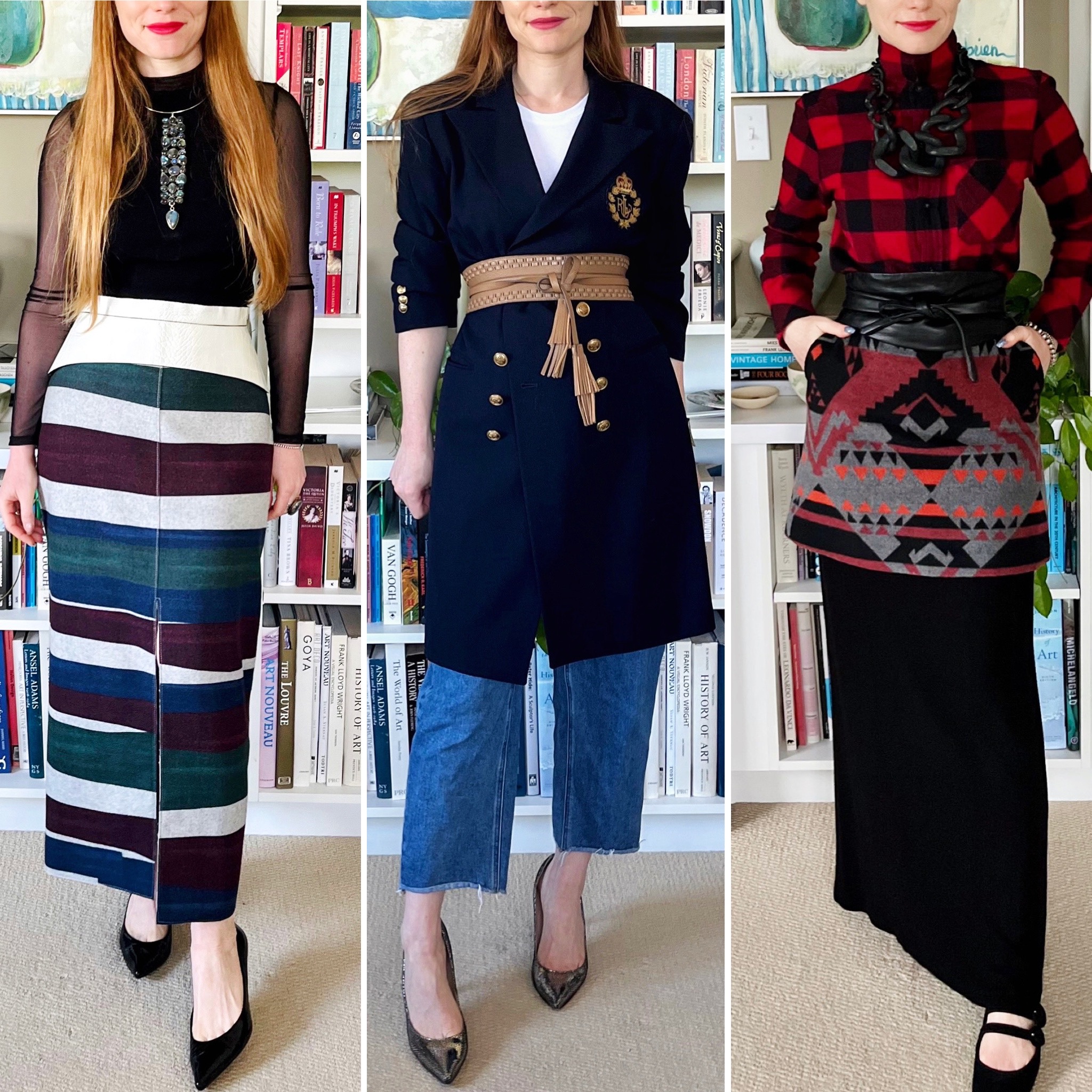
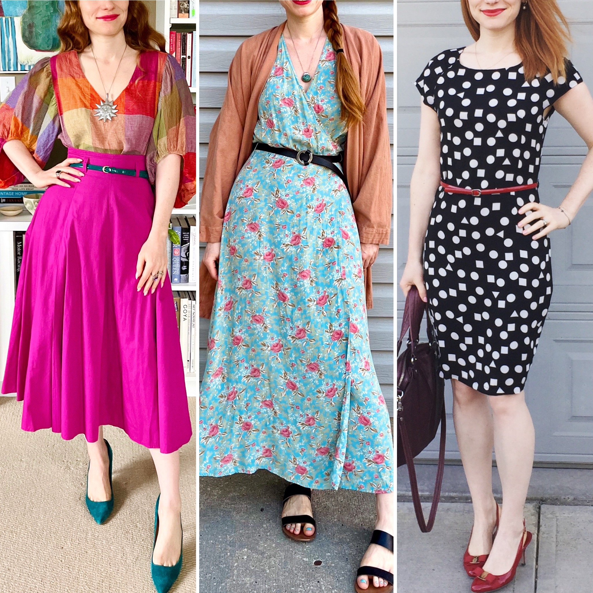
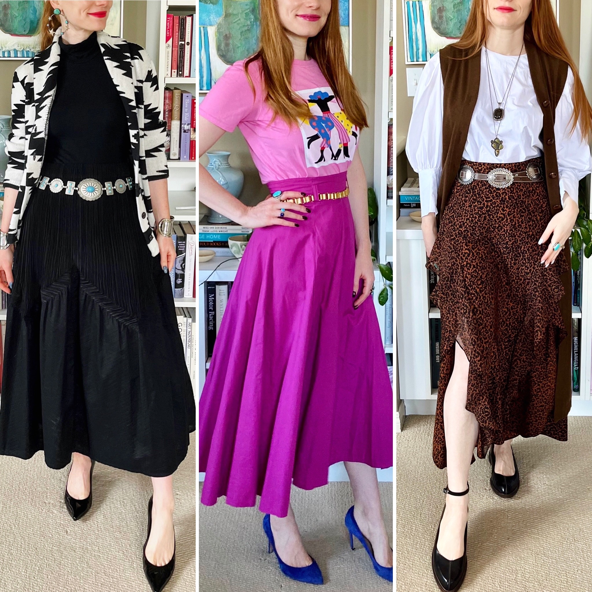
- Wide belts — these are generally belts that sit at my natural waist (the smallest part of my torso) so I wear them with skirts and dresses. Depending on the width, some can also work with high-waisted jeans or pants if the belt loops are big enough. In my non-scientific methodology, I consider anything wider than 2 inches to be a “wide belt”. Most of my wide belts are 3 inches and up, and include sub-categories like corset belts and wrap belts.
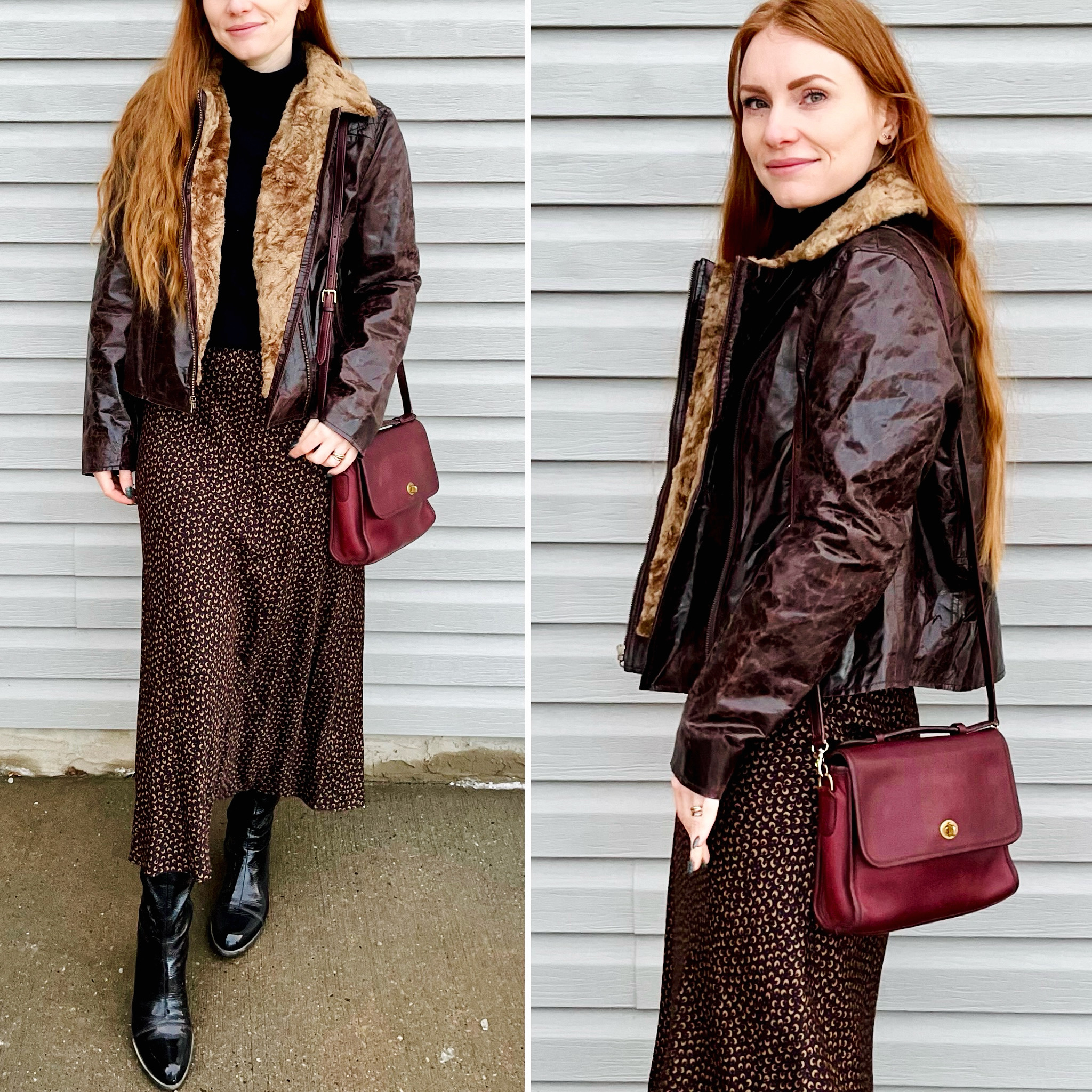
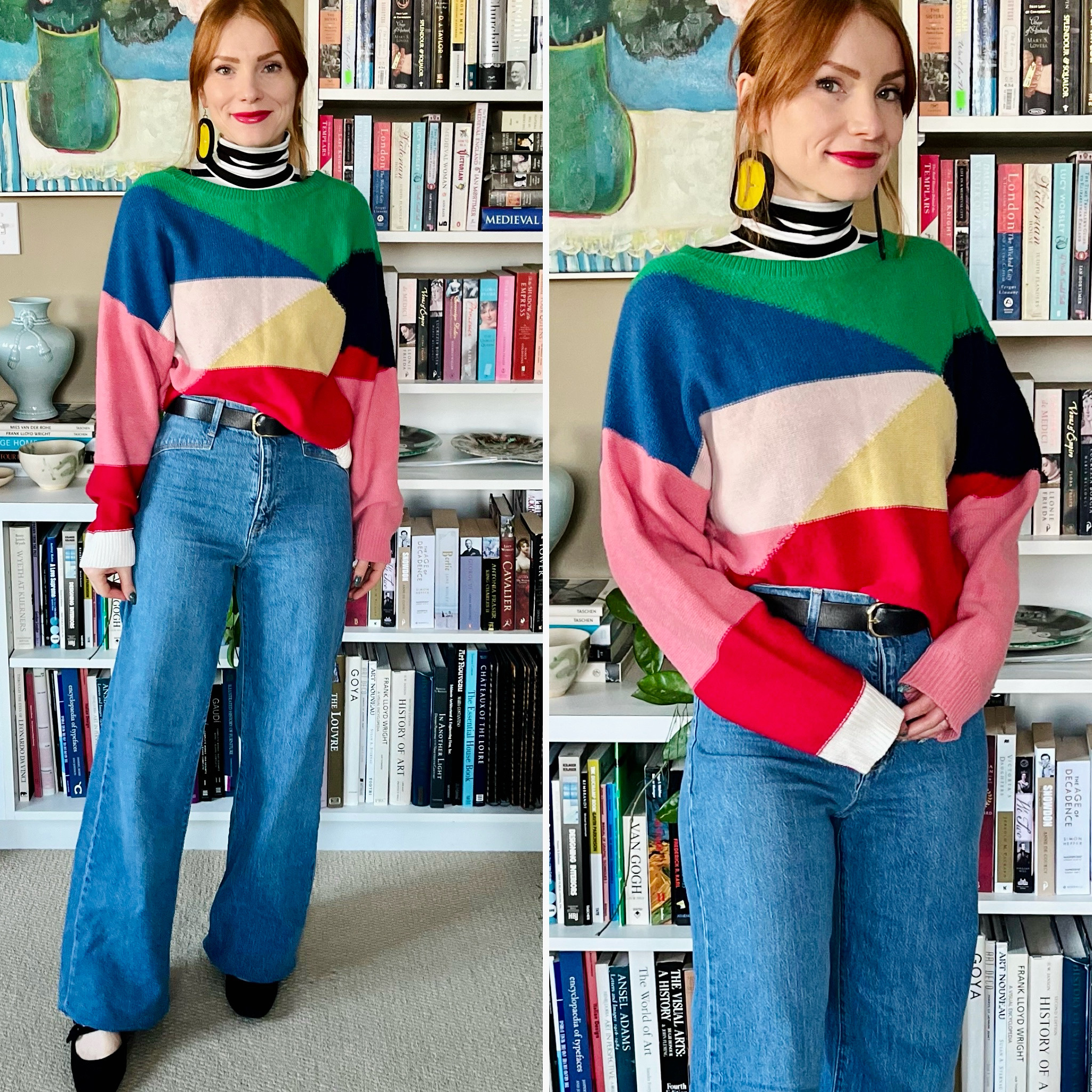
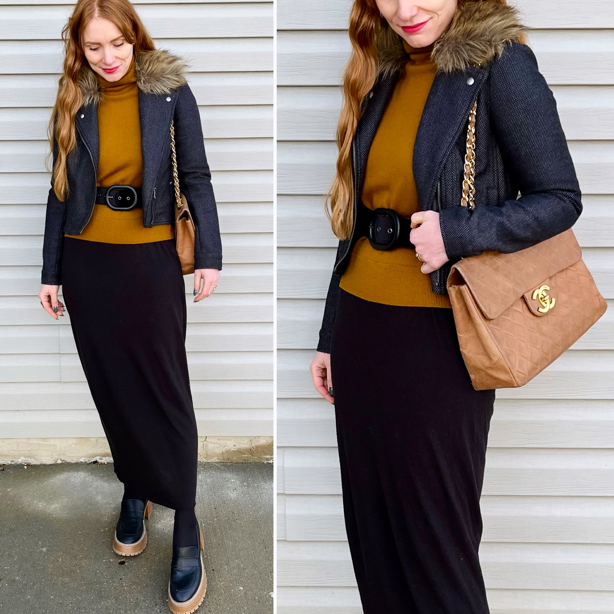
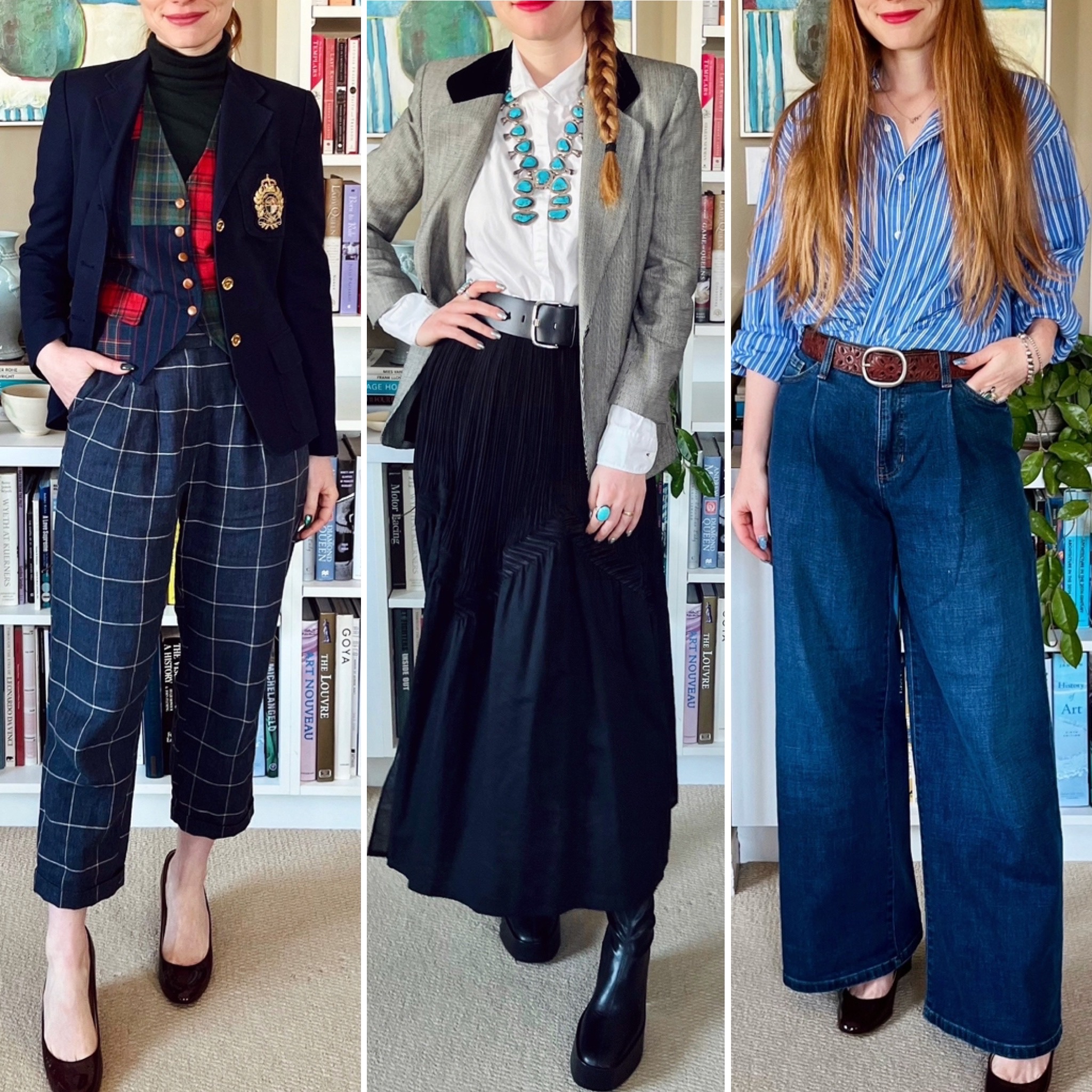
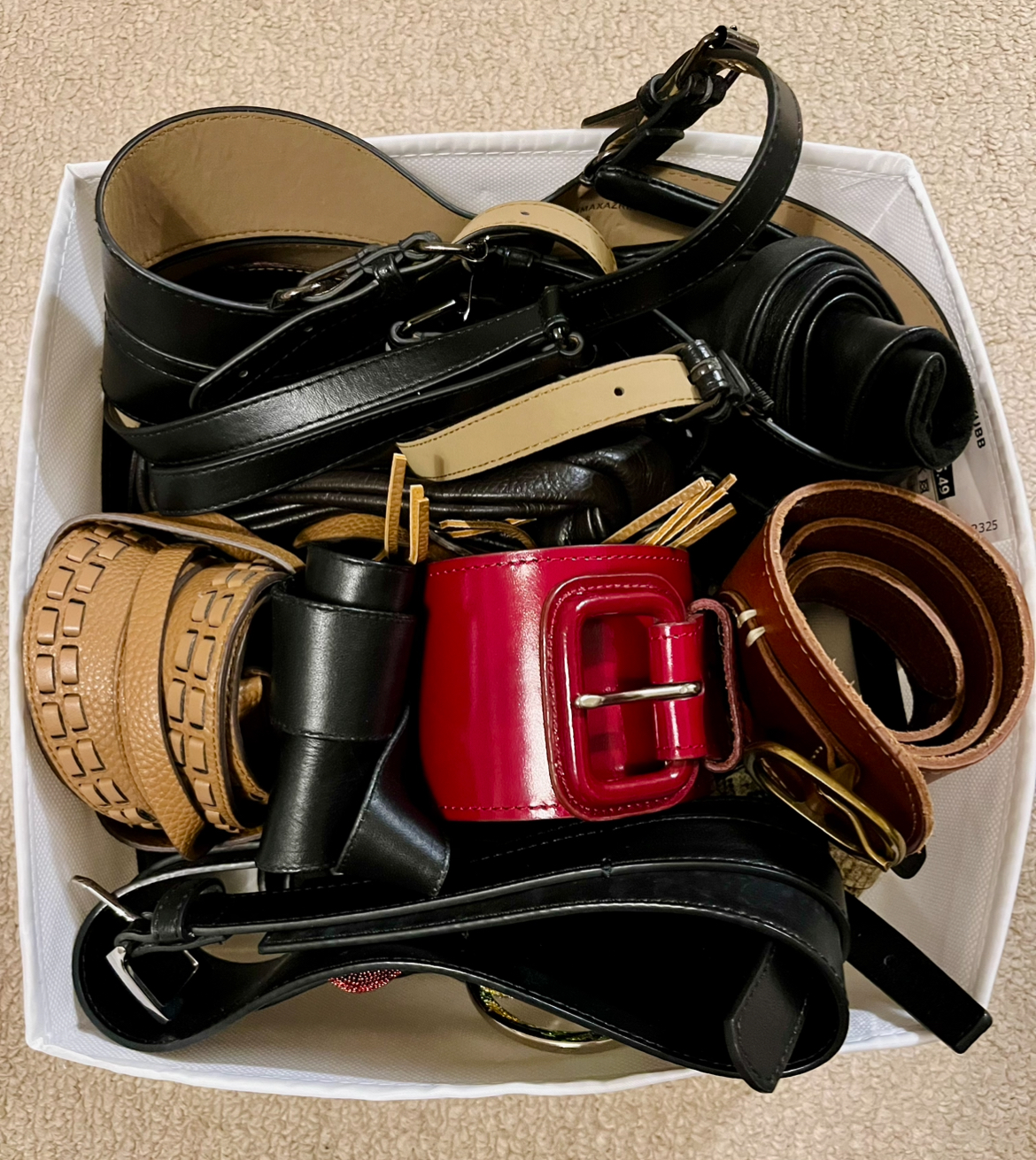
- Thin belts – these are belt less than 2 inches wide, which can sit anywhere from my waist down to my hips, depending on the rise of whatever bottom piece I’m wearing. As there is a significant difference in my waist and hip measurements, this can be tricky and we’ll talk more about it below. Most of my thin belts are either black or some shade of brown, as I find those colours to be most versatile for my closet. I love a fun, statement buckle on a thin belt so I have a lot of those. That being said, I’ve found it’s also it’s important to have some options with plain/simple buckles for outfits where the belt needs to be a supporting character, not a focus.
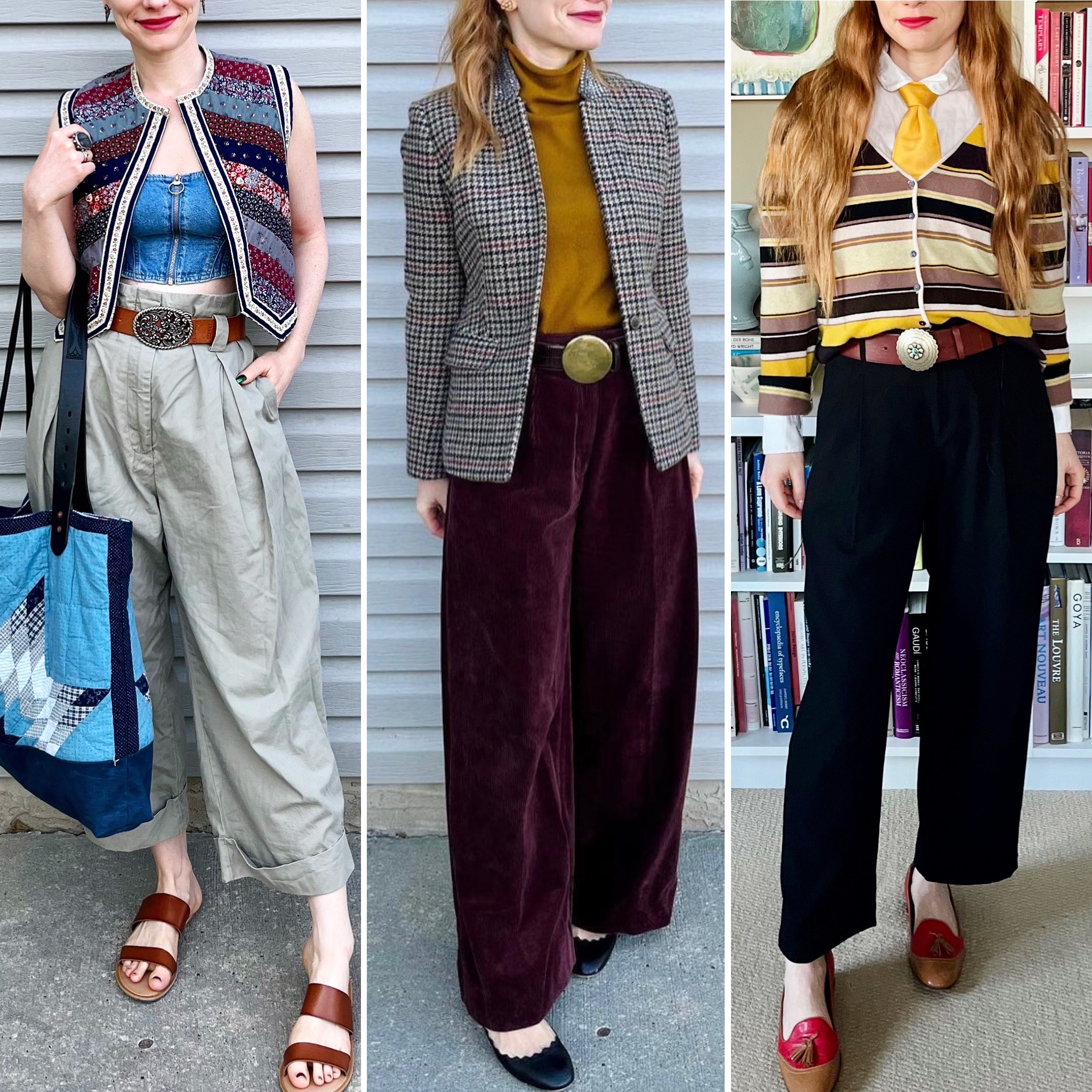
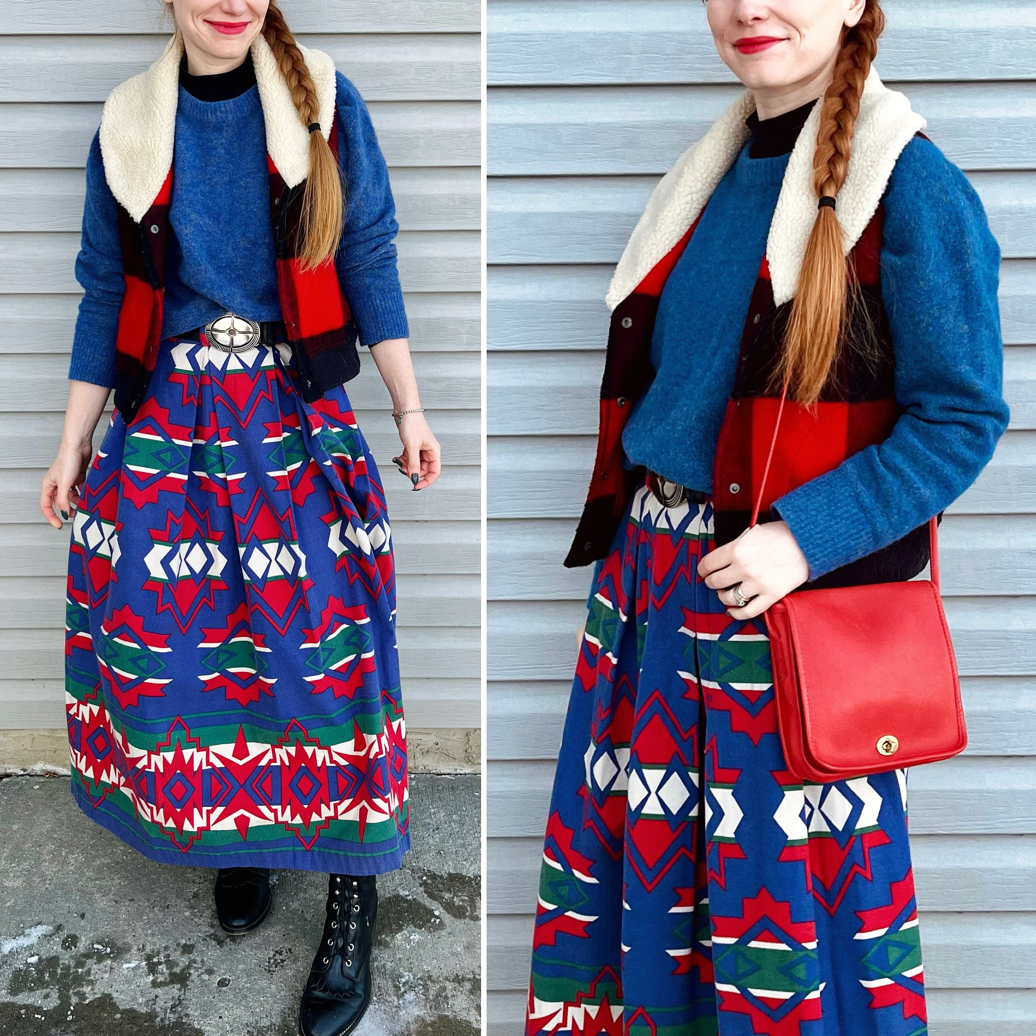
- Metal/chain belts – I don’t have a lot of these, but they can be a fab accessory — like a replacement for jewelry. I love concha belts for a southwestern flair, but gold chain belts are also super fun and glamorous.
- Fabric belts – I don’t currently wear fabric belts very often, but I do have a few stretchy elastic ones with jeweled buckles that I wear with fancy dresses (or to make dresses look fancier).
My belts come from a variety of different brands, and I don’t have specific brands I look for when I’m thrifting. I chose belts based on quality (as I said, I prefer leather), condition, and overall aesthetic. I will mention that the Canadian brand Brave is worth keeping an eye out for; in my experience, their belts are great quality and they often have interesting and/or unusual designs. Similarly, BCBG makes some pretty unique belts — my beloved white peplum belt, for example — although the quality tends to be a bit more hit-and-miss. Vintage belts also deserve a shoutout, especially if you’re looking for statement pieces.
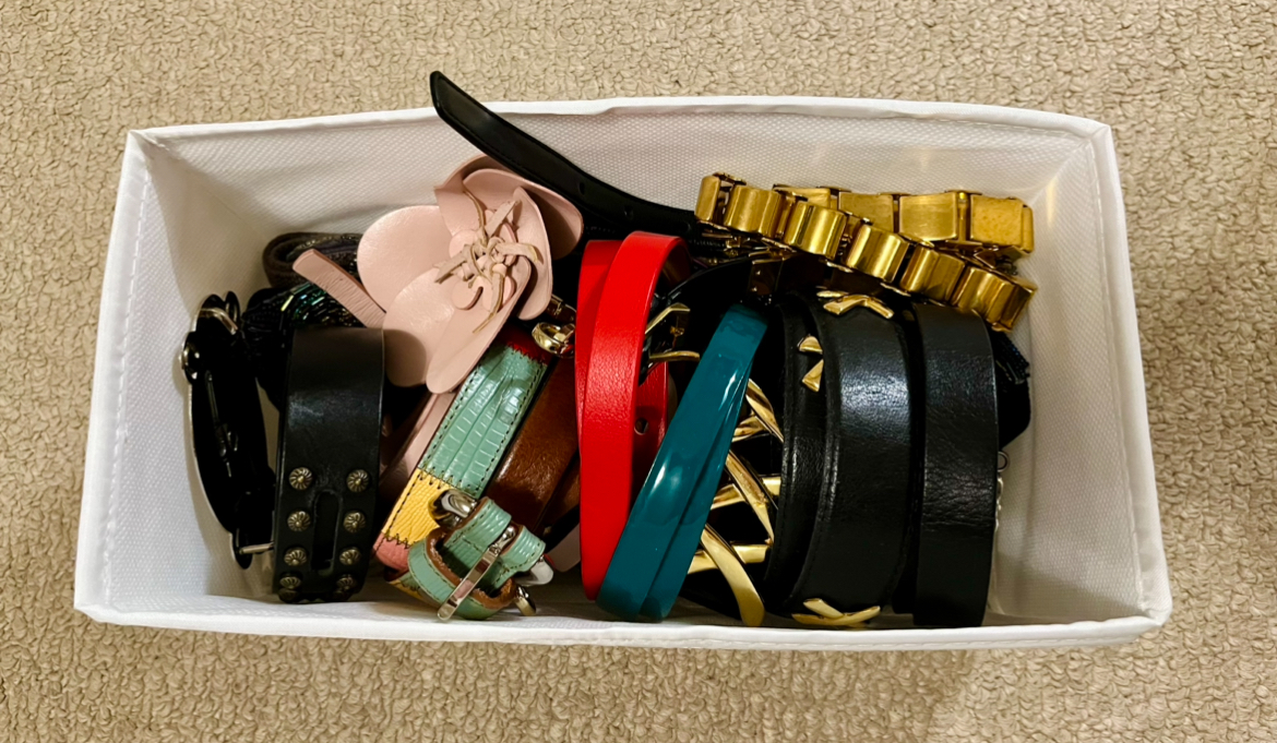
I used to keep my belts in a large storage box on one of the higher shelves in my closet. Then, as my collection grew, I had to split them into 2 boxes, the second on an even higher shelf. It wasn’t a great system for 2 related reasons. They were out of sight and somewhat difficult to access because the boxes got to be quite heavy and they required me to do an overhead lift to pull them out. Being out of sight (and generally disorganized in the large boxes), I sometimes forgot about them. So I decided to do a small reorg of one of my closet bays. For reference, my closet is made from Pax pieces from IKEA; the nice thing about that is that it allows for relatively easy reconfiguration.
I don’t have a “before” photo taken immediately before — by now, that shouldn’t surprise you, LOL! — but here is a photo from the original version of my closet:
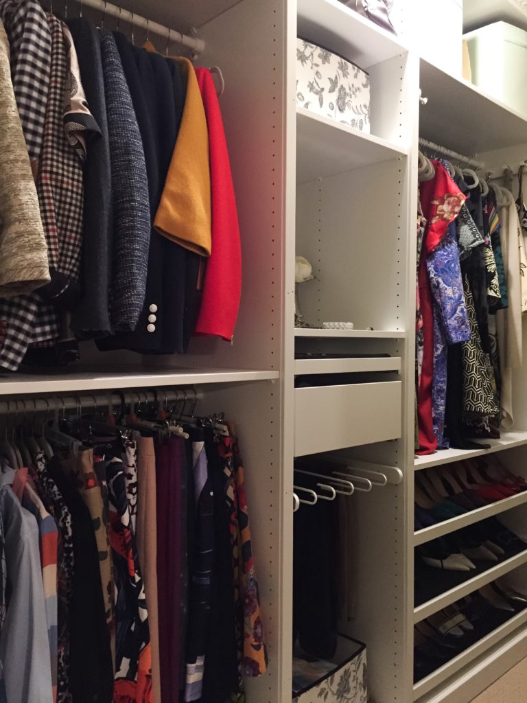
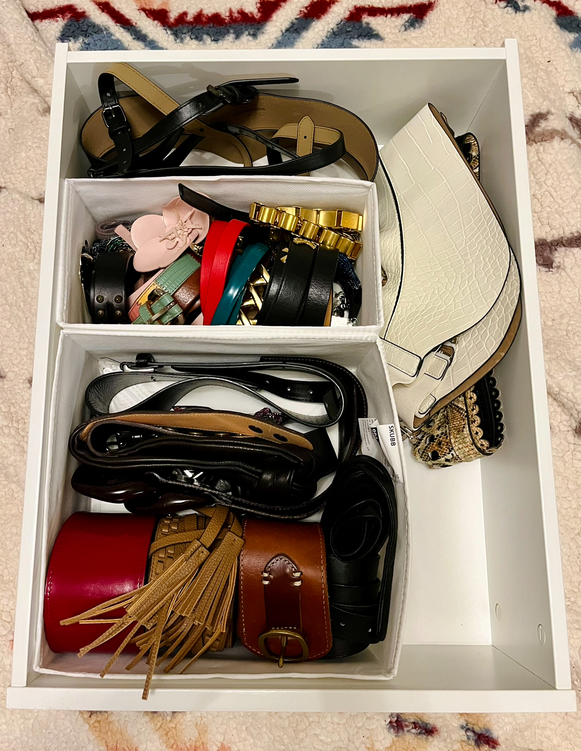
Prior to this most recent reorg, we had already added 2 more shallow drawers (jewelry storage) and a deep one in the middle stack, replacing the pants rack which I never found especially useful. This go-round, we eliminated the large opening with a storage bin full of odds and ends at the bottom, and added two further deep drawers. Like so:
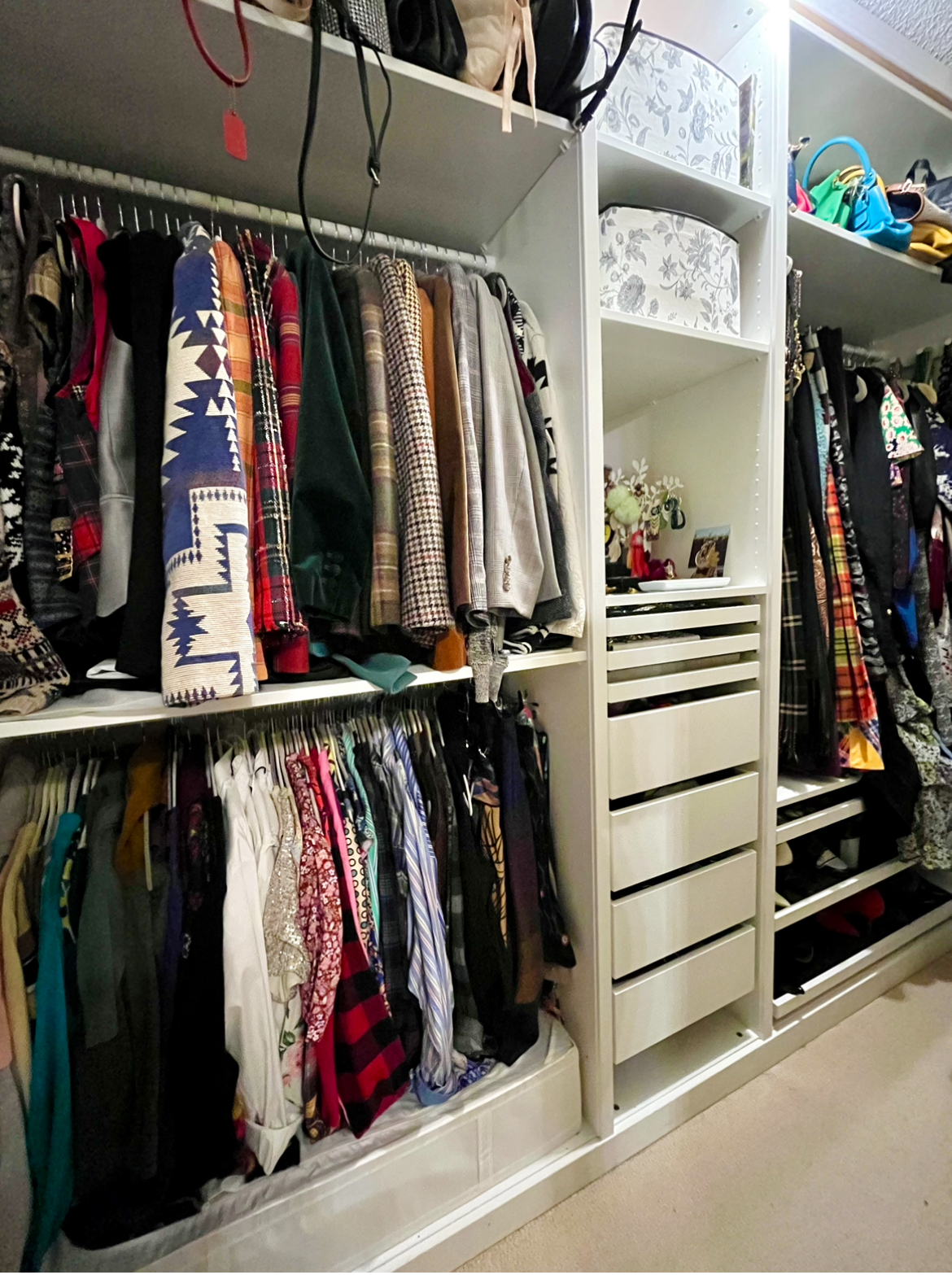
The belts used to be in the 2 boxes at the top, above the wide opening. The top one is now filled with random stationery (from the storage bin that used to be on the bottom). There is also a large bag behind it, one I don’t use very often but takes up a lot of room. The second box is now filled with my scarves, which used to be stored in various other places before (including my belt boxes). Again, because the shelves are so deep, there is a smaller box — also filled with scarves — behind it. I do wish I had another way to store my scarves so I could see them more easily, but I haven’t come up with that idea yet. The good thing is that the scarves are MUCH lighter than my belts so it’s easy to pull down that box when I need it.
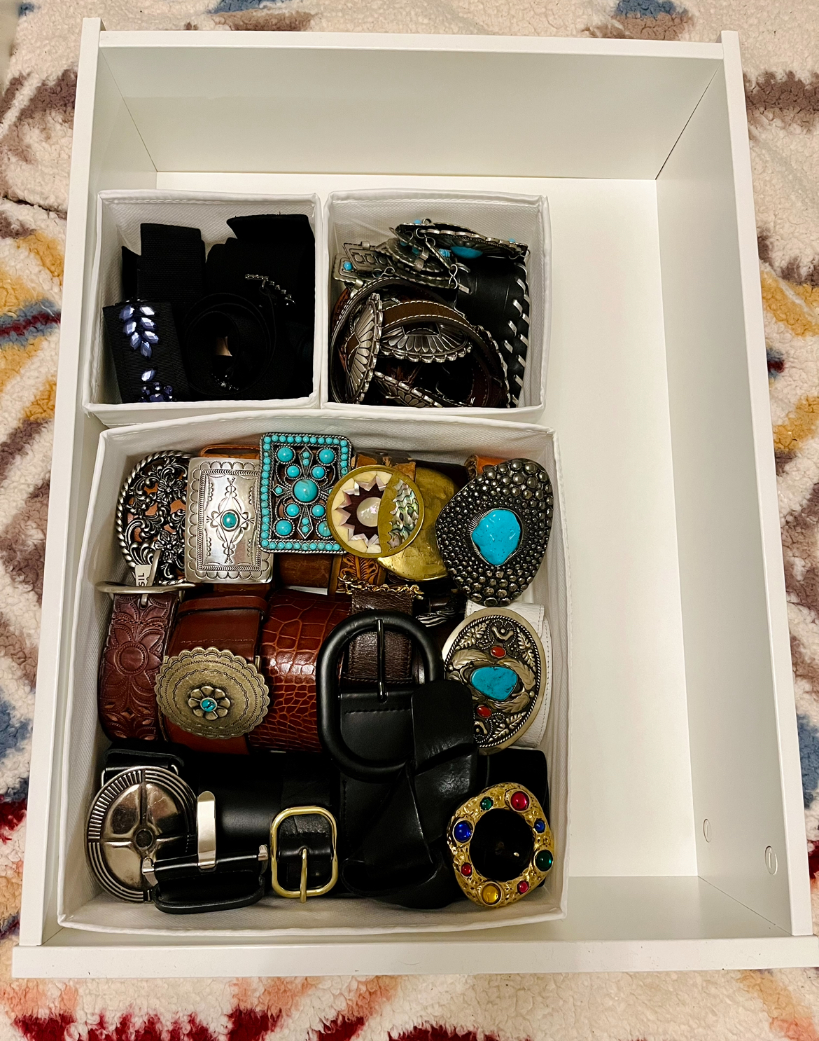
The belts are now stored in the 2 lowest drawers in the stack. Above them is a drawer of pants, and then one with underwear. The shallow drawers above are all jewelry. You may have noticed that there is a gap at the very bottom. I had originally planned to add another shallow drawer (and would have reconfigured the order rather than putting it at the very bottom) but IKEA was sold out. For now, I’m planning to repurpose an acrylic organizer tray and stick in down there. My plan is to go through the necklaces hanging elsewhere in my closet, pull out the chunkier ones that I don’t wear as often, and put them in the tray. This will create some “breathing room” on those other jewelry displays so I can more easily see the pieces I wear often.
Remember: a small space + a large wardrobe = constantly playing a kind of closet Jenga. But necessity is the mother of invention. Much to my husband’s chagrin — he’s the one that often has to execute my vision — I come up with new ideas for making the most of my closet all the time.
Anyway, here are the belts, all organized. I got a Skubb set of organizers at IKEA, and split up the belts by category, before putting them into the new drawers.
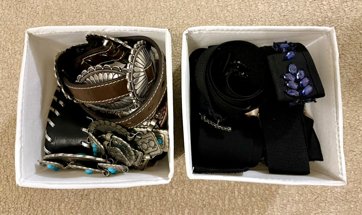
And here’s how they fit in the drawers — there is lots of room for more belts now!
A few days after everything was in place, I got another idea. I decided to move all my coloured tights — which had been jammed at random in another storage box with my jeans, mostly because I had nowhere else to put them — into one of the belt drawers. Like so:
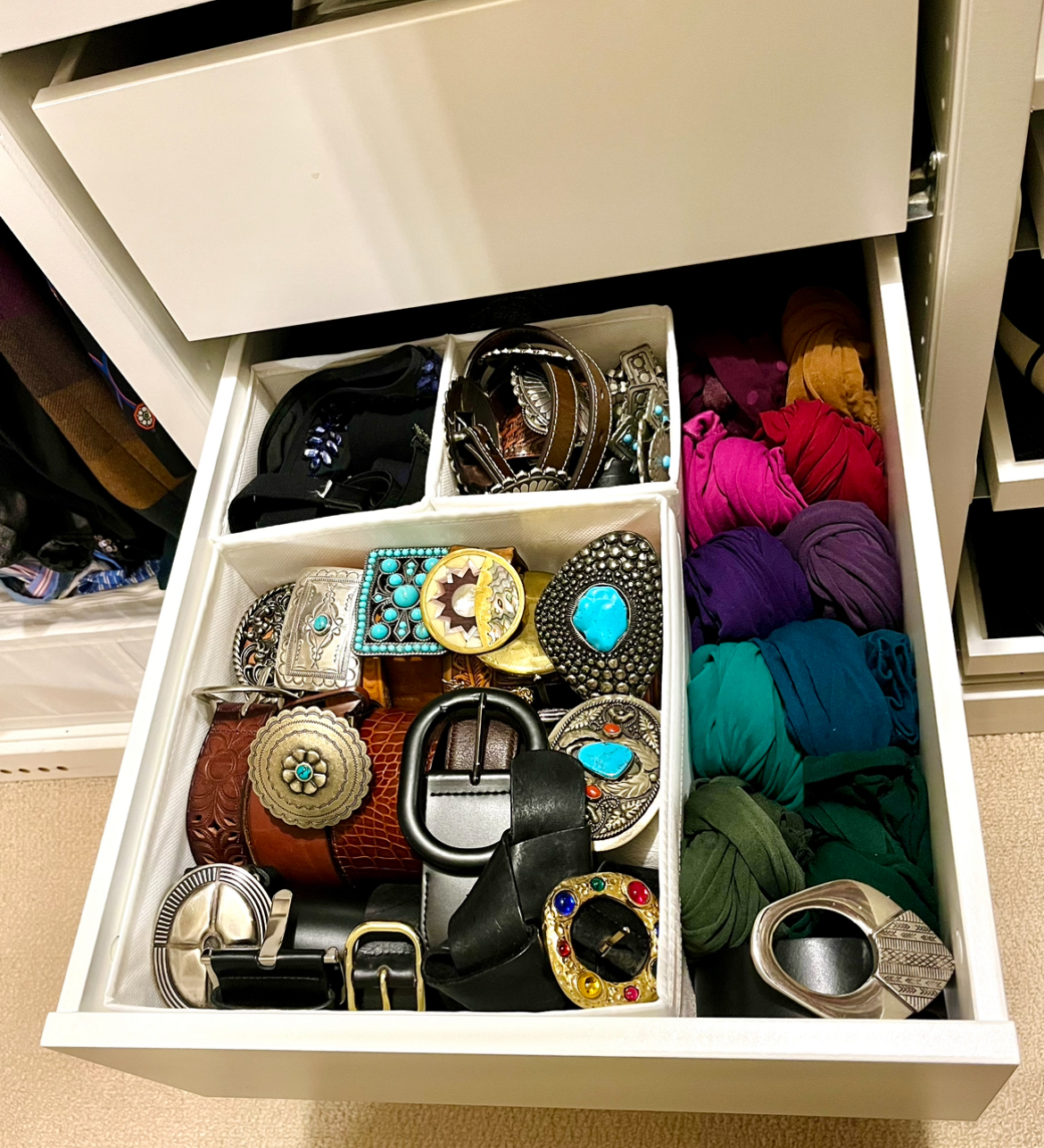
So much easier to see what I have! It doesn’t leave me a lot of room to grow into this drawer, though … so we will see what other bright ideas I think up in a few years.
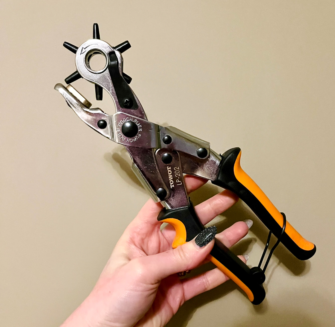
One last word on belts. If, like me, your waist-to-hip ratio is significant, you must invest in a belt-hole puncher. I can’t believe how long it took me to get one, and how life-changing it’s been! Ok, maybe not life-changing, but you know what I mean. There is a 7.5 inch difference between my waist and the widest part of my hips; most belts don’t come with enough holes to accommodate that, which means that I would need different belts to wear with different rises. I don’t like that! I want to be able to wear my favourite belts at various rises — which is possible if they’re sized for my hips and I punch additional belt holes. I used to get my husband to do this, but without a specialized tool, it was hard work and could result in a belt being ruined. In her video, Trinny mentioned buying a hole puncher, which made me go “a ha!!” I don’t know why I never thought that such a thing would exist outside of specialized leatherworking. But it does! I got this one from Amazon for under $20:
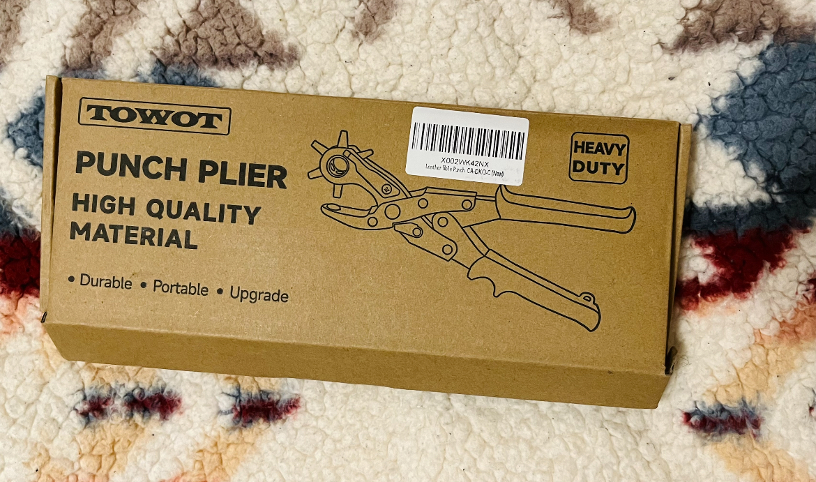
I picked the cheapest one that had good reviews, and it works great! So easy to use and you don’t even need a huge amount of arm strength to operate, and the holes are nice and clean.
Next to my steam cleaner and my sweater defuzzer, this has been the best money I’ve spent for wardrobe maintenance. Now, my belt collection will be working harder than ever!