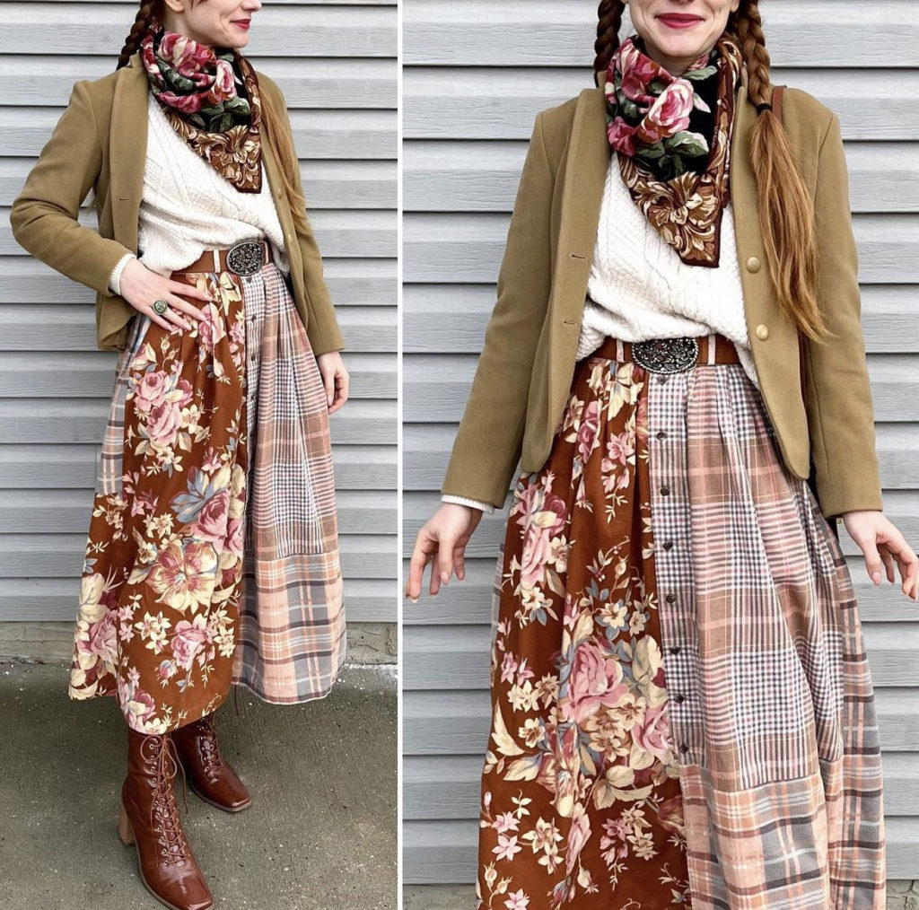
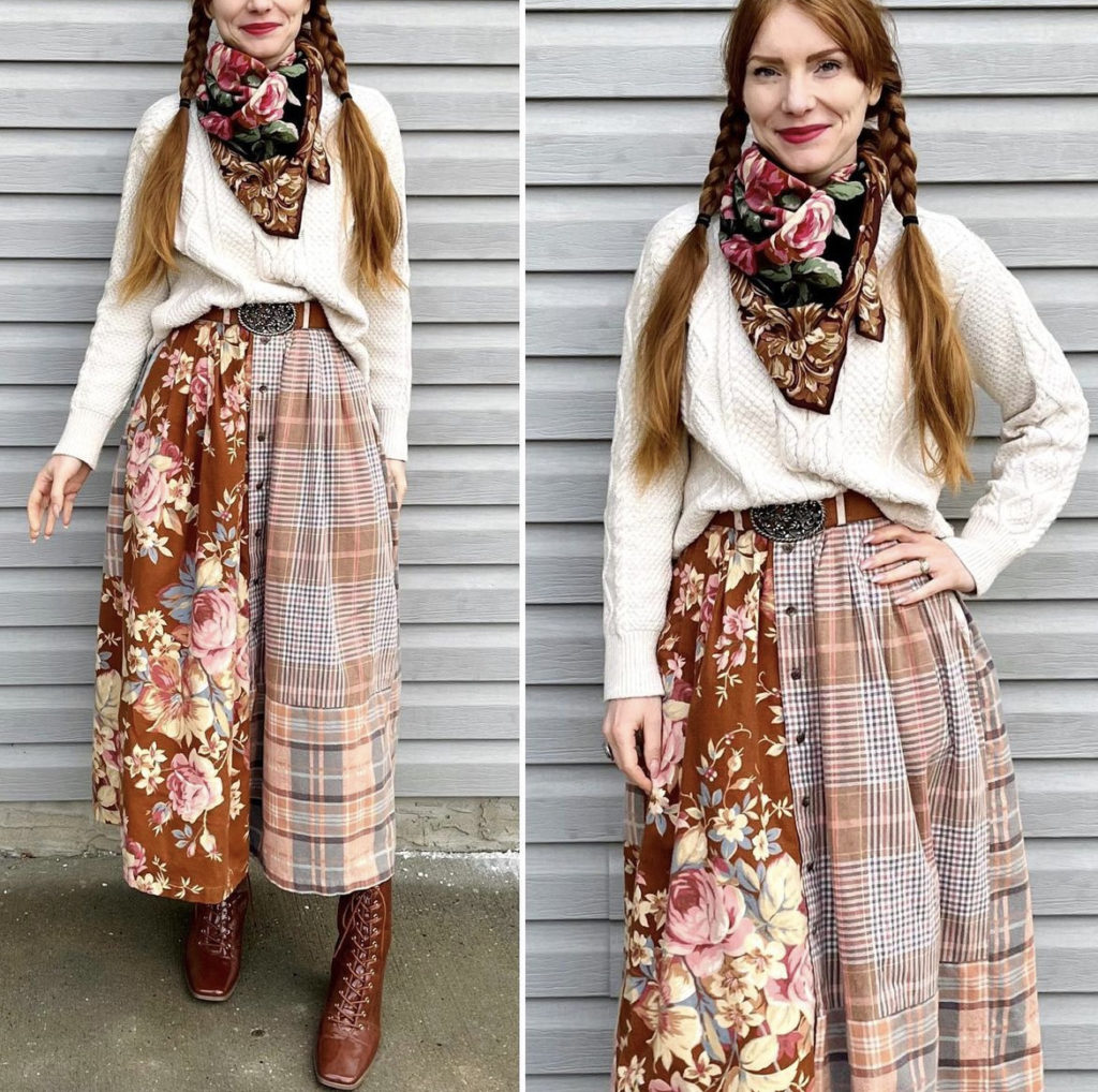
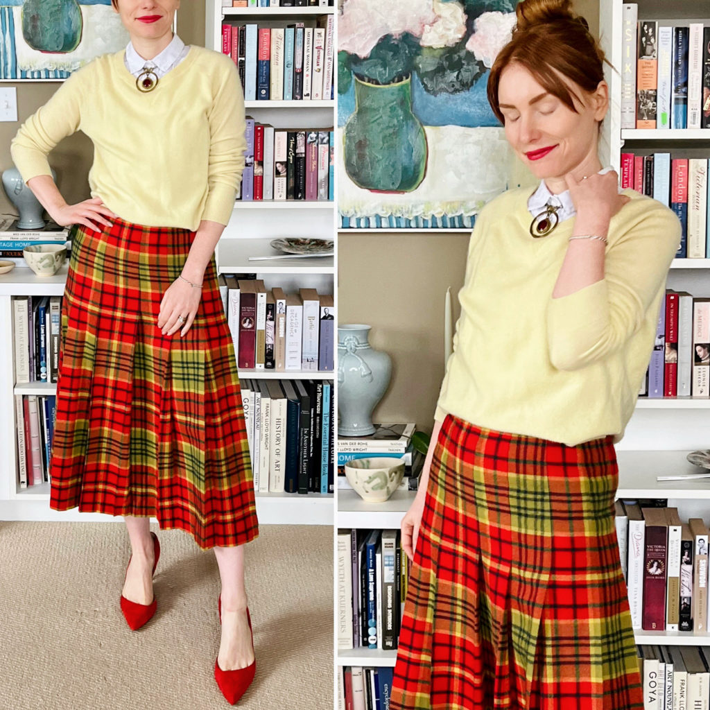
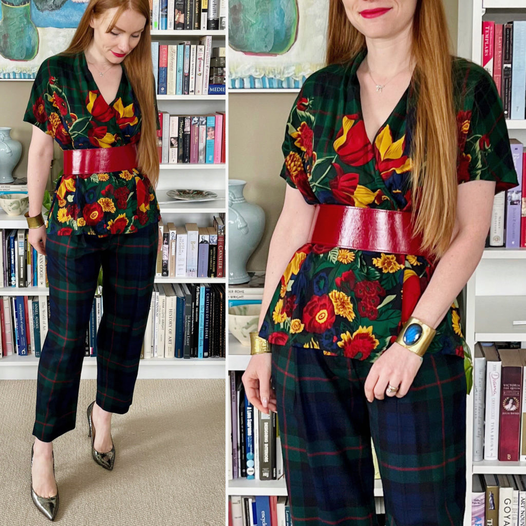
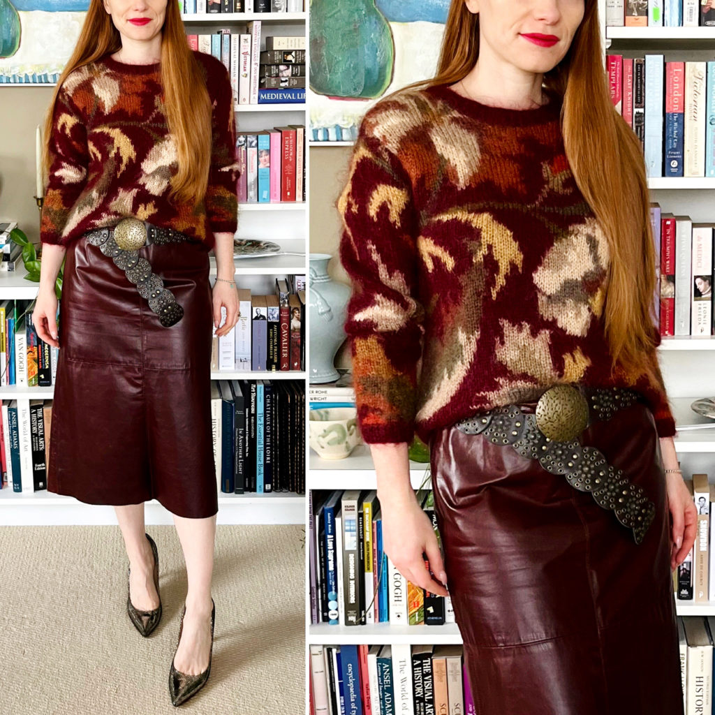
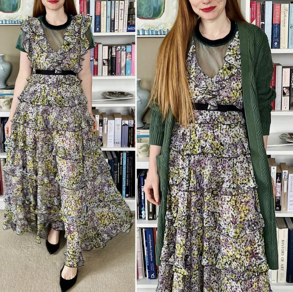
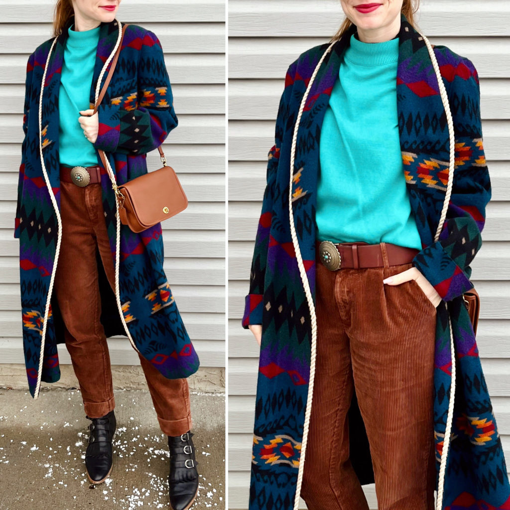
One of the questions I was asked recently on Instagram had to do with outfit building blocks and formulas. I consider myself an “instinctive stylist”, meaning that I tend to follow my gut rather than a systematic process when I’m putting together outfits. But that isn’t entirely accurate, I think. What’s actually happening is probably that I am subconsciously following a process without realizing it. Let’s see if I can reconstruct it all for you here.
To begin with, let’s tackle terminology. To me, outfit building blocks are the individual pieces of clothing in my closet. Some pieces form the backbone of the outfit; they’re like bricks. Some pieces hold outfits together without calling attention to themselves; they’re like mortar. And some pieces are pure decoration; they’re like … I dunno, my architectural vocabulary is pretty limited, guys. Maybe, like, crown molding? Anyway. Here’s an outfit breakdown for illustration purposes:
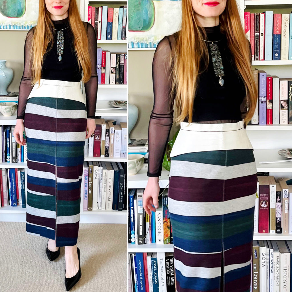
The backbone of this outfit is clearly the skirt; it’s doing all the heavy lifting here and it’s the immediate focal point of the outfit. The mesh turtleneck and black crop top are very much necessary to complete the outfit, but they are not, in themselves, memorable. They are also pieces that can be worn in an almost-infinite variety of ways because they are simple and versatile. They can “glue” together any number of different outfits. Lastly, the belt is purely decorative (functionally unnecessary) but that doesn’t mean that it’s surfeit. It very much contributes to the overall effect created by the outfit.
Here is another example:
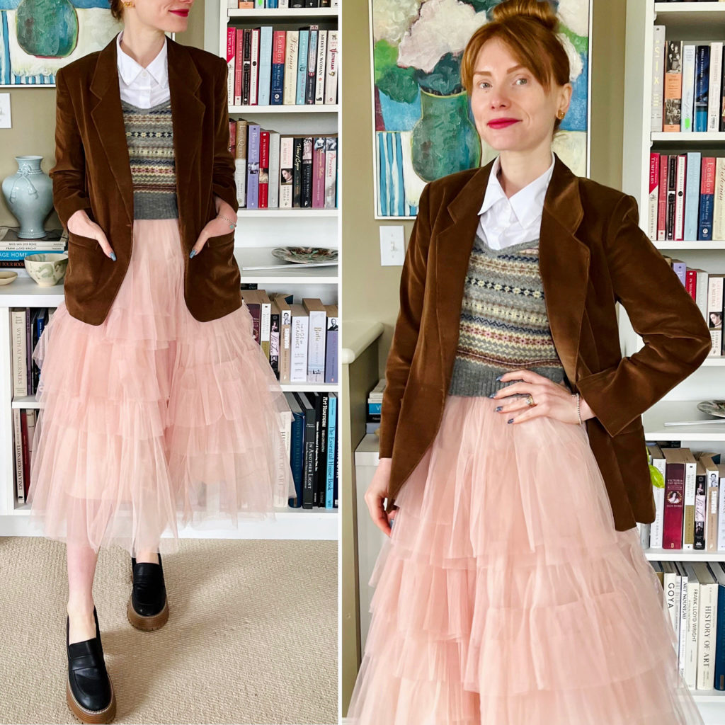
The backbone of the outfit here is blazer and vest; the white shirt is the “glue”. But what about the skirt? The skirt is a statement piece, which is a bit of a sui generis category. More than mere decoration, but not quite foundational either. Going back to our architectural analogy, a statement piece is a like a sparkly brick. It stands out just a bit more, and as a result it’s just a bit less versatile. You can build outfits around a statement piece, but you don’t necessarily need a statement piece to make an outfit.
Now, I don’t want us to get too hung up on taxonomies and classifications. The main thing is to understand that your closet is made up of different types of building blocks, each of which has its own function and purpose in outfit building. In my view, a well-functioning closet depends on 2 key principles:
- that all or most of the individual building blocks generally align with your personal style or preferred aesthetic(s); and
- that you have the right proportion of the different types of building blocks suitable to your personal style or preferred aesthetic.
Lets look at that more closely.
If you have a fairly cohesive personal aesthetic, then the first principle is pretty self-explanatory. Don’t buy a bunch of pink clothing if you only like to wear black. Don’t own 10 skirts and one pair of pants if you only like to wear pants. If, like me, your personal style has several facets, the same principle applies but requires a bit more finesse. The “glue” pieces should always be “anonymous” enough and/or versatile enough to work with any and all of your aesthetics. When it comes to the foundational “bricks”, I personally try to find things that can serve as “throughlines” – aka be as versatile as possible across different aesthetics – and then I can rely on the “decoration” building blocks to fully differentiate each particular aesthetic. This is easier to do when the different aesthetics all share some basic DNA. Harder to do if your aesthetics are “goth grunge” and “50s pin-up” (harder but maybe not impossible?). If you’re in that situation, it may be easier to rely on statement pieces – aka “sparkly bricks” – to bridge the gap.
The other thing to consider, when dealing with a multi-faceted personal style, is how much you use each aesthetic. If you’re “goth grunge” 80% of time, there is no point in having half of your statement pieces be “50s pin-up”. You’ll end up with clothes you rarely wear AND feel like you don’t have enough clothes.
This ties in with the second principle.
I’ve seen various recommended ratios for the different categories of building blocks – a common one is 80% “basics” (which I assume includes my bricks and glue) and 20% statement pieces. I don’t like arbitrary rules applied with an indiscriminate hand. The ratio is important because if you have too much of the wrong thing, or too little of the key things, your closet will feel out of whack. But the ratio will very much depend on your personal style and lifestyle. A minimalist aesthetic might need fewer statement pieces than a maximalist one. We’ve already talked about how a multi-faceted personal style (with different aesthetics) will impact the kinds of building blocks you need. I can’t tell you what your ratio is … and you might not know right off the bat either. But there are ways to work out the answer.
The first clue is how does your closet feel? Does it feel chaotic and disorganized? Does it feel like you have simultaneously too many clothes and not enough to wear? If so, your ratio is probably off. In contrast, if you feel satisfied and in control of your closet, you’re probably working with a good ratio.
If you fall into the first category, the fix takes a bit of work but it’s not an insurmountable problem by any means. I would ask myself 2 questions:
- when I’m getting dressed, do I ever say “boy, I wished I had X to make this outfit?” That is a clue as to what might be missing from my closet. If you start writing down those things as they occur to you, you will start to get a sense of which category of building blocks might be underrepresented in your closet.
- which pieces do I rarely or never wear? Which category do they tend to fall into? This could be a sign that the category is overrepresented. (It could also just mean that some pieces don’t fit you, or don’t suit your style, so eliminate those first before you draw any other conclusions).
Ultimately, only you can decide what’s too many or too few statement pieces for you. Sorry, I wish there was a generic answer but, hey: if we’ve learned one thing over the years, it’s that style is personal and, therefore, never generic.
For what it’s worth, my own ratio is something along these lines: 70% bricks, 20% glue, 10% decoration. Of my “bricks”, I would say that about a third are statement pieces aka “sparkly bricks”. These percentages reflect the fact that, while I do love bold/unique pieces and have a multi-faceted style, there are many commonalities between my aesthetics, I enjoy having versatile pieces, and I am not an out-and-out maximalist.
A last word on building blocks and shopping.
When you are considering a piece of clothing for purchase, it’s good to consider where it fits into the bigger picture of your closet. Which category does it fall into? Is that category over- or under-represented in your closet? Does it align with your personal style or reflect a new style direction you are consciously exploring? Do you already have something similar and, if so, when given the choice between the old item and the new one, which one would you pick? This one is a big downfall for me. I tend to buy different iterations of items I love – maybe with different patterns, or slightly different cuts, or different fabrics – and then struggle to give each of them the attention they deserve. I find it very hard to choose which ones to let go once they’re in my closet, so I try to be as ruthless as I can upfront – i.e. before I buy. While I don’t strictly hold myself to a ”one in, one out” rule, I do try to follow it as much as possible. And, always, if it’s not a “hell, yes” it’s a NO.
I hope you have found this discussion helpful – feel free to share your thoughts and tips in the comments. Next week, we’ll tackle outfit formulas!

