
We haven’t had any tales about home DIY (mis)adventures in a while around here, with good reason: there haven’t been any. Now, don’t go thinking that this is because we’ve become some sort of home reno geniuses in the meantime; we simply haven’t had time to tackle any of the eleventy million projects scattered around the house. A small flood back in early 2012 set us back on our basement renos, which are still only about 80% done, 3 years later. Blame the kids – we do, frequently. But this is the year, you guys! The year our house stops looking like a dump construction zone, and starts looking like the abode of human grown-ups. Like any normal persons procrastinating on an actually necessary project (ahem, that damn basement), we decided to start the big makeover with a whole different one. To wit: our living/dining room.
And I decided to write about it here because we all need the laughs, yes?
The main floor of our house has your basic open concept layout that’s ubiquitous in suburban “builder’s specials”. I’ve come to heartily dislike it, but that’s another story. The way ours is designed, the living room is larger than it needs to be, while the dining area is laughably small. This has created problems in both areas; my husband and I decided to take a divide-and-conquer approach, and divvied up the work – I took the living room, he took the dining area. (Don’t worry, we each had lots of input into the other’s projects.) Today, let’s take a look at how I did.
The main problem with the living room is that it’s a big, long space that tends to dwarf whatever furniture you put in it. The problem is complicated by the fact that one side of it is broken up by the half-wall dividing it from the kitchen; suffice to say, it is impossible to center anything with the fireplace on the opposite side, which would otherwise make a natural focal point. For the last 5 years, our living room set-up was basically inspired by the way in which the previous owner had his stuff organized when we first saw the house – we just couldn’t think of any better way to do it.
Because I forever fail at this blogging thing, of course I don’t have any photos of the room, immediately pre-makeover. I do have some ancient photos from 2010 (pre-kids!), so here you go – the before:

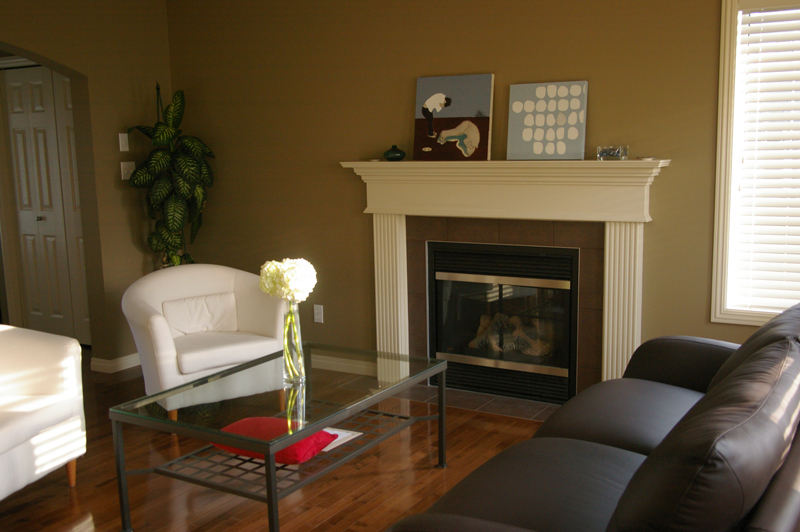
Let’s take a minute to admire all that IKEA goodness. Immediately after we moved in, the leather couch was our only “adult” furniture – a wedding gift from my in-laws. Now, these pictures don’t quite convey the full effect of the room, which was one of … emptiness, mostly. Bland, bland emptiness. Blandety bland. Anyway, not long after this photo was taken, we had a kid, and all thoughts about style and design went out the window. We did eventually upgrade the chairs and coffee table, and added a side table, china cabinet, and some wall art. But the basic layout remained more or less the same. (For the curious, the glass table got sold, and the white chairs moved into the basement. The plant died an inglorious death.)
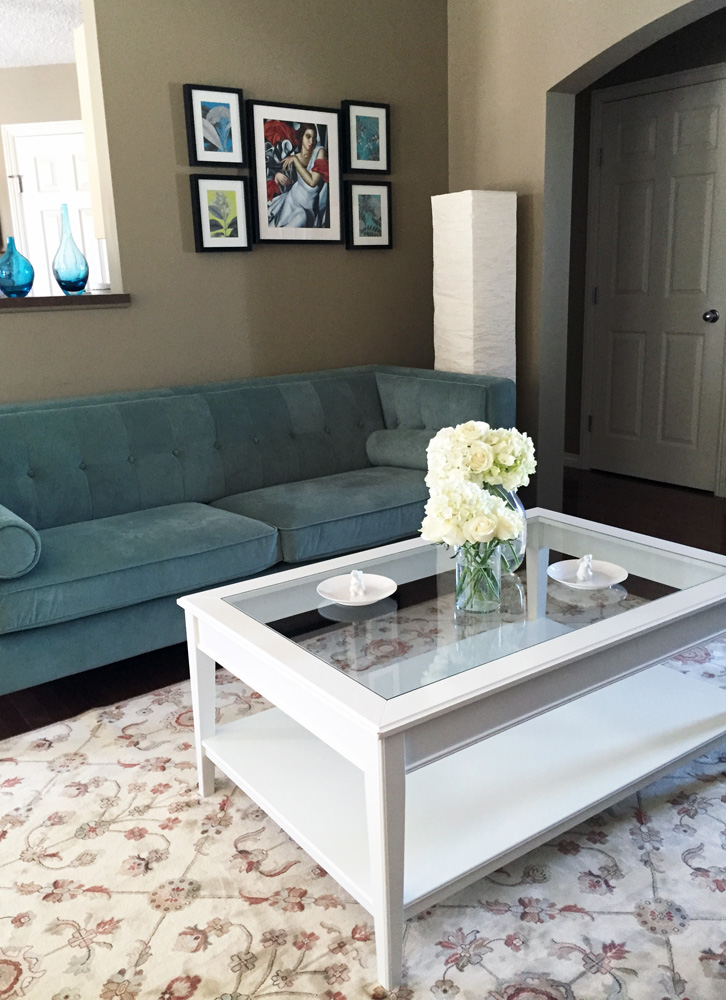
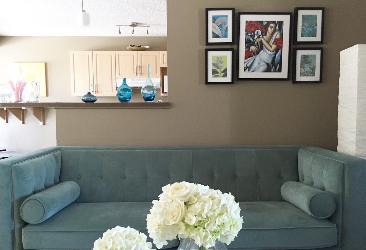
Adding piles of kids’ plastic crap toys, shockingly, did not improve the aesthetics of the living room, so by last December, I was completely over it. I wanted to have a living room that looked, well, the opposite of haphazardly assembled; one that made a statement – namely, that its owners graduated college over a decade before. When we started thinking about how we could accomplish this, the first thing we agreed on was the need for a new couch. There was nothing wrong with our old one; it actually had held up admirably well. But it just didn’t look right in this space. We decided to relocate it to the basement, and start fresh. Almost immediately, I fell in love with this baby:
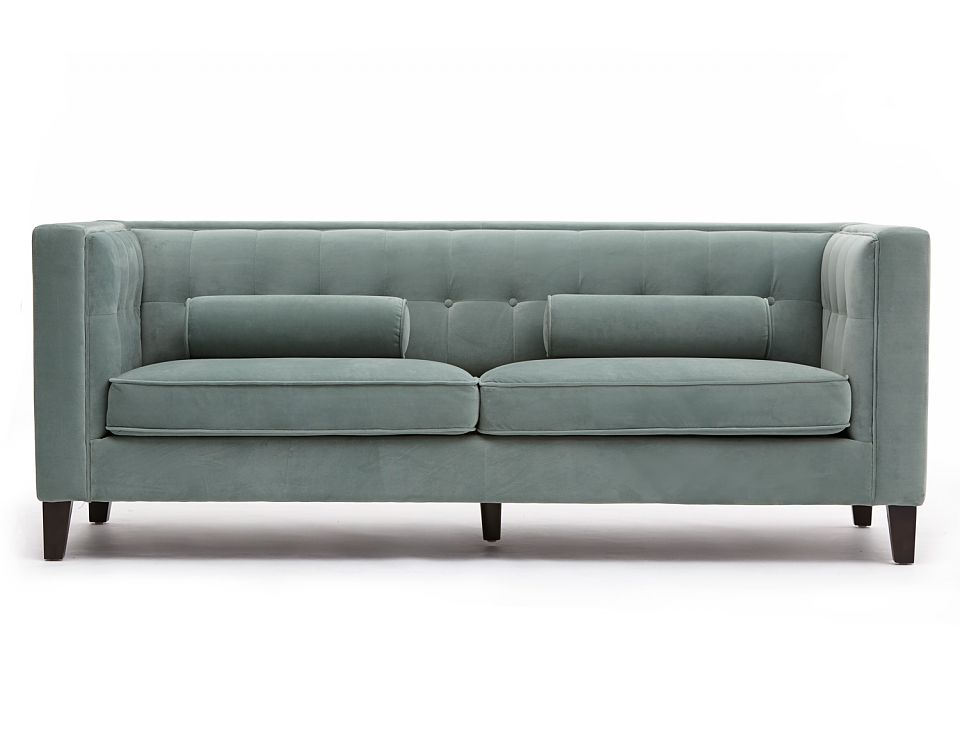
Luckily, my husband loved the colour as well, and this sofa was a go. We figured the old white chairs would work better with it than the updated models, so the latter joined the leather couch in the basement, and the former made their return to the living room. All easy peasy, right?
Well, not quite. When the sofa arrived, the real work began: figuring out where to put it. Size-wise, it was a perfect fit for the room. But remember that asymmetry I talked about? I didn’t want to put the new sofa in the place of the old one, because it would just perpetuate the same less-than-ideal layout. But placing it along the wall facing the fireplace (the only other possibility) didn’t seem like it would work either – it couldn’t be centered properly without blocking access to our kitchen high bar. And this, my friends, is when I had a stroke of genius.
Yes, suspend your disbelief, because it’s true.
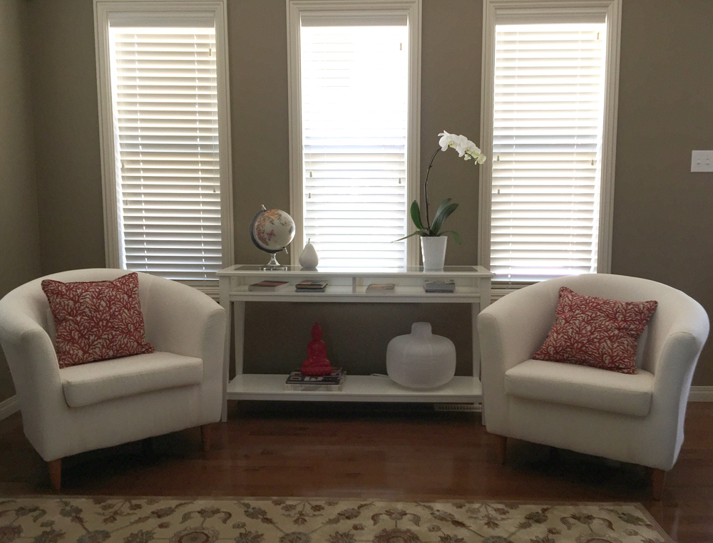
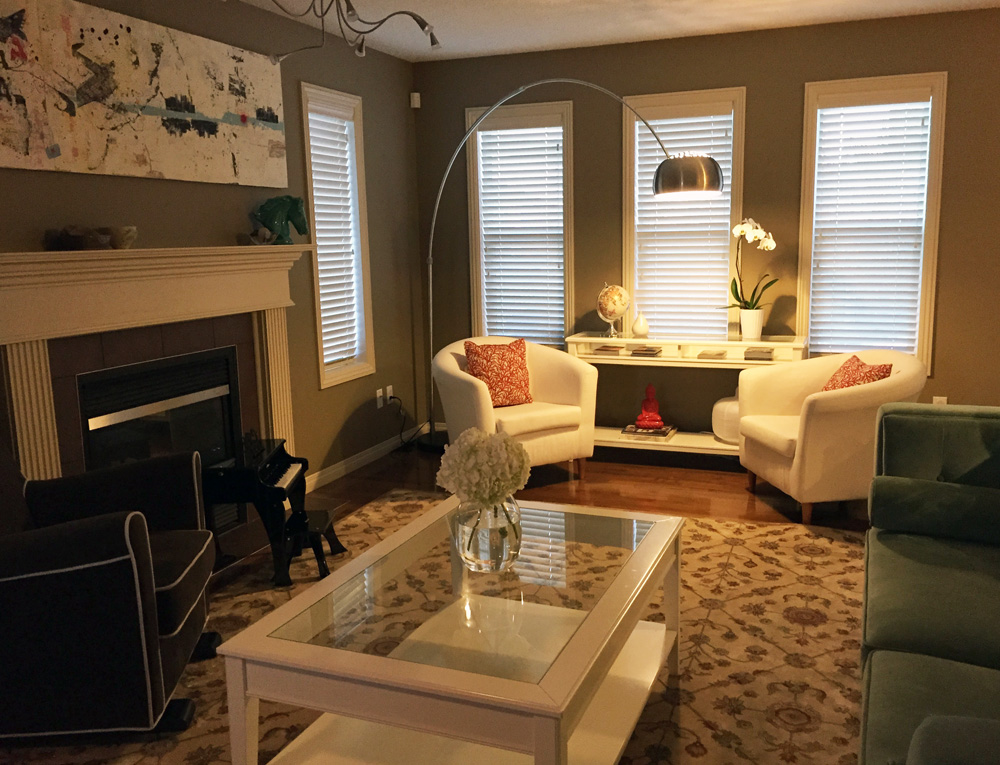
I really liked how the couch looked nuzzled into the right-hand side corner of the room, off-centre from the fireplace. But this left one half of the room looking bare … what to do? Separate zones, of course! I brought down an extra armchair from the family room upstairs, and re-arranged all the other furniture we already had, and voila:
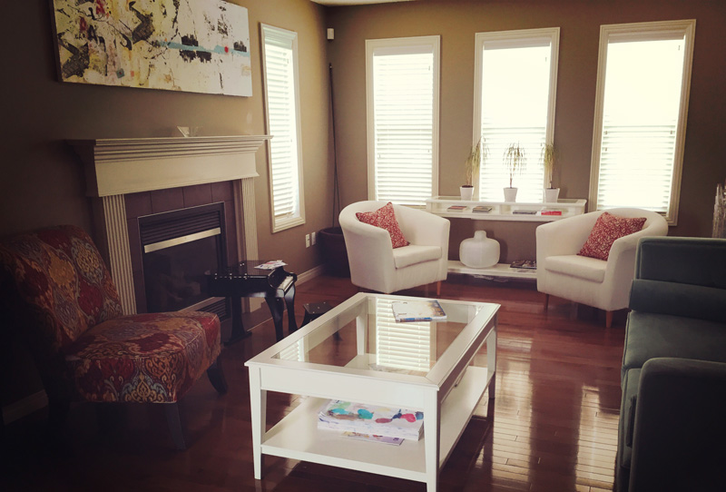
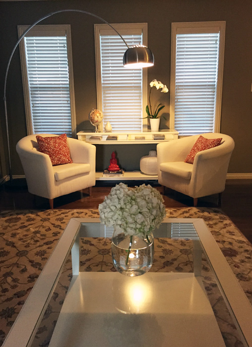
We loved how the room was taking shape, so we quickly drew up a list of finishing touches we still wanted to buy (the only thing we’d bought to this point was the couch): floor lamp, new lighting fixture above the fireplace (the old builder’s cheapie can’t be seen in the photo above), area rug, and some tchotchkes here and there to “style” the coffee and side tables. I also asked my husband to get rid of the old plant pot that remained as the only evidence of our brownthumb crimes (see corner). He also offered to stitch up the rip in my fancy armchair’s upholstery (thanks, kiddo who shall not be named!), because he’s awesome like that.
After a few more trips to Structube, HomeSense, and IKEA, our living room started to really come together. We ended up swapping out the colourful chair for a more sedately coloured rocking chair from the nursery/Teddy’s room, which fits the colour palette of the room a little better. [Considering how expensive that rocking chair was, and how little use it got through two babyhoods, I’m glad it will finally be getting some love.] Here is how everything looks now:
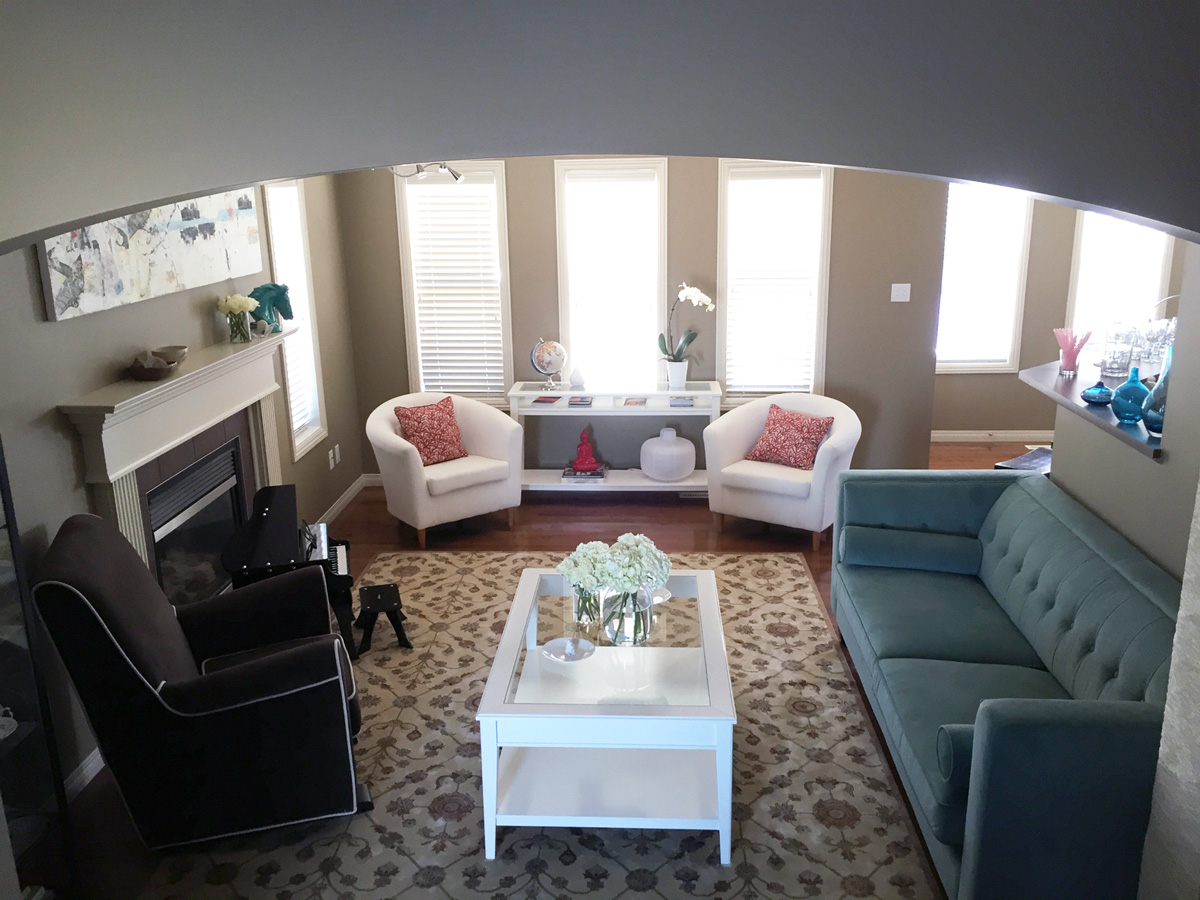
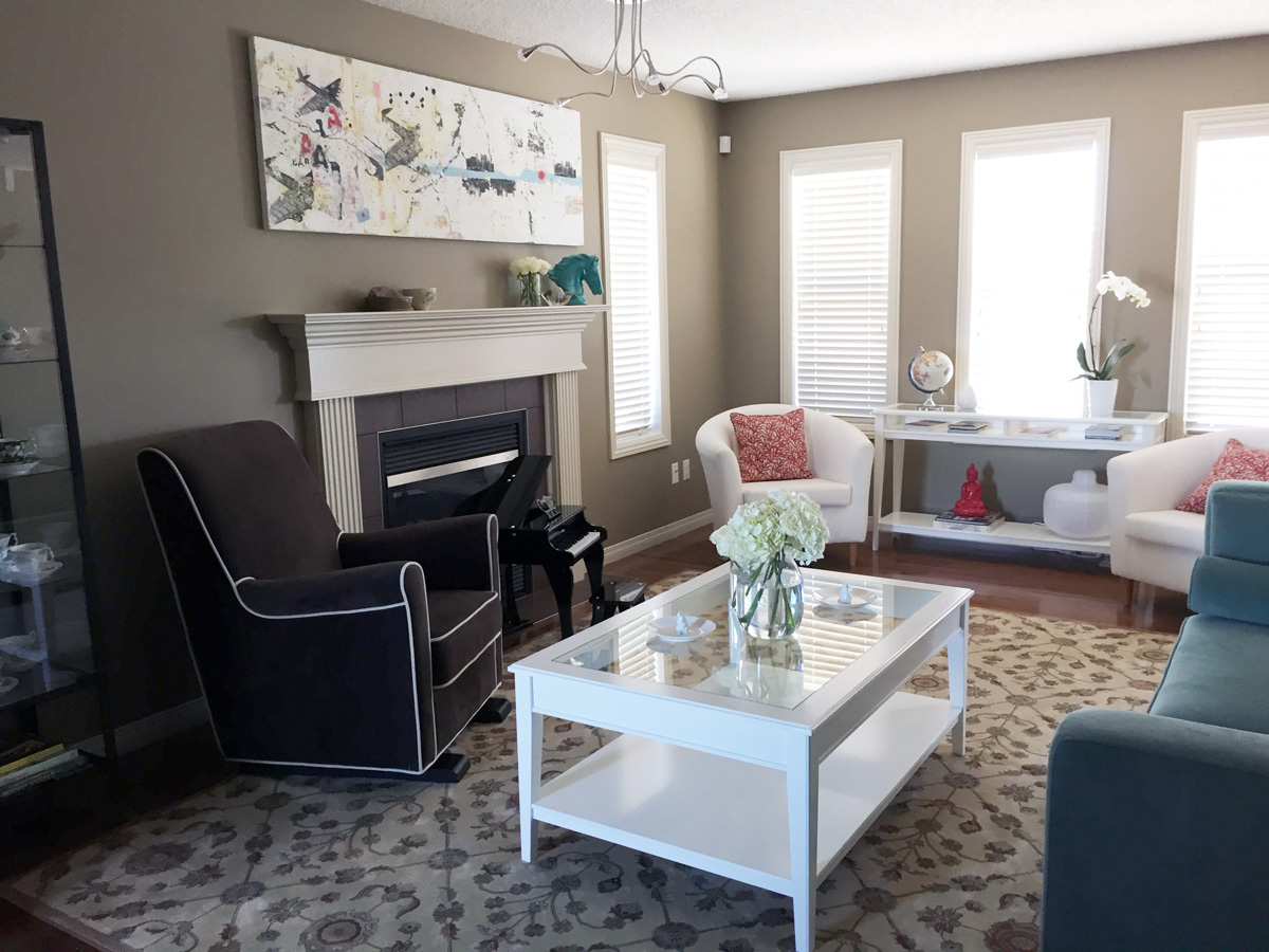
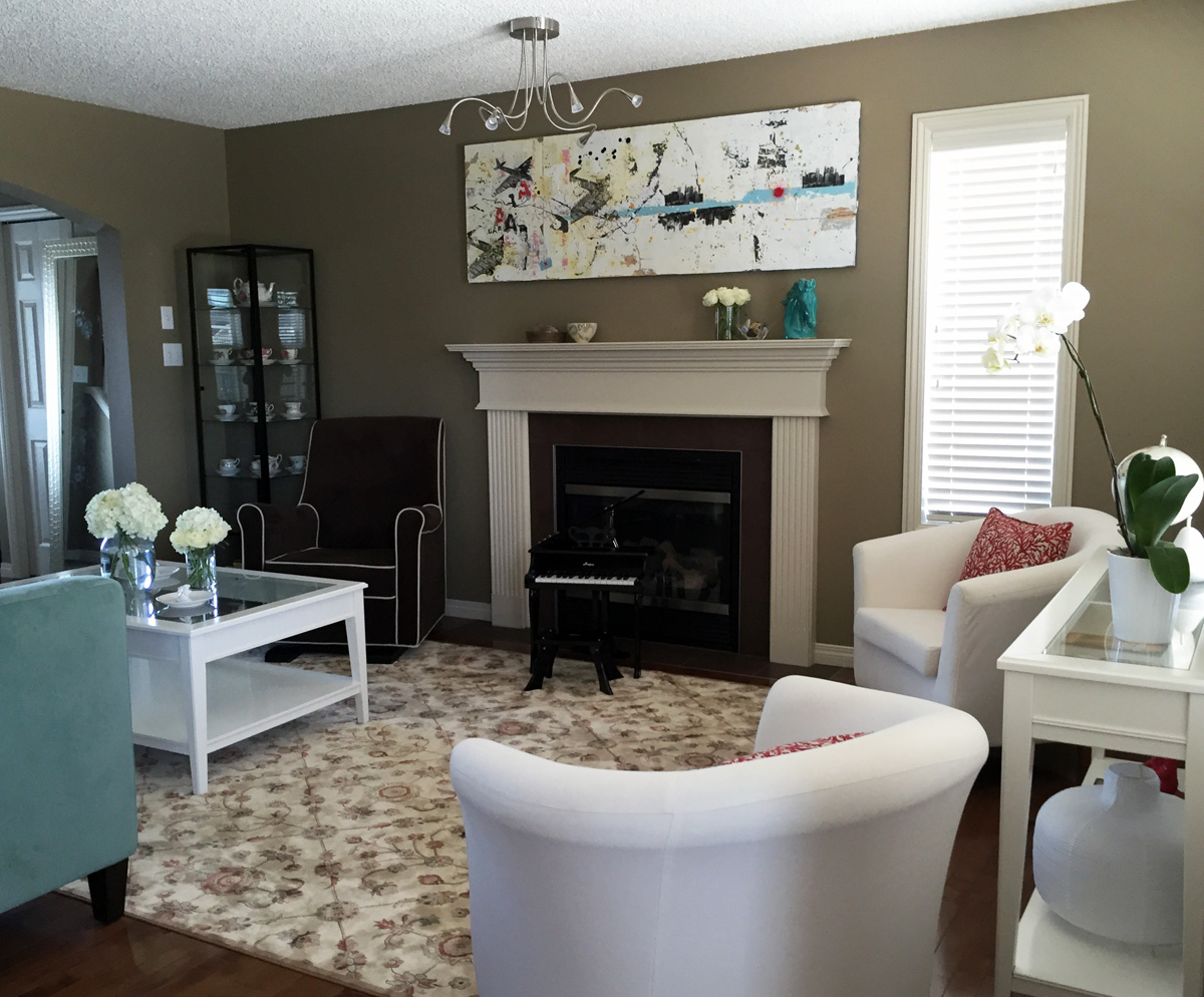
I absolutely love the carpet we got from HomeSense (and its very reasonable price), and so do the kids. Especially Luka. One of his favourite games at the moment involves talking off his socks and dancing/running/sliding around the carpet. I’m guessing the novelty of it will eventually wear off, but it’s been an amusing spectacle. I should also mention that the addition of the carpet easily made the biggest impact in terms of “adulting” the room, and making it look less impersonal and bland.
Seating area #1:
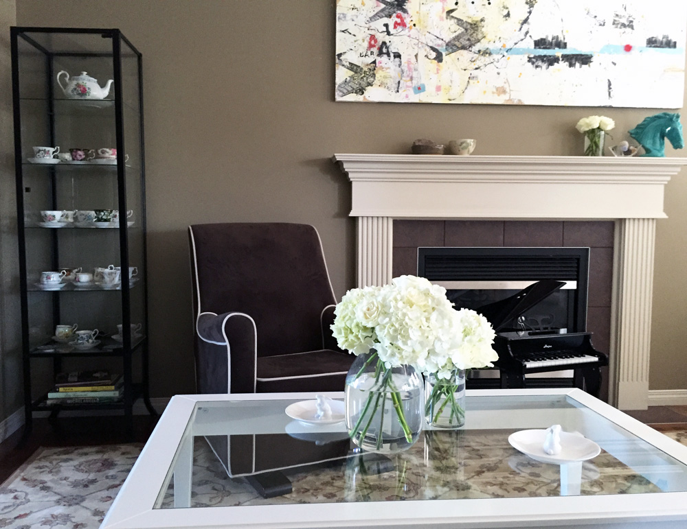
In the end, I didn’t bother “styling” the coffee table, because the kids use it a lot for crafts and such. Rather than battle them for table-top supremacy, I just left the damn thing alone. For special occasions, I can add some flowers in a pretty vase and call it a day.
Seating area #2:
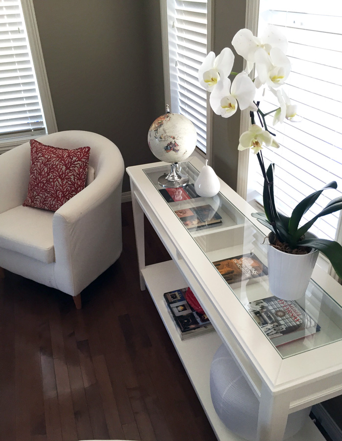
I have to admit that I really struggled with the accessories. I didn’t want the living room to look like a Pinterest board come to life (i.e. super trendy), and I also wanted all the pieces to feel organic and not overly “styled”. I’m not sure if I’ve succeeded (and I can imagine that there will be an evolution in the pieces we have anyway) but I do like how it all looks together. I debated about getting a big arrangement of faux orchids, but decided that the real thing (even if it’s on a more modest scale) would always look nicer, not to mention more, well, organic. (Har har!)
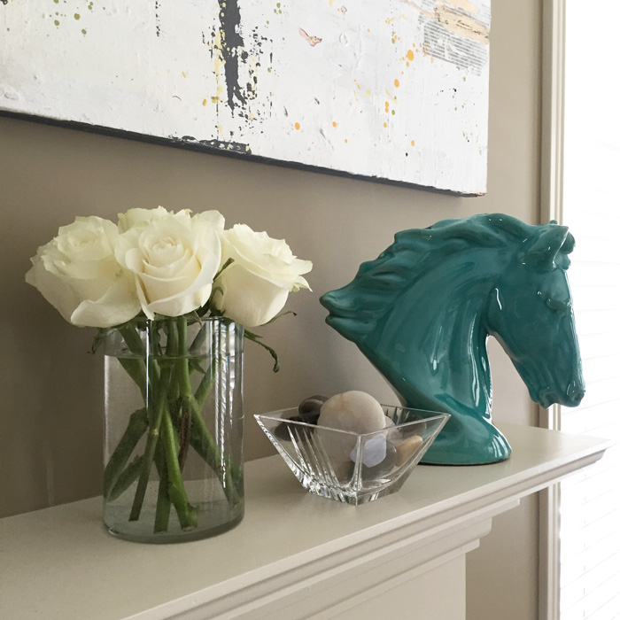
Luka’s contribution was the red Buddha figurine, which was his. He brought it down from his room to play with in the new space, and I loved how it looked there so much that I asked him if he would agree to relocate it permanently. Ok, some bribery may have been involved, but it was totally worth it. The only somewhat divisive item was the ceramic horse’s head, which inexplicably caught my fancy at Winners. My husband was not immediately sold on it, but he eventually came around … to tolerating it.
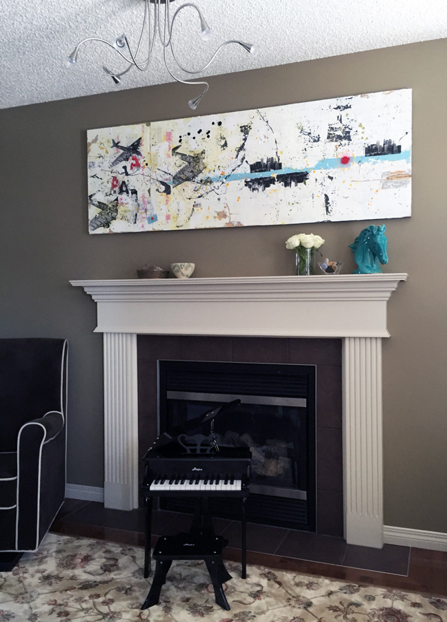
Things were looking pretty good, and there was just one thing still missing: my husband’s favourite lamp. Now, to set the stage, I have to tell you that my husband has been bugging me to buy this lamp (or a version of it), for the past 5 years. He’s a design nerd, and this is some sort of famous piece, yada yada. #philistinetalkinghere When we saw it, on sale, at Structube, I decided to make the guy happy and agree to its inclusion in my design space. It’s going to take a bit of time for it to grow on me, but I will say that the quality of this particular iteration (Structube Arc model) seems really good for the price. It has a real marble base, and the whole thing looks more expensive than it was ($149).
I’m still looking to add a few pieces to the mantel (I’m thinking about some vintage milkglass pieces, if the thrifting gods cooperate), but otherwise … I think we can call ‘er done. Whew.
Stay tuned for the dining room reveal … one of these years.
Gorgeous! Most amazing is that the paint color didn’t change. It read as brown and dark in the old space, yet looks gray and lighter with the new iteration. Not sure how you did that but it’s awesome!
Thanks! That could be a trick of the light too; the colour is a sort of taupe – the same colour as every other house in our neighbourhood, basically. It was a really popular builder colour back in the mid-2000s. At first, I hated it … but it grew on me. I like it because it’s actually a nice neutral backdrop, and it makes the white pieces pop. But it does probably make the room look darker than, say, a true light grey would. We are probably going to re-paint the basement at some point, and may decide to revisit the living room colour at that time. But I’m lazy, and if we change the living room colour, we would have to change a lot more because of the open concept layout – too much work!!
Perfect! Fresh and clean and not too fussy. A very soothing room. I like the paint color.
Thanks, Jeri! Soothing is definitely good – we need a break from the usual chaos at our house 😉
What a beautiful space! We used zones to break up our large living/dining room space as well and it made the whole design process much easier (and much more fun).
Totally! I don’t know why I didn’t think of it sooner. I probably would have if I ever paid attention to design shows, but HGTV is like the Food Network for me – I don’t trust myself to watch it, LOL!
The room looks great! And I LOVE THAT LAMP. It’s elegant but also interesting. I wish I could cram one into my tiny apartment lol.
Yeah, it is rather a large piece. The way we have it set up is not at its full extension (it’s adjustable) – it can take up a LOT of room. For one thing, I think it would look better in a room with a higher ceiling. But I think a lot of places now have different versions of this lamp, some on a smaller scale. I’m thinking even Ikea, maybe? Worth looking into if you like the look of it.
The couch is gorgeous! We picked up some dining room chairs at Structube and have been really happy with the quality for the price too. Good to know our chairs weren’t an exception to the rule. I also think the layout is much better…those awkward spaces are always tough.
I think they had some milk glass at Find last time I was there…
Ooooh, what’s Find? And where? I would love to find some cheap milk glass, but the antique malls want $60 for a small bowl and I’m, like, LOL Nope!
Find is a used furniture shop on 122 St just north of 51 Ave. It’s quirky…they set up the furniture in little vignets like you are at The Brick or something. It’s hit or miss, but usually the pricing is pretty good.
Everything looks gorgeous! Very inspirational. Thanks for sharing.
Thanks 🙂
I love the new seating corner. Beautifully done.
Thank you 🙂 I really love how it turned out as well.
Beautiful room and furniture pieces! How do you keep it so free of kid items? My place is small, so my toddler’s toys are all over the place. I’m on a mission to figure out how to organize better so that it doesn’t look like we live in a home owned by my daughter and her toys when guests come over.
Honestly … I don’t. If we have guests over, I just tidy up immediately before they come, to minimize the chances that toys will migrate back. We are lucky in that we have a dedicated kids’ space upstairs, which is where the majority of toys reside permanently – and that place is always a mess. Do you have a place where you can stash boxes? IKEA has a ton of cheap but nice looking storage boxes – you could try storing them on the bottom of bookshelves, underneath the coffee table, anywhere they might fit. That way, if someone’s coming over, just quickly toss all the small stuff in boxes, then hide the big stuff (anything that doesn’t fit in a box or can be disassembled easily) in a different room that your guests won’t see. Sorry, I wish I had better answers for you 🙁
Really love it! The couch and the lamp are amazing and I am so jealous that your husband is a design nerd. Mine is in love with our old red couch, the ugliest and largest couch I have ever seen, because it is comfortable.
One question: the set up of your living room is similar to ours and our biggest challenge has always been where to put the TV. I’m assuming you have another room where you watch TV? Or don’t?
Yes, we sure do, LOL! I laugh because, at one point, we had 4 TVs in our house. We are now down to 3, including a massive projector screen. We just don’t have one in the living room. It was a conscious decision we made; we primarily use the living room as a “reception” area for guests (the kids have run of the place the rest of the time), and there is never a need for a TV in that situation.
If you don’t have a separate TV-watching area, I know a lot of people with similar set-ups put the TV above the fireplace. The other thing you may want to consider is a projector. We have one in the family room, and we only pull down the screen when we are actually watching; the rest of the time, it’s hidden away, and the projector itself is mounted on a shelf in our library wall so it’s not very noticeable. It may be possible to do something similar in the living room – mount the screen above the fireplace, and the projector on top of one of the top cabinets in the kitchen (so it has a clear view over the kitchen half wall). Sorry, I hope that makes sense – I think the main thing you need for a projector is enough space between the unit and the screen … but I am def NOT the AV expert in our house.
I love that couch! It just elevates everything, in my opinion. And the rug makes the room so much cozier. I would love to see how the rest of the house comes together as you guys work on it! 🙂
Thanks! It will probably take a few more years for us to get to all the projects we have around the house, but I will definitely post updates from time to time. The basement is our biggest issue, but it’s taking a long time because my husband is doing all of the work (from drywalling on down the list).
Oh my, I love that couch, too! Furniture layout is weirdly intimidating to me, and so I enjoyed your explanation of how you improved this one. It really looks so much better!
Thanks! It’s the best part of the room, for sure. The kids love it too … a little too much for its sake, LOL!