As you may have started to notice, there has been some change happening in the old closet lately. Most of it has been of the organic, go-with-your-gut, find-your-joy variety, but one intentional exercise that I did undertake was updating my wardrobe colour palette. I had done a similar exercise a few years ago, but I decided to start from scratch again. (The results are actually quite similar.) I Googled Pantone swatches and colour names, and ended up putting together some basic collages. I think Pinterest would be a very helpful tool for this sort of thing, but I am too lazy to invest in a whole new social media platform. Below are my amateur efforts, which I’ve also saved on my phone to help me in future shopping trips.
A quick work on process. I didn’t follow any particular rules in doing this exercise – it was more of the same follow-your-instinct approach. Although, as you guys know, I love *all* colours, I realized that there were some that just “call out” to be worn more than others. I debated getting a seasonal colour analysis done, but ultimately decided against it because I wanted my wardrobe palette to reflect the colours I loved, not what I was told I should love. I may revisit this possibility later, just to satisfy my curiosity and see how close my own choices mirror, or not, my recommended colours.
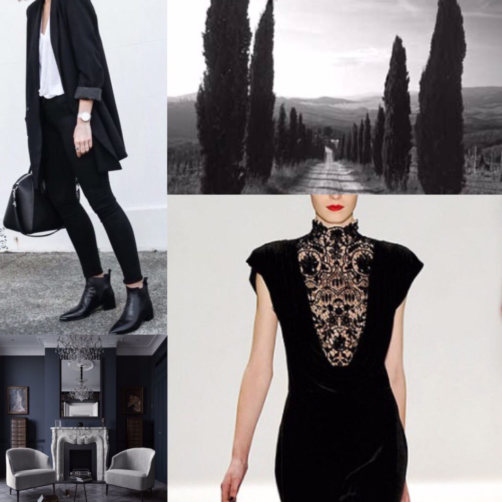
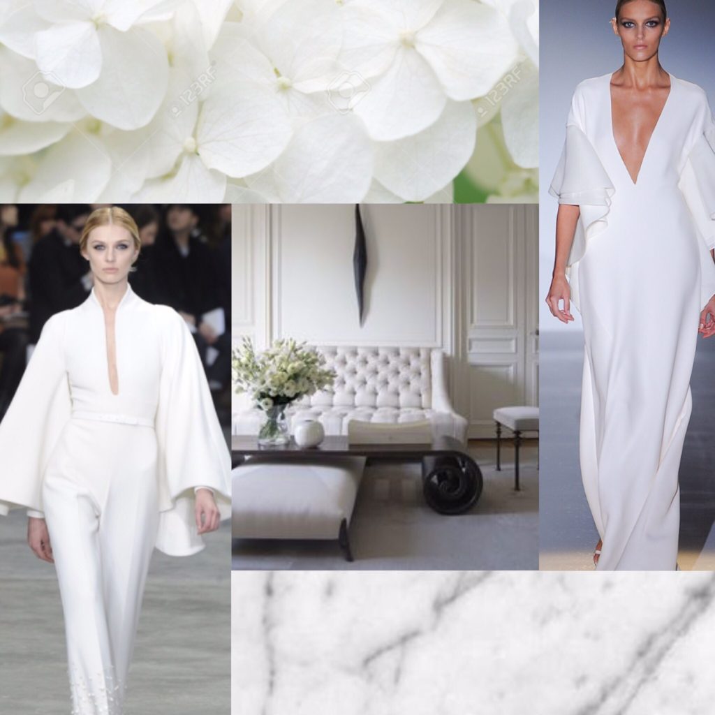
First up, the neutrals.
For anyone familiar with this blog, there shouldn’t be any surprises here.
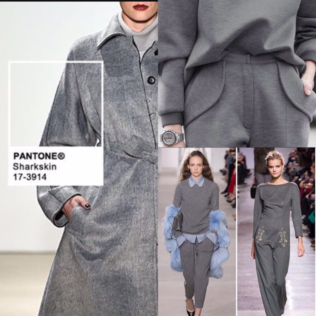
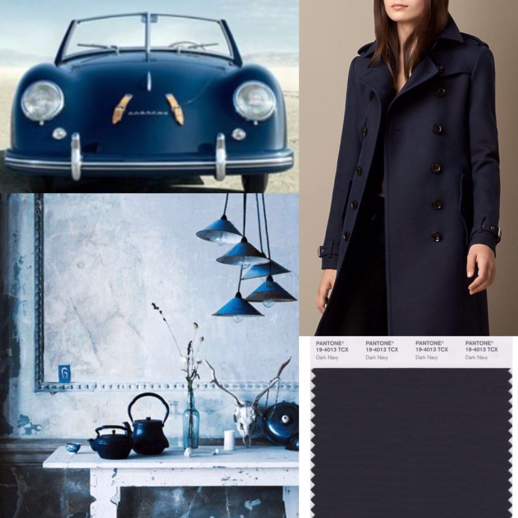
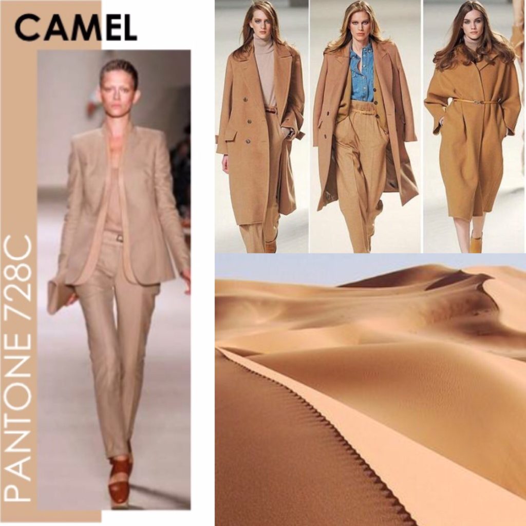
Next, my core colours. The main thing I’ve come to realize is that I like muted, muddled shades as opposed to either jewel tones, brights, or pastels. Basically, take any colour and throw some grey or black into it, and you have something I like. I call them my “complicated colours”. They’re probably not everyone’s cup of tea.
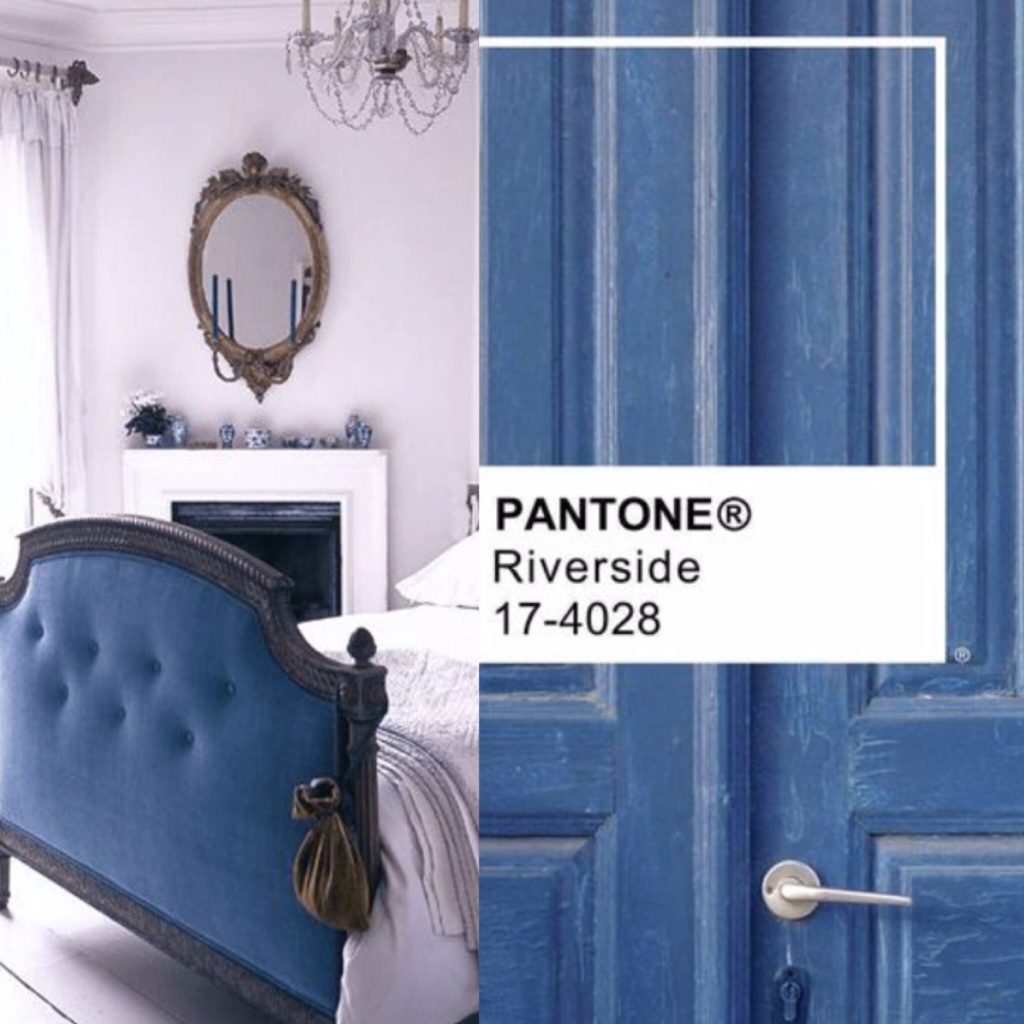
Blue — all shades of it — is my favourite colour, so the idea of narrowing that down to a specific shade was daunting initially. It became a lot easier once I ran across my new Club Monaco sweater dress. That was a blue that just spoke to me at a gut level. I ended up finding echoes of it throughout my existing wardrobe – sometimes lighter, sometimes darker. Pantone has a colour called Riverside that I think is the best approximation of this shade.
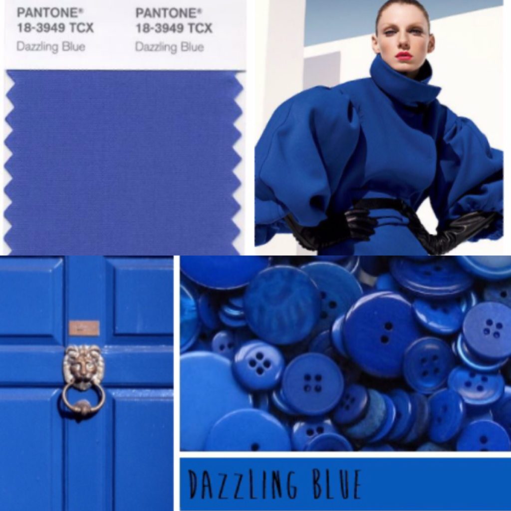
In the process of looking for Riverside, I came across Dazzling Blue. To me eye, it almost looks like a more intense, less muddled version of Riverside. I’m obsessed with it. I’m not sure if I need two colours that are ultimately so similar in my palette, but I’ve included it here because … well, I am obsessed with it.
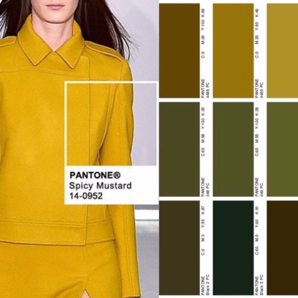
It should come as no surprise that mustard (or Spicy Mustard, as Pantone calls this shade) made the list. There is a lot of it in my wardrobe. Joining it is a small constellation of related hues on the spectrum between golden yellow and dark khaki (see small sidebar above). Basically anything kinda yellow, kinda green, kinda brown. Olive is definitely included, but that in itself has too many varieties to narrow down to only one shade. With the exception of mustard, none of them draw my eye in the same way that my blues do, but I find them very pleasing in combination with the other colours in my palette. To some extent, these warmer shades operate almost like a neutral for me.
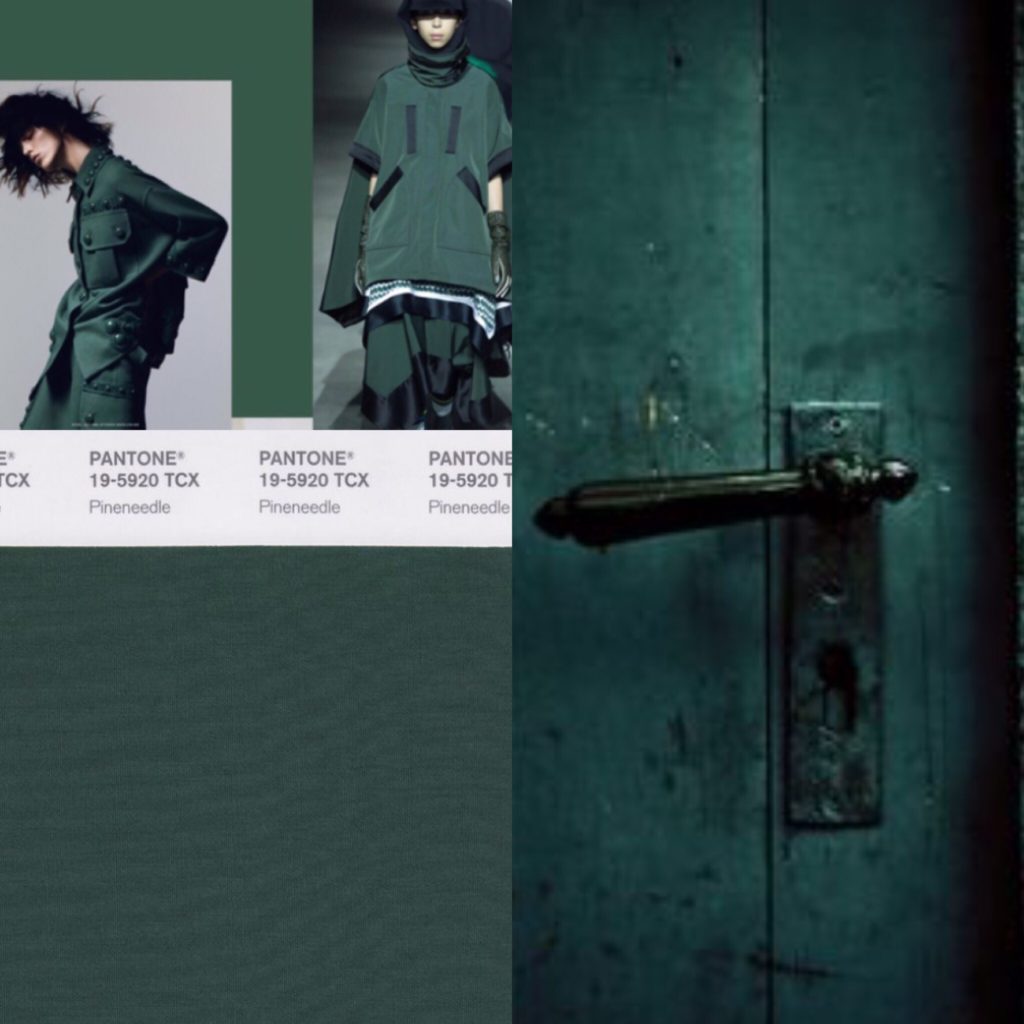
I adore green, but don’t enjoy wearing it. I know, it’s a crazy thing for a redhead to say. The only exception is this dark, mysterious green. It’s kinda like forest green, and kinda like dark teal, but with less blue and more bottle green, and a heart of black. Clear as mud? It was actually quite hard to find photos that matched my imagined ideal, probably because I struggled so much with the search terms. The photos above come pretty close.
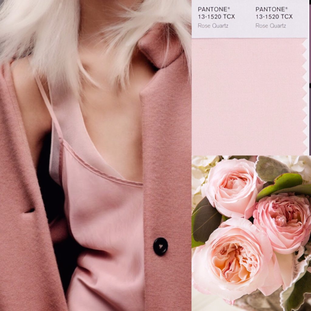
Blush pink (or Rose Quartz, per Pantone) is basically like ivory for me — i.e. close to my skin tone. I’m probably too pale to pull it off smashingly, but I think it works well with my hair colour, and I find it very soothing.
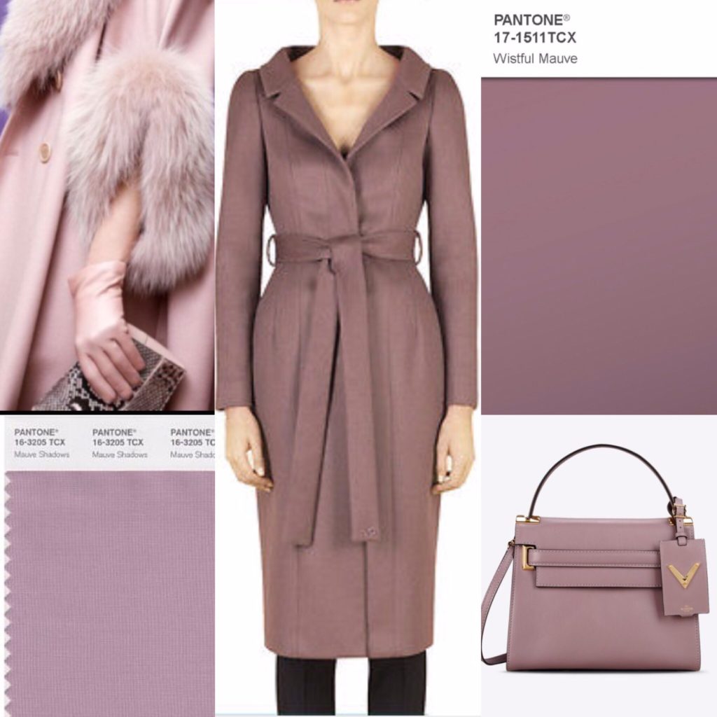
This was another colour for which it was very difficult to find a precise match, but what I have in mind is a very greyed out, desaturated purple.
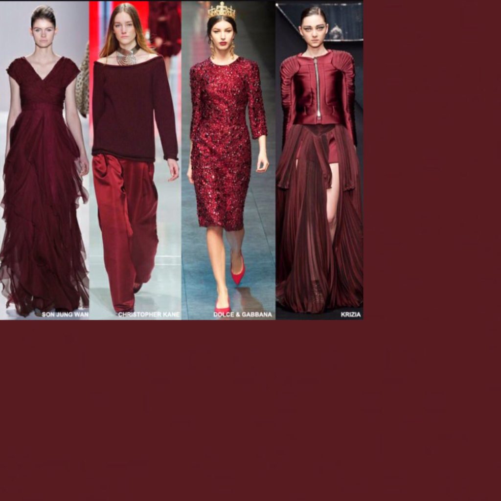
Burgundy, no surprise. I consider it an almost-neutral. Can you tell I got real lazy with this collage?
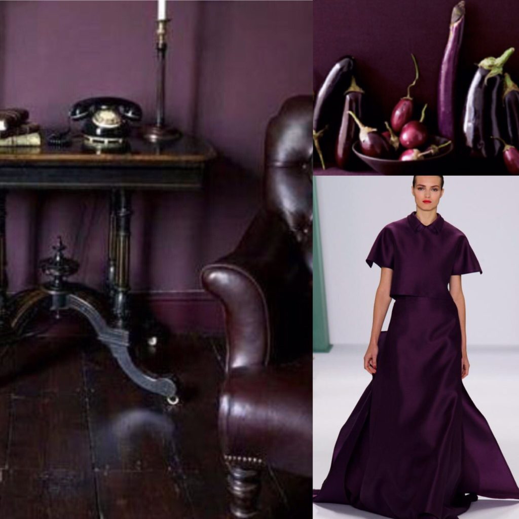
Last but not least, eggplant purple. Again, this is not a jewel tone. It’s darker, moodier (like my soul — zing!). I basically want to wear that magnificent gown (see collage above) everywhere; it’s made for dramatic entrances which, let’s be honest, is #stylegoals right there.
And that is my wardrobe colour palette in a nutshell series of pictures. The only shades missing are red and red-orange, which are my (sparingly used) accent colours.
For those of you who have created a wardrobe palette, I want to know: how did you go about it? Did you find the exercise useful? Did you limit yourself to a set number of colours? And if you’ve had colour analysis done, did you find it worth the price of a consultation?

Instead of a driver’s license, I got a color consulation for my 18th birthday, and it is one of the best presents I have ever gotten. I’m at a point now where I know my color palette by heart (I’m an autumn), and it makes shopping and deciding what to wear SO much easier – everything goes with everything! Sometimes, it can be a bit annoying when nothing “trendy” is around in your color, as designers also move through the different types with the seasons. But other than that, I can whole-heartedly recommend having it done. At the beginning, it can be a little hard to realize that there are a lot of things you need to replace (if for example like me you had a teenage emo-phase and owned a lot of black clothes when really, that makes you look like you’re attending your own funeral), but I think especially for someone with your shopping habits (from what I know off the blog, obviously), this should be no problem. It’s an investment for sure, but very much worth it in my opinion.
Yeah, that is one of my reservations about getting it done, actually. I basically like the clothes I have, and don’t want to go and replace them just because of the colour. I mean, I hardly need more reasons to shop, you know? It would be helpful going forward, just to guide future purchases.
I have been doing some more digging into seasonal (and body type) analysis, and I think I have figured what I (think I) am, which is kind of line with the direction my style has been taking lately. I do agree that it makes shopping much easier … I have been admiring and NOT buying lots of things lately, because they don’t fit my colour palette and/or my style.
My palette as I am looking at my wardrobe, has ALL jewel tones, mostly purples, pinks and cobalt blue.. then all the neutrals. That’s all I like to wear 🙂
I have something similar coming up soon
I can’t wait to read it!
I’ve never had a color consultation. I may steal your picks. Well, I’m on the fence with mauve. We have similar hair/eye/skin colors which was one of the first reasons I began following your blog so I especially like this list. I’m into inky blues right now.
If you have my colouring, I would love to hear what you think once you try some of these colours in real life. I am a little bit worried that, as much as I enjoy wearing them, perhaps they are not as flattering as I think? I dunno … reading about colour analysis online (which doesn’t seem to be have good answers for redheads) is messing with my head.
Mauve is a tough one, for sure. The wrong shade can make me look very wan. I think it has to be a cool, blue purple-leaning mauve, for sure.
“I am a little bit worried that, as much as I enjoy wearing them, perhaps they are not as flattering as I think?” Yeah, that’s all I can think when I read about knowing one’s most flattering colors. There I colors I know I like to wear, and hopefully it’s subconsciously because they flatter, but maybe I just like them in general (which I think may be more the case). I don’t really want to know, lol.
I love the wardrobe analytics posts and when you hinted about today’s colour post recently I couldn’t wait to read it! I like your muted colour palette – it lets your hair and skin shine. I like how you were so specific about colours – I have tried to figure out my colours before but I’m too generic; I just say blue instead of narrowing it down to a specific shade (or two!) of blue. I bought the Curated Closet book recently and it has some colour theory in it so I’ll try to work through it with my wardrobe when I have a bit of free time. I’m trying to be a bit more conscious with the colours I buy and I need to do a little work on what colours I want to have in my wardrobe for more focus.
I have always been curious about getting my colours done, but I think I would be disappointed if there were colours I liked that I couldn’t wear. I don’t know that mustard really looks the best on me, but it’s a colour I like and so I wear it whether or not it looks good on me. That being said, I like your point about admiring and NOT buying – I can like items and admire them without having to take them home.
Yeah, I struggle with that even though it’s a really great and useful mantra. I blame it on my collector’s mindset. Like, I can’t just admire a pretty teacup in a store; I need to buy it and put it on a shelf so I can look at it whenever I want. That (sorta) works for collecting hobbies, but I really need to remember to prioritize the functionality of clothes more. As much as I joke about it, I don’t want to just collect clothes for the sake of it. So I try to remember that mantra more 😉
The first thing I thought of when reading your colors was your J.Crew blue and green floral skirt and top that pulls in several of your favorites!
Also, while I have never done a color palette or analysis before, this post helped me figure out why I never wear two pairs of dress pants that are perfect in theory…they’re plum when I prefer either maroon or eggplant. “Purple” isn’t specific enough for me.
For other colors I like, I came up with goldenrod, marine blue, pistachio and royal purple. Oh, and whatever color you call a slate gray with a really strong lilac undertone.
Yes, that skirt/top is definitely in my colour wheelhouse. Most of my current pieces are (I’ve been slowly weeding things out). The hardest part is resisting the temptation to buy new things that are the right colours. And for some reason, every time I click on a blog, I seem to see something in one of my colours. I hadn’t realized that eggplant and dusty blue were so popular, LOL!
It’s so funny … I love some of the colours you picked, but others … pistachio is definitely NOT my colour. I guess no two people have the exact same palette.
Very cool post! I haven’t done much thinking at all about my color preferences for my clothing, until maybe only the last year or two. That was mainly just to decide that I liked what I was calling “dark jewel tones” in winter – including a slightly brighter version of eggplant and pine. (For some reason, I don’t like burgundy or oxblood type colors as anything more than an accent color… I’ve tried on a burgundy dress and it didn’t work for me, though I think of the color as being in the “dark jewel tone” family.)
I also realized I didn’t like most pastels (or the ones that were common in spring/summer clothes the year before) much at all, which meant that I’d pretty recently bought quite a few items I didn’t particularly like because mint green and dusty coral had been popular colors on the Loft sales rack.
I love pastels in principle, but I hate wearing them too. Which is tough … I still get tempted every so often by light aqua or mint skinny jeans. I don’t know why that specific item is what gets me the most, but there it is. I’ve held off so far though.
I love those colors. I’m always torn between the desire to pick my best colors and wear the colors I actually like. Case in point, I love jewel tones but they’re too strong for my coloring, since I’m pale with dark blonde hair. Meanwhile, that shade of pink you pulled works really well for me, objectively, but it also makes me look a little too much like little Bo Peep to risk it at work. :/
Is it a question of the items you wear in that colour? Like, would it make a difference if it was something more minimalist/androgynous rather than girly? What I have actually found really interesting more so than personal colour analysis (although the two are related) is style analysis based on face/body type. I know it sounds rather mad, and I was skeptical at first, but I’m starting to really come around. Check out the blog Truth Is Beauty (and in particular a post about dressing for your face). There is a section in the Menu on different style types that is worth exploring. I think the idea is to combine your colour palette and style persona, with the result being the “best you” possible.
For what it’s worth, I think many of the colours I’ve chosen (minus black and white, both of which are more accent colours for me anyway) reflect a Soft Summer palette as per seasonal colour analysis. So if you are a Soft Summer (possible, from your brief description) then you’re in luck. I’m pretty sure that I’m not a Soft Summer, which is unfortunate, LOL!
Thanks! I just checked out the blog and it’s really interesting. What did you end up identifying as? Dramatic classic? I think I might be a combination of dramatic and ethereal. (Muted coloring, crazy eastern european cheekbones). It actually would explain a lot about why I like clothing with an art deco inspiration – something about the ruching and geometric lines seems to make sense with the fact that I’m visibly angular, especially in my face.
Are you going to talk about this in a blog post? I’d love to hear more of your thoughts on it.
I think either Dramatic Classic Ingenue or Ethereal Dramatic Classic. So definitely Dramatic Classic Something, LOL! I’ve bookmarked both those pages, haha.
I think I’m going to post a link to the article on my next roundup, probably next week. I don’t really have more thoughts on it at this point (other than, I think there’s something to it!) but I would love a discussions with others. Down the line, I might write about my style evolution some more, but I always worry that people find those posts a big pile of TL;DR, you know?
Hi Adina,
I have never gotten a color analysis done, but a couple years ago I invested in two books that really helped me up my color game. One is my David Zyla, I think it’s called Color of Style, and the other was Color with Style by Donna Fujii. These two books totally changed my approach to color. I used to think I could wear every color (ha!) then I went through a phase where I though certain colors were totally off limits. The Zyla book helped me find my “core” colors. As another commenter said though, seasonal trends mean it’s hard to find your core colors all the time… but that’s the beauty of thrifting! The Fujii book helped me reintroduce colors to my wardrobe that I thought were off limits.
Hi Adina,
I wanted to share my experiences in having your colours done because I’ve done it almost two years ago and it was the most interesting and confusing experience but I think I’m starting to come to terms with it. I am a very Nordic type (always misitaken for Swedish or Norwegian even if I am Hungarian), very pale skin, light blueish/greenish eyes and light blonde hair. I dyed my hair red for a long time because I loved the overall look of women naturally of that hair color (I love yours too!) and I really liked bright colours. I never consciously said that I wear bright colours because I feel myself too plain and invisible because of the lack of any bright colours and contrasts in my natural features. As you can already probably guess, I turned out to be a very light summer, quite close to the light spring but still very on the cool side. This immediately disqualified about 80% of my clothes because for example in theory I am not allowed to wear green (the analyst threw away immediately the first and last green scarf she put next to my face and said “definitely no” before I could see what is wrong with that).
The analysis was on a Friday and on Sunday evening I literally had a small nervous breakdown when I tried to find out what to wear to work the next day and became overwhelmed with the idea that everything in my closet looks terrible on me (add to that that I was aroung 5 month pregnant at that time so maybe that could have added to the drama 🙂 ). My closet had 0 items of any cool pastel colours and I could not recognise myself in that ice cream-shaded sweet world that was recommended to me. I think I needed time to process the thing and even if I am sure I haven’t reached the end of that process there are some conclusions I can draw. 1) I REALLY look great in those pastels 🙂 🙂 :). I try to find out which ones I love the most – for the neutral I have (luckily) always loved everything light grey, grey marl – this colour became my no 1 neutral staple. I also changed everything I had in black for navy – still very dark for me, but works much better with the colours that flatter me and is much less agressive next to my skin. I do not regret it for a moment. I also decided that there are some looks and palettes that I am not going to abandon. I do not want to let green go – I got rid of the very dark, pine green coloured clother but I like the clean and string greens which most likely would flatter a spring best (but I am close to spring, right? 🙂 ). I really try to be critical when I check thing out in the mirror but I still do not hate the overall look in this case so green is here to stay. I also did not discard all navy striped things even if anything with strong contrasts is to be avoided as I have no such contrasts on my face in my natural colours. But the maritime-inspired trend is something that I love and consider to be a classic so I will stick to that. To a much lesser extend but I also decided not to stay entirely away from the Safari trend in the lighter versions, especially with some blush or very pale green hues in it because those are among my best colours. I am currently on the hunt for some periwinkle dresses and tops because I have a pyjama in that colour and I think that is what I look most gorgeous in! (and believe me, NOT because of its style 😉 ). I am also on the hunt for the perfect mid-blue and mid-grey perfect tailored suit (I work in the government administration) to become the grounds of my perfect, not too dark light summer office work wardrobe. On a final note I would definitely recommend to go for having your colours done, but be prepared for some shock. They way you see your current colours may change after some initial denial (it was the case for me) but for me it becomes more and more liberating to say no to things I liked. In the same time as I said there are some palettes that I am not ready to give up and the whole experience gave me the confidence to say that I am going to stick to those and sometimes finding ways to fit them better to my new colours, but it gave me a lot of strenght when it comes to my decisions about what colours I choose to wear. Would you decide to go for this experience I could not wait to hear about it as I love your approach about what and why and how you wear.
(I also can’t wait to finally start my blog on the matter after years of dreaming about it and a dream would come true if I knew that someone whose blog I followed and almost considered as a dear friend although we live on the opposite sides of the globe and have never met would ever see anything on my blog – it would be like finally meet that person, however that sounds even weirder than I initially thought)…
I’m definitely becoming more and more sold on the idea of getting my colours done.
And I would definitely love to check out your blog. Follow your dreams!