
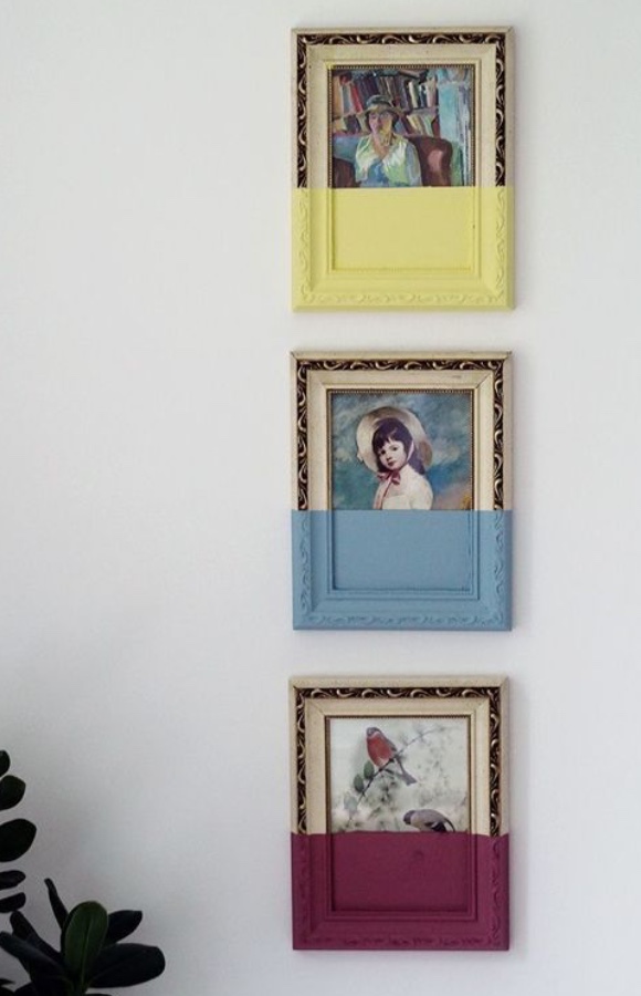
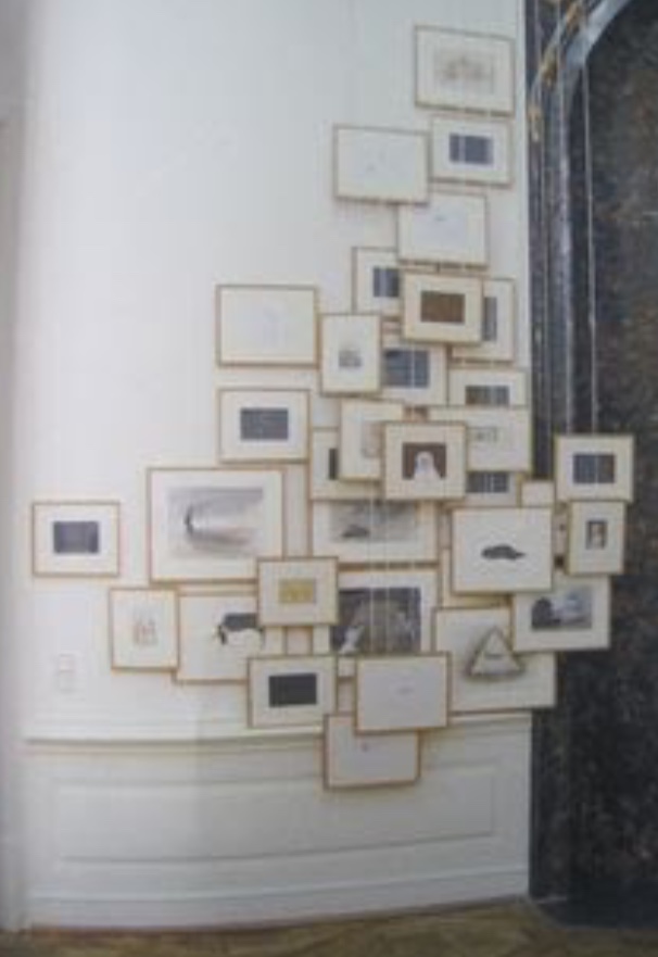
Given my love of thrifting and crafty endeavors (as long as they’re easy), I am quite late to the upcycled-thrift-store-art-project party. Thanks to a fellow thrifter on Instagram, I have now arrived at said party and I am HERE FOR IT. This is the inspo photo that got me hooked:

I love the whimsy and it’s no secret that I am obsessed with colour; the more sedate my wardrobe becomes (which feels right), the more I want to surround myself with colour in every other area of my life (which also feels right). This sort of “art project” is right up my alley; naturally, I decided to tackle one myself.
The first step was finding the right art piece at the thrift store. It’s a sign of how thrift-spoiled I have become that I actually experienced some impatience with this part of the process; it seemed like it was taking a really long time, but in reality, we are talking about 3 weeks, tops. And I found the perfect piece:
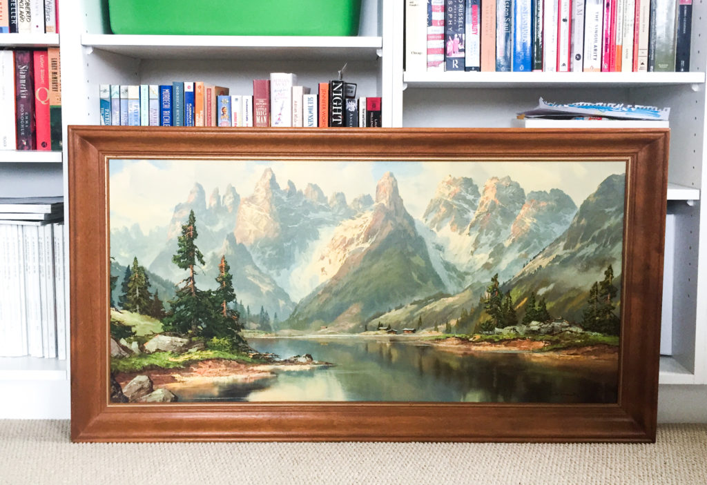
You can kinda gauge the proportions of it from the surrounding bookshelves – this thing is huge. It’s a repro of a painting by (as best as I can tell) Arno Lemke, probably from the 70s or 80s. It’s totally kitschy, but at the same time, not displeasing to the eye. And it cost a whopping $7.50 at Goodwill. The best part, though? My husband didn’t immediately nix it. In fact, he was surprisingly receptive to my idea for upcycling it:
We had a good talk about the various other things we could do with it – decoupage a Godzilla or Super Mario in the middle of the lake, add a rainbow effect like the top inspo photo, transpose a sticker drawing from my “paint by sticker” book, graffiti it up, etc. – but ultimately came back to the colour block idea. My husband like the “mystery” of the solid block of paint and I liked … well, the simplicity of it all.
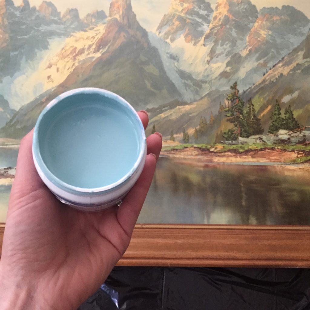
The next step was picking a paint colour. I toyed with several options (pink lilac, dark teal, eggplant), but ended up selecting the first choice: a muted, green-tinged blue. The specific paint we got was Sherwin Williams Blue Tourmaline; a sample sized pot set us back about $7 (including tax). The quantity was more than ample; after 3 coats, I have enough left over for another 3-4 similar projects. The other supplies (masking tape and paint brushes) we had around the house, so they didn’t cost anything extra.
Here’s a peek at the process:
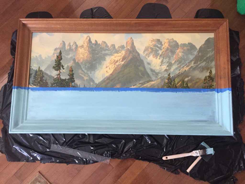
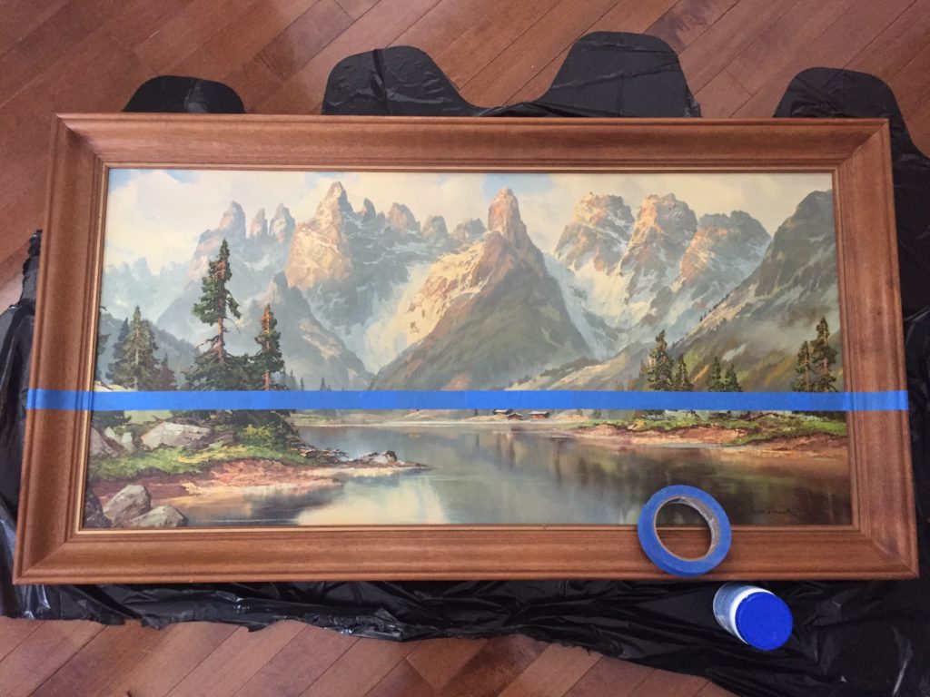
As I mentioned above, I did 3 coats of paint in total, over the course of about 6 hours, which was sufficient to achieve perfect opacity. [Lesson learned from subsequent project: the wood frame here was untreated so it took the paint well with no sanding, primer, etc. A treated frame would probably need some extra prep work or more coats of paint.] The paint dried very fast, and had no discernible smell; I worked inside the house the whole time. Because the original piece was a repro (on a flat surface), I did zero prep work on the surface and frame before I started painting. The trickiest bit was applying the masking tape in a straight line, and peeling it off without taking the paint with it. I did have my husband project managing the whole way (he can’t help it), but it was pretty easy from beginning to end.
Here’s the finished product:
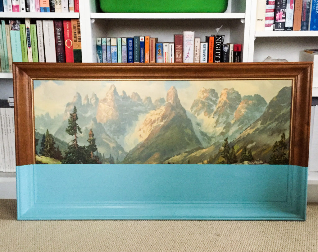
We have found it a great home, but the wall will need a bit of extra prep, so we haven’t hung it yet. In the meantime, I also tried another version of the same project:
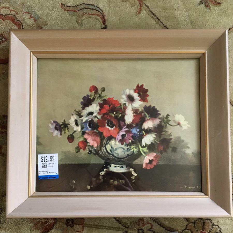
I loved this repro too much to cover any of it (plus, this frame came with a glass cover) but I wasn’t thrilled with the blah frame so decided to jazz it up. Like so:
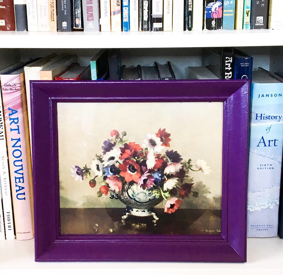
This took a bit of extra work – 6 coats of paint instead of 3 (and still plenty of leofover paint in the sample pot, FYI) – but I love it.
Counting these as a success, I have been emboldened to try something different:
Too ambitious? It remains to be seen …
These both look great! I especially love how the purple frame really makes the print pop!
I love this so much! The blue pops so well against the picture. Please share an update once you hang it!
I will!!