
I’ve been obsessed lately with Monet, especially his waterlily paintings from Giverny which have given me inspiration from some of my embroidery projects. But the more I looked at my favourite paintings, the more I found myself being influenced by the colour palettes. Recently, I realized that I was (subconsciously?) seeking ways to recreate those colour stories in my outfits.
Pulling ideas for colour combinations from existing patterns is one of my favourite (and easiest) styling tricks. Someone has already done the legwork for you, figuring out what goes together. It’s an especially helpful trick for finding less common combinations, especially if you don’t feel confident enough to make the decision — do these two or three or four colours go together?? — on your own. Doing the same thing with a piece of art is, well, kind of a no brainer.
Here are some examples I’ve been working with recently.
[Note: we all see colours differently (especially when viewed through a screen) so this isn’t going to be an exact science. My two cents would be: trust your eye to be your guide.]
Per last week’s post, here’s my current obsession. There are a few colour stories I’ve pulled from it, including these two 3-colour palettes.
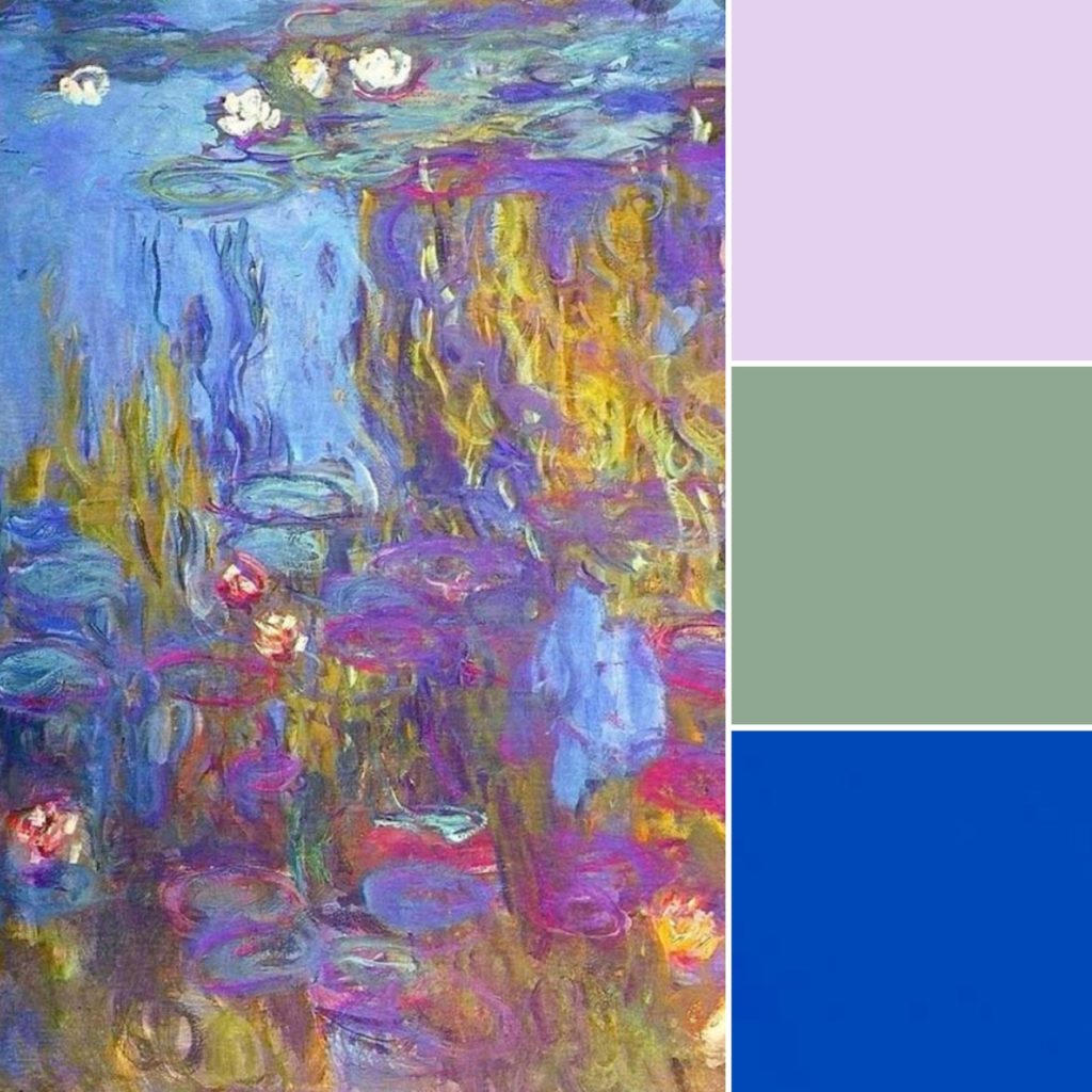
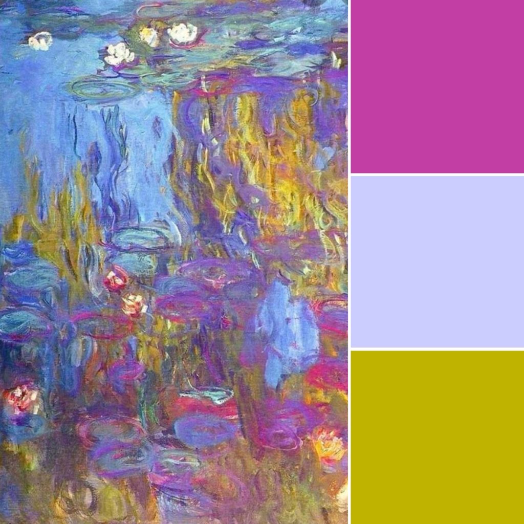
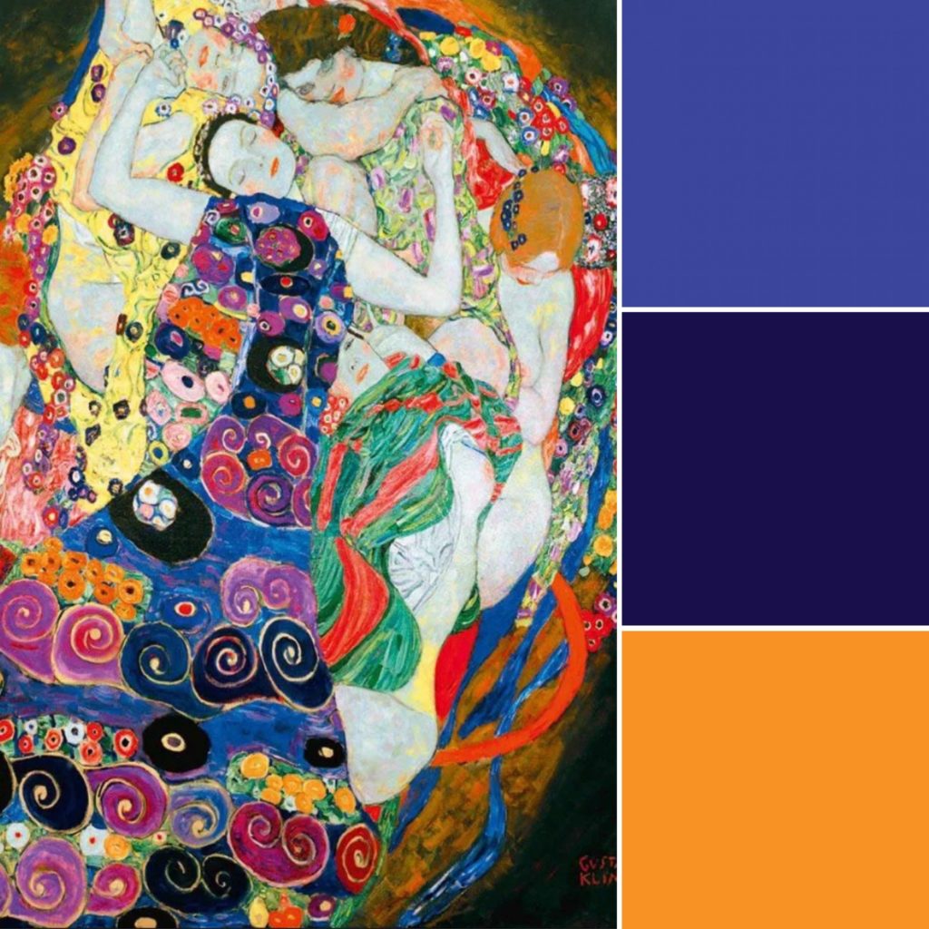
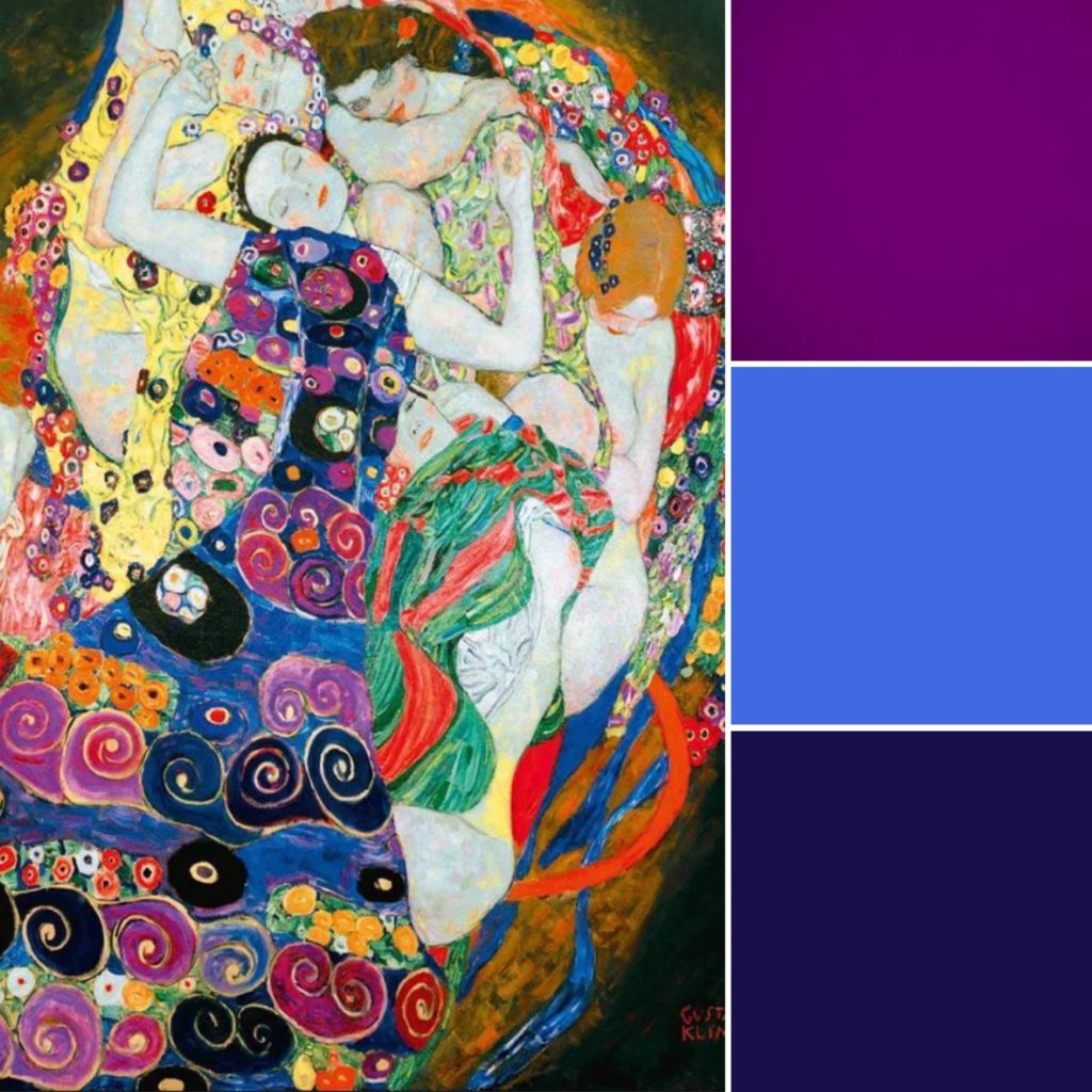
There are more colours and combinations that could be pulled just from this one painting, including 2-colour, 3-colour, 4-colour (and more!) palettes.
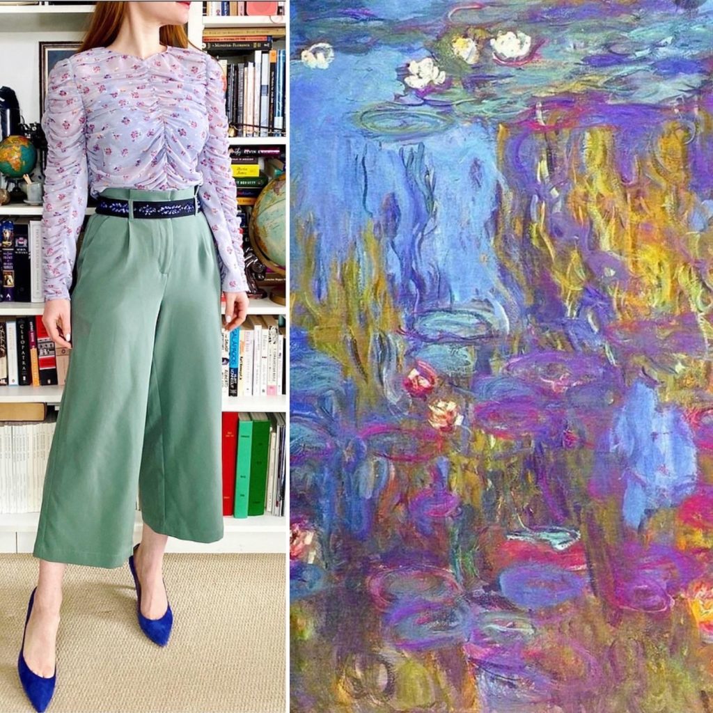
Here is an example of a recent outfit based on a 3-colour palette drawn from this Monet painting:
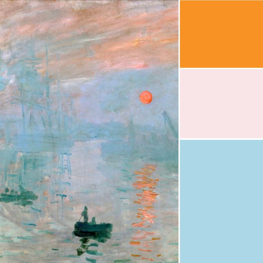
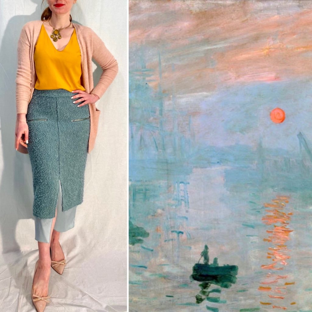
Here is another Monet painting and a possible colour palette:
And here is an outfit based around it:
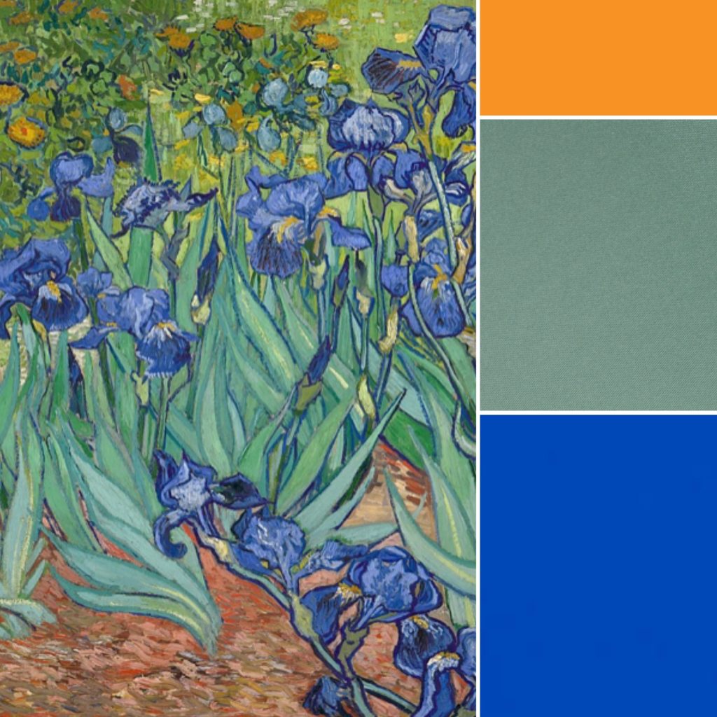
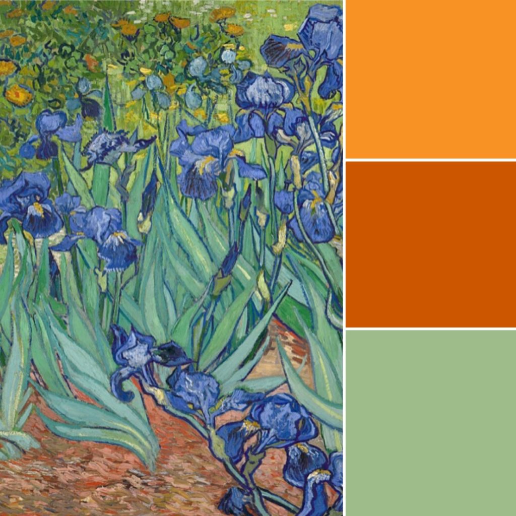
Never fear, you don’t need to stick to Monet only. Here are some ideas based on Van Gogh’s irises (another favourite of mine):
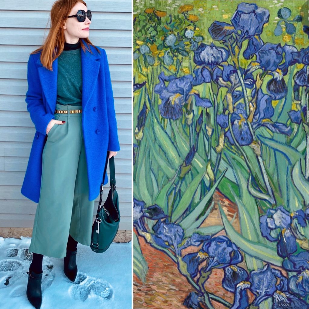
And here is an outfit which incorporates a 2-colour palette:
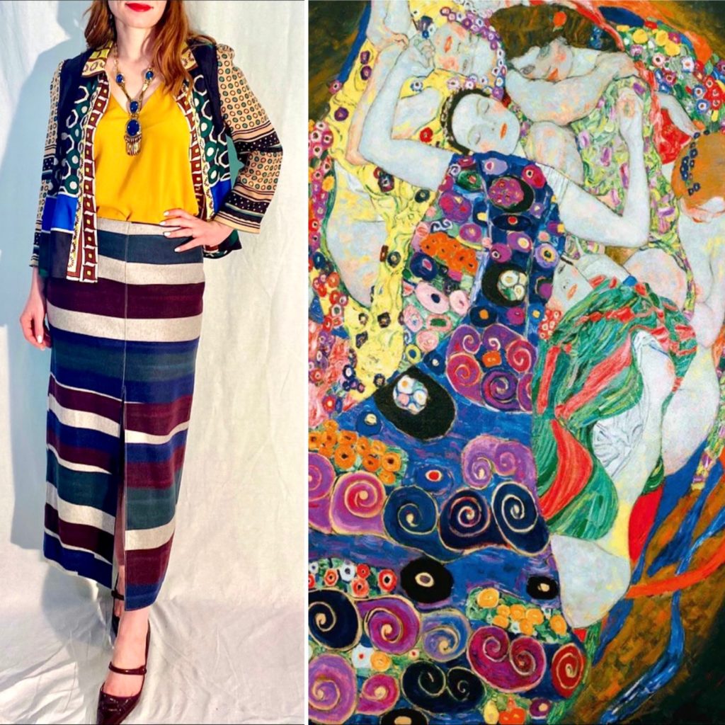
Klimt is another favourite of mine:
Here is an outfit built around a similar colour story (with multiple colours):
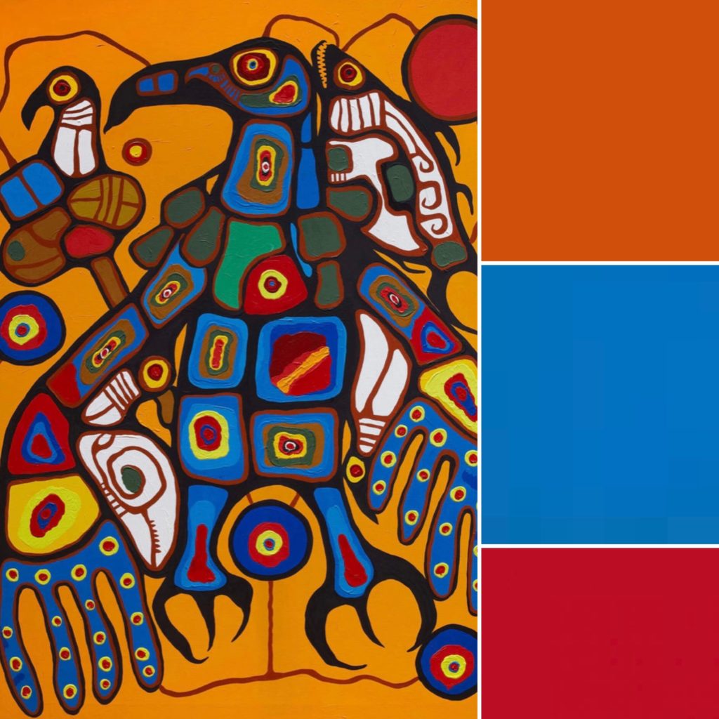
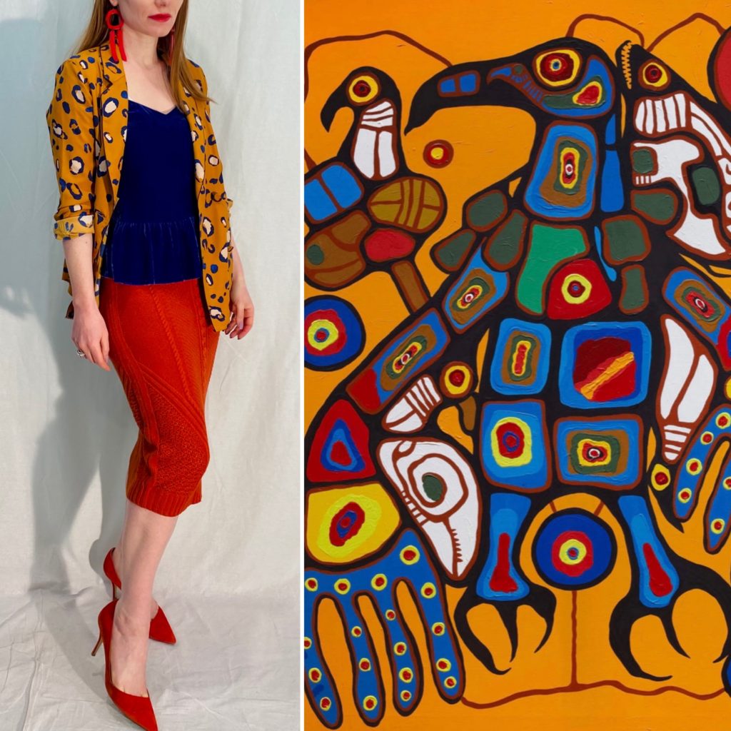
Norval Morrisseau was an Indigenous artist, whose work is wonderfully vibrant. Here are a couple of palettes based on his Man Changing into Thunderbird triptych (one panel only) which speak to my closet:
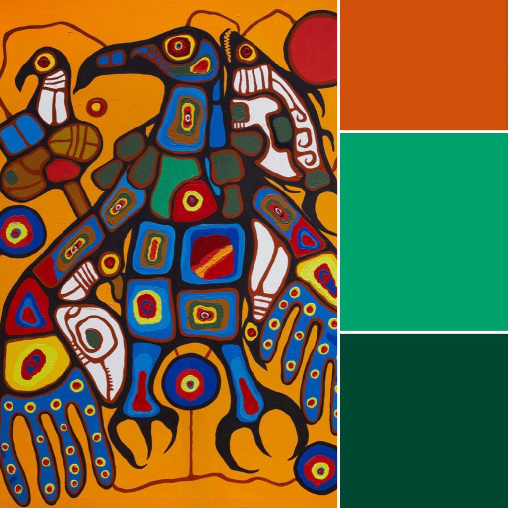
And here is an outfit based around a similar palette (but picking up the royal blue instead):
I hope these are helpful illustrations to get you thinking about how you might draw inspiration from art. As a general tip, I would suggest looking at paintings/drawings whose colours are similar to what’s in your closet, not necessarily just your favourite artists. To discover new (classical or modern) art with which you might not already be familiar and which might provide inspiration, I recommend following art accounts on Instagram such as @dailyart_official, which post a broad range of artworks on a regular basis, or borrowing art books from the library which cover different eras/movements in art.
Oh my goodness, I love this SO much! It’s fascinating to see your outfits next to the paintings from where they drew their inspiration. I have never thought to look for color inspiration in classic paintings, but will try to do so now!
I love this and your interpretations! Thanks for the suggestions and the inspirational IG account. Forgot just how much I enjoy viewing art and learning to better appreciate it.
These are stunning!
I love this! What I learned is that with a peach and a red-clay shirt I can make lots of outfits with my other cool brights. Very interesting, thank you!
I find it helpful and interesting to have a close look at paintings (or even patterns) because it can reveal surprising colour combinations. When we look at the painting, we tend to see the whole, which just looks harmonious and pleasing. But zeroing in and having a closer look at different parts of it can be illuminating too.
coming back very later 😉 but yes! Something I love to do in museums is see a piece of art from as far away as I can get and as close as I can get. This is a good version of that. thanks!
This reminds me of The Vivienne Files who makes capsule wardrobes from a colors taken from art. Fun as an exercise, but I really appreciate seeing them as actual outfits!
That’s a blast from the past! I remember that blog from way back. She did collages, right? They were beautiful.
Hi Adina, you really are a master of colour combinations and now you have told us your trick, thank you!
I remember being in the Louvre years ago and suddenly realising just how many paintings there had the colours teal and terracotta in them. I didn’t do much with that information at the time though, must try it.
I think that would be a fab combo!
Gorgeous combinations!