I’ve been deep into nesting mode for the last few weeks, and I’m going to blame it on Taurus season. That, and basemen renos. Major renovations always seem to trigger my desire to fuss around with every corner of my house: rearrange, redecorate, reimagine. As I mentioned before, since the pandemic, I’ve been more attached to my house than ever — and I was a homebody to begin with. Nowadays, I feel … oh, something like a bird, constantly fluffing up my nest, making sure it’s the most comfortable and cozy.
For both privacy and practical reasons (most of the house is in a state of upheaval at the moment due to the basement reno), I do not full-house-tour style photos on social media. But I wanted to share some small glimpses and talk about some of the ways that I’m “upgrading” our living spaces. I enjoy seeing what other people are doing on this front, so I hope you will too.
Mantlepiece
I love decorating shelves, and my living room mantlepiece is what you might call the pièce de résistance. I often make small changes to it, but every few years I end up making a big overhaul. I find there is a real transformative power to it, since it’s such a focal point in the room; it can instantly change the vibe of the entire space.
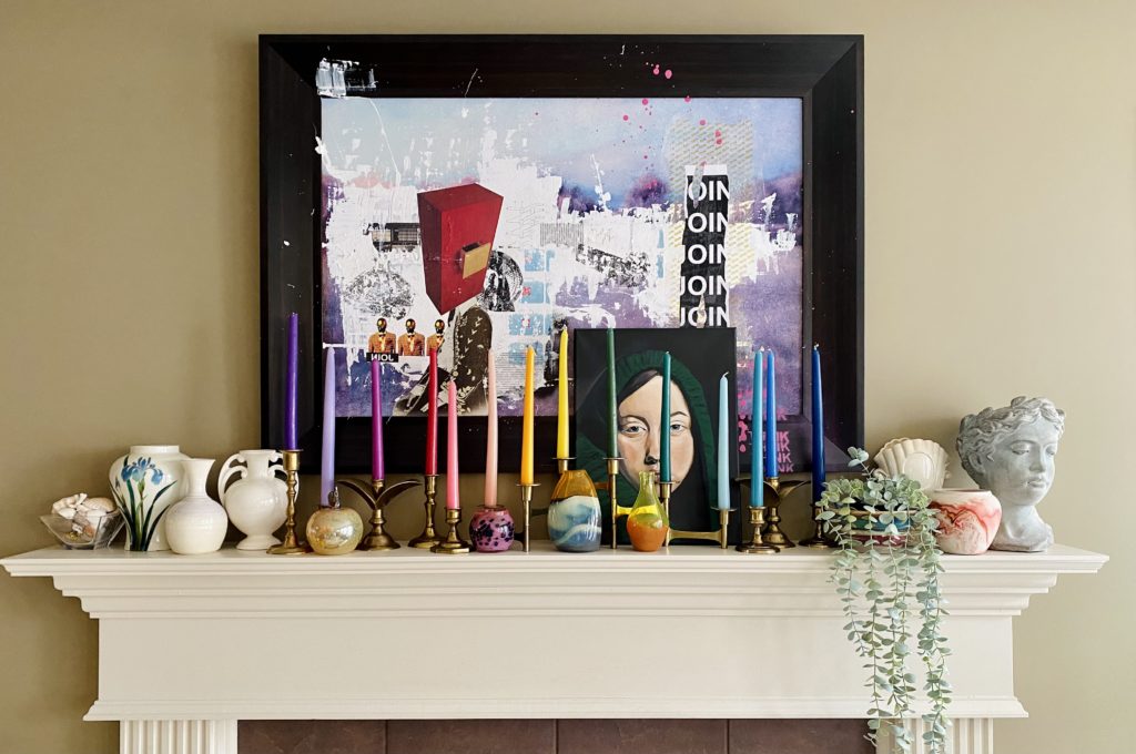
Here is the old mantlepiece:
And, after some experimenting, the new one:
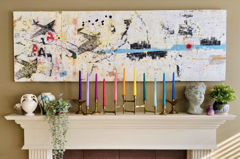
I felt like the old mantle was getting a bit too “busy” visually, and wanted something “lighter”. All the pieces I added are things I already had; I move things around like this all the time. (The pieces I took away will find other homes too.) The painting is a custom piece made by a friend of my husband. It was actually designed, sizewise, for this exact space, and used to hang here until 3(ish?) years ago.
Let me pause here and talk a bit about fake plants. I love decorating with plants and, in general, prefer real plants for many reasons, including looks. Fake plants, past a certain size, never look like the real thing and, for whatever reason, I don’t like that. However, there are constraints on my ability to use real plants as decor; while I am no expert, in my experience, the key to keeping plants alive is appropriate light — which, in most cases, means lots of indirect light. There are spots in my house which would benefit from a plant but which are not conducive to one. Our living room is a prime example; beyond a 5-foot radius of the windows, there isn’t enough light in the room for most plants. This is where fake plants can come in handy. Personally, I find that small fake plants added to a room that also has real plants tend to “blend in” and look more natural. This is my rationale for adding the plants to the mantlepiece.
That being said, the plant placement here is temporary. Wah, wah – I know! But these plants are destined to go into the basement to liven up the space there. However, if I end up liking this set-up, I may look into getting some extras to keep on the mantlepiece long term.
(In case you’re wondering, these are both IKEA. The trailing plant was thrifted, the other one was bought at IKEA. I’ve also had decent luck finding nice looking fake succulent-type plants at HomeSense.)
Library Couch
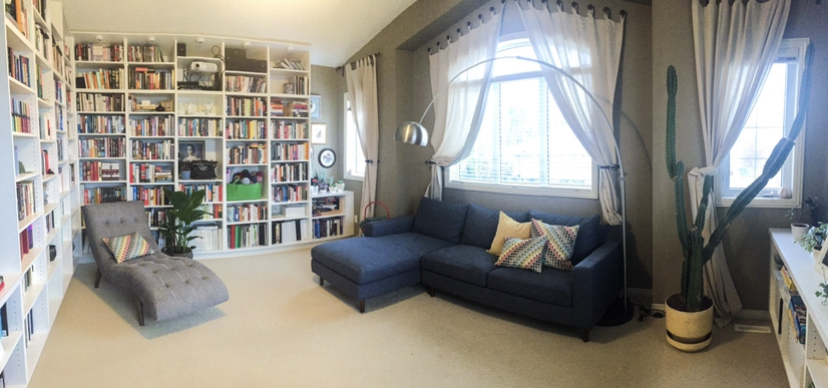
This was our last couch in the family room/library. It is destined to go into the basement, so we started to think about replacements. Eventually, we veered a bit off the beaten track and decided to go with a daybed rather than a conventional sofa sectional. A few reasons: I have always loved the look of daybeds, especially as a reading nook; a pull-out bed here is a good option for us as we have no other guest rooms available. We went with the IKEA Hemnes daybed because (a) it’s been on my mental Pinterest board for years, and (b) it’s relatively inexpensive and available. (Supply issues are real, you guys!) Plus, the white works with the old IKEA coffee table that we moved up here a few years ago.
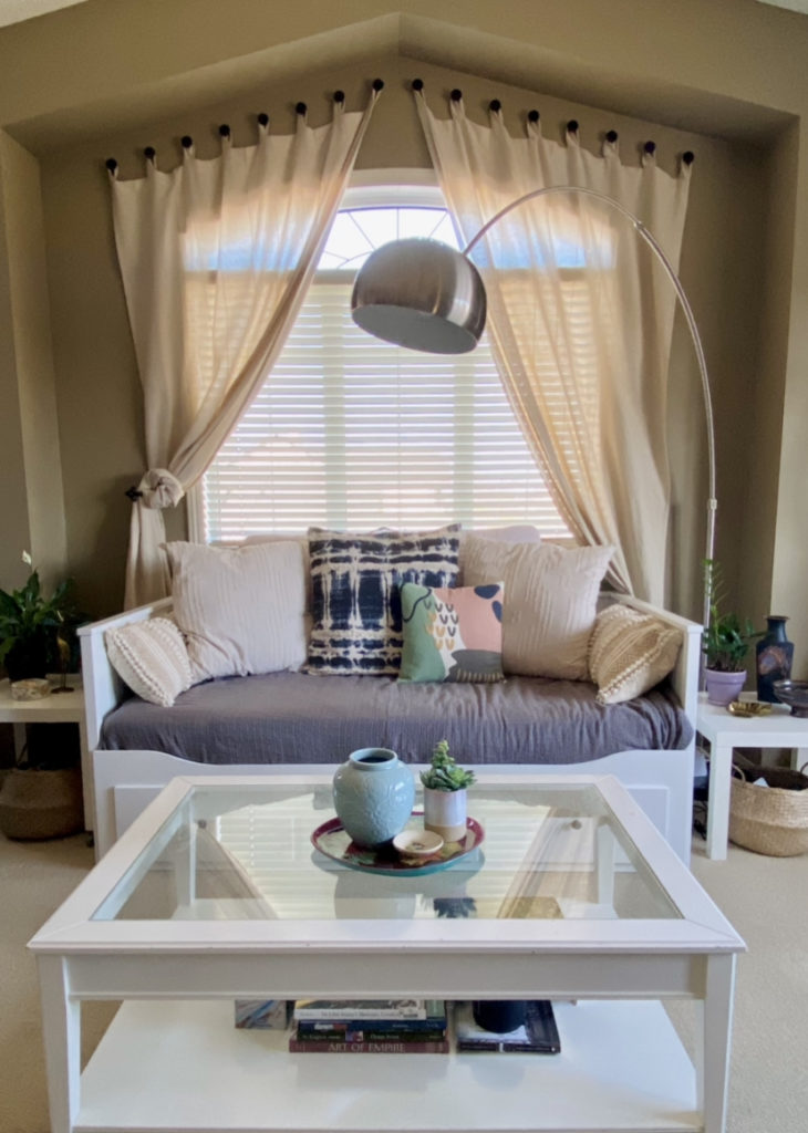
I absolutely adore how this looks and the whole family is obsessed with this “nook” now. It did require us to buy approximately a bazillion pillows which was, gulp, not cheap but once we went down that path, we really went to town. It does make the space, though. I’ve never been a huge fan of cream/beige in interior decorating, but I am glad I went with a mostly cream colour palette — it works well with the curtains behind the bed, and creates a very soft, cozy, warm and inviting atmosphere.
Another plus with the beige pillows? I thrifted a second bedcover — a plaid patchwork quilt topper that gives me major Ralph Lauren vibes — and the pillows work with that as well for a more cottagecore vibe.
Bed Refresh
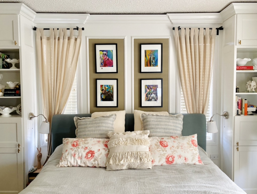
This may surprise you, given what I said about being a homebody and all, but one thing I have never spent a lot (or any, really) money on was bedding. We buy our sheets at IKEA, and our last bedcover was a wedding registry present. I never “did up” the bed with decorative pillows and whatnots. But guess what? Once we got the daybed installed in the library, and I saw the charms of some well-chosen pillows, I decided it was time to upgrade our bed too. The cover and pillows were all from Winners/HomeSense except for the floral ones which came from IKEA back in the day (and I mean back, like 2010 or so) and used to be on our old (like, 3-couches-ago-old) couch in the library. So I guess it was some kind of full circle?
Window Shelf Update
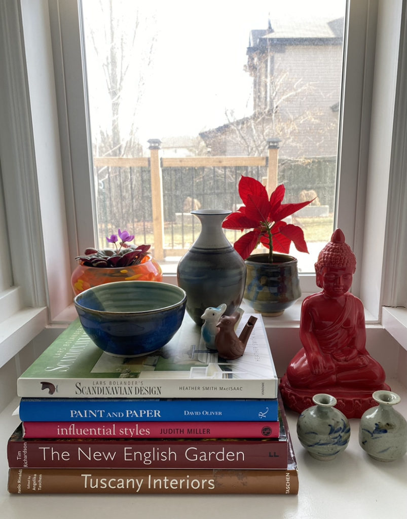
The living room is in a bit of a state of flux at the moment, as many items are destined to go into the basement, or else move upstairs into the library. This picture window ledge update was originally intended to be temporary — those books were going to be moved — but I’ve ended up liking this arrangement so much that I’m probably going to keep it. It came together rather haphazardly; I moved the large plant which was rather taking over this space to another location, and ended up substituting two smaller plants that were sort of accidental. The one of the left was a “baby” from my oldest violet plants, which I harvested last year and didn’t manage to give away to anyone. The one on the right is a Poinsettia from Christmas which survived the season; I didn’t have the heart to get rid of it, as it was still alive, so I left it on a small north-facing window ledge … and it continued to grow. So I decided it was time to formally adopt it into the family. Plus, I have to say that I like the pop of colour it brings to this shelf.
Reading Corner
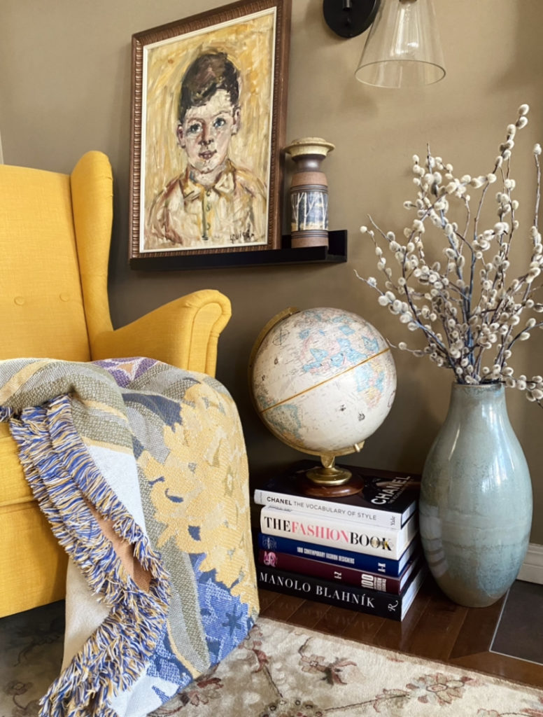
The only new thing here are the pussy willows, which I recently got at the farmers’ market. I’ve been wanting to get a bunch for a while, but I somehow forgot every spring. I will add that the book stack is above to be decommissioned. The globe will be moving to the basement — I have plans to finally display my whole collection in one spot — and the books into the library. But I thought I would immortalize this little corner while I had the chance.
Office Shelf Refresh
The shelf I probably see the most is the one above my computer desk. When I got it last year (after we finally upgraded my “office space” in the bedroom), I put a lot of thought into curating it:
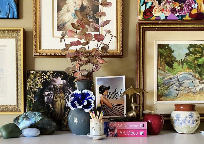
But, in my world, shelves are not meant to be static. To me, they’re kind of like a museum display: meant to change every so often to showcase different collections. And you know I have a lot of collections. When I recently thrifted a cool Canada goose embroidery, I felt it was time to change things up:
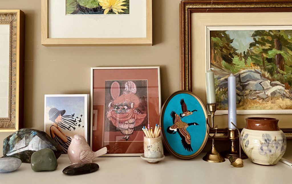
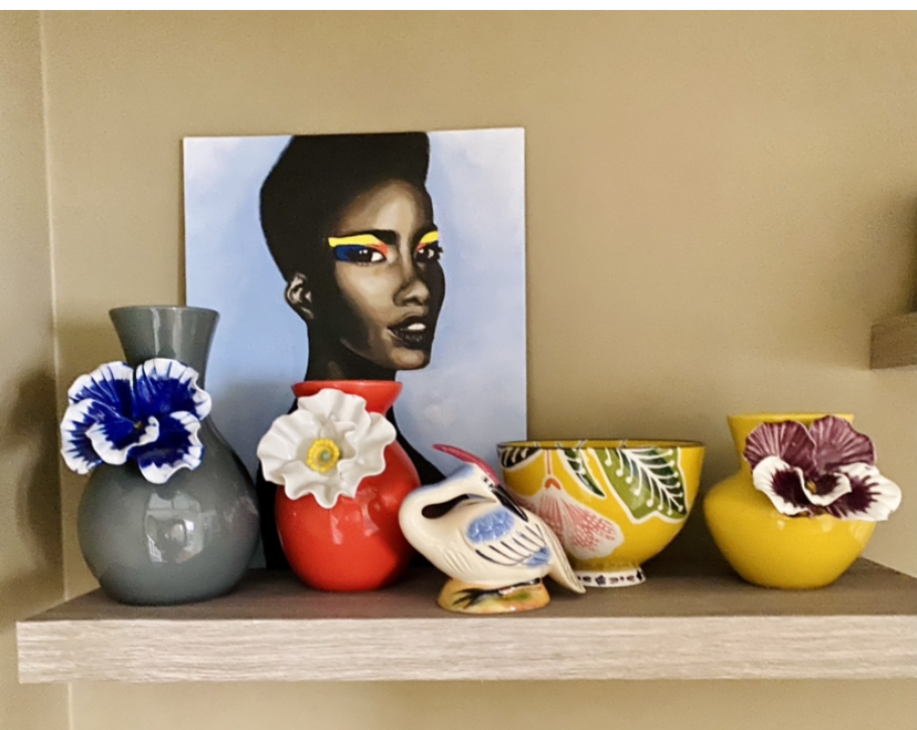
Everything here is either thrifted or gifted, with the exception of the matchstick set, which I bought from a talented friend who makes concrete objects. Again, none of the things I removed are being discarded – rather, they are joining other collections in other parts of the house. For example, the flower vase? Living its best (new) life together with some of its cousins:
Rainbow Glass Addition
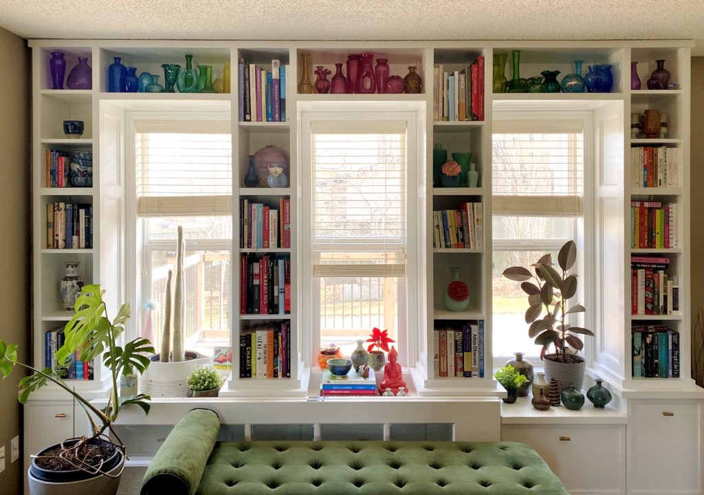
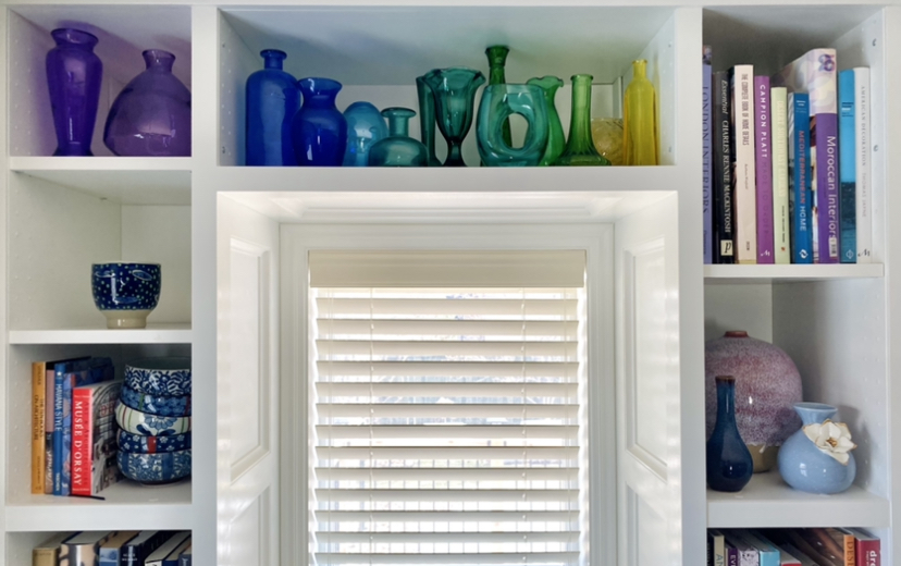
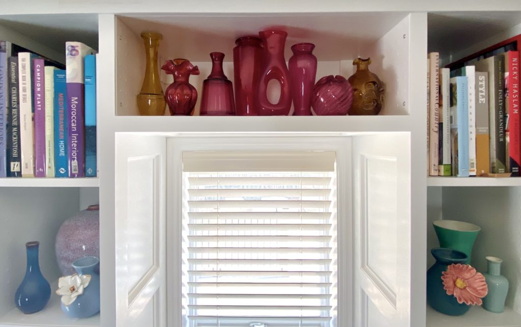
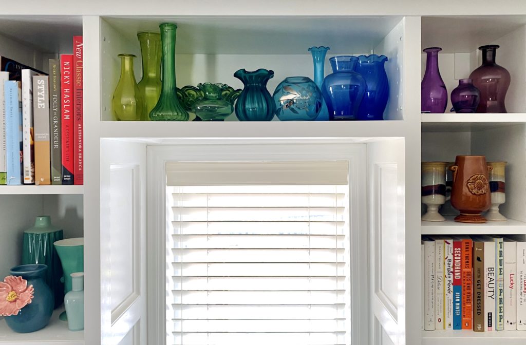
This is not new at all, but I did recently pick up a couple of new coloured glass vases to add to my collection. I haven’t done that in a couple of years, but these were a beautiful teal colour and unusual shapes (plus cheap!).
My rainbow glass collection is one of my faves; I think it really brightens up the space, and I am partial to rainbows. The key, in my opinion, is to aim for a variety of shapes and sizes (it’s easier than finding the exact same shape in different colours); with a little patience, this can be achieved fairly inexpensively at the thrift store. Most of my glass isn’t fancy (though a few pieces are) but this collection is not about quality, per se, but visual impact … for me, anyway. Over time, if I run into nicer pieces at bargain prices, I might upgrade here and there. But mostly I just leave it alone and enjoy.

I think the idea that my house is a museum — not only of my favourite objects, but also of favourite memories and hobbies — is one that really appeals to and inspires me. It’s also making me more discerning when it comes to thrifting or buying new items, because I think about the available “gallery spaces” and the stories those spaces are telling. That being said, I cannot wait for the basement renos to be finished, and a new chapter in our house’s history to begin.

Thank you for sharing! Love what you said about your home being like a museum and shifting “collections” around. You’ve inspired me to switch out our wedding photos and add in our child’s photos (over a year old, eek)… 🙂
Don’t feel bad about the photos … I’m the worst for not updating mine. My kids will forever be kindergarteners in theirs, haha!
Your home is gorgeous Adina! I’m a big fan of coloured glass, so I really like your collection. I’m finding lots of inspiration in the rest of your rooms too. Great post, thank you!
Thank you for the kind words, Patricia.
Your house decor posts are my favorite!