I Did A Thing, Vol. 27: Portraits

The last time we talked about my painting, I showed you some of my recent pieces which tend to fall into 3 buckets: landscape, still life, portrait. I usually alternate between them, and generally have 2 or more works-in-progress, because I find the variety keeps my eyes fresh; if I work on the same painting for too long, I start to lose perspective. Anyway, today, I want to focus specifically on portraits because I think they illustrate my experience with process as a self-taught artist.

I’m going to start with a confession: I’m a very stubborn person. [Understatement of the year, my husband would say.] One of the ways in which that stubbornness manifests itself is in how I approach new skills; I tend to choose hobbies that I can feasibly learn without instruction. I like to learn as I go, and mostly by doing. Even something as simple as watching a how-to YouTube video (which I’ve had to do for knitting a couple of times) is the antithesis of fun to me. [Perhaps not coincidentally, knitting is the least favourite of my recent hobbies.] It’s quite possible that I would be a better crafter/painter/knitter if I took some lessons, but that’s not how I’m used to doing things, and well … I am stubborn.

It all started when I was about 14 and my family gifted me a box of Caran D’Ache watercolour pastels. I was not familiar with pastels or how to use them, but I played around with them until eventually I hit upon a technique that seemed to work. I used my fingers to rub in and blend the colours to a smooth finish (and developed some serious calluses in the process) that, in some cases, looked almost photo-realistic. I only have a few pieces left from those years, but they’re a good representation of my adolescent work:

As you can see, I was quite interested in faces even though, objectively speaking, faces are challenging subjects. I’m not particularly good at drawing, and I can’t draw from memory/imagination so I have to rely heavily on photos for inspiration. When I started working with acrylics this past summer, it was a portrait that first drew me in.

I quickly moved on to easier subjects because I had no idea how to use the medium to complete something that didn’t look like a Grade 3 art project. But, inevitably, I was drawn back to portraits. First, there was Grace:

I did this without a pencil sketch to guide me, and while the shading is still quite rudimentary, you can already see the improvement over my first picture. I’m learning to trust myself with colours. One of the big lessons I explored with this portrait was the ability to layer. Acrylic is an accessible medium for beginners because it’s quite forgiving; up to a point, you can just pile on more layers of colours over any oopsies, and no one need be the wiser.

By the way, I use “lesson” in this context in a very ex post facto manner. I am not conscious of learning anything in particular while I am working on a piece; it’s usually afterwards, in retrospect, that I can say “ah, yes, I learned to do x while painting y”.

After Grace, my next 2 portraits were much in the same vein. First, there was Edith:

Edith exhibits a slightly more sophisticated technique than Grace, but not significantly so. It remains one of my favourite pictures because I love the colour scheme and the overall “naif” effect.

Then, there was the portrait I like to call “Tilda by the sea” (because it was inspired by 2 separate photos of a young Tilda Swinton, though there isn’t much likeness in the final product):

Tilda represents the final stage of this phase. The shading is much more subtle (and abundant) and the effect is more life-like and less caricature. I like the overall picture, but I didn’t feel like I captured the atmosphere/feeling that I wanted from the face itself.

After Tilda, I took a break from portraits for a bit and focused on other stuff. One thing I realized during that time is that some of best work happened when I was “doing my own thing” rather than trying to copy the style of paintings I found online. There is a temptation, when I see a picture I like online, to try to make my own version of it using the same approach; but the results are never satisfactory. I am much happier when I approach a subject matter using my own technique (such as it is). So, for example, my preferred approach to still life is semi-abstract, with clean lines and high contrast.

With this in mind, I tried a similar tack with portraits: a completely original piece.

It’s fine. I mean, I don’t hate it but I don’t love it. It’s very generic, which is a failure of my imagination. What I love about portraits is how unique faces are; I am especially drawn to dramatic, unusual ones but I have a hard time visualizing them from scratch. Counterintuitively, despite my slight disappointment with the Girl With Flower Crown, I decided to level up my portraiture. I decided to do a portrait of a man.

Now, even during my pastel heydays when I became quite adept at drawing faces, I was never very good at doing men’s faces. Not sure what possessed me, but I now decided to tackle this one:

I’ve had a crush on Rufus Sewell for 20 years, but his is not a conventionally pretty face; it has sharp, almost precipitous angles, heavy lidded eyes, thin lips – all challenging to capture. When I was Googling photos for inspiration, I was lucky enough to stumble on this one:

Not, perhaps, his most photogenic shot but I was struck by something else. The pixelated effect was like a “cheat sheet” for shading. I also approached this portrait in a different way. As with my other portraits, my first “pass” was a general one – the purpose of which is to get the general shape of the face and base skin colour down on paper. Next, instead of continuing to work on the face as a whole, I began to focus on sections separately. I would enlarge the corresponding section of the inspiration photo and look very closely at the shadows, lines, etc. I did several passes this way, section by section; with each one, the verisimilitude improved. You can see my progress here:

And here is the finished portrait:

You can see how it’s a “quantum leap” from Tilda. What I learned during this process was to break down the components of a face and teach my eye how to see the shape of features and shadows versus just their overall appearance. It’s hard to explain. It’s the difference between seeing a nose, or the various shapes that make up a nose (and which, individually, don’t resemble a nose at all).

What I learned with Rufus, I put to good use with my next subject, Alek. This was the inspo photo I selected:

I chose it because the dramatic lighting highlights the amazing angles of her face. And, I am not going to lie, I am very proud of my portrait, which is currently my favourite thing I’ve ever made:

The process I used for Alek was very similar to Rufus. I took a bunch of progress photos to illustrate it:

The top 3 photos show what I did in my first session. It takes me about an hour to get down the initial “sketch”. In this case (as with Rufus), I did use a very rough pencil sketch as a guide – mostly to ensure I had the shape of the head done properly. Then, over the course of about a week or so, I worked to refine each component of the face.

Finding inspiration that speaks to me is one of the hardest parts. I gravitate towards editorial photos because they tend to feature more “arty” shots with dramatic lighting. Finding the right photo online can be time-consuming. In effect, I am looking for something that approximates an image or idea I have in my head; a lot of magazine spreads look, well, too commercial to serve as a basis for a portrait. After Alek, I struggled a bit to find something that spoke to me but eventually I chose this photo of Saoirse Ronan.

To me, it’s the kind of picture that begs to be painted. I could see it, in my mind’s eye, painted. Turned out, the reality was a little more challenging. Because her colouring is much lighter than either Rufus or Alek, I had to be more subtle with my shading to retain the ethereal effect of the photo.

I think I did okay, but I struggled with the skin tone and shadows a lot. Here are the progress shots:

But another quantum leap was around the corner. I fell in love with this photo, and decided to double down on the whole “ethereal, Pre-Raphaelite” vibe.

It also happened that I had just purchased a couple of black canvases. I had used one for a still life, and quickly learned that painting on black is a whole other kettle of fish. Nonetheless, I decided I would do just that for this portrait. Brave or foolhardy, you decide. Luckily, I managed a bit of a Hail Mary pass, and summoned up some new techniques (using my fingers for blending! just like the old days!) that helped me pull it together.

Next to Alek, this is my current favourite painting. I love it so much, even though I made a bit of a muck of the dress fabric and the earring. Progress shots:

Again, I’m not sure if this post is a good testimonial for the learn-as-you-go approach to picking up a new hobby, but I hope it shows that, no matter where you start, practice does tend to lead to improvement no matter how stubborn you are.

What I Wore: October 2019

Can you believe that a brand new decade is just around the corner? I’ve been so caught up in the day-to-day that I haven’t quite wrapped my head around it. In some ways, this is progress for me; I have a tendency to live too much in the future (or the past) so being able to feel present in the moment is a good thing. We have been dealing with health issues in our immediate family over the past 2 years that have made me incredibly grateful for every day, so I consciously try not to take any of them for granted. In fact, I can’t remember now if my “theme word” for 2019 was gratitude but if not, it should have been. It’s been on my mind a lot all year, and I think it’s made a measurable difference in my perspective. That all being said, I am not mentally ready for the idea of a new decade. Yes, in a way, it’s just another year. But conceptually, 2020 is a big milestone for many reasons. Personally, I’ll be entering into a new decade of my life: I turn 40 next August. I don’t really know how I feel about that, except thankful (and lucky) to be alive, healthy, and privileged in so many ways.


Anyway, the good news is that I still have 2 more months to get mentally ready for 2020 and November lasts approximately 357 days so I should be all set.

On to the clothes:

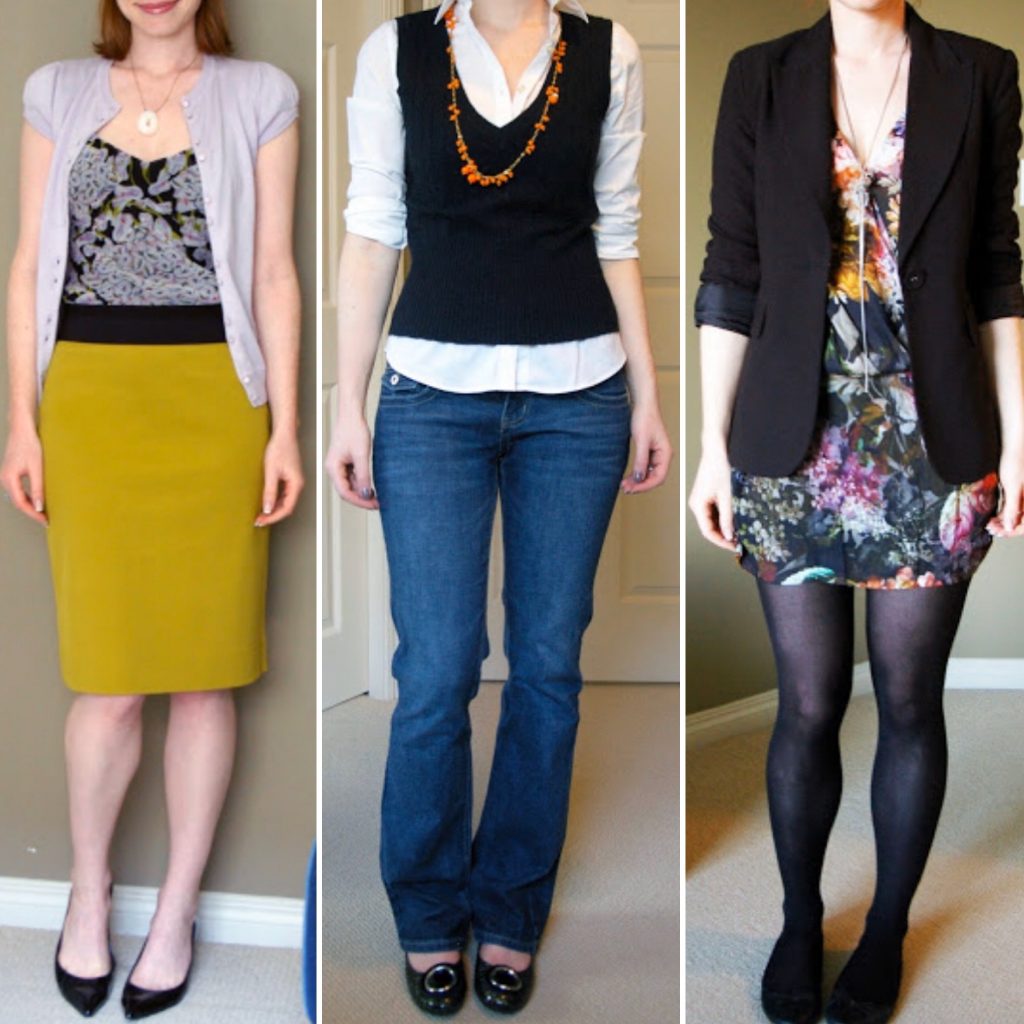
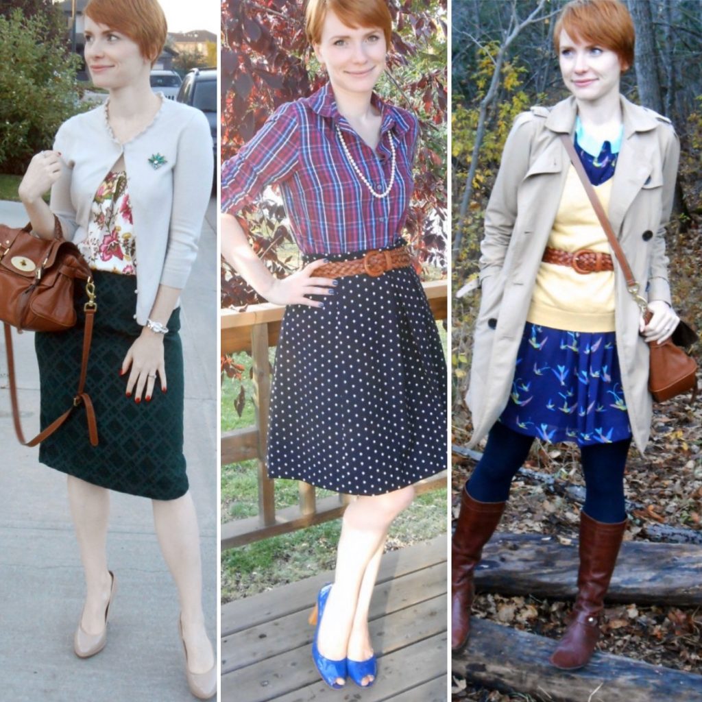
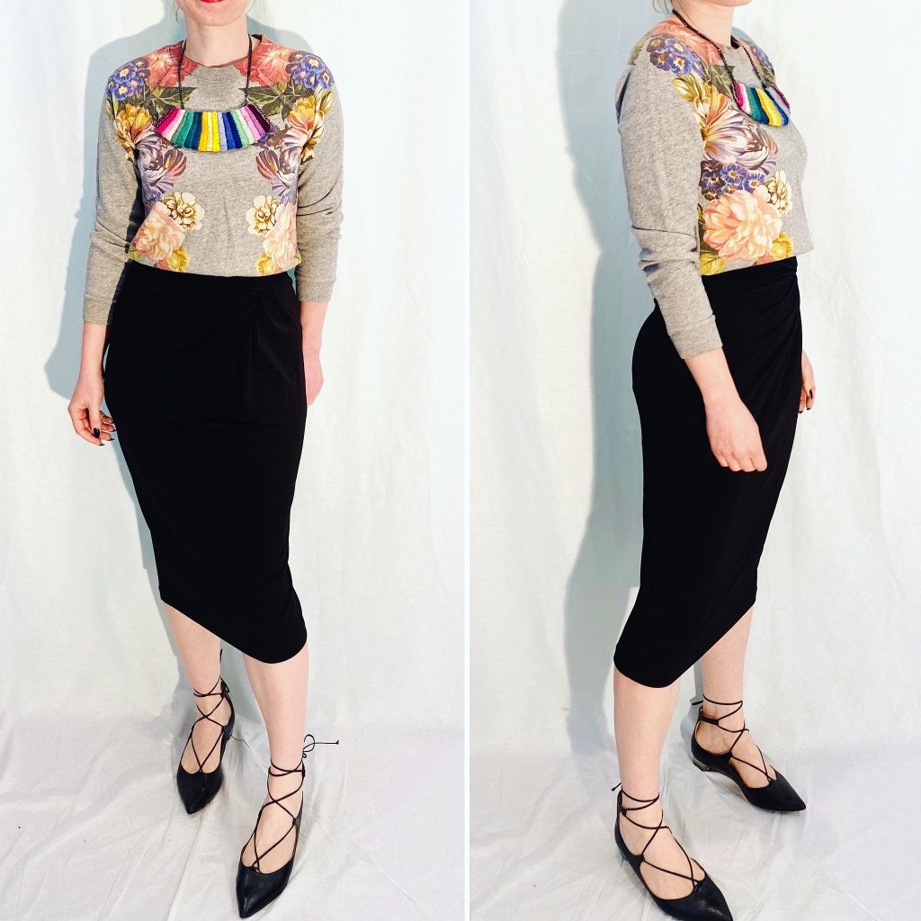
October was the month when I embraced green. You guys know how much I love a cohesive collage, so this one is very satisfying. I feel like I’ve got the hang of my aesthetic, I know what I like and (mostly) how to achieve it with my outfits. Pretty much the only challenge now is not falling into a rut. One, because I tend to do that seasonally (every November to January), and two, because once you find formulas that work very well, it’s so easy to just keep repeating them. The key to avoiding the rut is to do little tweaks on those formulas, so they keep feeling fresh and exciting. Switching up accessories – add a belt or take it away, change up the shoes, wear different necklace – or changing the colour story are easy tweaks. For November, I think I am going to go with a black (always), grey (a risky choice for a grey and cold month), and purple palette. Here’s hoping it works as well as last month’s.

Hacks for Spotting Quality Clothing: A Visual Guide

One of the most important things which thrifting has taught me is that brand and retail price are not reliable guides to quality. Designer brands sometimes offer quality that is indistinguishable from fast fashion. The quality of fast fashion itself can vary wildly. To be a savvy consumer, you have to be able to recognize quality by other means: the materials used, the construction, the finishing touches. As far as that goes, the best education is a working knowledge of how clothes are made. While I can’t help you in that department, I have a few “hacks” that I’ve developed over my years of thrifting which you may find useful.

Some of the them, unfortunately, cannot be easily explained in a blog post. Spotting good quality materials by a combination of visual identification and “hand feel” is one of the key ways that I maximize my time in thrift stores; I rarely bother looking through racks exhaustively, I just scan them for materials that stand out to the eye and the touch. I can’t tell you how to develop that skill other than by doing – touching clothes in stores, looking up the fabric content, and learning what certain materials look and feel like.

In this post, I want to talk about one of my other favourite hacks: “inspecting the guts”. Please note that I am writing this as a non-sewist , so my terminology may be off. That’s why I will be relying heavily on photos to explain what I look for; for this exercise, I will be using pieces from my own closet, representing a range of brands.

The way a piece of clothing looks on the outside can tell you some things about the way it was made and its quality. But it’s not the whole story. Flip the piece inside out, and you’ll see much more. I like to look at a few things in particular:

1) Lining

2) Seams

3) Hems

Let’s talk about each one.

Lining

Now, lining is easy. The first question is: do we have a lining? Most pieces benefit from having a lining (there are exceptions, of course) because it helps them sit better on the body, and it protects the fabric (especially delicate ones like silk) from direct contact with the body. Lining can also make the garment more comfortable – wool pants are a good example – and create some built-in climate control.

Now, there are high end designer pieces that don’t come with a lining but probably should; to me, that’s a sign of the label taking shortcuts. It doesn’t automatically disqualify the piece from purchasing consideration, but it’s something of which I take note. Although, I will say that most unlined wool pants (or skirts) are an abomination.

If there is a lining, the second question is: what kind of lining is it? Silk is nice from a comfort perspective, but it is more fragile itself. It’s also pretty rare; I tend to see it on pieces that run in the high 3 figures or over at retail. (My YSL blazer has a silk lining … and that’s about it for my closet.) Polyester, or poly blend, is more common even in designer pieces. I’ve had mixed success with this, and I haven’t been able to pinpoint why – it seems not all polyester is born equal. Some poly-lined blazers are a sweat-trap, others are not bad; poly-lined dresses are usually fine.

Lining can also be a trap with some skirts. I’ve had experiences where the lining was either poorly sewn in, poorly designed, or both, to the point of making the skirt unwearable. Depending on how the skirt is constructed, fixing a lining can be done easily and inexpensively by a tailor … or not. Again, I am not an expert, but generally it’s been my experience that if there is a zipper on the seam that has to be adjusted, that will cost more money.

Speaking of seams …

Seams and Hems

First up, let’s compare a Dries Van Noten top and a Forever 21 top. I picked these 2 because they are actually similar in the more obvious ways: both are 100% cotton, long-sleeve, unlined tops. The DVN piece is one of the brand’s more run-of-the-mill items, which is probably why it’s made in Hungary rather than Belgium like my other pieces.

Here is the inside seam on the DVN piece:

Apologies for the photo quality – it’s hard to capture details on black fabric, so I had to kick up the contrast a lot.

Here is the Forever 21 piece:

You can see that the way the seam is finished is much more basic (more likely to rip or split open) and sloppy. Same with the hem.

For further comparison, here is a Maeve top (Anthro brand). This one is 100% rayon, but otherwise similar:

Not all that different from F21. To me, it looks like the stitching is a bit more neat, and the hem is more even, but that’s about it.

Let’s look at skirts. First up, a Suno skirt. I had never heard of this brand before I found this skirt at VV, but I knew it was quality without having to look it up. Here’s the seam:

I don’t know the correct term for this type of seam (and that hem!!!) but it looks like it would be (a) time consuming, and (b) more expensive. Why?

See this part where my finger is? That “flap” is actually material folded on itself. So that’s an extra 3-4 inches of material that isn’t visible – but will add up, cost wise, over a whole production run. The benefit of the extra material to you as consumer? If you need to let out the skirt (i.e. take it up to a larger size), it can be done.

Compare with this satin-like polyester skirt from Nordstrom Rack:

There is no extra material here – if I gain any weight, goodbye skirt. Also, the seam doesn’t sit flat which makes for a sloppier fit (puckering where my body curves, i.e. the hips).

One more skirt comp: AllSaints (real) leather mini skirt versus Zara (faux) leather skirt.

You can probably guess which one is which. The AllSaints skirt has a (polyester) lining and, again, its seams look neater and, well, more “finished”.

For dresses, I don’t have a lot of good comparisons but let’s use a Marni dress (100% cotton, unlined, sleeveless) and a Rachel Rachel Roy dress (100% polyester, unlined, sleeves). Can you tell which is which?

Again, it’s not hard to spot the difference. Even to a non-expert, the Marni seam and hem (second photo) looks cleaner and sturdier. It would take a lot of abuse for that hem to fall out.

Now, even when garments are finished in similar ways, some can still be better than others. Let’s look at a silk dress from a higher end Anthro brand; keep in mind this would have retailed for over $300. It’s a simple, unlined tunic.

Not a huge seam allowance (compare to the Suno skirt above – I am referring to the extra “flap” of material at the seam) but all the stitching is nice and neat. The silk fabric is a bit thin and not fully opaque).

Now let’s look at this Zero+Maria Cornejo dress. Also silk, also unlined. Because it’s cut on an angle, here are 2 photos to capture all the seams and hem:

First of all, the material is way nicer – thicker, luscious silk. The hem is similar, but check out that inside seam – lots of reinforcement there.

The last thing I want to mention is that the quality of vintage “fast fashion” clothing (I am talking about stuff from the 90s here which, yes, qualifies – did I just blow your mind, fellow Gen Xer?) is often better than equivalent contemporary brands. Note that I said “often”; always have a look to confirm, but don’t immediately discount these pieces.

Here is a look at this vintage Ralph Lauren skirt:

There have been a plethora of RL labels over the years, but as best as I can tell, this was not one of the premium collections – more like the stuff you would find at The Bay nowadays. The skirt and the lining are both 100% silk, and they didn’t scrimp on the fabric (there is enough here for a parachute). Again, both skirt and lining have nice, sturdy seams and hems – which is a bonus, because I’ve tripped on this skirt more than once. No rips so far, knock on wood.

I hope you have found my visual guide helpful, and if you have tips to share, please let us all know in the comments.