Recent Non-Fashion Thrift Finds

Today, I thought I would write a little about my recent thrift finds and, in particular, those that fall outside the usual purview of this blog. Clothes and accessories will never not be at the top of my thrifting list, but I have been spending a lot more time lately looking for other treasures. Every 2-3 years, I go through a hard-core nesting phase – which is a relative thing, because I’m a homebody at heart in any event – when I divert most of my creative energy into my home. That time has come again, and I have been a busy thrifting bee. Let’s take a look at my more interesting, unusual or downright quirky finds, shall we?

Vintage Scarf Upcycled Project

77490187-B094-4D43-AE42-3EF1D01AD2A9

I mentioned this in my previous post about our living room refresh, but it’s worth mentioning again because this was such an easy (and inexpensive) upcycling project with a big impact. This La Mendola (vintage, I think) scarf was a fabulous find for under $5 – pure silk, gorgeous pattern. Have I mentioned how much I love cacti?

I don’t wear silk scarves, but I knew I had to have this one because it was simply too beautiful to pass up. On the spot, I decided to treat it as a piece of art – which, in my eyes, it is – which meant getting it framed. After searching for an appropriate frame in thrift stores for a few weeks, with no success, I ended up getting a basic one from IKEA. We simply “sandwiched” the scarf between the Plexiglas front and the cardboard backing, because I didn’t want to risk damaging the fabric by pinning it down. We didn’t bother adding a mat; we used the (white) back of the stock photo that came with the frame as a makeshift mat, and it worked just fine. I think the slightly uneven borders add to its overall charm. From a distance, this looks like a poster; it’s kind of surreal, actually.

A quick tip for finding quality scarves: look for rolled edges. I used to think that meant edges that are doubled over and sewed nicely, but no. Rolled edges are very distinctive to the touch – sort of bubbly and quite bulky. You will know it as soon as you touch one. Every single expensive scarf I’ve thrifted – this one, Pucci, vintage DVF – has had a rolled edge.

Globe, With a Twist

8F3E6F85-2F50-4772-919B-BB302BB855B7

I’m not sure if I mentioned it here before, but one of my more recent collections is globes. Sometime last year, I came across this photo when I was looking for bookcase inspo online. As one does. Ahem. I love anything map-related, and I was immediately smitten with the array of globes of varying shades of blue, and decided I needed this punch of colour in my own library. I have been slowly accumulating globes ever since, picking them up in thrift stores wherever I find them. This particular globe was $5 at VV, and was a very nice shade of blue:

28259595-BC6F-410B-A4C8-DD5843FA94B3

It was only once I got home that I realized there was something different about it. Can you spot it?

F05F7F49-5EE9-4CFC-BE3B-F98D25F10E6F

Yup, my first Francophone globe.

Mantel Centerpiece

I tend not to thrift a ton of pictures, because my husband and I have generally divergent preferences when it comes to art unlike, say, interior design as a whole. He’s a die-hard for original art and I … just like looking at beautiful things. One of my favourite (thrifted) pictures is a reproduction of an old Picasso drawing:

A17F5B01-8BED-4F90-9604-737C44E1576F

I managed to “sneak” that one by him, and I also got this other repro accepted on the mantelpiece:

A9DE9C7A-AC06-446C-AF38-BDEC899DEA56

The larger painting behind it is an original piece from an artist friend, but there’s more to it than meets the eye: the original canvas was a mass-produced landscape I picked up at HomeSense years ago to hang in my then office. It was pretty bland and boring – the art version of elevator muzzak – and I was going to get rid of it when our friend asked if he could have some fun with it. My husband and I both loved the result, and during our recent living room refresh, we decided to make it the focal point of our fireplace.

Around the same time, I spotted the little “Rembrandt” and was drawn to its colour scheme, which echoed the colours on our mantelpiece. I thought it would provide a nice contrast/juxtaposition to the larger artwork, and I ended up buying it during a VV sale for something like $4 – a modest investment in case my husband balked at my idea. Which he did, initially. He hated it, in fact. But we argued talked it out, and eventually he sorta just … gave in. All I know is that the picture has been on the mantel for a good month, and hasn’t mysteriously disappeared yet.

Portrait of a Young Girl

D2936B1F-0A39-4630-997B-89DBF6A59299

Speaking of divisive items, this one was a doozy. This repro portrait of Bianca de Medici by Bronzino was love at first sight for me. Don’t ask me why; I know it’s maybe (more than) a little quirky, but I love it. (And I fell down a rabbit hole while researching it, which is one of my favourite ways to waste an evening or three, tbh). Love must have temporarily blinded me, because I bought it assuming that my husband would share my feelings. Not so much. He not only didn’t love it; he thought it was creepy.

Creepy?!

I like to think that I have a finely tuned creepiness meter – no dolls, puppets or clown paraphernalia for me, thanks – but this didn’t register at all, so his reaction took me by surprise. He was must have sensed my disappointment, and being the good husband that he is, he agreed to keep it around so that he might “acclimatize” to it. As of the writing of this post, we have not yet agreed on whether this can go up on a wall in the house, but I remain hopeful.

Update: it found a home!

8B482ED8-CF41-40B5-9440-6C0DAC126EF8

Compromise
Compromise

Makeshift Side Table

AA693DFF-F2FD-40F6-A254-5EAE0CF35E0D

I love this little reading nook in the living room, but there is an electrical outlet that sticks out (visually) like a sore thumb. I initially wanted to hide it with a plant, but this spot doesn’t get a lot of light, which ruled out that option. As an alternative, I thrifted this large vase ($8) in a colour complementary to our overall palette, but it still looked out of proportion just sitting there on the floor. What would help is a little table, but it has to be just the right dimensions and style – and that is proving hard to find. In the meantime, I came up with an improvised solution: the stack-of-books-as-makeshift-table idea.

EA11D9C3-CD53-497D-A6C6-D3455FF58AD6

A half dozen or so large “coffee table” books later, and we had the right height. These are multi-functional; my husband and I love flipping through interior design books, so they are both furniture and entertainment in one. Most of them cost under $5 a piece, so it was an inexpensive solution to boot. Once we figure out what we’re doing with this nook on a permanent basis, the books will get re-homed in our new living room bookshelves or upstairs in the main library; no doubt, they will continue to inspire future DYI projects for many years to come.

Butterfly Terrarium

I love butterflies, but I had not come across butterfly terrariums until recently; first, in an interior design book, then on the Thrift Store Hauls sub-Reddit. Naturally, I became determined to thrift my very own. Thrifting for niche items is a long game, so I put it to the back of my mind. And then, out of the blue, I found one a few weeks later! It’s a small one, but it’s lovely:

CD31316E-61C9-4EDE-B8EC-E01E4A515615

I wanted to find it a good spot in the house right away, but none of the established “corners” of the house (like the mantel) suited it. So I made it its own spot on a previously-ignored ledge/shelf of the library.

B98BC0A2-2C0F-4914-B409-579B1550A059

This is all stuff I already had, except for the potted hoya which is a new addition to our growing plant family. I love moving things around every so often; it makes the house feel fresh without any major overhauls.

Have you found good stuff at the thrift store lately? Working on a cool upcycled project? Tell us all about it!

Style Avatars: A Progress Update

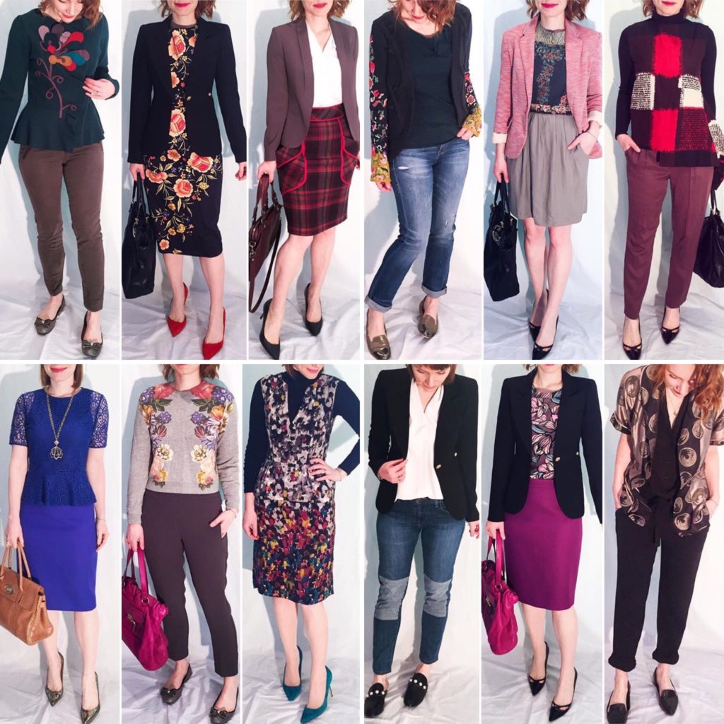
It has been more than 3 months since I adopted a new approach to personal style, one premised on the notion of style avatars or personas with well-defined aesthetic profiles. My chosen avatars – the Prince, the Adventurer, the Artist, and the Bohemian — have helped me to curate my existing wardrobe and have guided my shopping decisions in recent months, with the result that I feel much more comfortable with both the contents of my closet and my daily outfits. There are still occasions when I find myself stepping outside the boundaries of my style Venn diagram (there is quite a lot of overlap between my avatars), with predictable results — I end up feeling like I’m wearing another person’s outfit — but I am trying to be patient with myself. I am so used to wearing clothes in certain ways that it’s not always easy to re-imagine them in new ways better suited to my new aesthetic. Some trial and error is to be expected.

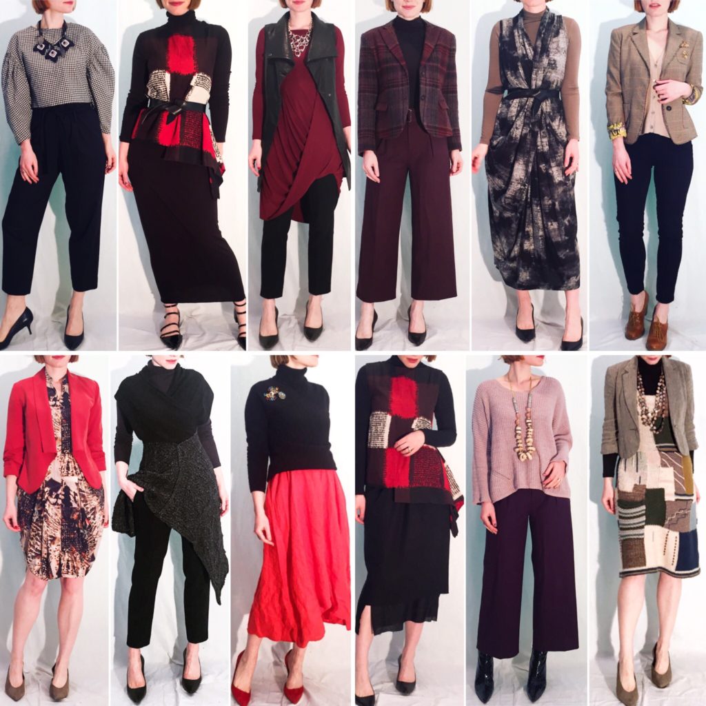
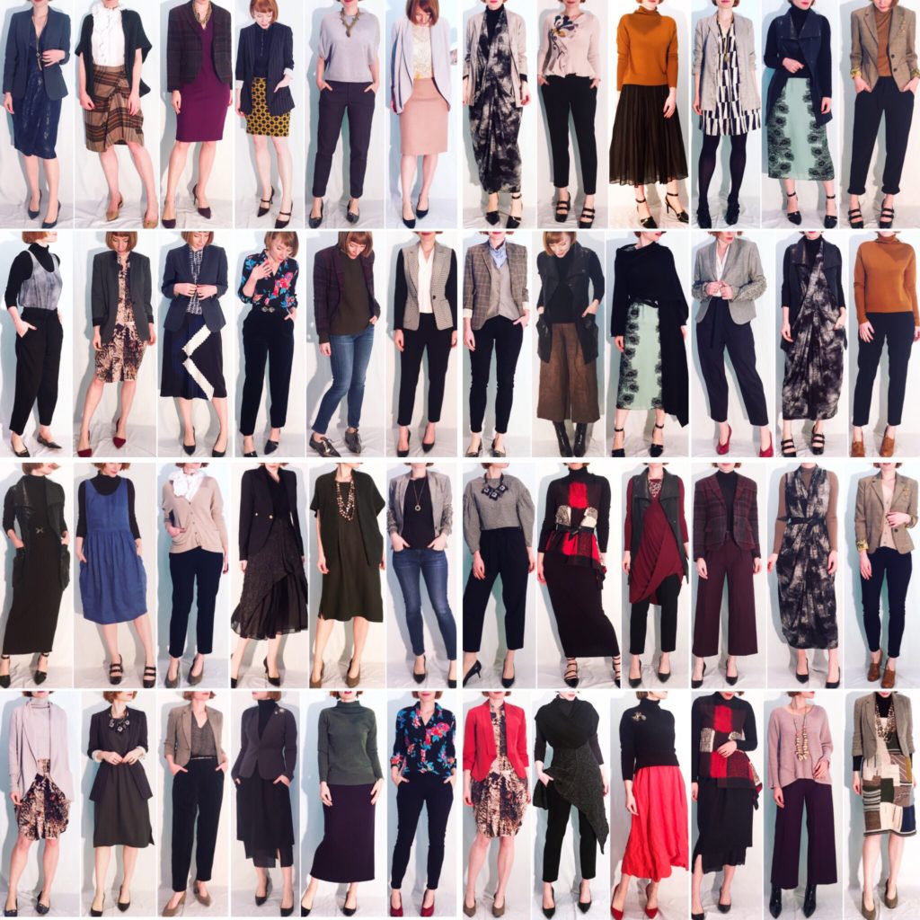
As I stopped doing monthly outfit recaps a while ago, I thought it would be interesting to revisit that concept now and see if the progress I feel I’ve made is actually reflected in my outfits. Below, I’ve compiled my work outfits for the month of July (less a couple of Fridays because of they wouldn’t fit in this format):

C8070A01-29B8-4A95-90F7-5D5D0177A012

What pleases me the most is the cohesiveness of these looks. I used to feel that my outfits in the past were “all over the map”, so to speak; I never truly knew why, but that always bugged me. I think it has to do with what clothes mean to me. Style is an expression of the individual, a reflection of who they are (or want to be). Looking at collages of my old outfits left me feeling like I was someone who didn’t really know who she was. I was wearing things I thought I should – because the clothes were nice, or they looked flattering, etc. But there was no clear intention to it all.

These looks are much less likely to be crowd pleasers, I do know that; but they very much reflect the person I feel I have become. They are quirky and eclectic and a maybe little bit flamboyant, but in an understated kind of way (if “understated flamboyance” is not an oxymoron). They are not trendy, except perhaps by accident. They are pieced together from thrifted finds, because I am a woman who loves finding beautiful things in the rubbish heap. There is some broader life metaphor in there, somewhere.

What surprised me the most is all the brown. I don’t think of myself as someone who loves earthy colours, but there is an undeniable theme happening in these photos. I don’t mind. I have been increasingly drawn to muted colours, from one end of the colour spectrum to the other, because I find them soothing and peaceful. I do still like throwing in a wrench of a bright colour every now and then, though … just to keep things interesting.

What I Wore: August 17-28, 2018

Extra, Extra

442ABD1A-B6B2-421C-B3F8-21E9EBB44F2B

I mean, come on. This AllSaints shirt is as extra as they come … and it’s fabulous. I knew it was a keeper as soon as I picked it up, without even seeing the label. I love the shape & volume of the neckline with the large rosettes creeping up the shoulder. I don’t typically do ruffles, but I was immediately drawn to the drama here. They don’t look particularly “cute” to me, which is key; I further de-twee-defied the look by adding these boyish cut trousers by COS, which just happen to be my current faves. They’re incredibly comfortable and easy to wear, and I am low-key panicking about finding a replacement pair soon, given my current frequency of wear. I also added my birthday earrings, because why not double down on big statements:

15706315-4E19-4114-9A2D-AE98921B7FAB

On Repeat/strong>

8F43BE7A-DE91-4B4A-B2C1-54F525412DD3

You guys know how much I love this dress, and here it is again. It’s a funky shape, for sure (you can see that better in this photos) but such a breeze to wear. I paired it with a fun, twisty necklace – it bends into any shape and can double as a fidget toy in a pinch.

A991D629-6524-4F43-960D-24219A8D6A2B

Smoky

2EDE4310-B7B5-4758-8167-1AE834E8F5C4

Not talking about the air quality around here (but also apt) – I’m talking about this Eileen Fisher top.Technically, it’s a wood grain print, but the colour paired with its filmy texture makes me think of swirls of smoke. Kinda badass, which is not necessarily the adjective I’d normally associate with EF. Paired with my trusty (and old) Madewell jeans, Club Monaco turtleneck, and Joe Fresh leather jacket, it added up to the perfect relaxed outfit for a (chilly) evening hanging out with friends.

A Different Take on Leopard

BE65D8B5-A580-4426-B67B-C6F259BBBD6B

This outfit was a bit of a style risk, but I was not displeased with how it turned out. It was a cold morning, so I needed a jacket for practical reasons, but I was initially stumped for options. Black would have been an easy default, but I didn’t think it would add much to the outfit, nor do justice to the lovely dark green of the (faux) leather skirt. I wanted something that would offer a bit of contrast, but not a bright colour. That’s when I remembered this Zara coat; it’s a subtle take on leopard print (if such a thing exists) and it possesses surprising chameleon-like qualities. Here, it’s practically a neutral, letting the green take center stage. I added some cognac accessories to pick up on the brown and, voila: a slightly mod take on the Bohemian.