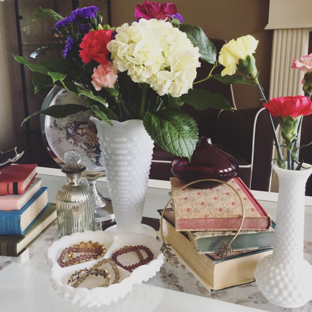
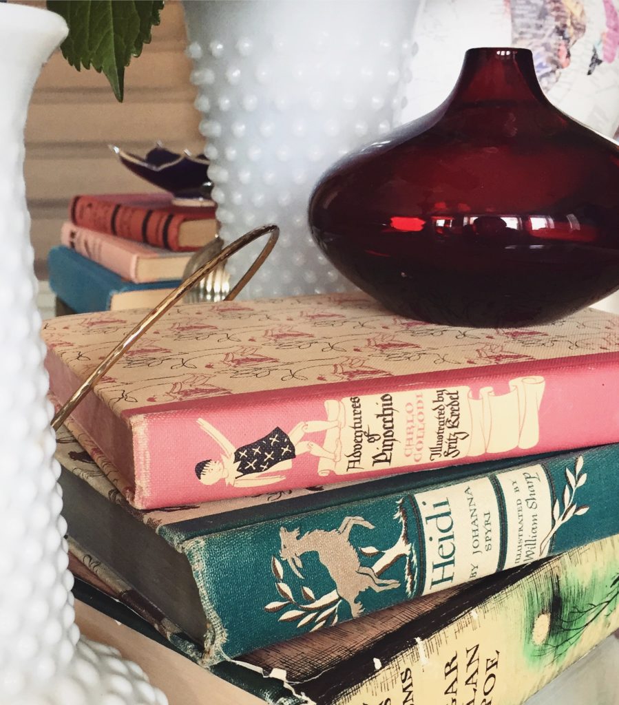
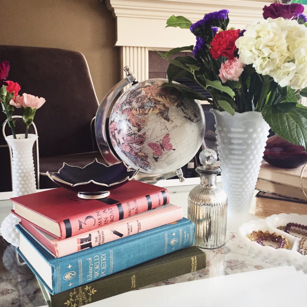
Clothing swaps have been a constant in my life for a long time (as the title of this post suggests), and while I still enjoy hosting them, this year I was not able to devote as much time to my preparations as in the past. I had no theme picked out in advance, and I scrambled to get everything ready at the last minute. Life, man – it gets in the way of all the fun stuff. Anyway, I threw together a bunch of décor things I had around the house, bought some flowers and a bunch of cheeses at Costco, and called it a day. It’s never a wholly terrible party if there’s cheese, amirite? (I didn’t JUST serve cheese, but let’s be honest, it was the highlight.)
Besides, people don’t come to this sort of gathering for the food or the décor – they come for the clothes. And there were plenty of clothes to go around. This was just my batch:
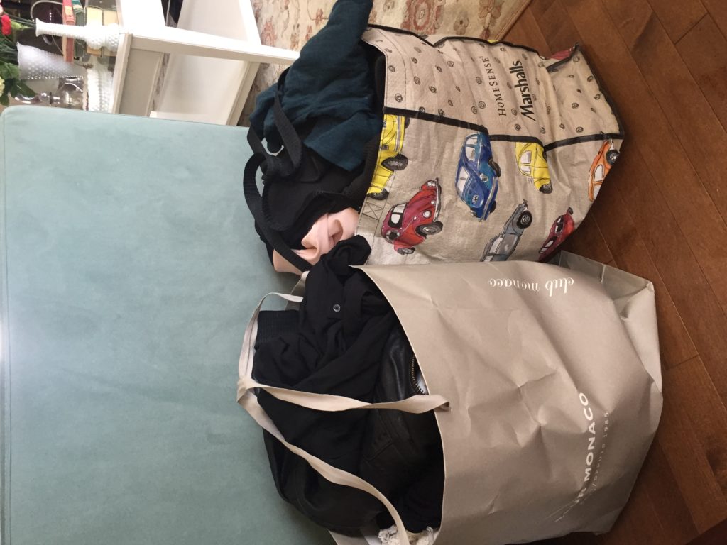
The tower of shoes:
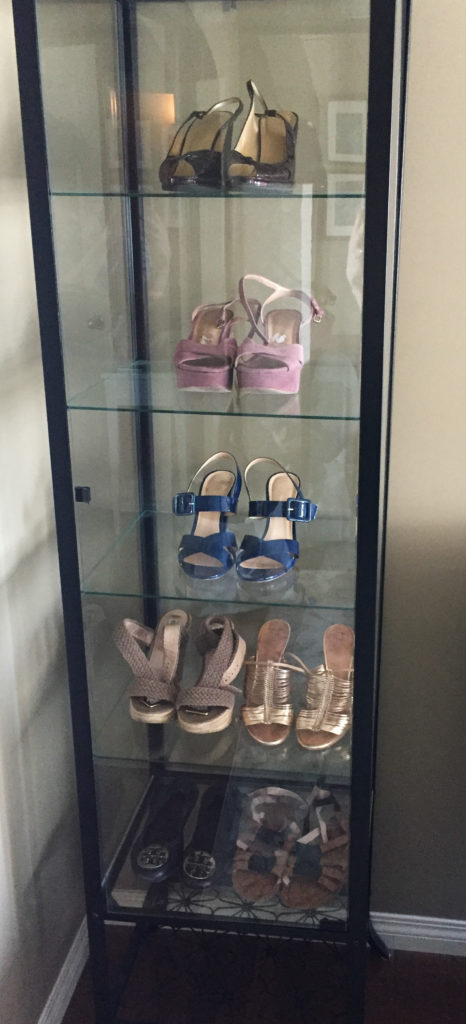
These photos are embarrassing when you consider how much of my own stuff I have been selling lately, but let me take this opportunity to make the same pledge I make (and break) every year: this is the last time I will have so much stuff to contribute to the swap. But, really, this is the year that promise will stick. I have a good feeling. Maybe.
As always, a good time and lots of laughs were had all around. There were tons of goodies, and it’s safe to say that no one went home empty-handed. Here are some of the clothes that were there for the taking:
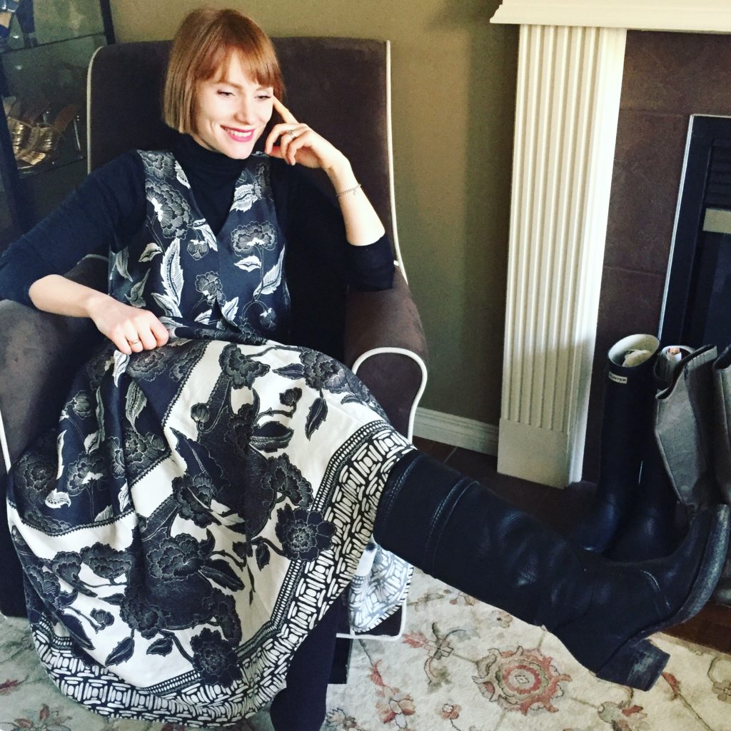
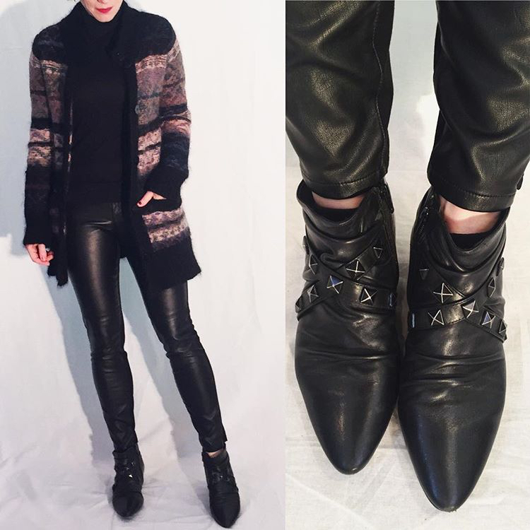
I tried really hard to get these Frye boots on but it was no-go. Sad trombone. They found a good home, don’t worry.
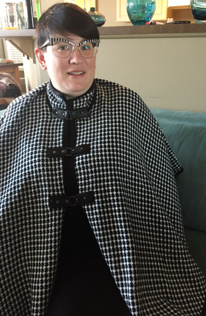
My bestie got this awesome cape that matched her glasses.
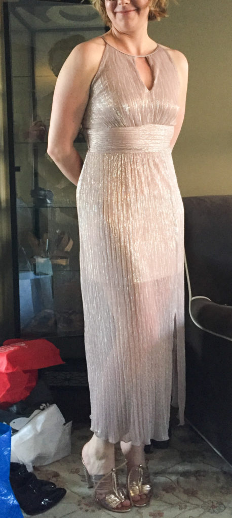
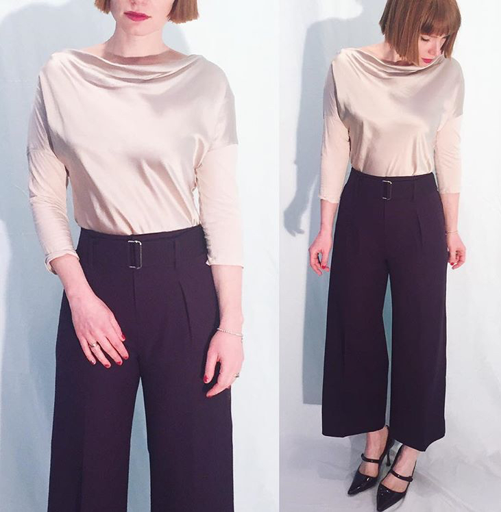
My friend K got a bunch of gorgeous dresses including this slinky number.
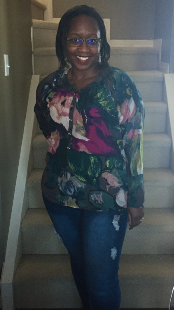
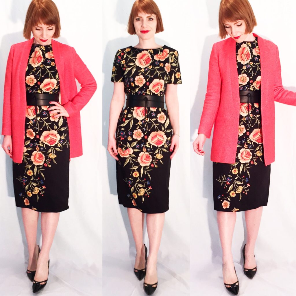
My friend T found tons of colourful pieces to complement her bold style including this Ted Baker floral number that I (reluctantly) let go.
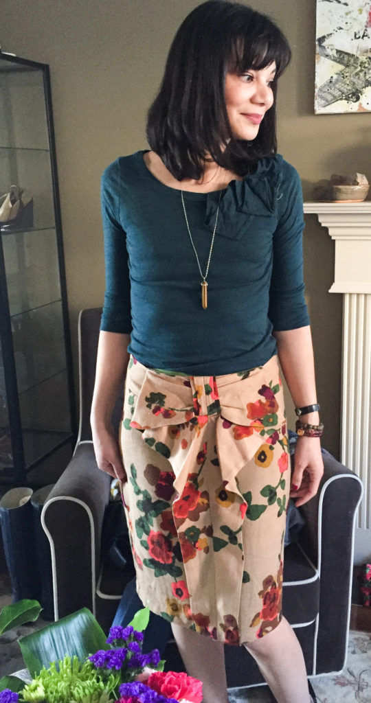
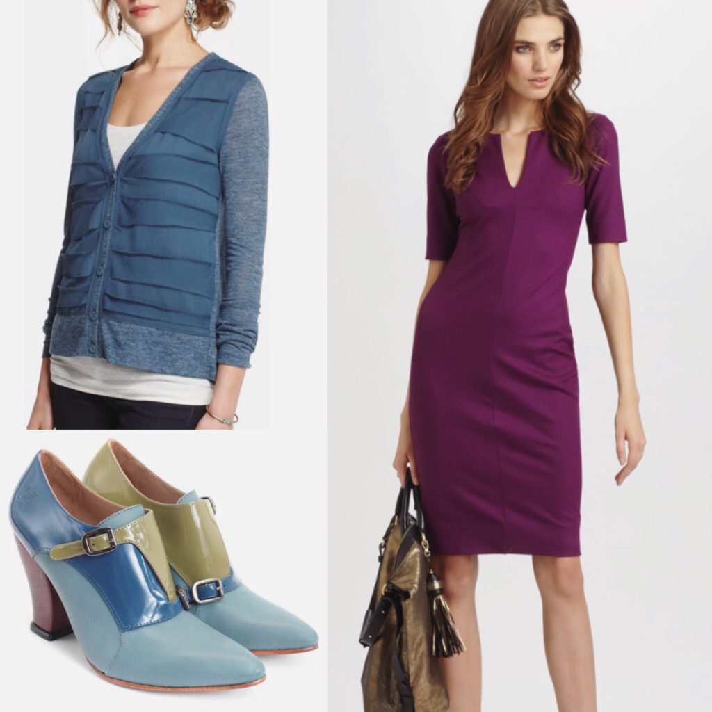
The lovely S (IG uincolour) found some real gems like these Anthro pieces that actually look great together.
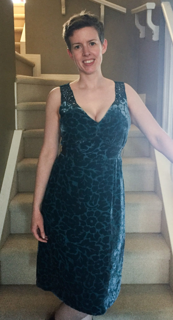
Cassie (The Minuteglass) rocked this Moulinette Soeurs dress (and her pixie – jealous!)
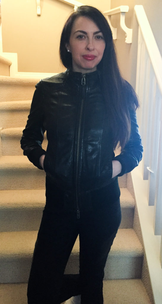
Jenn (Life Preloved) was delighted with this Mackage jacket (and a To did For Tadashi Shoji sequin mini among other things including, ahem, a certain pair of boots).
My friends L and O — who somehow managed to avoid my photographic efforts – did not go home empty handed either. Miraculously, each of us found things that seemed like they had been meant for us all along.
Speaking of which, here’s a list of the stuff I took home – stay tuned for photos coming to a blog near you soon:
– DVF “Aurora” wool sheath dress
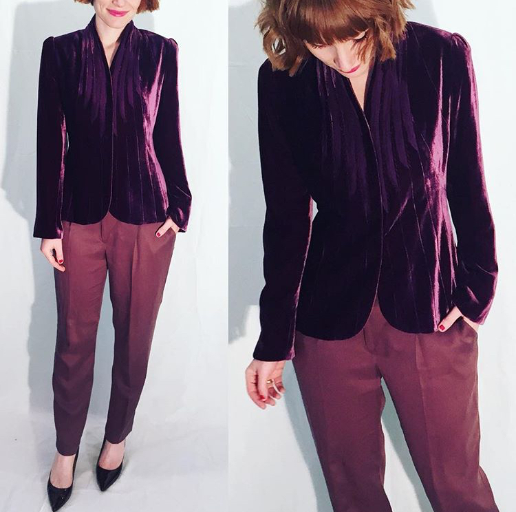
– Talula “shrunken Exeter” purple blazer (this is my fave style in a gorgeous colour)
– Zoa grey tie-waist shirt
– Vanessa Virginia teal cardigan
– Rebecca Minkoff green bag (yes!)
– Fluevog monkstrap pumps (yes!!)
– Tara Jarmon silk pleat pants
– Colorpop lipsticks
Have I convinced you yet that a clothing swap is a most fun and excellent idea? I hope so … and if you have already tried one yourself, tell me all about it.