Last year, we talked about outfit building blocks and outfit formulas, which gets us most of the way to an outfit. What’s left? Well, choosing the specific pieces to use in an outfit. This can feel tricky when colour is involved. If you fall down the rabbit hole of reading about colour theory online (much less stuff like seasonal colour analysis), it’s not difficult to feel overwhelmed. Ready for my hot take? I think all those theories can make it all seem far more complicated than it is.
Assuming no vision impairments, figuring out what colour combinations work can be very simple: just look at them. Put two pieces of clothing next to each other and check to see if they look nice together or not. That’s it. There may be a lot of science behind that, but you don’t need to know about it in order to put together a well-coordinated outfit. It’s how we can look at a person’s outfit and find it visually pleasing without having to pull out a colour wheel to confirm whether it is, in fact, a good outfit.
I don’t use a colour wheel when I’m putting together outfits; after years of practice, I have a number of favourite colour combinations, which I know work well together, but I also still experiment all the time. I start with one piece of clothing, the one I know I want to include in my outfit. Next, I pull out a bunch of different options that might be suitable for completing the outfit, ignoring colour to begin with. Say I start with a skirt (I often start with a skirt); I might pick three or four different tops or sweaters, depending on the season – maybe more, if I’m feeling really adventurous. Then I put each top next to the skirt and see how they look together. I don’t usually try anything on at this point, since that takes extra time and this is a speed elimination round. I usually have a favourite combination right off the bat, but if I narrow down my choice to, say, two tops, then I make the final decision after trying on both versions of the outfit. If I like both, I’ll wear one and make a note of the other, so I can wear it another time; this way, I’m making the most of my experimental session.
Still not convinced? Ok, here are some traditional colour theory-based “rules” to consider.
Monochromatic and analogous schemes
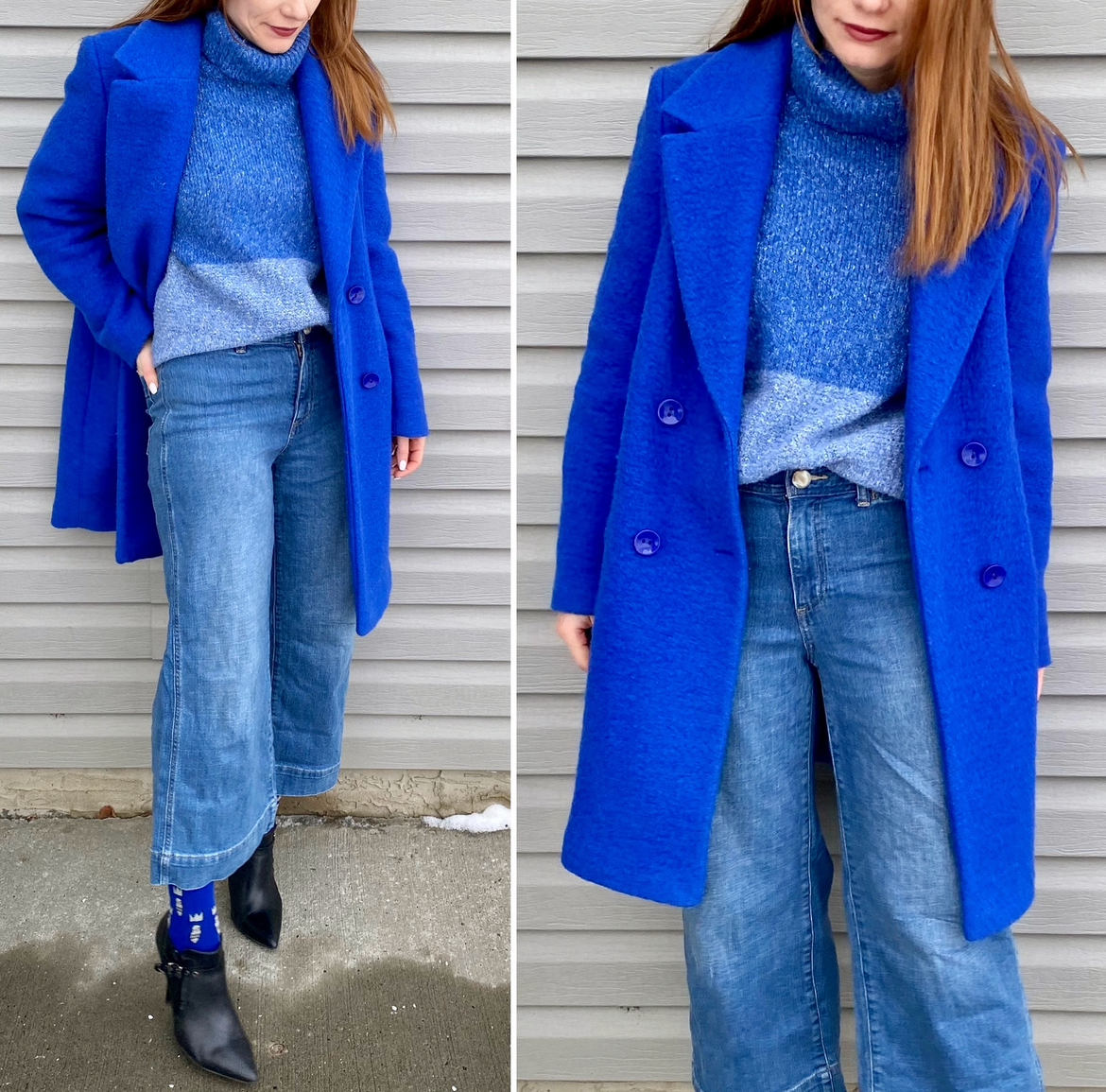
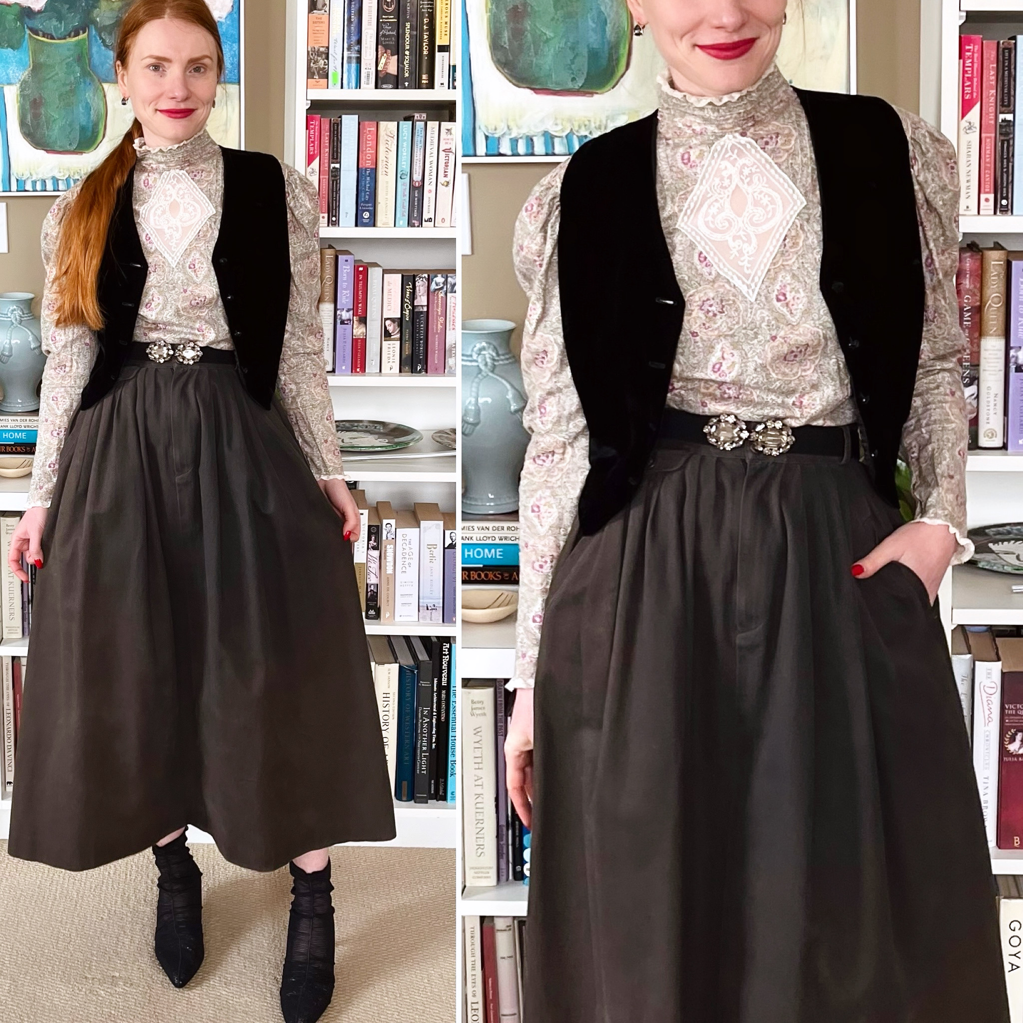
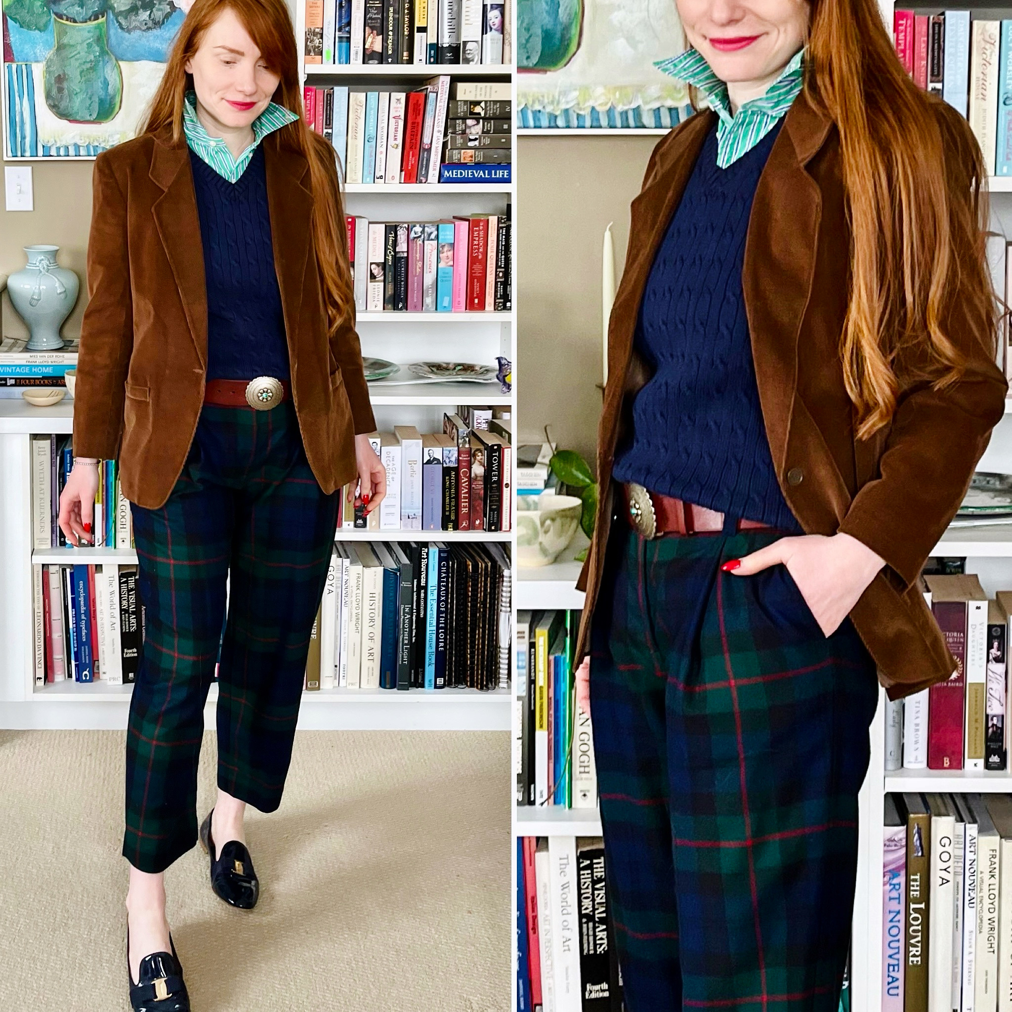
This one is self-explanatory: it’s about wearing the different shades and tones of the same colour head to toe. (Note: monochromatic can also be used to refer to a black and white colour scheme. That one’s a classic too.) Monochromatic can be trickier than it appears. If you look at the classic fashion colour wheel, you will see that there are at least two blues, two greens, two yellows, and so on. You may or may not have each colour sufficiently well-represented in your closet for a truly monochromatic look (unless we’re talking about neutrals like black, beige, white, etc.).
An analogous scheme can be easier to achieve: you’re looking to mix several shades that are next to each other on the colour wheel. Personally, I like to do at least three because the combination not only looks richer, but also because there is less risk of it looking like you were going for monochromatic and simply missed the boat.
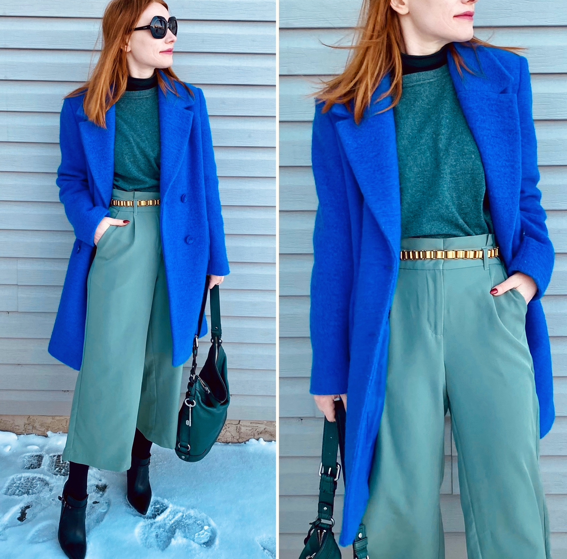
Complementary schemes
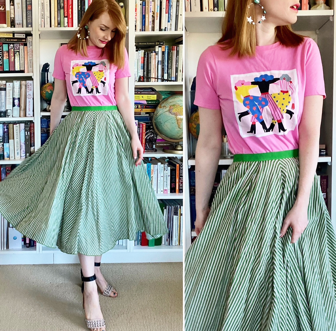
Complementary colour schemes are probably the ones most people think of when it comes to colour theory: choosing colours that are directly opposite to each other on the wheel. Think pink and green, orange and blue, violet and yellow.
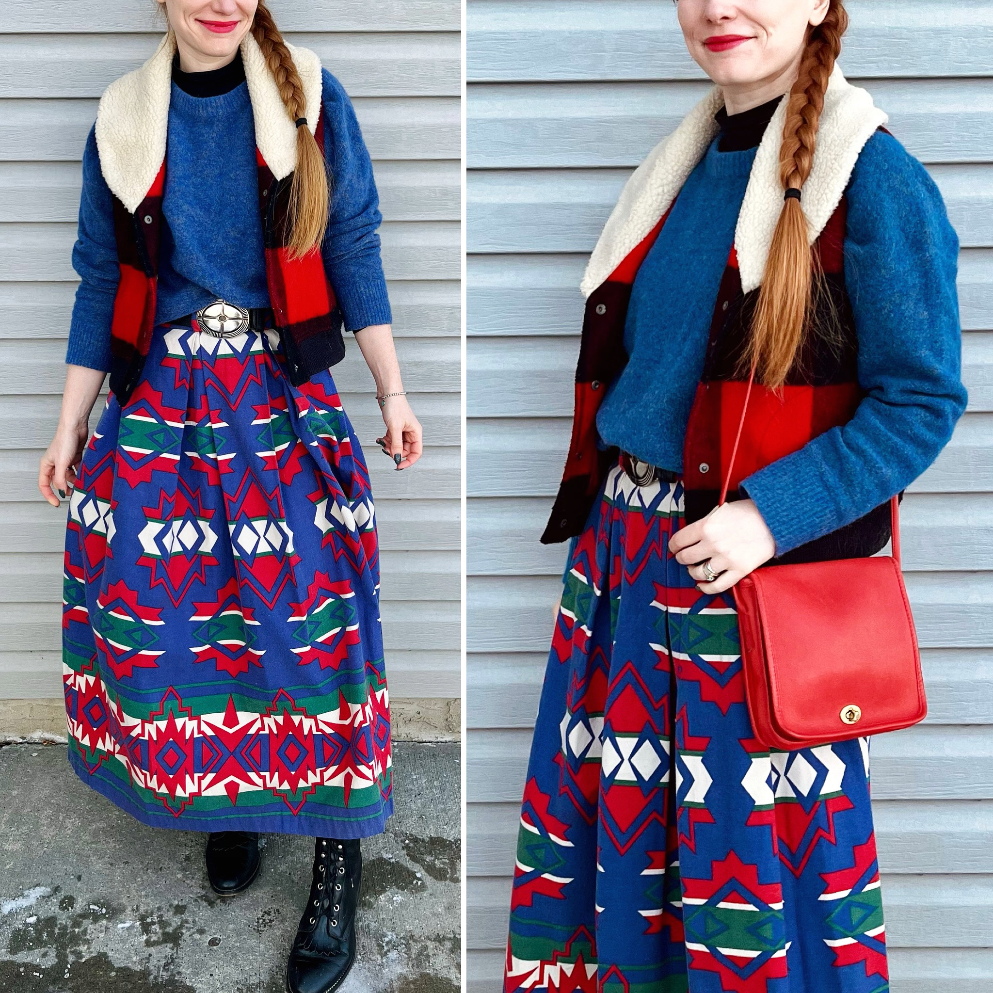
A split complementary scheme is similar, but instead of choosing the colour directly opposite, you choose the two colours on either side of it. For a triadic scheme, you are looking for a combination of three colours that are equidistant from each other on the wheel. Using a triadic scheme can result in very bold outfits, which can feel overwhelming to some folks, but it’s possible to tone down its impact by choosing softer or more muted shades of each colour. If you’re trying to use multiple colours in an outfit and start to feel like you’re losing your courage, it may help you to revive it if you “ground” those colours with a small amount of black – for example, a black belt.
The “cheat code”
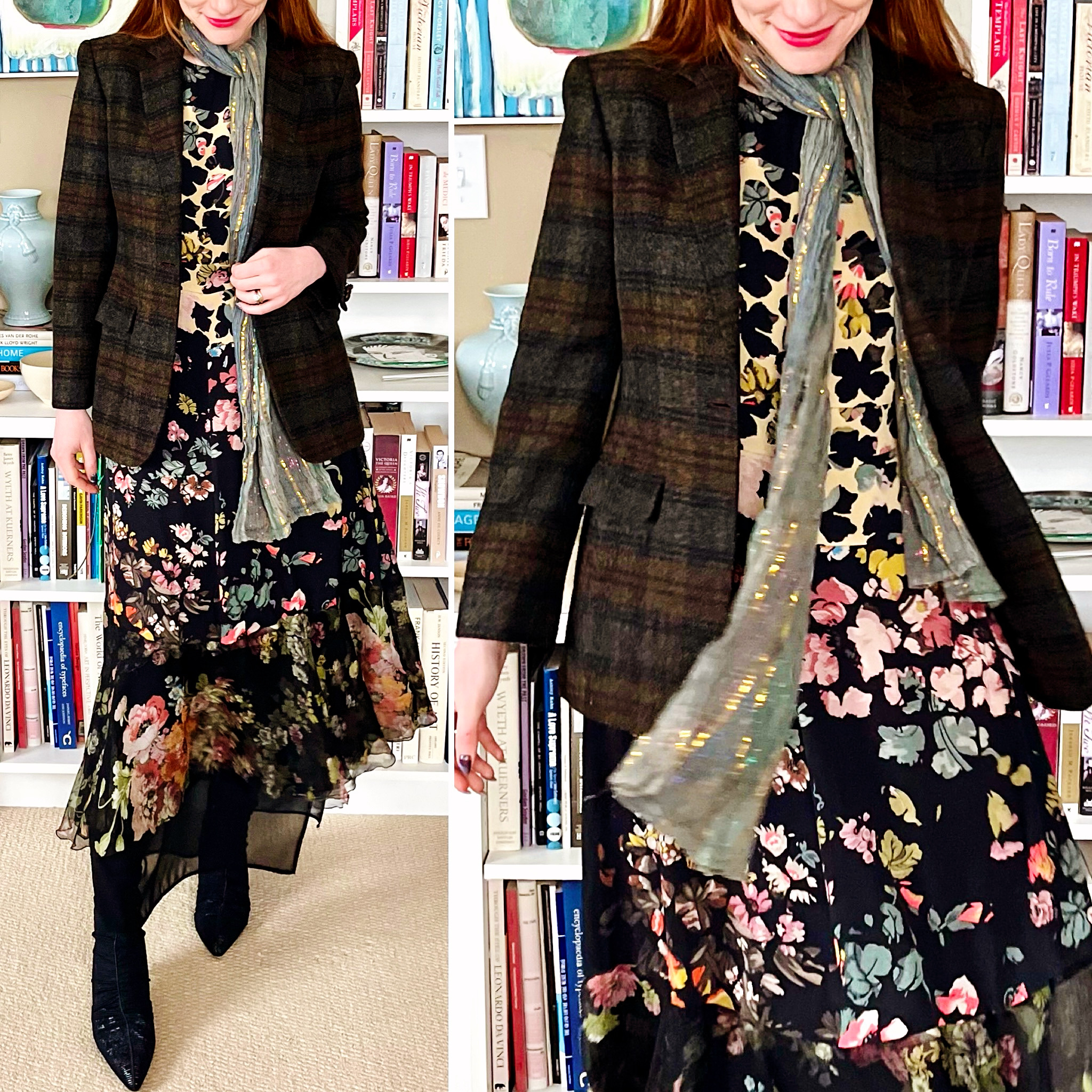
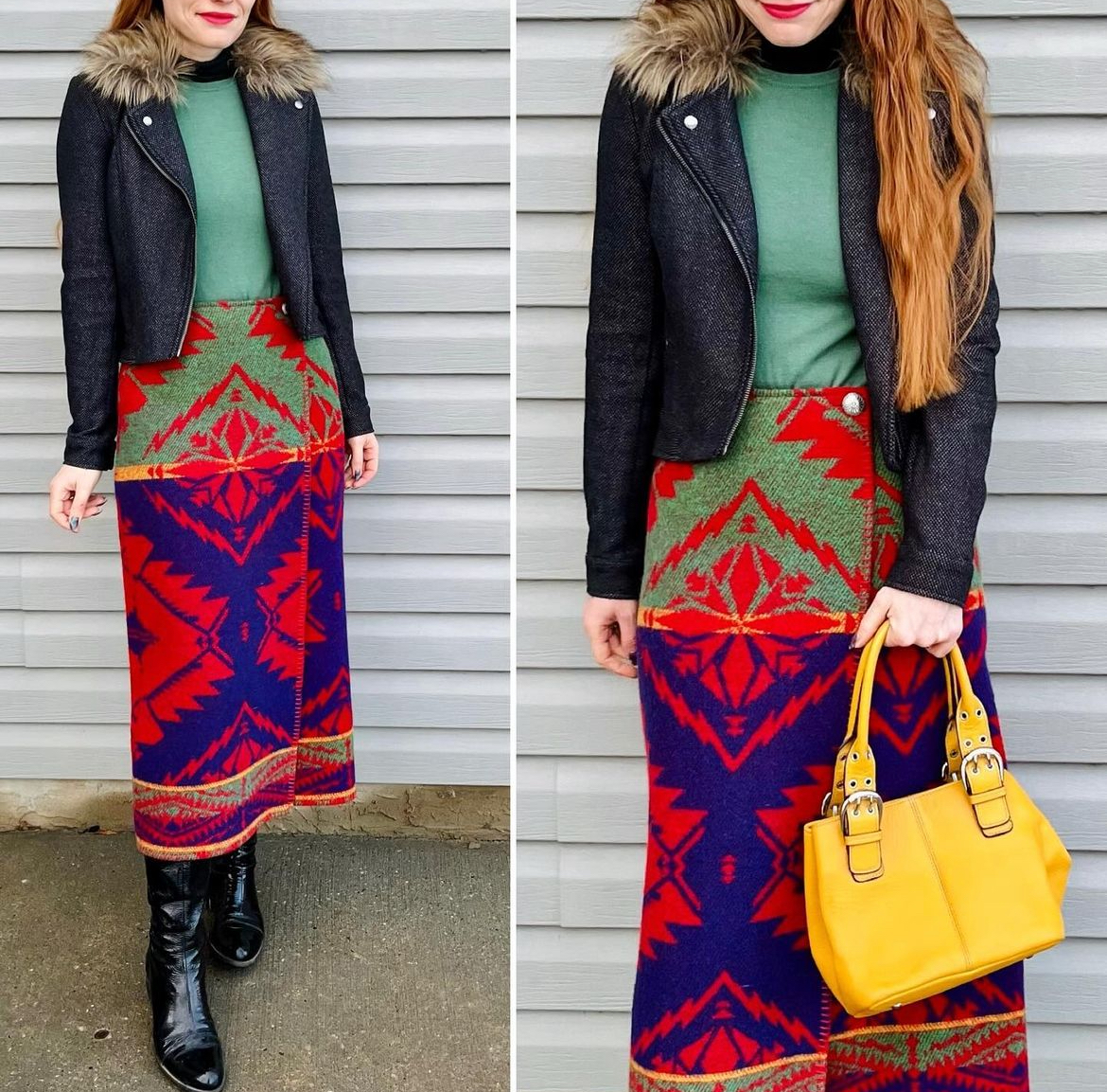
Yeah, there’s a cheat code: a way to pick amazing colour combinations without doing any work at all. How? Find a pattern you like. It can be from your closet, your house, a book, anything. Look at the colours used in the pattern. Pick two or three. Voila! You have a colour combination you can be sure works because a professional designer with years of experience used it to create a pattern that you already love. It doesn’t get easier or more failproof than that. This, by the way, is also the easiest way to figure out how to wear patterned clothing. The simplest option is to pair a pattern with one or more solid colours; to choose complementary garments, pick colours from the pattern itself. If you want to pattern mix in advanced mode, you can choose different patterns that feature similar colour palettes. Start with black and white patterns if you’re feeling hesitant, and use solid white or black pieces to tie them together. I have thrown together every black and white pattern under the sun, and this approach hasn’t failed me yet.
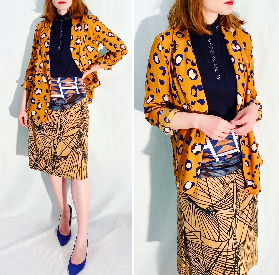
If you’re feeling more adventurous, use the same approach but expand the colour palette; choose patterns in similar colours, and pick one of those colours to emphasize via accessories or a solid-colour third piece. For example, if you have a jacket and skirt that both feature blue and orange in their respective patterns, you can pick a top in the same shade of blue; if your top and bottom are patterned and you’re not wearing a third piece, a pair of blue shoes or a blue bag can do the trick.
The bottom line, though: colour is fun! Remember how fun it was to mix paints when you were a kid and take liberties with the colour of the sky and the grass and the sun? This is exactly the same, except way less messy. Have fun with it!