
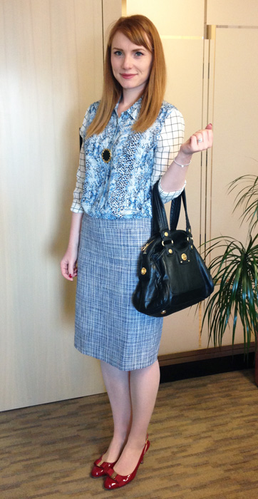
As you guys may remember, I had some reservations about this blouse when I bought it. The print combo, paired with the style, struck me as borderline … ugly. I may have been more diplomatic in my description at the time, but that was the gist. I’m happy to say that I was wrong. Quite wrong. And I have no problem admitting that, notwithstanding what my husband might have to say on that topic. (He’s wrong. Hah!) Bottom line: this shirt has grown on me a lot.
Not 100% sure how I feel about it in this outfit though. Let’s take another look, or two.
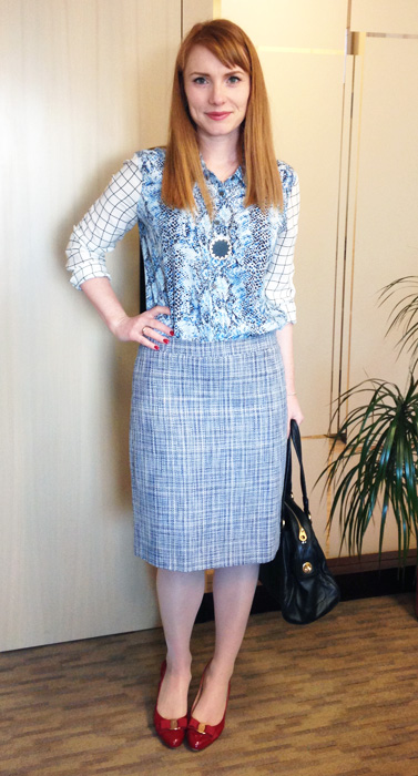
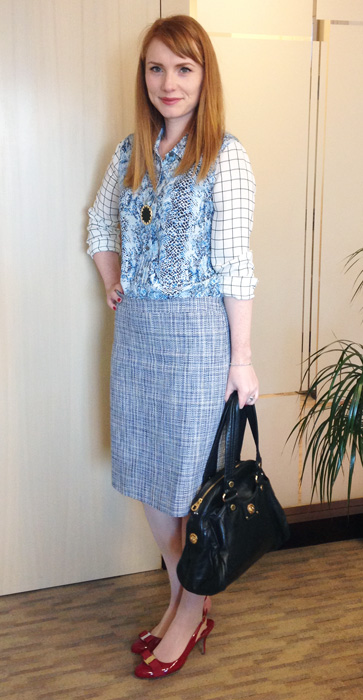
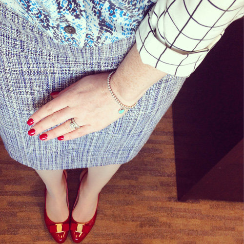
Was mixing 3 prints a step too far? They’re all in the same colour family, roughly (blue, black, and white), so I don’t think they look clownish per se. But maybe just a little bit off? Seriously; here’s a close-up, and you tell me: one too many prints?
OK, enough about that. Can you guys handle yet another one of those navel-gazing entries about my never-ending quest to get my (style) s**t in order? Well, I hope so, because here goes. I’m sure I’ve mentioned it a hundred times once or twice before, but I have this weird attraction/repulsion/inner conflict about minimalism. (And, to be clear, I’m talking about minimalism as an aesthetic, not minimalism as a lifestyle.) As much as I love bright colours and prints, my definition of true chic has always skewed in the opposite direction. Think Gwyneth Paltrow’s or Kate Lanphear’s street style. Or a mere mortal’s version of Tilda Swinton’s wardrobe.
I’ve struggled with this a lot because, duh, I love bright colours and bold prints. The idea of wearing a pared-down colour palette and unembellished outfits always seemed … restrictive. And boring. And yet. One of the things that has really surprised me during this whole new “adulting my work wardrobe” adventure is that the outfits I’ve felt most comfortable in – and most like the best version of my(current)self – are the, you guessed it, minimalist ones. Note to self: what the hell is going on?
And, then, it finally dawned on me: the way I feel about colour when it comes to clothes, is the way I feel about colour when it comes to make-up. Let me explain. Set me loose in a drugstore (or, God forbid, Sephora), and I am likely to end up with a bazillion colourful things in my basket – eye shadows, eyeliners, lipsticks, you name it. I see colour, I want to get my hands on it. I want to play with it. But, in reality, I wear the same 2-3 eye shadow and lip colours day in, day out. I learned the hard way to avoid giving in to my colourful make-up buying urges, because it all just goes to waste. I don’t wear all those pretty, bright colours on my face, and if I ever try (because of an ill-advised purchase), I feel odd.
Anyway, it’s kind of the same story with clothes. I cannot get enough colour. I love looking at colours. I feel the same way about pretty prints. I would probably wallpaper my house in Anthropologie-esque prints if my husband allowed it. Because I just like looking at them. Does that sound crazy? Regardless, I’m starting to realize that just because I adore a print, doesn’t mean that I have to wear it. It may not, in fact, be something I really enjoy wearing, as opposed to just, you know, looking at it. I know that’s probably a really strange and random revelation to have but, well, strange and random is kind of the name of the game around here.
So, what does that mean? I think that, going forward, I’m going to try to set aside my love of prints and colours (for their own sake) when I go shopping, and try to base my buying decisions on other criteria. I’m working on figuring out a wardrobe colour palette (loosely inspired by this Into Mind post), which will hopefully make it easier for me to make more, shall we say, dispassionate choices about the things I buy, and don’t buy. What I’m not going to do, at least not until I’m really sure about where I’m going with all of this evolving style stuff, is get rid of all of my colourful clothes and prints. A lot of them I really enjoy wearing, so purging them seems unnecessary; the ones I’m on the fence about, I’m going to evaluate over the rest of the year. (I have a feeling that wardrobe analytics is going to play a big role in this.) No haste, no waste. Or maybe that’s just the hoarder in me speaking.
As always, I’d love to hear your thoughts, so hit me up in the comments.
Yup, totally makes sense! I’ve been working on a wardrobe inventory/purge and had a similar discovery. In theory, I love the bright/happy chic vibe when I see it styled by my favorite brands (J. Crew, Kate Spade, Boden, etc.), but making it work in real life is different. I have some prints that I love when I look at an item as an individual piece, but when I look at my wardrobe together I’m happiest with rich neutrals, subtle prints, interesting textures, etc. And sometimes the prints and colors look kind of juvenile in comparison.
I’m trying to work on thinking about using those prints and colors in new ways…making them an accent in my outfits rather than the star, trying new color combos. And even if my wardrobe goes a different way, it doesn’t mean I won’t want to play around with something bright and funky every once in a while…so I won’t be purging them from my closet just yet!
In thinking about it some more, I think it’s actually pretty common – to fall for something in the abstract (a cute print, or colour, etc.) without really thinking about it how it works in the practical sense (with your complexion, or the rest of your closet, or your lifestyle, etc.). And I think retailers feed that too. I’m trying to learn not to let that guide my shopping behaviour – to say, “hey, that’s a cute skirt, and I can just admire it and even lust after it, but I don’t have to HAVE it, and that’s ok”. It sounds so basic, but I feel like that’s the type of behaviour our shopping culture is designed to suppress, haha.
Yes, that’s actually one of the reasons I started to blog! I can work through some of my desires and have a place to talk about what I love without having to buy all the things. Some things just belong on a Pinterest board, not necessarily in my closet…and that’s OK!
That’s a really good way of putting it! Hmm, maybe I should get on Pinterest …
Hi, from ‘over the pond’! stumbled across your blog after reading ‘what Lou wore’ blog and just want to say I think your style is great; you really dress to suit your shape and colouring, but on trend too!
I love colour and print but am careful not to ‘overdo’ it!
The minimalist look is great on some people and suits certain types I think. I’ve tried minimal colour and just end up feeling ‘Meh’!
So, I say go with what makes you happy and don’t worry about the latest craze; dressing well I think is all about wearing what suits your body shape, colouring and personal style!
Keep up the good work!
Welcome! Lou is the bee’s knees – she has such fantastic style. I hope I can measure up on this side of the pond 😉
Hi, new here (like this is my second issue), I feel it with the love color but some don’t feel right. Look into Carol Tuttle’s book “It’s Just My Nature”. That with her Dressing Your Truth has given me a lot of insight.
Thanks for the recc’s! I will def take a look at those – I love books on personal style 🙂
I wish I knew how to post a pic but this outfit reminds me of Tracy Ellis’ on essence. Google it!
I know I’m always asking a variation the same dang question… but when I looked at that Into Mind post a few months ago, I had no idea what palette to use based on my red hair/pale skin/blue eye combination. Are we warm or cool? Personally most of my office wear is based around navy, but now I question that decision…
So, here’s the thing: I ended up creating my own palette, because none of the ones Into Mind had really spoke to me. I have a post coming up on that 😉
I think navy is a very good choice for a base/main/neutral colour for red-heads; black is my safety net, but I think navy is probably more flattering, from an objective perspective.
Amazing! I can’t wait to check it out!
I also look forward to your post on the colour palette. I couldn’t figure out what sort of palette I should use – I don’t know if I’m warm or cool either. (Not a redhead – dark blonde, but also pale and blue eyed.) I ran some metrics on my own closet and nearly half of what I own is some sort of neutral – black, white and grey. But I couldn’t figure out how to translate that into the colour palette formula, so I can’t wait for your post!
Hehe, I hope you won’t be disappointed with it. There was no science to my method, or method to my madness. And even less so in my blog post, LOL! But what’s new 😉
I love this outfit. Not matchy-matchy. It’s…mmmm…creative yet safe? A very personal look to wear if you have to dress for the office. Sorry Adina, I LIKE IT!
No, hey, I’m glad: I like it too! I’m happy to hear that I’m not coming out of left field with it 😉
I do like prints in theory as well but I tone down the rest of my outfit when I wear them. As in, simple lines and textures (generally really conservative cuts), no accessories and very little jewelry. Print mixing was never something I was comfortable with on myself.
I love print mixing but I think there is a time and place for the go-big-or-go-home type of mixing, and that is not at the office. Just my 2 cents, of course. I still think subtle print mixing can work and look professional, but I try to save my more experimental attempts for the weekend.
I am on the opposite site of you- I have like two printed items in my closet, and think I should incorporate more prints to avoid boredom. But when I go shopping I go for solid colors, mainly neutrals. So I don’t really have an answer, except that I like this outfit and your style in general. It’s not like you are a walking wallpaper! In the most recent outfits you have successfully paired prints with a neutral base, and it looked very “you”. Maybe the secret would be to buy prints in subdued colors? I don’t really know…
I think that’s a really good point! I would probably be bored with an all-solids wardrobe, but I also shouldn’t let my love of colours dictate my outfits entirely. I do think I’m starting to get the hang of the whole balance thing, so I appreciate the encouragement!
I am new here too and I love the outfit, it looks very deliberate and considered. I struggle with my creative urges too, I studied art and so have a long history of gathering colours, be it paints or eyeshadow! I think dressing is a creative act and it’s no wonder you are drawn to the visual arts – are you artistic, it could be channelled…
I’m not super artistic, but there certain crafty things I enjoy doing. The problem is time, or lack of it. Sigh. Perhaps in a few years when the kids are older (or when I work less, LOL!) I’ll get back into my other hobbies, and compensate for my colour-love 😉
Anyway, I’m glad people understand what I’m talking about re collecting colours – it’s almost a compulsion, you know?
Love your outfit today. It works in that way you think it shouldn’t, but it does. And while I can personally related to 100% of the things you said about your purchasing style vs your wearing style, I have to say that the prints I see you in on here look fabulous on you! You really have an eye for picking them out and wear them well. So perhaps we are just more self-conscience in our prints and therefore don’t feel as comfortable as we do in our blending neutrals even though we look just as fabulous to everyone else.
Aww, thank you! I really do appreciate the feedback (especially the positive, hehe!) because it’s very helpful during this whole figuring-out-who-I-am (style wise) period.
I think the colors of this outfit are fantastic and it works, but would like it even better if the scale of the print in the body of the shirt was bigger. I think the shirt and skirt fight with each other a bit. But honestly, this is only because I’ve been thinking on it for a while. As to your other thoughts, one of the reasons I follow your blog is that you don’t look like everyone else. I love your prints, but I’m also a firm believe in having good simple basic items, which is probably important especially when working in an office with any kind of a dress code. So maybe that is all you’re needing, a few more building blocks to show off your wonderful prints.
I do have a fair number of basics, but for a long time I tended to avoid them – they seemed to safe and boring, especially for blogging fodder. But I find that the less I dress “for the blog”, the happier I am (and, dare I say it, the better my outfits turn out). I’ll never be a real, capital-F Fashionista anyway!
I actually love your print-mixing…the color thing ties them together, and none are bold enough on their own to be overwhelming, so I think it looks great!
Thanks 🙂 I do agree with Karen that the skirt & shirt are a little bit too similar, size-wise, to the point of almost clashing, but … I also think they’re really close to being a great match. I guess it’s all a matter of how you look at it – and I’m in a glass-half-full mood, LOL!